Showing posts with label walking. Show all posts
June 24, 2022
My Sabbatical with Maggie
companion
,
countryside
,
dog
,
hiking
,
hunting
,
kpi dashboard
,
outdoors
,
recovery
,
rest
,
running
,
sabbatical
,
tableau
,
UK
,
united kingdom
,
walking
No comments
Having been with The Information Lab for more than 5 years, I had the opportunity to take a month-long sabbatical. I went to Siam Park with my son Henry in Tenerife, a week long trip to Eckington in the UK, plus every possible moment spent with Maggie.

Of course, I tracked everything I did with my beloved companion. And we did A LOT.
We covered 254 kilometers (158 miles) in 60 hours over the course of 38 days.
While I do have the routes for every activity, I thought that was too personal, so I stuck with a simple KPI dashboard. It tells me lots of stories I'll never forget...from gun dog training to long hikes across the English countryside to cuddles on the couch. I love her so much!
January 3, 2021
#MakeoverMonday Week 1: Quiet Streets & Clean Air - Americans Are Getting Outdoors
air quality
,
bicycles
,
comparison
,
covid
,
cycling
,
line chart
,
Makeover Monday
,
pedestrians
,
rails to trails
,
variance
,
walking
,
year over year
No comments

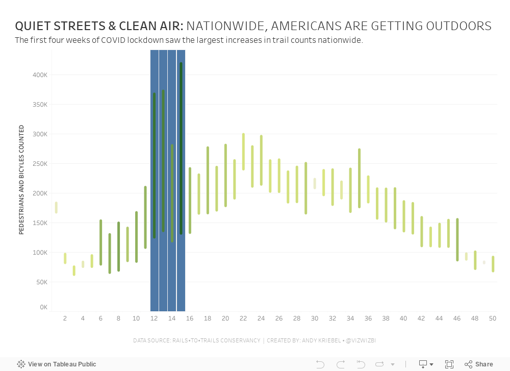
Back in March 2020 when COVID lockdown started in the UK, the streets were amazingly empty, the air got fresher and I saw more and more people outside. You could hear birds chirping on streets you never would have before. And we could ride our bikes right down the middle of the road since there were no cars. The lack of cars was glorious! (COVID isn't of course).
For 2021, #MakeoverMonday gets started with a simple graphic that compares pedestrian and bicycle counter stats for 2019 and 2020 at 31 counters across America. The data is collected by the Rails to Trails Conservancy, and you can learn more about the data here.
ORIGINAL VISUALIZATION

WHAT WORKS WELL?
- A line chart is a good choice for time series data.
- The colors are easy to distinguish.
- The grid lines help guide the eye across the view.
WHAT COULD BE IMPROVED?
- Include a more impactful or descriptive title. What is it about?
- Why are thee weeks missing on the x-axis yet the lines go the full year (or appear to)?
- The lines could be labeled directly so that you don't have to refer to the color legend to know which lines represents which year.
MY MAKEOVER
Subscribe to:
Posts
(
Atom
)


