July 19, 2021
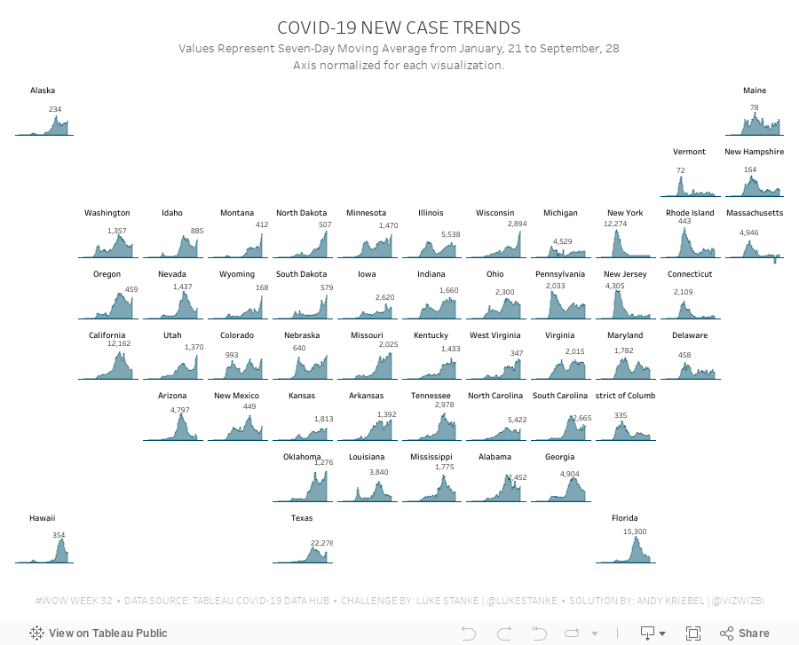
#MakeoverMonday 2021 Week 29 - Non-Whites Are At Higher Risk of Dying From COVID-19

Another COVID-19 data set this week and a great visualization that shows how much more likely ethnic minorities in the UK are to die from COVID.
In the video, I worked through rebuilding the original viz since I liked it so much. Interact with the viz below the video.
July 12, 2021
#MakeoverMonday 2021 Week 28 - COVID Vaccination Rates by Ethnicity and Age in England

April 19, 2021
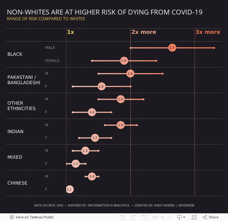
#MakeoverMonday Week 16 - The Impact of Covid on Air Travel in America
I struggled to come up with anything interesting this week, but that's ok. I was still able to explore the data a lot and ended up with a simple dashboard. Check out #WatchMeViz and interact with the viz below.

January 3, 2021
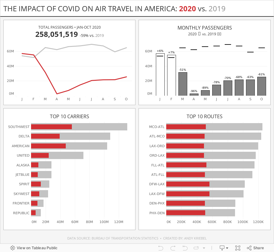
#MakeoverMonday Week 1: Quiet Streets & Clean Air - Americans Are Getting Outdoors

Back in March 2020 when COVID lockdown started in the UK, the streets were amazingly empty, the air got fresher and I saw more and more people outside. You could hear birds chirping on streets you never would have before. And we could ride our bikes right down the middle of the road since there were no cars. The lack of cars was glorious! (COVID isn't of course).
For 2021, #MakeoverMonday gets started with a simple graphic that compares pedestrian and bicycle counter stats for 2019 and 2020 at 31 counters across America. The data is collected by the Rails to Trails Conservancy, and you can learn more about the data here.
ORIGINAL VISUALIZATION

WHAT WORKS WELL?
- A line chart is a good choice for time series data.
- The colors are easy to distinguish.
- The grid lines help guide the eye across the view.
WHAT COULD BE IMPROVED?
- Include a more impactful or descriptive title. What is it about?
- Why are thee weeks missing on the x-axis yet the lines go the full year (or appear to)?
- The lines could be labeled directly so that you don't have to refer to the color legend to know which lines represents which year.
MY MAKEOVER
October 1, 2020
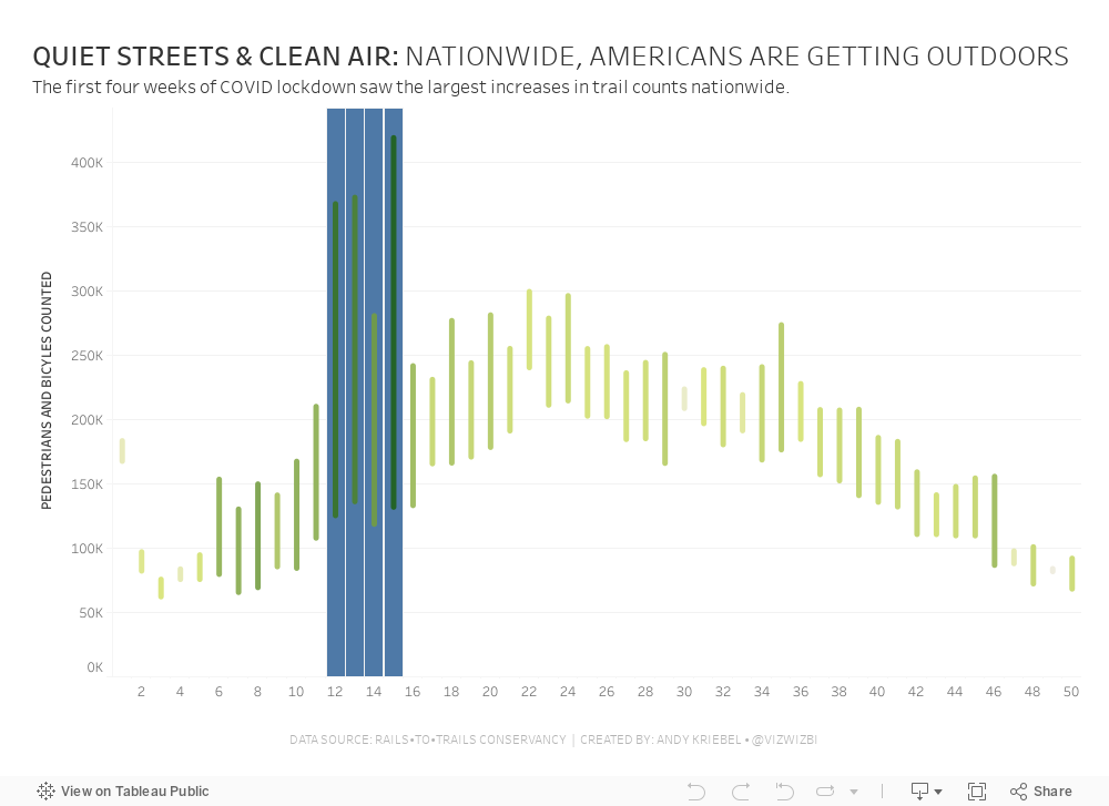
#WorkoutWednesday 2020 Week 32: COVID-19 New Case Trends

As I continue to catch up on Workout Wednesday challenges I've missed, I'm picking and choosing those that looking interesting at first glance (and that I think are doable in a short amount of time). Week 32 was one I knew I could get done quickly since it was very similar to 2017 week 7. Actually, since the columns and rows were provided to use already via a CASE statement, the trellis part of the exercise required no calculations and no work.
The toughest part was normalizing the calculation within each State. The key here is to think about each State individually, find the highest value, and then compare all of the other dates to that value. I did this by putting each State and date into a row, creating a calculation to get the largest value, then computing the necessary ratio. Once I had that, it was simple to turn it into a chart.
To get the State names in the middle of each chart, think about how you can count half of the day in each chart. Then take that value and add it to the first date and you'll get a single date that's halfway across the date range. This solution will be flexible for any new data that would be included.
Some difference between mine and Luke's
- I didn't filter the dates; I decided to use the entire data set, but keep in mind that I did this several weeks after Luke posted the challenge.
- I created a mobile version as well.
And with that, here's my completed #WorkoutWednesday for week 32 2020.