January 3, 2021
#MakeoverMonday Week 1: Quiet Streets & Clean Air - Americans Are Getting Outdoors

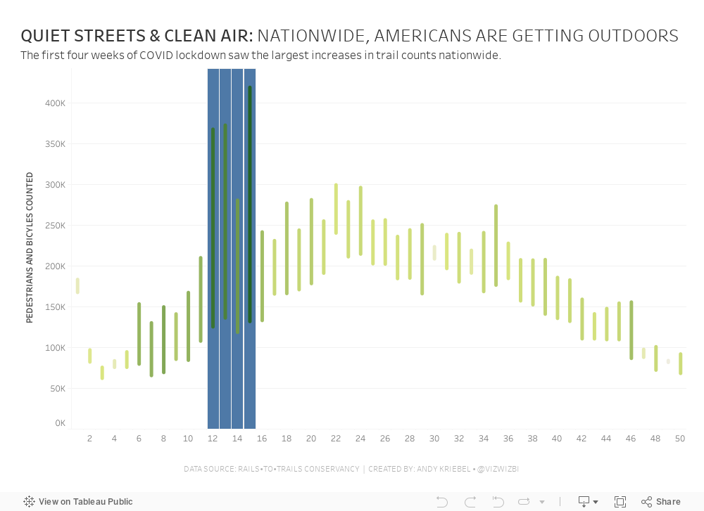
Back in March 2020 when COVID lockdown started in the UK, the streets were amazingly empty, the air got fresher and I saw more and more people outside. You could hear birds chirping on streets you never would have before. And we could ride our bikes right down the middle of the road since there were no cars. The lack of cars was glorious! (COVID isn't of course).
For 2021, #MakeoverMonday gets started with a simple graphic that compares pedestrian and bicycle counter stats for 2019 and 2020 at 31 counters across America. The data is collected by the Rails to Trails Conservancy, and you can learn more about the data here.
ORIGINAL VISUALIZATION

WHAT WORKS WELL?
- A line chart is a good choice for time series data.
- The colors are easy to distinguish.
- The grid lines help guide the eye across the view.
WHAT COULD BE IMPROVED?
- Include a more impactful or descriptive title. What is it about?
- Why are thee weeks missing on the x-axis yet the lines go the full year (or appear to)?
- The lines could be labeled directly so that you don't have to refer to the color legend to know which lines represents which year.
MY MAKEOVER
June 22, 2017
Makeover Monday: Tiled Heatmap of U.S. Air Quality Levels
I was very interested in looking at state-level air quality and built lots of heatmaps and originally built them in a single worksheet using table calcs to sort out which states go in which columns and rows.
This didn't work for me, though, because it only helped me see the states alphabetically. It's much more intuitive if they are displayed geographically. An idea popped into my head...
I wonder if I can combine a heatmap that looks at daily max reading by state across all years with a tile map.
I quickly went to Matt Chambers' great post for how build tile maps added the secondary data source, blended it by state and replaced my crazy table calcs with a simple tile map view. What a fun exercise! I learned a ton and feel like I created a much more intuitive view. Does anyone recall every seeing a tiled heat map? Have I come up with a new chart type???
Click on the image for the interactive version. Note that the viz might be slow to load as it's displaying about 460,000 marks.
September 2, 2016
The Toxic Twenty Five: An Analysis of Southern California Air Quality
This week I challenged The Data Duo to a #VizOff of sorts. I provided them with a data set of 8.5M ozone level readings from stations spread all throughout the U.S. I started looking at this data a few weeks ago because I was thinking about the smog in Atlanta and wondering if it had gotten any better since I left. This led me to the master data set or all cities that are measured.
Once I started exploring the data, I noticed that Southern California consistently had the most cities with high ozone levels. So I filtered the data set down to the 25 worst cities.
This helped me focus on a single story with multiple parts, as seen in the long-form visualisation below. Enjoy!


