September 2, 2016
The Toxic Twenty Five: An Analysis of Southern California Air Quality
This week I challenged The Data Duo to a #VizOff of sorts. I provided them with a data set of 8.5M ozone level readings from stations spread all throughout the U.S. I started looking at this data a few weeks ago because I was thinking about the smog in Atlanta and wondering if it had gotten any better since I left. This led me to the master data set or all cities that are measured.
Once I started exploring the data, I noticed that Southern California consistently had the most cities with high ozone levels. So I filtered the data set down to the 25 worst cities.
This helped me focus on a single story with multiple parts, as seen in the long-form visualisation below. Enjoy!
May 19, 2016
Rain Patterns at Mount Diablo: What 60 years of rain data tells us about the Northern California drought

I’ve been getting deep into Alberto Cairo’s latest book “The Truthful Art” and was particularly fascinated by the Rain Patterns in Hong Kong visualisation created by The South China Morning Post.
Immediately I began to think back to our time living in Northern California and the historic drought conditions. I decided to use Mount Diablo as a representative weather station because it was one of the most complete and oldest in the Bay Area.
I decided to use this visualisation as inspiration for a version of my own. Some interesting patterns reveal themselves:
- It hardly ever rains between the end of May and early October.
- The most single-day rain total in the last 60 years was 5 inches on 21-Jan-1967.
- Out of the 21,404 days in the data set, only 3,892 had any measureable rain (18.2%).
- We lived in Pleasanton for 1,070 days. During that time, there were only 145 days of measurable rain (13.6%) and only 57.3 inches of rain during that time (less than 1/2 inch per day that it rained).
- Over 60 years, there’s an average of 66 days of rain per year.
- During our time living there, we saw an average of 50 days of rain per year.
My version was made with Tableau 10, so I can’t publish it to Tableau Public yet. You can download the workbook here and the data set I used here. The data was sourced from NOAA.
Finally, a special thanks to Data Schooler Nisa Mara for her feedback during the process.

January 29, 2015
Emergency Makeover: Vaccination Rates at California Elementary Schools
Consider this Viz of the Day from January 28, 2015.

What is incredibly ironic is that I saw this literally minutes after having talked about color blindness in a data viz class I was teaching. In the room was a colleague of mine, who is red-green color blind. I showed it to him and said "What do you see?" to which he responded "A bunch of brown dots."
I ran the map through the Vischeck color blindness simulator and low and behold, this is what you get:

Now can you understand why I'm getting so upset? Who picks VotD after all? Why aren't best practices part of the criteria? Does anyone know the criteria? Is there a criteria?
I downloaded the workbook and made a few simple adjustments to it. Here's my version after about 15 minutes of TLC. I focused on color, sorting, tooltips and filtering.
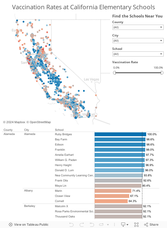
Don't get me wrong; It's a huge honor to get chosen for VotD. I know I get excited every time one of my vizzes is chosen. But what I really want, and I think there are lots of other people with me, is for VotD to be an amazing gallery that everyone recognizes as the most outstanding work done with Tableau. Work that's designed well. Work that's visually appealing. Work that follows best practices. Work you'd want to emulate.
With the visibility that the Viz of the Day gallery has, am I asking for too much? If I am, please tell me. Explain to me why I'm off base. If you're in agreement with me, let your voice be heard.
August 7, 2013
Where did they come from? How did they do? Visualizing results from the Summer Breeze Half/10K/5K
This past Saturday, 1,589 runners/walkers participated in the Summer Breeze Half/10K/5K, put on by Brazen Racing. At the end of the race and on their website, when you want to find your time, you look it up on a table like this:

This is great when you simply want to find yourself and see where you placed, but it doesn’t give you any insight into the entire race. Being the data nerd/runner that I am, I wanted to know more. Who are the runners? What do we know about them? Where are they from? How do different demographics perform? Did certain areas in California produce faster average times?
To answer these questions, I downloaded the data and created this race results visualization. Go ahead…click around, look for patterns, get a feel for the race.






