Showing posts with label environment. Show all posts
February 1, 2021
#MakeoverMonday Week 5 - Renewables vs Fossil Fuels in Europe
comparison
,
dual axis
,
energy
,
environment
,
EU
,
europe
,
fossil fuels
,
label
,
line chart
,
Makeover Monday
,
panel chart
,
renewables
,
small multiples
,
trellis chart
No comments

ORIGINAL CHART

WHAT WORKS WELL?
Overall, I think this is a very good chart.
- The colors are perfect for the topic.
- I like the labels on the ends of the lines.
- The tooltips are very responsive and color-coded to match the line.
- The title and subtitle are informative and give good context.
- The slightly lighter shading of the axes labels make the chart stand out more.
WHAT COULD BE IMPROVED?
- Make the dashed lines solid.
- Format the percentages in the tooltip to one decimal place.
MY VERSION
Click on the image or here for the interactive version.
January 25, 2021
#MakeoverMonday Week 4 - Coal Production in India
coal
,
containers
,
dashboard
,
data visualization
,
environment
,
India
,
interactive
,
Makeover Monday
,
production
,
WatchMeViz
,
youtube
No comments

- Watch Me Viz - https://youtu.be/ur3Vhs7Ceck (also below)
- Tableau Workbook - http://bit.ly/MM2021W4
I'd been looking for a data set about India for quite a while now in an effort to keep the Makeover Monday Community in India engaged. This week, I found one about coal production at various mines across the country. It was an interesting topic to learn about, including why the research was done and the purpose. Read the manuscript for background info here.
The original visualization was a simple bar chart of coal production by District.

What could be improved?
- There's no title.
- The District names are way too small. My old eyes can't read it.
- I don't understand the sorting. I would pick one of the metrics to sort by.
- The comparisons need to be more clear, if that is the intent.
Watch Me Viz
To see what I built, check out the video below. I iterated through all of the dimensions with a series of bar charts to understand the data. Thank you very much to those that watched to help me understand what some of the values meant!! I ended up with a simple dashboard that allows you to explore the data by producer and mine within each State. See the viz below the video or here.
Final Dashboard (click to interact)
May 27, 2019
#MakeoverMonday: What has happened since people started paying attention to climate change?
carbon dioxide
,
carbon footprint
,
climate change
,
co2
,
data studio
,
environment
,
Makeover Monday
,
pollution
,
world bank
No comments

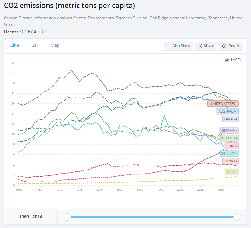
What works well?
- Using a line chart over time helps show the trends
- Including a slider filter for the user to zoom in on a specific period
What could be improved?
- Using dotted lines indicates there are breaks in the timeline, but there aren't. Therefore, a solid line should be used.
- The labels on the ends of the lines hide the data.
- It could use an impactful title and subtitle. Though I suppose this is just a report, not analysis.
What I did
I created a map to ensure that the country names were correct. When I did this, I then saw that there were lots of aggregations of countries. For some reason, the income level categories captured my attention so I filtered down to just those items.
The years 2015-2018 were include and didn't have any values. I filtered those out. There were years when no data was captured for some countries. I filtered those out.
I plotted the data as a line chart and created a calculation to show the change vs. the first year for each country. I noticed that there was a spike in CO₂ per capita in 1973 for high income countries. This reminded me of the oil crisis of 1973, but that wouldn't have anything to do with carbon emissions I wouldn't think.
That got me thinking about climate change in general. I entered "when did people start paying attention to climate change" into Google and the first search result was an article from National Geographic titled "Climate Change First Became News 30 Years Ago. Why Haven’t We Fixed It?"
This particular line was what I was looking for: "The Intergovernmental Panel on Climate Change was established in late 1988..."
So, back to the data I went and I filtered the data to 1988-2014 and compared every subsequent year to 1988 in order to see how much things have changed since climate change started garnering some attention. I expected high income countries to have ever increasing CO₂ per capita. I was wrong.
It turns out that the middle income countries have had the largest change in CO₂ per capita. So that became the focus of this analysis.
I created a map to ensure that the country names were correct. When I did this, I then saw that there were lots of aggregations of countries. For some reason, the income level categories captured my attention so I filtered down to just those items.
The years 2015-2018 were include and didn't have any values. I filtered those out. There were years when no data was captured for some countries. I filtered those out.
I plotted the data as a line chart and created a calculation to show the change vs. the first year for each country. I noticed that there was a spike in CO₂ per capita in 1973 for high income countries. This reminded me of the oil crisis of 1973, but that wouldn't have anything to do with carbon emissions I wouldn't think.
That got me thinking about climate change in general. I entered "when did people start paying attention to climate change" into Google and the first search result was an article from National Geographic titled "Climate Change First Became News 30 Years Ago. Why Haven’t We Fixed It?"
This particular line was what I was looking for: "The Intergovernmental Panel on Climate Change was established in late 1988..."
So, back to the data I went and I filtered the data to 1988-2014 and compared every subsequent year to 1988 in order to see how much things have changed since climate change started garnering some attention. I expected high income countries to have ever increasing CO₂ per capita. I was wrong.
It turns out that the middle income countries have had the largest change in CO₂ per capita. So that became the focus of this analysis.
April 1, 2019
#MakeoverMonday: How much plastic waste has been found on UK beaches?
beach
,
environment
,
Makeover Monday
,
plastic
,
UK
,
united kingdom
,
waste
No comments

Don't believe me? Watch Drowning in Plastic on the BBC. If this documentary doesn't change you mind about the amount of plastic you waste and the impact its having, then you need to have a deeper look into your soul.
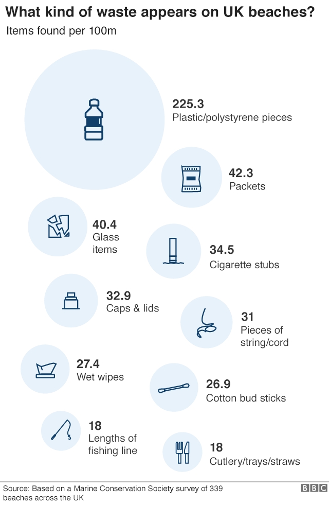
This week, Eva chose a data set about the waste found on UK beaches.
 |
| SOURCE: BBC |
WHAT WORKS WELL?
- Including the raw numbers, and how big they are, provides great impact.
- They sort going down the page.
- The title is clear, concise, and tells you what you are about to see.
WHAT COULD BE IMPROVED?
- The infographic makes it appear as though this is ALL of the waste found on the beaches. However, it's only the top 10. You can see that if you read the original article Eva linked to.
- The icons are cute, but are the necessary?
- A simpler visualization, like a bar chart, would make the impact of the plastic more apparent.
WHAT I DID
As I did last week, I wanted to try out another tool. This week, I played around with infogram.
- Infogram is great for building simple infographics very quickly.
- The customization options help you create a good looking visual.
- The interactions on the charts are super responsive.
- You can change the theme or chart type with one or two mouse clicks.
- There's no "publishing" required. It's already live to everyone once you create your graphic.
- The chart types are limited, but I suspect 90% or more of what you need is available.
- If you want a chart to display the graphic a slightly different way, you may need to edit the data and either crosstab or transpose the data.
Overall, using infogram was a pretty fun experience. I haven't used it for a while and it seems to have come a long way since then. With that, here's my Makeover Monday for week 14.
March 30, 2019
Groundwater Contamination and Cow Poo: A Major Contributor to Global Warming
cow poop
,
environment
,
EPA
,
groundwater
,
methane
,
nitrate
,
pollution
,
United States
No comments

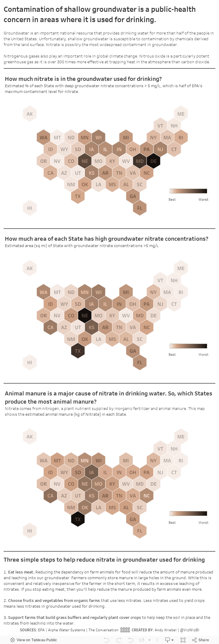
While watching a documentary, they mentioned how methane from cows (i.e., cow farts) are a major contributor to the greenhouse gasses and how cow manure is a major source of nitrate released into groundwater used for drinking. Fortunately, there is tons of data available, the primary source being the Environmental Protection Agency (EPA).
I wanted to understand the geographical distribution of three factors:
- The percentage of each State with high groundwater nitrate concentrations.
- The total area (square miles) of each State with high groundwater nitrate concentrations.
- Where the cow crap comes from that pollutes groundwater used for drinking.
I decided to create a map for each of these topics, as a scrolling story, with three actions you can take to help reduce the impact of cow manure pollution. We all want safe drinking water after all.
April 23, 2018
Makeover Monday: Biocapacity vs. Ecological Footprint
biocapacity
,
earth day
,
ecology
,
environment
,
global footprint network
,
Makeover Monday
No comments

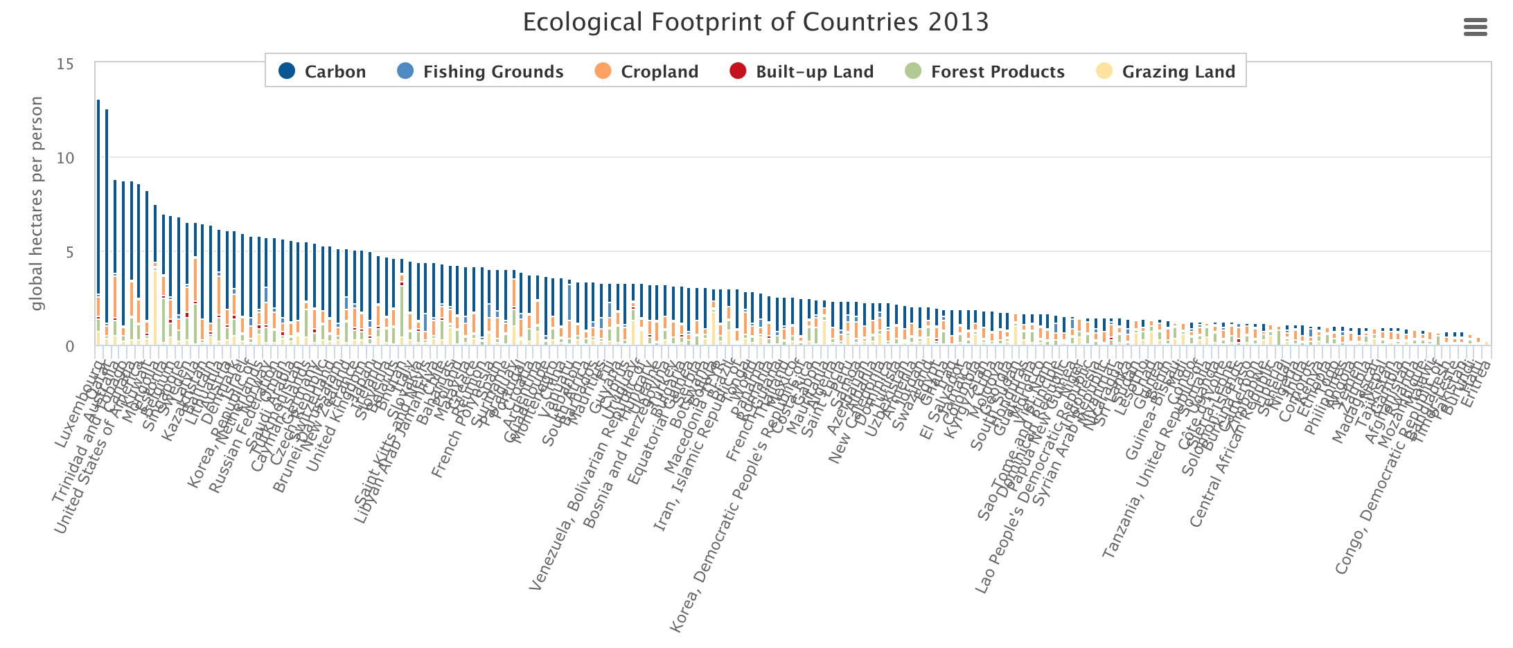
What works well?
- Simple title
- Nice framing of the legend
- Clicking on categories to add/remove them from the view
- Super responsive tooltips
What could be improved?
- Everything is very compact making it impossible to read
- Rotate the chart and make it tall vs. wide
- Reduce the number of categories to reduce the number of colors
- Provide a total option
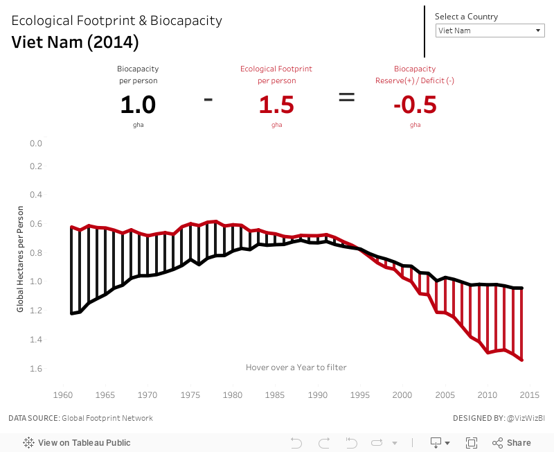
For my viz, I wanted to recreate what was in the tooltip of one of their maps. I didn't have much time so I had to get it done quickly and I really like the BANs and how coloring between the lines helps emphasize the difference.
April 9, 2018
Makeover Monday: Arctic Sea Ice is Disappearing Fastest in Summer Months
arctic sea ice
,
change
,
climate change
,
environment
,
global warming
,
line chart
,
Makeover Monday
,
melting
No comments
So when I found this visualization by the National Snow & Ice Data Center, it seemed an appropriate topic for Makeover Monday. One of the most fun elements of this data set is that it includes only two columns: date and sea ice extent.

What works well?
- Without even trying, it tells a compelling story.
- The interactivity is fabulous. I really like being able to simply click on an item on the legend to have it added or removed as a highlighted line.
- Including the 1981-2010 median along with the IQR and IDR provides great context.
- Defaulting the view to show 2012 (the previously worst year for arctic ice) to 2018 helps show how 2018 is looking to surpass 2012 (in a bad way) by a lot.
- Subtitle explains what sea ice extent means
- Good use of simple colors
- Great example of using highlighting for context
What could be improved?
- The x-axis could be simpler by only showing the month names and removing the word "Date" from the axis title.
- Make the title more impactful
My Goals
- First, I wanted to rebuild the original and see if I could make it any better. I couldn't.
- Second, build a spiral diagram that shows the months around the outside, but this only worked well when it was animated.
- Finally, I settled on a different take on the metric that swaps the months and year on the original. That is, put the year on the x-axis and month on each line. This gave me only 12 lines which looked less busy and helped me see patterns for each month.
- Next, I included a line that is the average of each year (black line).
- I then decided to look at how each year of each month changed compared to 1979. I went with a percent change because I think that provides more context.
- Lastly, I included a highlighter for the months and included some BANs of the actual values for comparison.
Click on the image for the interactive version.
September 2, 2016
The Toxic Twenty Five: An Analysis of Southern California Air Quality
air quality
,
AQI
,
California
,
Data Duo
,
environment
,
EPA
,
tableau
This week I challenged The Data Duo to a #VizOff of sorts. I provided them with a data set of 8.5M ozone level readings from stations spread all throughout the U.S. I started looking at this data a few weeks ago because I was thinking about the smog in Atlanta and wondering if it had gotten any better since I left. This led me to the master data set or all cities that are measured.
Once I started exploring the data, I noticed that Southern California consistently had the most cities with high ozone levels. So I filtered the data set down to the 25 worst cities.
This helped me focus on a single story with multiple parts, as seen in the long-form visualisation below. Enjoy!
Subscribe to:
Posts
(
Atom
)






