July 11, 2023
#MakeoverMonday 2023 Week 28 - Global Passport Rankings

- Grouped bar chart
- Bar in bar chart
- Grouped bar chart with a gantt bar for the difference
- Diverging bar chart
- Histogram
- Butterfly chart
- Barbell chart
- Scatter plot
- Slope graph
- Trellis chart
- Jittered bar chart
October 24, 2022
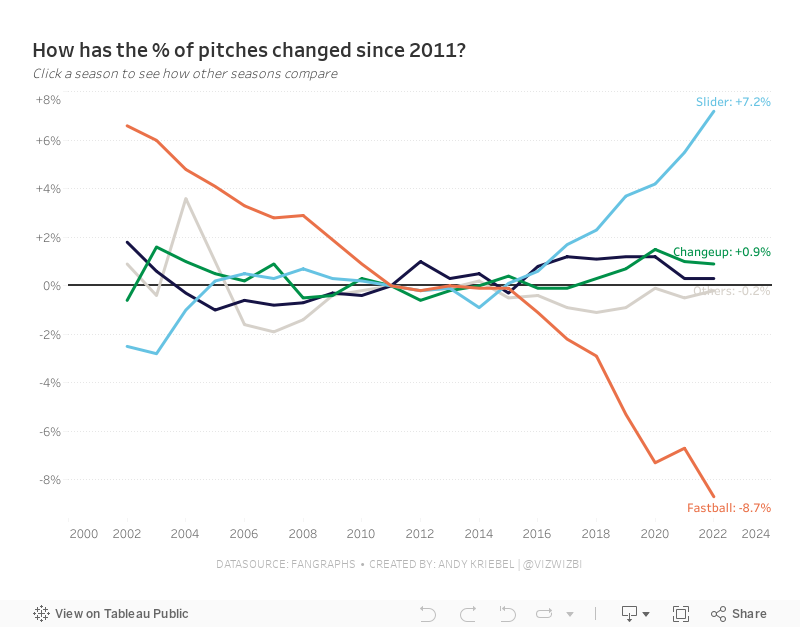
#MakeoverMonday Week 43 - How have Major League Baseball Pitch Types Changed?

This week's data set was pretty simple. We had 21 baseball seasons and a column for each pitch type. Pivoting the metrics made it much easier to work with for me as I could then split the view by pitch type.
During #WatchMeViz (below), I create a trellis view, showed how to create groups, sets, set actions, sparklines, LODs, custom number formatting, creating a mobile view, and more.
Thank you for tuning in. Here's the video and below is my visualization.
September 26, 2022
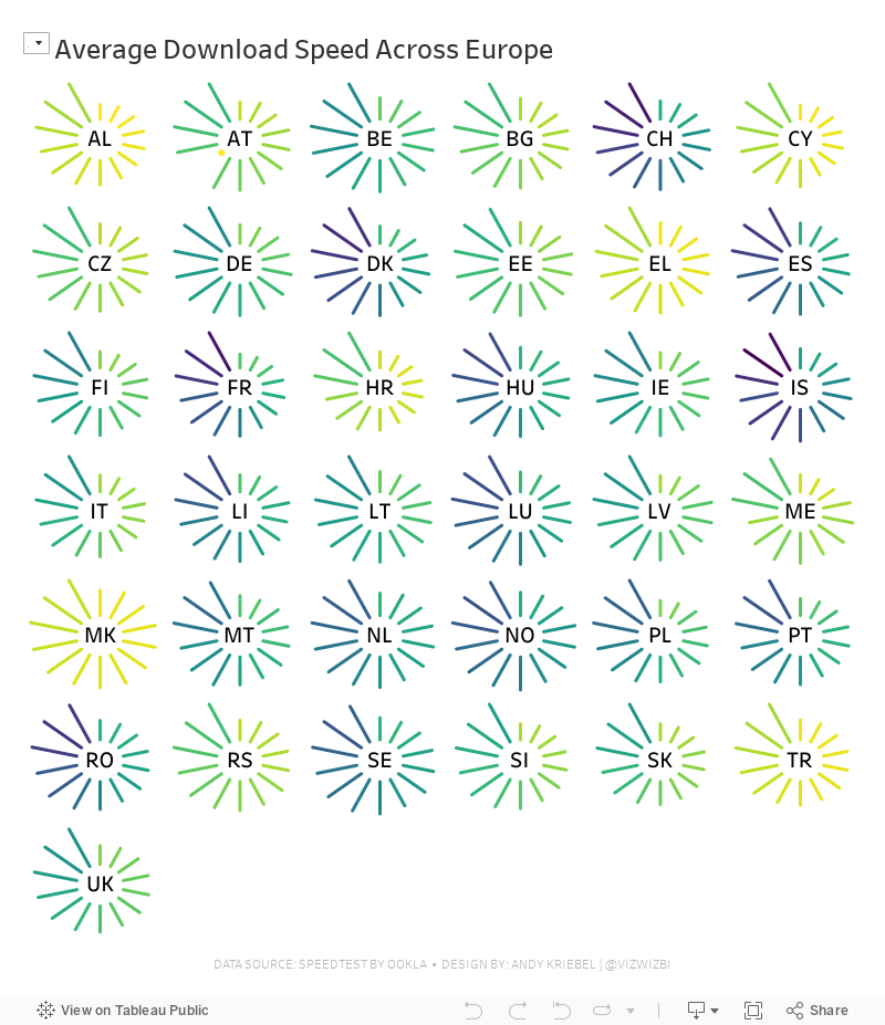
#MakeoverMonday Week 39 - Average Internet Speeds Across Europe

My goal this week was to correct my failures from last week, so I focused almost exclusively on building the starburst/sunburst chart. As promised to the viewers, I will also record a separate tip video for how to build them.
Here's the WatchMeViz and the viz is below that.
September 19, 2022
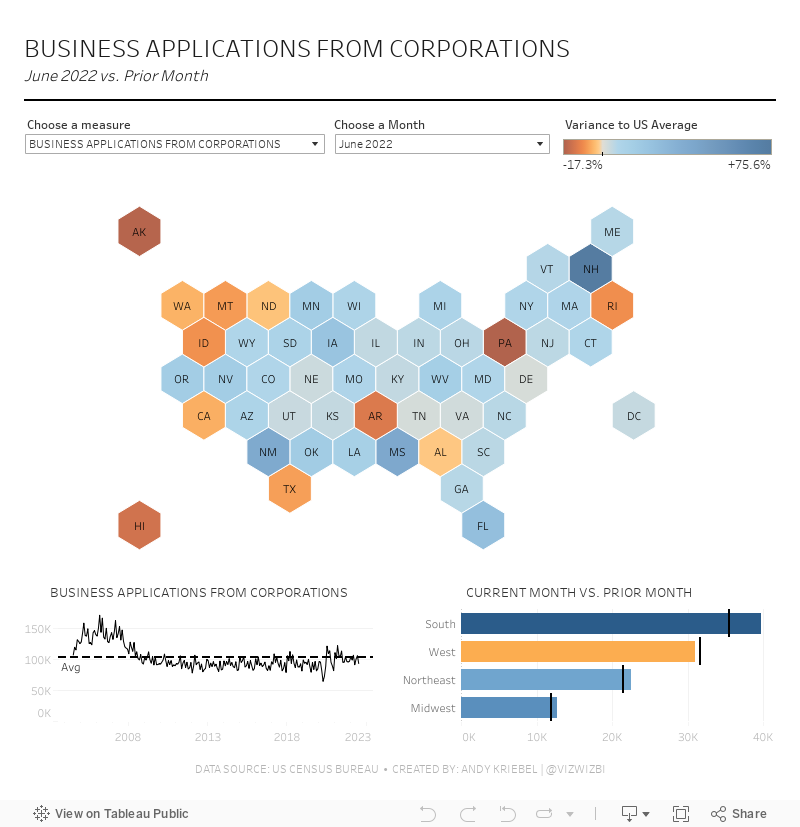
#MakeoverMonday Week 38 - American Business Applications

August 19, 2021
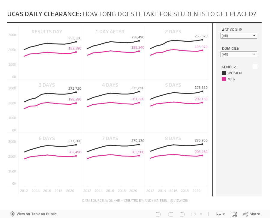
#MakeoverMonday 2021 Week 33 - UCAS Daily Placements

April 12, 2021
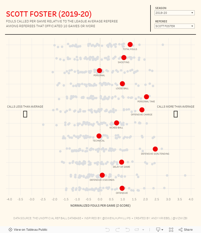
#MakeoverMonday 2021 Week 15 - Fouls Called by NBA Referees
The original viz for this week was so good that I struggled to come up with something different. In the end, I wanted to learn by recreating the original. Check out #WatchMeViz and interact with the viz below.

April 5, 2021
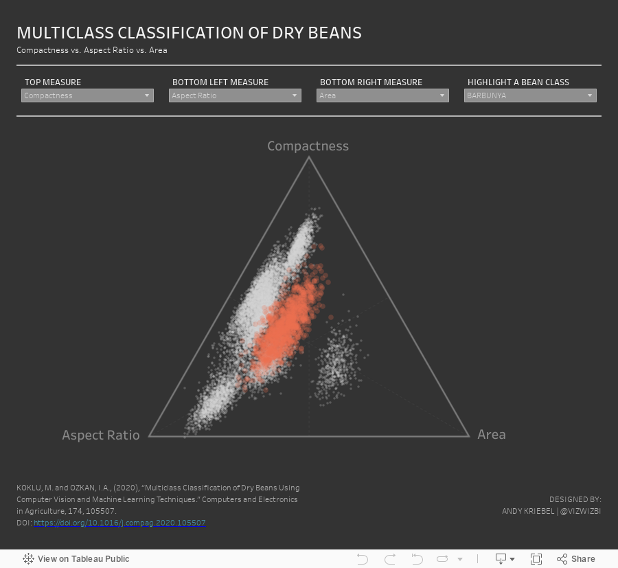
#MakeoverMonday 2021 Week 14 - Multiclass Classification of Dry Beans

March 1, 2021
#MakeoverMonday Week 9 - Seats Held by Women in National Parliaments in the EU


- Clear title
- Line chart is a good choice for a time series
- There are too many colors.
- What's the focus?
- The legend takes up a lot of space.
- The chart ratio is too flat.
- Overall, it's confusing and harder than necessary to find patterns.

February 2, 2021
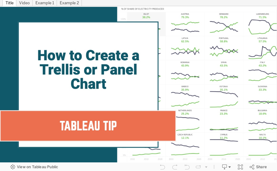
How to Create a Trellis Chart in Seven Steps

Trellis charts are a version of a small multiples chart that organizes the dimensions in the view across a grid. In this tip, I show you how to create a trellis chart that will work even when you are missing data.
Trellis / Panel Chart Calculations
//Columns
(index()-1)%(round(sqrt(size())))
//Rows
int( (index()-1)/(round(sqrt(size()))))
Steps
- Create the column and row calcs
- Create a custom date
- Place custom date on columns, measure on rows and dimension on detail
- Place column on columns, row on rows, and custom date on detail
- Ensure dimension is above date on detail shelf
- Change custom date on columns to ATTR
- Configure table calcs
- Check both the Dimension and the date field date in order
- Ensure the dimension is above the date field in the Specific Dimensions section
- Set "At the level" to the dimension
February 1, 2021
#MakeoverMonday Week 5 - Renewables vs Fossil Fuels in Europe

ORIGINAL CHART

WHAT WORKS WELL?
- The colors are perfect for the topic.
- I like the labels on the ends of the lines.
- The tooltips are very responsive and color-coded to match the line.
- The title and subtitle are informative and give good context.
- The slightly lighter shading of the axes labels make the chart stand out more.
WHAT COULD BE IMPROVED?
- Make the dashed lines solid.
- Format the percentages in the tooltip to one decimal place.
MY VERSION
June 8, 2019
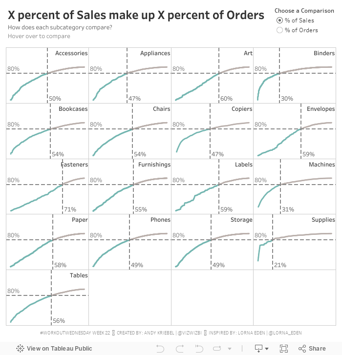
#WorkoutWednesday Week 22: X% of Sales make up Y% of Orders

Great! That part was pretty straightforward. I've done a Pareto tons of times. I've done a trellis tons of times.
Then there was the coloring of the line. That is, the line needed to be colored in each pane up to the point where two reference lines meet. I got that right way...so I thought.
Lastly, there was the little detail (i.e., not so little) of creating dynamic reference lines that update based on both the parameter selected and the point which you hover over. The fact that these are two conditions should have been my first clue.
I spent quite a while on the reference lines trying to make one reference line act upon two calculations. Well...that's not how reference lines work. Then it hit me that I actually needed four reference lines. Two of them will always hide based on the option selected in the parameter.
PROGRESS!!!!
The calcs were fiddly. I got lost in the logic a couple times because what you have to do is a bit counterintuitive, kind of like double negatives. I wrote down the four scenarios so that I could approach them one by one.
My calculation names are a mess, which drives me insane and actually made getting to the solution much harder. I'm normally very good about making sure I have clear names, but in this case I had several with almost the same name, so I kept mixing them up, hence why writing things down helped.
Once I got that figured out, I was done. A bit of tidying, then I downloaded Lorna's solution to compare mine too. We had taken a nearly identical approach (it must be that teacher she had at The Data School that set her on her way).
Thanks for the challenge Lorna! I enjoyed the struggle and always love the eureka moments. This was another viz that I could easily see used in a business context.
April 12, 2018
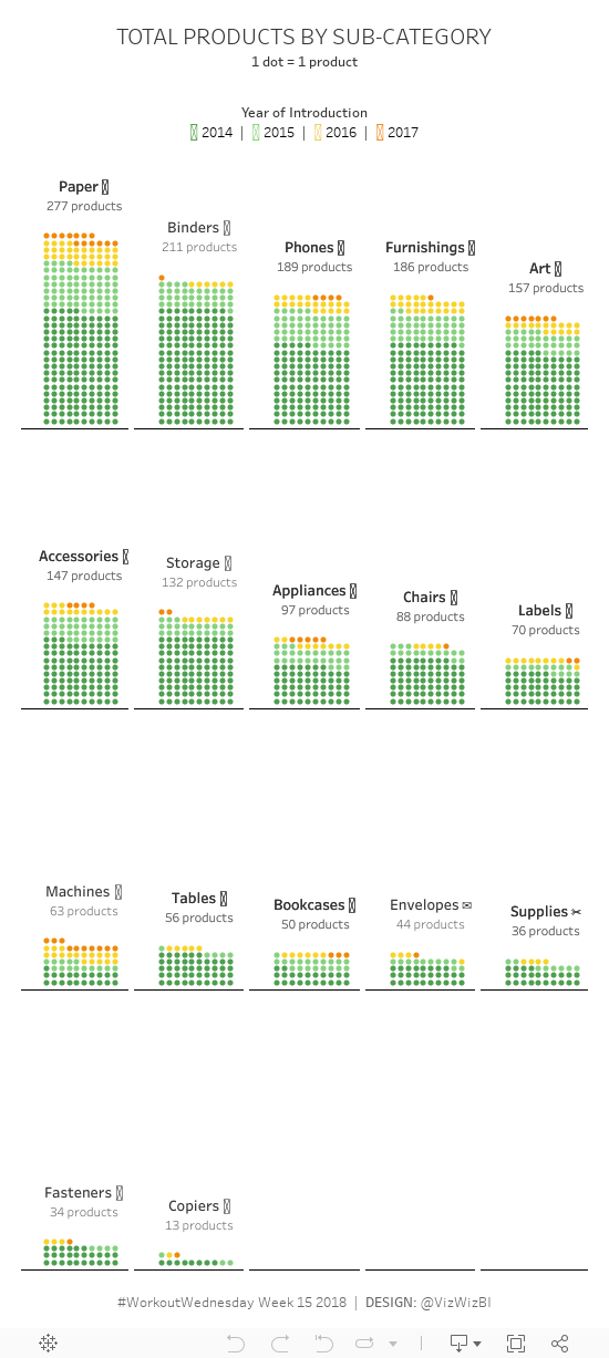
Workout Wednesday Part 2: Total Products by Sub-Category
Some thoughts:
- Getting the subcategories to layout correctly in a trellis plot was easy.
- Getting the labels above each grid was easy.
- Getting 10 dots across each pane was easy.
- Getting the stacking of the dots in rows was a pain!
- Luke has an evil side.
April 11, 2018
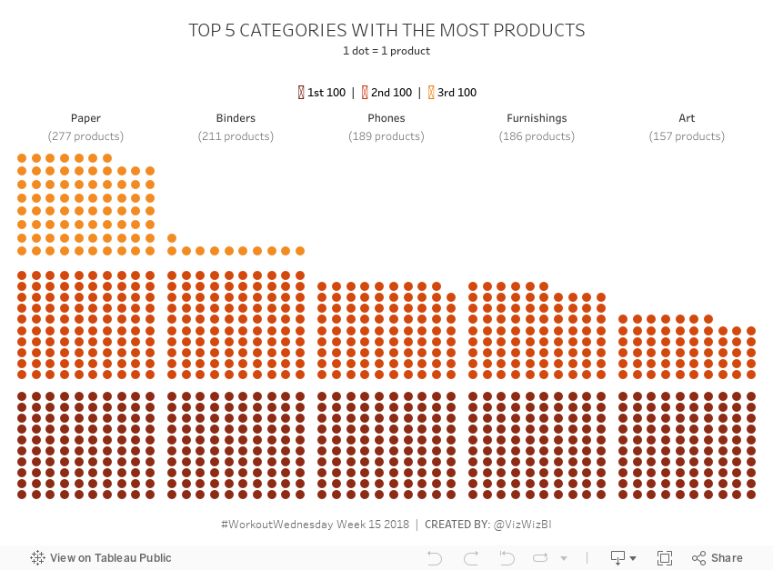
Workout Wednesday Part 1: Top 5 Subcategories with the Most Products
There were two requires that I didn't need to use to make it work:
- Set the minimum and maximum values on the columns axis (x-axis) to -3 and 12, respectively.
- Set the minimum and maximum values on the rows axis (y-axis) to -1 and 32, respectively.
June 28, 2017
Workout Wednesday: UK General Election Slopey Trellis Chart
Fortunately, I have my trellis chart calcs safely saved in my notes, so I didn't have to Google those. The tricky bit for me was the sorting. I'm not going to spoil how I did it for you, but you can download my workbook to see how I did it. As usual, Emma and I took very different approaches for the calculations required for the sorting. She used LODs for all of her calcs, I only used one. They both work though! It all depends on how your brain works I suppose.
The data prep parts were pretty straight forward (thank you Emma for alerting us to the need to do this). Emma loves little tricks in the formatting, but I didn't see any this week.
One thing I did different was to provide a "buffer" for the year labels. I place them 10% above the highest value so that they don't overlap the slope chart lines. Emma's year labels sometimes overlap with the slope chart lines. Just a personal preference for me.
Great fun Emma! Thanks! Took me about 90 minutes including this blog post on the train from Frankfurt to Hamburg. Great use of my time! #AlwaysLearning
Click on the image for the interactive version and to download.
February 15, 2017
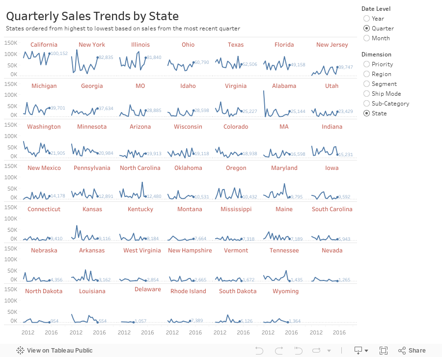
Workout Wednesday: Dynamic Trellis Chart
In this example, I'm using the same Superstore Sales I've used in previous Workout Wednesdays. Here are the guidelines:
- Match my colors.
- The user should be able to choose the level of detail they want for the date.
- The date axis format should not change, irrespective of the date level chosen.
- The user should be able to pick from the list of dimensions shown.
- The dimensions should be sorted from upper left to lower right based on the sales in the most recent time period.
- Match my tooltips. Note that they change based on the options the user selects. Pay attention to the date formats in particular.
- The title should update dynamically based on the date level and dimension selected.
- The end of each line should be labeled to the right of the last point.
- There should be a little circle on the end of each line.
- Each section of the trellis should include a label for the value of the dimension for that section. E.g., California should be on the upper left when you selected quarters by state.
- The dimension labels should be centered in each section.
- There should be no gridlines, but the zero line should be included.
- Each row should should have a light divider between them.
- My final view is 900x700.
October 21, 2016
Fix It Friday: Ten Alternatives Methods for Presenting Alcohol Consumption in OECD Countries

Interesting @OECD chart on alcohol consumption. By country & trend. E.g Austrians drink twice as much as Italians pic.twitter.com/OOGYJ3BpAq— Paul Kirby (@paul1kirby) October 19, 2016
You might think "It's just a chart Andy, relax!" True. It's a chart. It's not changing the world or anything. There are several things that have me a bit upset:
- Paul Kirby calls the chart "interesting" and maybe the CONTENT is interesting, but the chart is terrible.
- He says "Austrians drink twice as much as Italians", a fact that is simply not true. They drink 61% more than Italians. You can't just spout facts like that.
- Paul is visiting professor at the London School of Economics. I can only assume that his students follow him on Twitter. When he tweets things like this, his student will assume that this is how charts should be made, which only proliferates the number of poor charts we'll continue to see.
- It's too dark overall. The dark red bars and dark bottles are hard to see against the blue background.
- The flags are unnecessary. What value do they add?
- The bottles are cute, but unnecessary decoration.
- The legend is in reverse order.
- Do the bottle extend beyond the bars or do they start from the same baseline?
- It has a weak title. What's the story?






