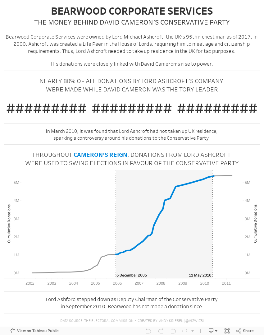
October 7, 2019
#MakeoverMonday: Bearwood Corporate Services - The Money Behind David Cameron's Conservative Party

 |
| SOURCE: THE ELECTORAL COMMISSION |
WHAT WORKS WELL?
- Placing the filters on the upper right let me know immediately that I can interact with the data to find my own story.
- The bar chart is sorted in descending order.
- The summary numbers provide some context, but not much.
- The bar chart would be easier to read if it was horizontal.
- Why are all of the bars colored? There are way too many colors and they have no meaning.
- The packed bubbles would be much better as a bar chart or BANs.
September 10, 2018
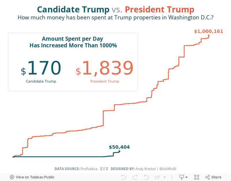
Makeover Monday: Spending at Trump Properties in Washington D.C.

Since Watergate, presidents have actively sought to avoid conflicts between their public responsibilities and their private interests. Every president since Jimmy Carter sold his companies or moved assets into blind trusts or broadly held investments – until now. Donald Trump never did this, despite his expansive holdings. He stands to gain personally when groups pay his companies.Let's start by looking at the chart created by ProPublica:
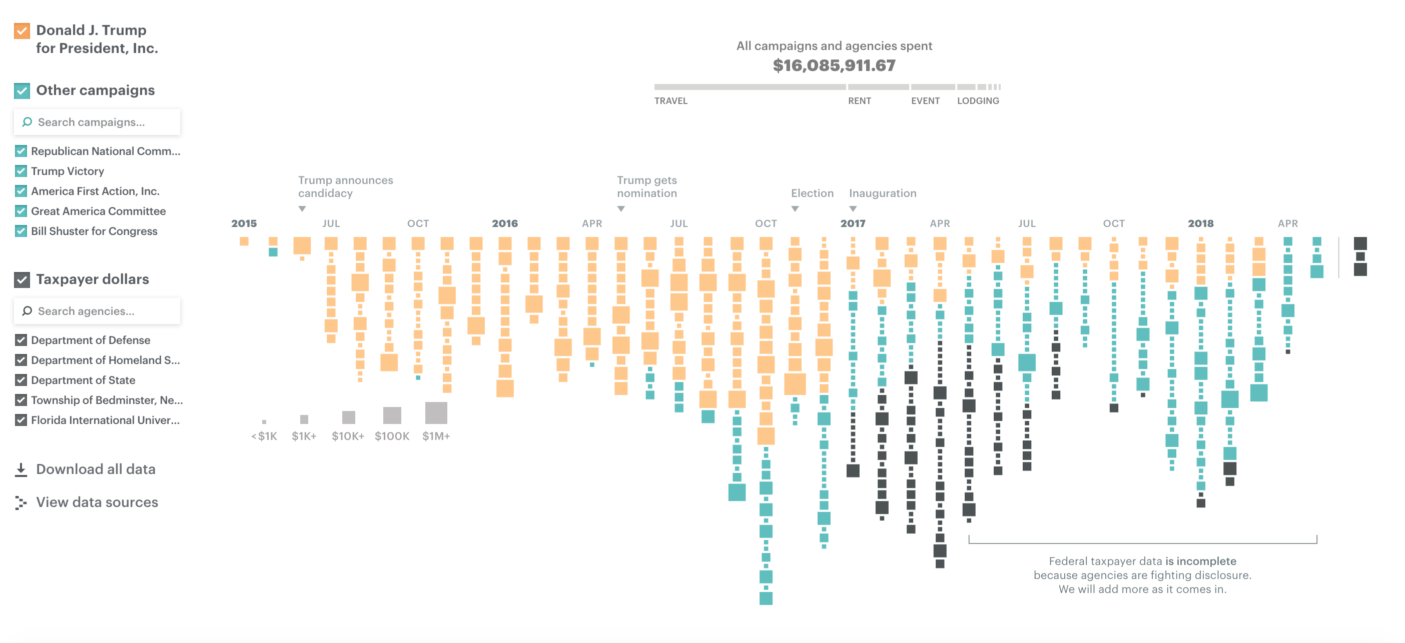
What works well?
- Colors are easy to distinguish
- Good interactivity for additional information
- Filter options are obvious and easy to use
- Sizing the blocks gives you relative comparisons
- Good use of annotations
- Stacking the blocks makes it obvious there were more records in one month versus another
What could be improved?
- Using size for the blocks makes exact comparisons difficult
- Include a title
- Include a subtitle with additional context
- Provides the user the ability to ask "How does this affect me?"
What I did
- I explored the data quite a bit, before focusing on Washington. I did this because I saw a large increase in spending after Trump was elected.
- Use simple colors like the original
- Compare spending during the Campaign vs since Trump has been President
- Use BANs to call out the import information
March 5, 2018
Makeover Monday: How good are policymakers at estimating indicators related to girls and women?
I ended up skimming through parts of the main report to get a better idea as to what the survey is about and any interesting findings they might describe.
In the end, there were major themes:
- Policymakers are really out of touch with the issues facing girls and women in the five countries in the study.
- Policymakers "think" they know what's going on.
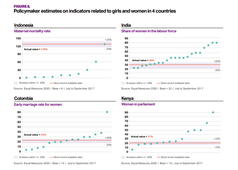
What works well?
- The bands for +/- 20% from the actuals helps give context to the estimates from policymakers.
- The country titles and subtitles for the topic make is easy to know what each chart is about.
What could be improved?
- What do the green diamonds mean? Apparently they are policymaker estimates, but there's no indication of that in the dashboard.
- Why are these topics picked for these countries?
- Why is Senegal excluded?
- A more impactful and descriptive title would help.
- It's unnecessary to include the source and legend with each chart.
My Goals
- Try to understand the data; easier said than done
- Understand the spread of each topic within each country
- Show ALL responses
- Allow the user to filter and drill in to the topic they are interested in.
- Stick to the overall style guidelines from Equal Measures 2030
- Include BANs for the number of policymakers that estimated within +/- 20% of the actual values
July 17, 2017
Makeover Monday: Comparing White House Salaries
What works well?
- Binning the salaries makes it easy to see the distribution
- Colors are consistent across the charts
- Including summary numbers for context
- Including a note for the outlier
- Linking to the source
- Titles clearly show me that we're only looking at one year for each President
- Charts are consistently formatted and scaled
- Light grid lines help guide the eye
- Good title and subtitle
What could be improved?
- Are the bar chart colors necessary?
- Overall, the chart is misleading as the maximum allowable salary has changed.
- Comparisons are harder than necessary.
- What does the Y-axis mean?
What were my ideas?
- Adjust the salaries so that they account for the change in the maximum allowable salary.
- Bucket the employees by how far they are from the max salary
- Keep the idea of binned data from the original and play with the bins to see what works well.
- Use color to highlight
- How can we add context?
June 28, 2017
Workout Wednesday: UK General Election Slopey Trellis Chart
Fortunately, I have my trellis chart calcs safely saved in my notes, so I didn't have to Google those. The tricky bit for me was the sorting. I'm not going to spoil how I did it for you, but you can download my workbook to see how I did it. As usual, Emma and I took very different approaches for the calculations required for the sorting. She used LODs for all of her calcs, I only used one. They both work though! It all depends on how your brain works I suppose.
The data prep parts were pretty straight forward (thank you Emma for alerting us to the need to do this). Emma loves little tricks in the formatting, but I didn't see any this week.
One thing I did different was to provide a "buffer" for the year labels. I place them 10% above the highest value so that they don't overlap the slope chart lines. Emma's year labels sometimes overlap with the slope chart lines. Just a personal preference for me.
Great fun Emma! Thanks! Took me about 90 minutes including this blog post on the train from Frankfurt to Hamburg. Great use of my time! #AlwaysLearning
Click on the image for the interactive version and to download.
August 24, 2016
Clinton vs. Trump: The Battle for the Presidency

It’s election time, so time for an election viz. You will notice this is very similar to the RealClearPolitics version the difference being that I am calculating the 2-week average of all polls in their data set.
This little project also provided me a chance to try out the new Google Sheets connector in Tableau 10 and allow the extract to refresh on Tableau Public. In addition, I learned how to scrape a table from the web in a Google Sheet via this blog post, which should (if I did it right) update automatically.
This was also another chance for me to test out the Device Designer that came with Tableau 10. Enjoy!
August 17, 2016
The Data School Gym - Running to the middle ground

This Data School Gym challenge is nothing more than a remake of an existing chart. I was reading Andy Kirk’s great series “The Little of Visualisation Design” and he showcased a chart from The Economist. From Andy’s blog:
"Typically, charts like this would have categorical value labels right-aligned to the left of the vertical axis. However, in this case, the labels are positioned with immediate proximity just to the right of the highest value - which is the value used to order the categories vertically. This approach aids readability, making it just that little bit more efficient to perceive the values and their associated categories."
According to The Economist, this chart shows:
"In every state where exit polling from this year’s primaries is comparable with the previous competitive cycle (2012 for the Republicans and 2008 for the Democrats), more voters have described themselves as “conservative” on the Republican side and “liberal” on the Democratic one."
I thought this would be a fun chart to try to rebuild in Tableau. I recreated the data manually, which you can download here. Note that the data probably isn’t 100% accurate to the original chart; I did the best I could and that’s not the point anyway. The point is to practice, practice, practice.
Some hints:
- This is three charts.
- I used 100% floating objects.
- The vertical and horizontal lines were added manually.
- Each event has its own sort: The top is sorted by Conservatives, the second by Liberals and the third by Moderates.
- The shading must span from the smallest to largest value for each event and state.
Give it a shot. I didn’t think this one was too terribly difficult. The toughest parts for me were getting the layout just right.
May 23, 2016
Makeover Monday: The Militarization of the Middle East in a Post-9/11 World

After an epic week 20 for Makeover Monday, I had great expectations for this week. Another great data set, this time looking at global arms imports and exports. But dang it was tough! I really struggled this week making something I was happy with. In the end, time is up and I learned a lot.
Let’s start by looking back at the original visualisation.

What works well?
- The colors clearly distinguish imports and exports.
- The labels provide the needed context.
- Nice small line charts for Europe and the Middle East along with an indicator for the rate of change.
What could be improved?
- The title of the article doesn’t match the chart.
- It’s hard to compare countries.
- Why were the countries that are shown selected? Are they the top N?
- Why is the timeframe 2011-2015? That seems a bit arbitrary.
- Why are there only sparklines for Europe and the Middle East?
- The lower section with the flags has nothing to do with the map.
- In the lower section, why don’t UAE and China show awaiting delivery? It should be consistent.
- Is there a better story that can be told? The data goes back to 1950 after all.
I decided to focus on the title of the article: “The Militarization of the Middle East”. And I focused even farther by looking at the post-9/11 era from 2002-2015. America initiated a war with the Middle East. I wanted to know how that impacted the import of arms to the region.
Once again this was a week of iterations. I started with this small multiple map view, but didn’t think it showed the change through the years very well.
 |
| Click the image for the interactive version |
I then looked at a slope graph comparing the % of total arms imported in the region by country in 2002 compared to 2015. This definitely shows the rate of change better, but I lose the context of the years in between.
 |
| Click the image for the interactive version |
Maybe a DNA chart will work better than the slope graph? Not really, it just flattens it out.
 |
| Click the image for the interactive version |
I was getting frustrated by this point, so I decided to take the opportunity to learn a new technique. I read Matt Chamber’s blog post recently on how to build ranked bump charts and thought this would make a great use case for this type of chart. In this view, I can see how a country moves year by year in the ranking of arms imported into the Middle East. I really like being able to click on a country and see it highlighted.
What the bump chart loses, though, is the context of the overall value of the arms imported. So to take care of that, I included the sparkling which also updates when you click or tap on a country. In the end, I’m satisfied and I learned something new. That’s a bit of what Makeover Monday is about.
March 16, 2016
Can Anyone Stop Trump in the Race for the Republican Nomination?

As the race for the Republican nomination slowly drags us towards the scary place that is Donald Drumpf, I thought I would take a look at how the candidates have trended in the opinion polls. This post was inspired by this viz from FiveThirtyEight. They used a trellis chart to show all of the candidates and I’ve been wanting to learn how to build these charts.
Big shout out to Graeme Wiggins for helping me make my trellis calculations much simpler and dynamic so they resize based on the number of candidates. I’ll create a video for how to create these charts in a future Tableau Tip Tuesday. This was quite tricky to build.
The FiveThirtyEight viz is really good, but in my version I wanted to include more:
- All of the polls and an option to filter to a specific poll
- Choose between the average of the polls or a 2 week moving average
- Filter out the candidates that are no longer in the race
- An additional view that allows you to compare polls
November 17, 2014
Makeover Monday: The Facebook Election

There are several things about this infographic that I don't like:
- The title doesn't tell us what the graphic is about.
- The pie charts; simply too many of them making comparisons difficult.
- There's no apparent order to the candidates.
- Candidate names are in ALL CAPS...why?
- The label for the Democrats section is off to the right, why?
- Some of the pies add up to less than 100% and some to more than 100%.
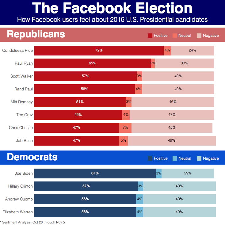
- The title makes it more clear what you're looking at.
- I switched the pie charts to stacked bars.
- The candidates are ordered by positive sentiment.
- The candidates names are easier to read since they're in proper case.
- The labeling for the two sections is aligned.
- Since I'm using stacked bars, the fact that some of the candidates are not equal to 100% is irrelevant.
August 10, 2012
Displaying time-series data: Stacked bars, area charts or lines…you decide!

First, let me say that this is a tremendous improvement over those produced by the U.S. Bureau of Alcohol, Tobacco, Firearms and Explosives (a.k.a. the ATF). Don’t bother reading the ATF report, unless you love 3D bar charts and 3D pie charts created in Excel.
A stacked bar chart is basically a pie chart unrolled to make a stick. And more often than not, when plotted as a time series, they do a poor job at showing the overall trends. Stacked bars are good up to three bars, no more. Why? Because it’s difficult to compare the heights of any of the bars except for the bottom bar, rifles in this case.
Let’s go through several alternative displays. If you’re interested in playing with the data, Matt published it here for me. Thank you Matt!
All of the charts below were built with Tableau. You can view an interactive version of all of these charts here and download the workbook here.
Let’s start with a redesigned stacked bar chart that uses Tableau’s built-in color blind palette.

Can you see the trends for each of the weapons? Maybe an area chart would be better.

Well, ok. Now the trends are easier to see, right? Area charts certainly improve the ability to see trends over time, but there are only two trends that give an accurate reading:
- The line at the top of the bottom area, i.e., rifles.
- The top of the top chart, which represents the total.
We still don’t have the ability to see the trends for any weapon except for rifles.
Before you read on, take out a piece of paper and sketch what you think the trend is for shotguns (light blue) based on the area chart above.
Ok. Now let’s compare the area chart above with the area chart for shotguns.

Did you come close? I doubt you did. Why? Because the tops of each color are influenced by the size of the colors below it, therefore making gauging the true size of each individual color extremely difficult.
Here’s another way to prove it. I know this isn’t a good way to represent the data, but bear with me, I’m trying to prove a point. If I overlay lines for each weapon over the area chart, look how different the shapes of the lines become.

Like most time-series data, your best way to represent the data is nearly always going to be a line chart.

Using a line chart we can quickly make some observations:
- There was a three-year spike in the early 90s for pistols made and there’s been a similar, but longer, surge since 2006. What was the cause of the big decline in 1995? Was there a change in handgun laws in 2005 or 2006?
- Revolvers were on a steady 20-year decline until 2005-2006. Is this merely coincidental with the pistols? Possibly so, possibly not.
- Rifles have increased recently, but shotguns have decreased. Are people buying rifles instead of shotguns? Their rate of variance since 1994 has grown consistently and the gap continues to get wider.
Using a line chart, you’re immediately asking questions of your data. Rapid-fire analysis!
When analyzing time-series data across several categories, consider not only looking at the raw numbers like above, but also review how each category contributes to the total. Let’s go through the same series of charts.

We’re off to a good start with the stacked bar chart. It looks like measuring the contribution of each weapon to the total may tell us something. Let’s try it as an area chart.

Not much better, other than it looks smoother. How about a line chart?

Ok, now we’re onto something. You might think that this is the same as the line chart for the raw numbers, and I can see how you might make that conclusion at a quick glance. But let’s look at them side-by-side.

The charts look very similar up until 1997, but then look at how many more rifles started to be made compared to the rest. And look at the drop off in percentage of shotguns produced since 2004.
Hopefully you’ve learned two main lessons:
- Don’t display time-series data as stacked bars (or pies unrolled onto on a stick if you prefer). The best medium for time-series data is a line chart.
- Consider looking at both the raw numbers and their contribution to the total. It’s always a good idea to look at your data in more than one way. You may get some additional and/or different insights.
Let me wrap with two charts that disturbed me a bit as I was playing with the data for this blog post. I’m not disturbed by their visual display, but by what they reveal.

The chart on the left is the running total of guns made by gun type since 1986. The chart on the right summarizes the chart on the left.
These charts tell us that the US has manufactured over 99 million guns since 1986. Seriously! 99 million! According to the US Census Bureau, there were ~238M Americans over 18. That means that approximately one of every five Americans 18 or older owns a gun.
That terrifies me!
Perhaps political interests (and lobbyists) have played a part?? For more information on how to use the US Census Bureau data, check out this guide.

UPDATE – Source CNN: This certainly explains the drop that started in 1994 and the subsequent increase in 2005.
The Clinton administration imposed a ban on several types of military-style semi-automatic rifles and high-capacity magazines in 1994, but that ban was allowed to lapse in 2004. Obama has proposed restoring the ban, requiring background checks for buyers at gun shows, and other "common-sense measures."
June 7, 2011
Facts are friendly: Why Cobb County should keep the balanced calendar
NOTE: The data and charts in this post are excerpts from “The Citizens Report on the Cobb County School District Attendance Calendar”. There are limitations on the data, but overall I think you’ll agree that the School Board has made an incredible unwise decision to revert to the traditional school calendar.
Summary
The data shows overwhelming support for the Balanced Calendar by all stakeholder groups: teachers, staff, parents, students, and the community. The data points are:
- 2009 Employee Survey
- 2011 Calendar Survey
- Board Member Reports & Email Counts
- 2011 Cobb County Association of Educators Survey
The results of these four data points are remarkably consistent. When presented with the opportunity for a school calendar with a shorter summer and additional week-long breaks versus a later August start date and no additional week-long breaks, all stakeholder groups strongly prefer a calendar with a shorter summer and additional week-long breaks.
Across all data points the margin of preference for the Balanced Calendar is significant, averaging 76.1%. The support ranges from a low of 61.0% to a high of 88.2%.
Iowa Tests of Basic Skills (ITBS)
Grade Equivalency (GE) scores for Cobb’s third, fifth, and seventh graders had all been declining in recent years. However, for the first time since 2007, ITBS GE scores in Cobb County increased in 2010 in all of these grade levels.


End-of-Course Test (EOCT)
Results in ELA and Social Studies have maintained a slight but steady increase through the 2010-2011 school year. Results in Science showed a slight decrease in 2010-2011, returning to their 2008 level of 71% meeting or exceeding standards. After a 23% decline in 2008-2009, results in Math dramatically improved by 26% in 2009-2010. They continued to improve by another 11% to 75% in 2010-2011, reaching a level not obtained since 2006-2007.

Teacher absences
Absences down significantly YTD through March 2011 as compared to the last three school years.

This amounts to 15,008.7 fewer days teachers were absent in 2010-2011 versus 2009-2010 through March. This has two benefits. The first is the direct benefit of lower expenses for substitute teachers. Specifically, the direct financial savings are $1,118,381.26 YTD through March 2011, due to lower expenses for substitute teachers. Second, our students benefited by having their own certified teachers in the classroom more often.
Student absenteeism
Absenteeism was down 27,600 days in the first semester of the 2010-2011 school year (August - December 2010). This represents a decrease of 7.5% district-wide as compared to the first semester of the 2009-2010 school year.
Of 120 schools, 75.8% reported improvements in student attendance and 24.2% reported an increase in student absenteeism. As student attendance is the second AYP indicator for elementary and middle schools, the influence of the school calendar on student attendance is vitally important.
Student Discipline
Data available from the Georgia Department of Education (DIS010) through May 17, 2011 shows:

Once the year-end data is available for 2010-2011, the results will need to be adjusted for inclement weather days and the shorter 175-day school year. In total, these two factors should account for 3.4% of any decrease in student discipline.
December 24, 2010
You know you’re a viz nerd when…
…you wife sends you a link to a chart she thinks you’d like.
Author Kevin Drum: “Speaking of tax cuts, I thought everyone should see a nice picture that compares the Obama position with the Republican position. As you can see, under the Obama plan (in blue) everyone gets a tax cut.”

Here’s the original article if you’re interested.