March 29, 2021
#MakeoverMonday Week 13 - UK Trade With the EU Since the Brexit Referendum
I must admit I got a bit stuck with this week's dataset. It was very straightforward and I didn't like how anything turned out. With some ideas from the live audience on YouTube, I started comparing exports, imports and the trade balance. I then thought about a trick I had taught the Data School about using a timeline to filter.
Great, that's it! Wrong! The layout I had in my head was all wrong. I had to move some things around and then getting everything to line up took ages! Why or why isn't formatting easier???
Then, after creating the BANs, someone suggested that it would be good to show a zoomed in version of the line chart for the dates selected. I added those as sparklines with each BAN and it turned out so much better.
Check out and download the viz here.

March 26, 2021
#WOW2021 Week 5 - Predicting HBCU Future Enrollment
Workout Wednesday 2021 week 5 required you to become familiar with the statistical functions in Tableau as well as being able to create predictions based on those stats. I hadn't done either of these before, so I knew it would be a good learning opportunity.
 |
| View the dashboard here |
Building the chart itself was simple. I chose to NOT truncate the axis as Candra did because it's not best practice to truncate the axis of an area chart as it skews the magnitude of change across time.
To create the Gaussian process regression, I found information on Tableau's website about the calculation and how to configure it. For Gaussian regression, the help says to use this formula:
MODEL_PERCENTILE(
"model=gp",
AVG([Days to Ship Actual]),
ATTR(DATETRUNC('month',([Order Date])))
)
However, when I did so, the chart and values were not the same as Candra's. So I used the MODEL_QUANTILE function instead. As always, the help within the calculation window was immensely useful.

Great, I now had the line chart. But I couldn't figure out how to get the prediction to extends another five years. A Google search for "predicting the future Tableau" sent me to this link.


Some formatting, a few calcs to get the tooltips and title correct, and a sheet to trigger the change of the measure with a parameter action and done! Check out my solution here.
 |
| View the dashboard here |
March 23, 2021
How to Create a Parallel Coordinates Plot Over Time

March 22, 2021
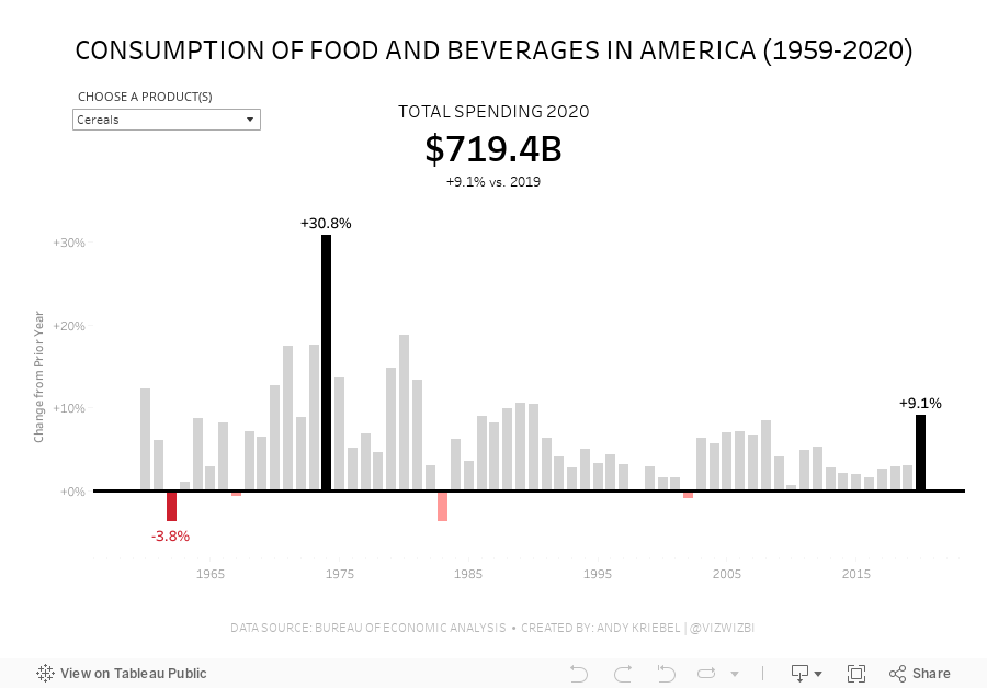
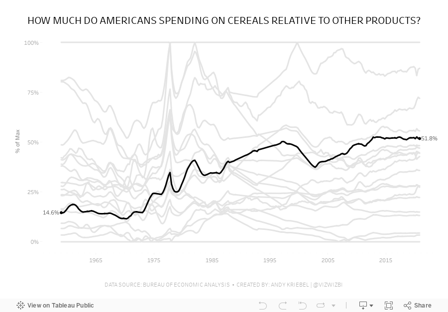
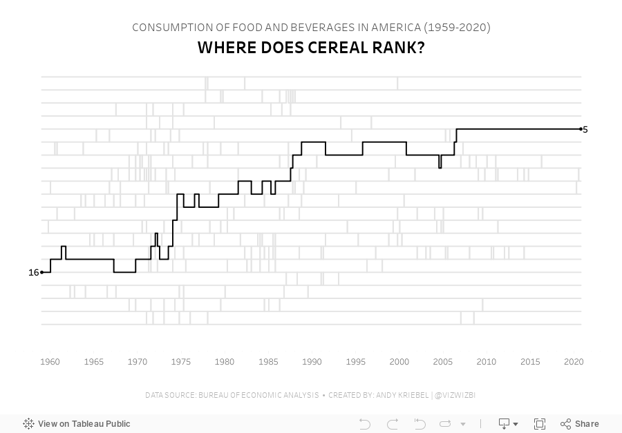
#MakeoverMonday Week 12 - How much do Americans spend on cereals?
Viz 1 - Year over Year Change in Consumption of Food and Beverages in America

Viz 2 - Parallel Coordinates - How much do Americans spend on cereals relative to other products?

Viz 3 - Bump Chart - #MakeoverMonday 2021 Week 12 - How Does Cereal Rank in American Food Spending?

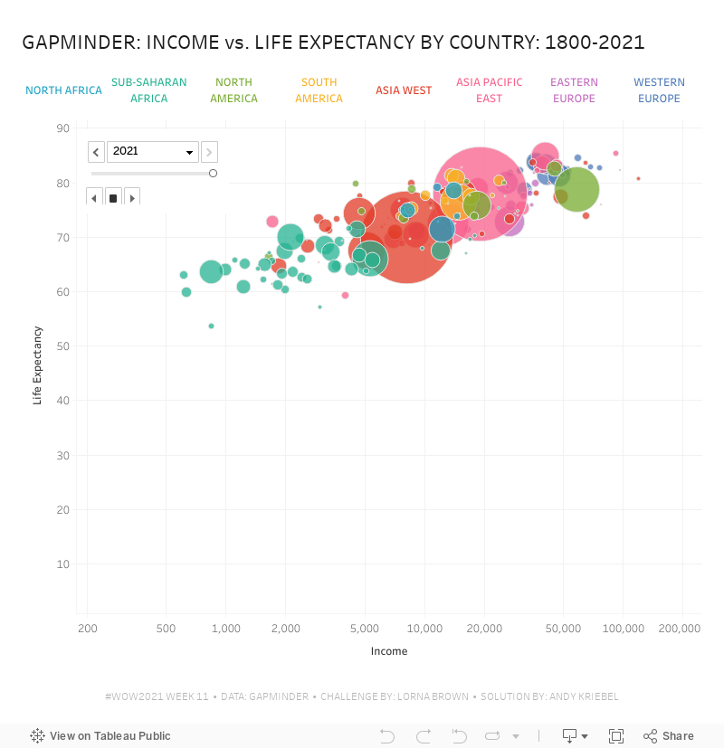
#WorkoutWednesday 2021 Week 11 - Gapminder: Income vs. Life Expectancy


What you should see, though, is that the headers are in the first row. To fix that, click on the drop down triangle next to the unioned data sources and choose Field names are in first row.


Now that the data is pivoted, in order to build the view, you need to create a calculated field for each measure: life expectancy, population, and income


March 19, 2021
#WorkoutWednesday 2021 - Week 2: Customer Lifetime Value (CLTV) Matrix

If you like a table calc challenge, this Workout Wednesday is for you. Get Ann's requirements here. On the surface it seems pretty simple:
- Get the first order date for each customer.
- Determine the number of quarters that elapsed since then.
- Calculate the cumulative value of each cohort.

Next, calculate each cohort's cumulative lifetime value.

You should now have a view like this with the marks are filled in across the whole table


March 16, 2021
Mastering Containers in Tableau (Part 2) - Sales Performance Dashboard

March 15, 2021
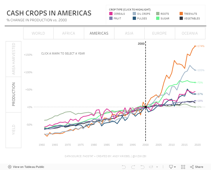
#MakeoverMonday Week 11: The World's Largest Cash Crops

March 9, 2021
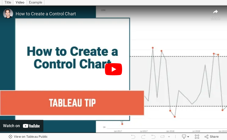
How to Create a Control Chart

- A control chart is a time series graph.
- A line across the time series that represents the mean of all of the measurements in the graph.
- Upper and lower control limits (UCL and LCL) that are displayed as a reference band across the view at a specified number of standard deviations from the mean.
- Indicators to show which measurements are "out of control".
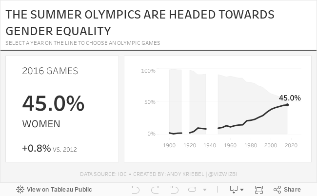
March 8, 2021
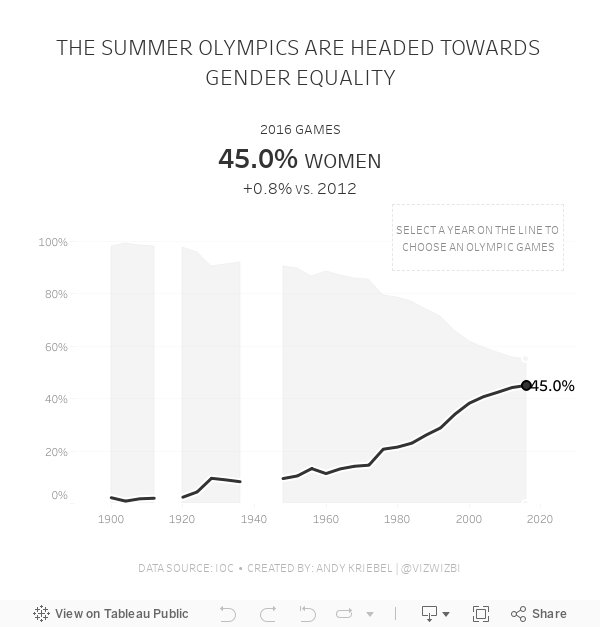
#MakeoverMonday Week 10: Female Participation in the Summer Olympics

First, thank you to Tommaso Ferri for moderating Watch Me Viz. I enjoyed working with this data set and was able to build nine vizzes in about 40 minutes, then took another 40-50 working through formatting and some pesky table calcs. I got there in the end!
After the live stream ended, I created one more version that uses containers. I think I like this one best. Below you'll find the live stream recording as well as the two final visualizations.
Thanks for watching!
March 2, 2021
Mastering Containers in Tableau
The Workout Wednesday 2020 Week 53 challenge required extensive knowledge of containers in Tableau. Containers can be quite the mystery! It's taken me years to grasp them.

In this webinar, I showed what I've learned about containers, how to complete the Workout Wednesday challenge, and how you can master containers.
Resources:
- Workout Wednesday Challenge - http://www.workout-wednesday.com/2020w53/
- Data source (Superstore 2020.3) - https://data.world/vizwiz/superstore-20203
- Workbook - http://bit.ly/WOW2020WEEK53
How to Create a Circle Timeline


March 1, 2021
#MakeoverMonday Week 9 - Seats Held by Women in National Parliaments in the EU


- Clear title
- Line chart is a good choice for a time series
- There are too many colors.
- What's the focus?
- The legend takes up a lot of space.
- The chart ratio is too flat.
- Overall, it's confusing and harder than necessary to find patterns.


