June 20, 2024
How to Simultaneously Highlight & Deselect with a Parameter Action in Tableau

February 20, 2023
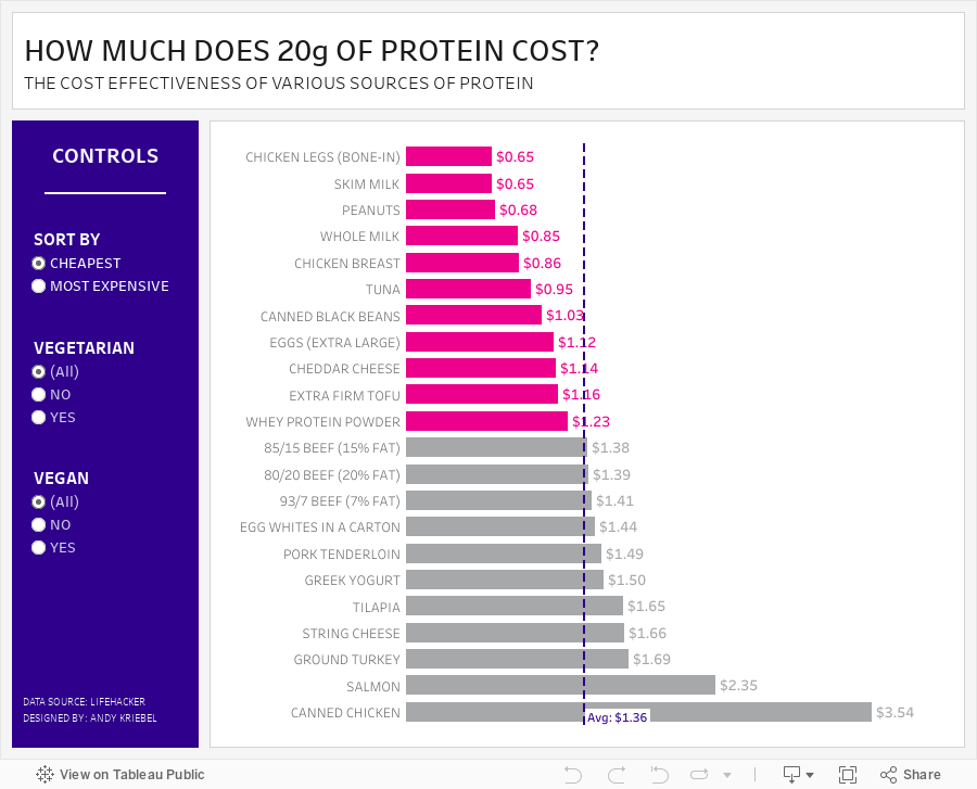
#MakeoverMonday 2023 Week 8 - The Cost Effectiveness of Protein Sources

This week we explored the cost of 20g of protein in various foods. During Watch Me Viz, I showed how to create toggles to allow the user to filter by vegan and vegetarian foods. I did this with parameter actions; if you want to learn more, watch the video below.
In the end, though, my fancy filtering with parameter actions didn't quite work out. I hadn't account for the option when the user might want to look at all foods. So I ended up using basic filtering. I overcooked the whole process, but I bet you'll learn something anyway.
I then went through the entire dashboard design process using containers, padding, shading and more. Check that out if you're interested in learning how to use layout contains.
Here's the #WatchMeViz recording, followed by the interactive viz. Enjoy and thanks for watching!
October 17, 2022
#MakeoverMonday 2022 Week 42 - Food & Drug Administration Inspections in America

Having looked at the original visualization this week (here), it was pretty clear to me that the creators desired to create a KPI style dashboard. In a way it's good that I picked up on it that way. However, it wasn't designed particularly uclarly well to communicate most efficiently.
I decided during Watch Me Viz that I would stick with their idea of a KPI dashboard, but design it in a way that I thought would be easier to understand.
As per normal, it took way too long to faff about with the formatting. I made a couple of small changes after I finished the live stream. Click on the image below the video to check it out. Leave a comment on the video on YouTube if you have any questions. (Comments aren't appearing on the blog for some reason).
Have a wonderful week!
August 30, 2021
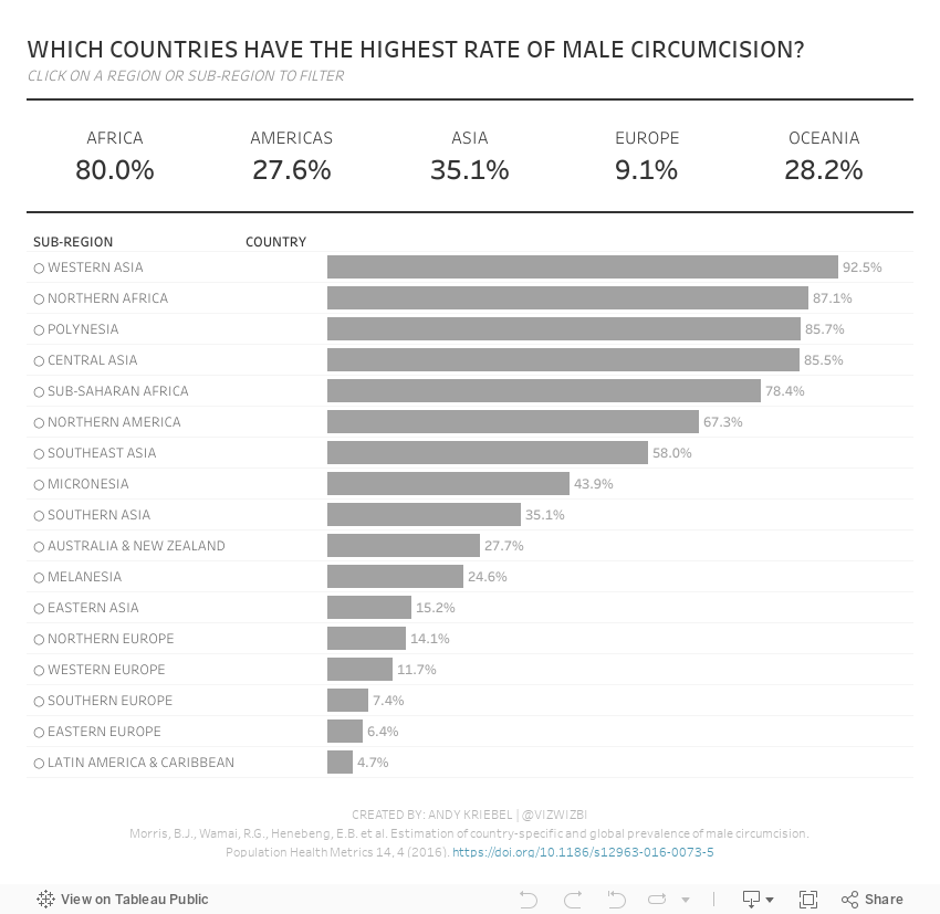
#MakeoverMonday 2021 Week 35 - Male Circumcision Around the World

In this week's Watch Me Viz, I started by showing the original visualization, demonstrated how to make a non-geographical field geographical, and then I spent lots of time working through set action drill down.
I showed how to do drill down to two and three levels of dimensions in a hierarchy. Lastly, while building the dashboard, I also showed how to move fields you select in an action to the top of the view with a sorting calculation.
Enjoy!
April 27, 2021
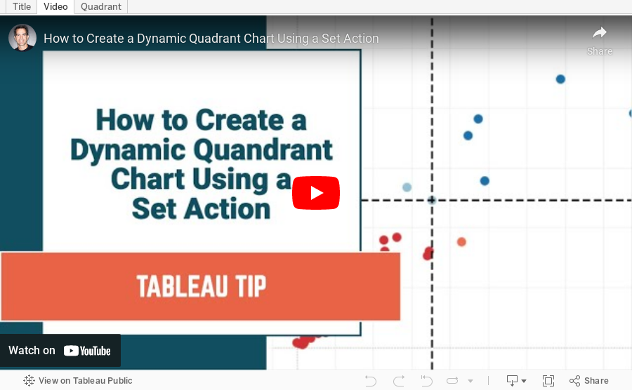
How to Create a Dynamic Quadrant Chart Using a Set Action

April 26, 2021
#MakeoverMonday 2021 Week 17 - Price Parity in America
In this week's Watch Me Viz, I covered the following charts:
- Line chart
- Trellis chart
- Slope graph
- Connected scatter plot
- Bar charts with comparisons
- Diverging bar charts
- Heatmap
- Hex map
- Tile map
- Barbell chart
- Peas in a pod chart
- Bump Chart
- Comet chart
In the end, I settled on the bump chart using highlighting and BANs. Other topics covered include:
- Sorting calculations
- Level of detail expressions
- Rank table calculations
- Parameters
- Filter actions
- Padding in dashboards
- Cleaning tooltips
- Divider lines in dashboards

March 15, 2021
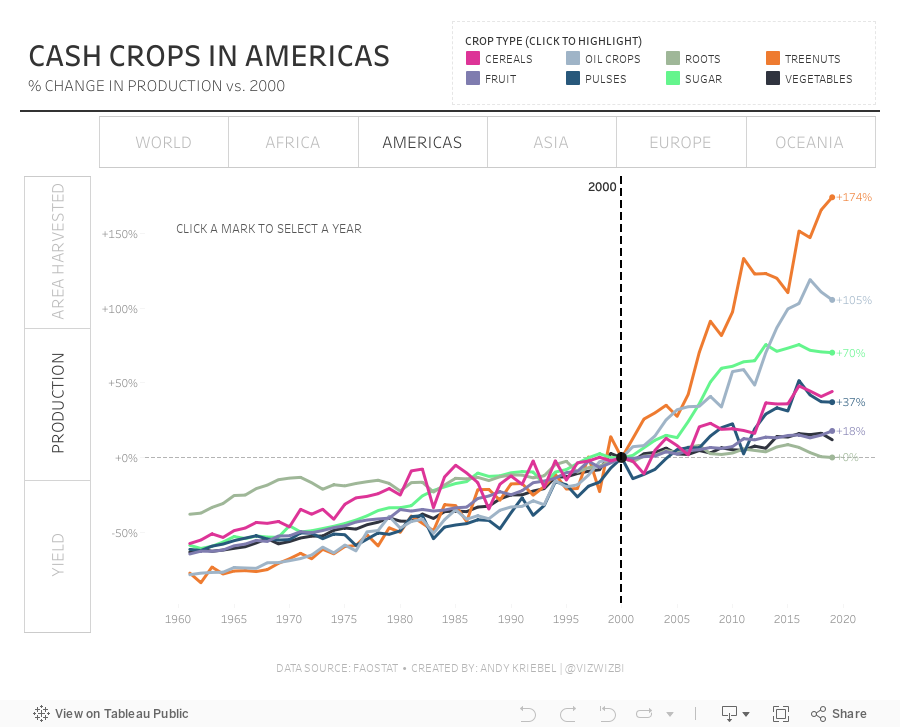
#MakeoverMonday Week 11: The World's Largest Cash Crops