Showing posts with label male. Show all posts
August 30, 2021
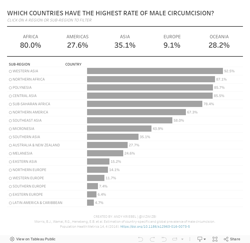
#MakeoverMonday 2021 Week 35 - Male Circumcision Around the World
action
,
BAN
,
bar chart
,
circumcision
,
dashboard
,
dashboard action
,
filter action
,
gender
,
health
,
how to
,
Makeover Monday
,
male
,
region
,
set action
,
tableau
No comments

In this week's Watch Me Viz, I started by showing the original visualization, demonstrated how to make a non-geographical field geographical, and then I spent lots of time working through set action drill down.
I showed how to do drill down to two and three levels of dimensions in a hierarchy. Lastly, while building the dashboard, I also showed how to move fields you select in an action to the top of the view with a sorting calculation.
Enjoy!
June 4, 2018
Makeover Monday: The UK Gender Pay Gap Across Salary Bands
female
,
gender
,
gov.uk
,
heat map
,
highlight
,
Makeover Monday
,
male
,
parameter
,
pay gap
,
UK
,
united kingdom
No comments

Let's start with this viz from the official report:

What works well?
- The symbols make it clear this about females and males.
- The BAN in the middle tells us what the bonus pay gap is.
What could be improved?
- Both icons are filled to the same level, making it look like there is no bonus pay gap. These should be filled to the actual values for each gender.
- The icons don't add much value.
- The title could tell us a whole lot more.
- There's no source listed nor no timeframe.
- The gridlines aren't evenly spaced between 0% and 50%.
I must admit, this is a tough data set. Hopefully the explanations I wrote on data.world provide sufficient context. I found it most useful to look at a specific company and look those values up in the data provided to ensure I understood what it means. Given that I found the data overwhelming, I decided to focus on the pay bands since that's what Aisling focused on in her article.
From there, I started to build lots of charts, but found the number of companies overwhelming. Therefore, I decide to limit the data to those companies located in the City of London (i.e., those with a postcode that starts with EC). I also knew I need to do some data prep so that I could compare females and males in each pay band more easily. I turned to Tableau Prep for this.

The flow works like this:
- Remove columns that aren't needed
- Splitting the data up into two streams, one for the female columns and one for the male columns.
- Pivot the data so that the pay bands are listed down instead of across
- Add a column for the gender
- Union the data back together
- Export to an extract
Pretty straightforward and this short amount spent prepping the data made the gender comparison significantly easier. I first wanted to understand how the median proportion of females and males in each pay band by the size of the company with a City of London total (NOTE: the total only represents companies that reported).
Click on the image for the interactive version.
Click on the image for the interactive version.

This simple view makes it incredibly evident that the proportion of females declines as the pay band increases. Males would be the inverse. It's particularly stark in the largest organizations. In the City of London, there are only three employers in that range (British Telecom, Royal Mail, and Sainsbury's Supermarket).
The heat map helped give me an overview of the data and felt ready to create something more detailed. This time I wanted to look at all companies together by gender by pay band compared to the overall median for each gender. I also wanted to provide the user with the option to choose a specific company. When they do, that company gets highlighted.
Click on the image for the interactive version.
What first struck me in this view is the clear, overwhelming patterns down and to the right for women. This gave me a great impression for how big the gender pay gap problem is.
The gender pay gap is not a myth. These are facts, facts that show women are underrepresented at higher salary levels. Don't let this discussion get lost. Check out your own company. How are they performing? Ask them to share the data within your organization. Transparency is a key to fixing this discrepancy.
May 16, 2017
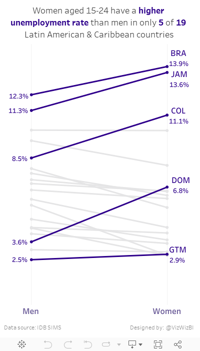
Makeover Monday: Female vs Male Youth Employment in Latin America & Caribbean Countries
caribbean
,
employment
,
female
,
highlight
,
latin america
,
Makeover Monday
,
male
,
slope graph
,
unemployment
,
youth
No comments
Today, I had a few spare minutes and knew that Eva really wanted me to create something with the full data set she created for #VizForSocialGood. Also, I was really surprised at the remarkably few slope graphs this week. This is a great data set for slope graphs, whose main purpose is comparing two points.
So, here is my second Makeover Monday this week. Special thanks to Eva for feedback on my iterations. In this viz, I wanted to compare the unemployment percentage for 15-24 year olds by country. Perfect use case for a slope graph...and my 500th Tableau Public viz!! I wonder who has more??
March 10, 2016
The Data School Gym: How do Female and Male Literacy Rates Compare Across the World?
challenge
,
Data School
,
female
,
literacy
,
male
,
men
,
women
4 comments

Today’s test was inspired by this blog post from John Mathis in which you have to create a 45 degree reference line to aid in the analysis of comparing two groups. If you’d like to take the challenge, you can download the data here and here are the requirements:
- Show female vs. male literacy rates on a scatterplot
- Include a dot for each country
- Create a 45 degree line so that you can clearly see which group has the higher literacy rate
- Color-code the dots to indicate whether females or males have a higher literacy rate
You can download my workbook below to see how I created it, but give it a go on your own before you look at my solution (or John’s).
Subscribe to:
Posts
(
Atom
)


