April 27, 2015
Makeover Monday: Where Is the Global Talent Pool Expected to Come from in 2030?

Twitter follower Sean Trout sent me a link to this tweet from OECD:
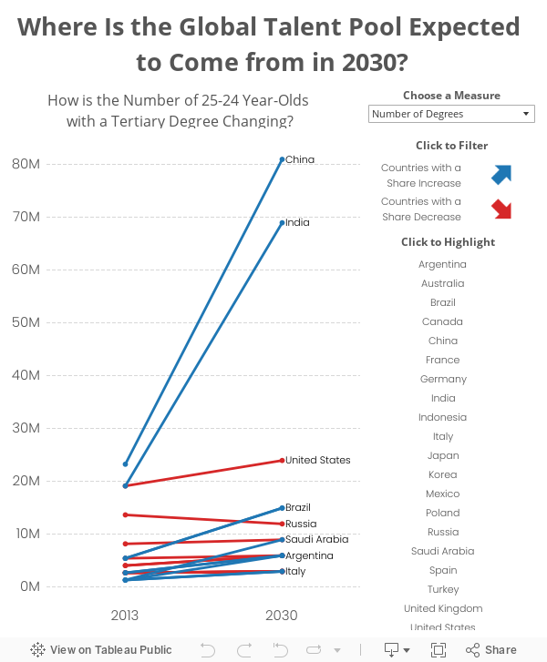
Given all of the above, I decided to create a slope graph.
The global talent pool has never been larger, will grow to 2030, read http://t.co/aA9AyLEXta (pdf) #education #stats pic.twitter.com/aiIiTDbZt9
— OECD (@OECD) April 24, 2015
These pie charts are part of a larger study conducted by OECD, which you can read here. Some thoughts about these pie charts:
- The author is trying to show the change from 2013 to 2030. Using two pie charts makes this more difficult than necessary. At least, though, they kept the countries in the same order.
- The pies do not add up to 100%, I assume due to rounding. The 2013 pie adds up to 101% and the 2030 pie adds up to 102%.
- The focus is on the top 20 countries, so the “Other” category isn’t needed.
- The labels on the pies include both the country name and the value. A table would be better than this. Adding all of these labels makes the chart way too busy.
- There are two key metrics in the data: share of degrees and the number of degrees. The pie chart doesn’t provide enough context for understanding where the number of degrees will be coming from.
Given all of the above, I decided to create a slope graph.
- I included a parameter which allows you to select the metric.
- This option, along with using a slope graph, really helps show how dramatic the change is for China and India.
- Switch back and forth between the parameter options and you’ll see quite a different story.
April 23, 2015
Dear Data Two - Week 2: Transport
connected
,
Dear Data
,
Dear Data Two
,
drawing
,
Jeffrey Schaffer
,
lines
,
nodes
,
steps
,
tableau
No comments

Jeffrey Shaffer and I are two weeks into a year-long weekly hand-drawn data viz project we’re calling Dear Data Two. The project is entirely modeled after the Dear Data project Giorgia Lupi and Stefanie Posavec are doing. Jeffrey and I thought this would be a great way for us to remove ourselves from software and work on being more “artistic”.
The week 2 theme was “Transport”. Jeffrey tracked his step pattern around his office.


While I tracked the places I went all week and how I got to each place. What was different for me this week is that I started with Tableau and then went to hand drawn. Going forward, you can keep up with the project at www.dear-data-two.com, where you can read more about our thoughts and how we created each postcard.
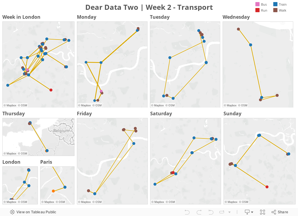


April 22, 2015
Multiple PDFs to Tableau Extract to Tableau Viz in Seconds via Alteryx
Alteryx
,
bar chart
,
Chris Love
,
Information Lab
,
parameter
,
Stephen Few
,
tableau
,
word cloud
2 comments

- You put a bunch of PDFs into a folder (as many as you’d like)
- Run the Alteryx module
- Alteryx spits out a Tableau extract and workbook that count how many times each word appears in the PDFs
Keep an eye on The Information Lab Blog for more details. Chris is going to write a post soon on how he built this. It’s genius!
For my testing, I decide to run the module against the PDFs of the course materials that Stephen Few gives you at his Visual Business Intelligence Workshop. These PDFs average 25MB (i.e., that’s a lot of words). Chris provided a simple word cloud output as part of the package he wrote. I took that and added a bar chart and a parameter. Anyone that uses Alteryx is going to love what Chris created, pun intended.
April 21, 2015
Tableau Tip Tuesday: Star Wars - The Force Awakens (Embedding Audio & Video in a Dashboard)
audio
,
bar chart
,
map
,
soundcloud
,
Star Wars
,
video
,
youtube
No comments

Just announced at Star Wars Celebration: The Force Awakens Teaser was watched over 88M times in its first 24 hours globally! Thanks to all the fans for a record breaking and truly historic response!
Posted by Star Wars on Sunday, April 19, 2015
Today’s tip is about embedding YouTube videos and Soundcloud audio into a Tableau dashboard. It’s pretty simple. Scroll down below the viz for the instructions. May the Force be with you!
- Drag a Web Page object onto the dashboard.
- When prompted for the URL, you want to grab the embed code:
- Copy the string after the “src=“ and add "?rel=0&showinfo=0” onto the end of it. The URL should look like:

The process for embedding audio is much the same.
- Go to the track on Soundcloud.
- Click on the Share button.
- When the share window appears, click on Embed at the top.
- Scroll to the bottom and click on More Options.
- Choose the size and check the Automatic play box.
- Copy the embed code.
- Select the text after the “src=“ and copy it
- Add a Web Page object onto the dashboard.
- Paste the copied text in the URL box.
That’s it!
April 20, 2015
Makeover Monday: Chelsea Are the Worst-Behaved Team in the Premier League When It Comes to Showing Respect to Referees
Chelsea
,
england
,
English Premier League
,
Fair Play League
,
football
,
Premier League
,
soccer
No comments

As I was scouring the various reports, I didn’t see anyone actually create a viz on the subject. The best I found was this table from The Daily Mail:

A table is great for ranking and looking things up, but terrible for doing any sort of analysis. I downloaded the FPL table into Excel (here) and combined it with the BPL standings as of the same date.
In the viz below, I’m using Chelsea as the baseline for comparison, because the story that interested me was how much worse does Chelsea behave compared to the other teams. For example, if you hover over Liverpool, you will see that Chelsea is 14% worse with its respect for referees.
I then added a second tab that allows you to explore the data on your own. Pick a FPL stat, a BPL stat and you can compare and contrast. The question I wanted to answer here was “Is there a relationship between FPL and BPL stats?” I can’t find any interesting relationships, but maybe you can.
April 13, 2015
Makeover Monday: David Cameron's Overseas Trips
bar chart
,
bubble chart
,
David Cameron
,
detail
,
Guardian
,
Makeover Monday
,
makeovermonday
,
map
,
Prime Minister
,
table
,
UK
No comments


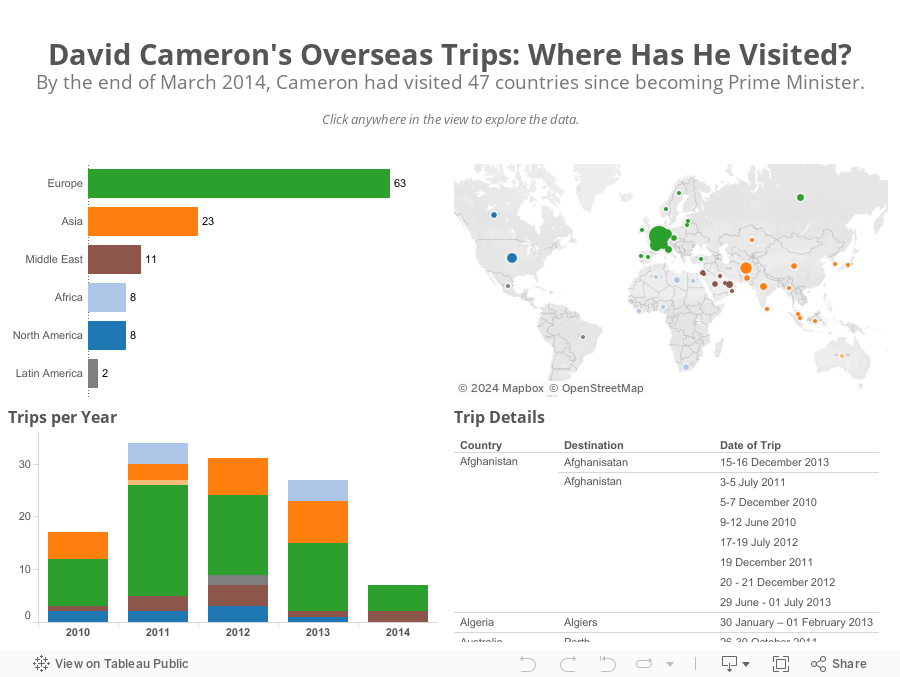
First, bubbles make comparisons harder than they need to; bar charts are much better for comparisons. This view also doesn't provide any addition insight. I can't answer a simple question like "Which countries did Cameron visit in Europe and when?"
I only had a few minutes this morning to create an alternative and here's what I came up with in about 15 minutes.
April 12, 2015
English Football Stadium Tracker
england
,
English Premier League
,
football
,
London
,
map
,
running
,
Scotland
,
soccer
,
UK
,
united kingdom
No comments
Today is Sunday, which means it’s Sunday Long Run. Those of you that are runners know what I mean. I moved to London last Saturday and my goal for my runs is to use them as a way to explore new places. Yesterday, I went to see Leeds United play with a friend from Atlanta who grew up a Leeds fan.

Today, I set out to see some football stadiums. I mapped a route that took me from Wimbledon, past three iconic football stadiums.
Today, I set out to see some football stadiums. I mapped a route that took me from Wimbledon, past three iconic football stadiums.
 |
| Craven Cottage - home of Fulham FC |
 |
| Loftus Road - home of QPR FC |
 |
| Stamford Bridge - home of Chelsea FC |
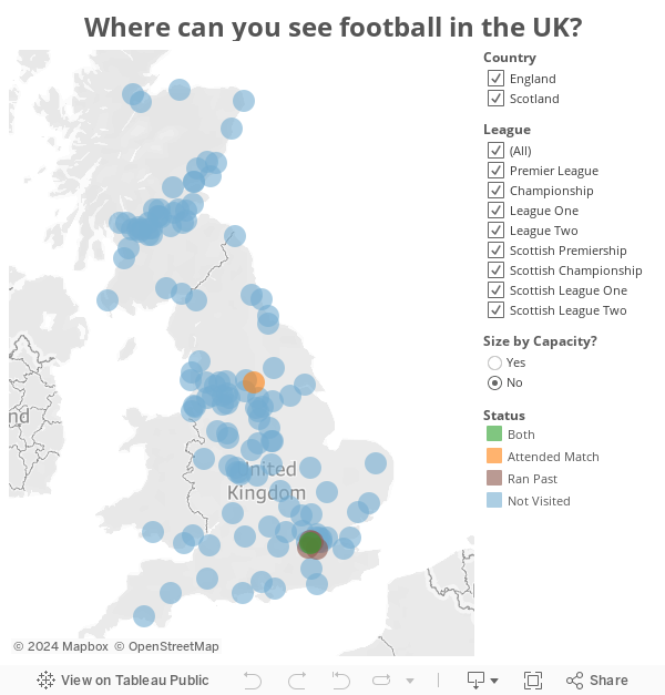
And yes, I know I titled this post "English" and Scotland is not part of England, but UK football stadium tracker doesn't resonate as well with me.
April 7, 2015
Tableau Tip Tuesday: How to Create a Moving Reference Line
moving
,
reference line
,
tableau
,
tip
,
Tuesday
3 comments
It's my first day on the job with The Information Lab, so what better way to celebrate my first day and the release of Tableau 9 than with a video tip.
Over two years ago I wrote about how to create a reference line for today. In this week's tip I take it step farther, by showing you how to create a moving reference line based on user input from a date parameter.
Enjoy!

April 6, 2015
Makeover Monday: As the Wheels Turn | 5-yr Change in Percentage of U.S. & Canadian Content in Car Models
bar chart
,
change
,
color
,
donut chart
,
Jeffrey Schaffer
,
Makeover Monday
,
pie chart
,
slope graph
2 comments
Friend Jeffrey Shaffer sent me this tweet for as a makeover candidate:
However, a much better alternative, as suggested by Jeffrey is a slope graph. I’ve not only included the slope graph, but I also include a bar graph to show the five-year change.

You can download the data here and the Tableau workbook here.
A pie and donut in one chart for comparing year vs. year? That's a new one for me. #slopegraph http://t.co/TLtx2lYpY8 pic.twitter.com/4Ukd3faH6o
— Jeffrey Shaffer (@HighVizAbility) March 24, 2015
It’s obvious what the creator of this viz is trying to do...show the five year change for each car model. The problem is with their choice of visualizations. They placed a pie inside a donut. Both of these chart types are not only hard to read, they have them in reverse order as well. If they insist on using this type of graph, they should place 2010 on the outside and 2015 on the inside.However, a much better alternative, as suggested by Jeffrey is a slope graph. I’ve not only included the slope graph, but I also include a bar graph to show the five-year change.
You can download the data here and the Tableau workbook here.
Subscribe to:
Posts
(
Atom
)


