Showing posts with label Chris Love. Show all posts
September 26, 2017
Tableau Zen Master Webinar Series

Have you ever wanted to learn from a Zen Master for free? Well here's your chance.
Join us for The Information Lab Europe Tableau Zen Master Webinar Series with me, Chris Love and Craig Bloodworth. We'll be sharing our love for Tableau in three webinars starting in October.
Sign up here:
Part I: My 20 Favorite Tableau Tips
Presenter: Andy Kriebel
Date: Oct 17, 2017 9:00 AM BST
Register: https://attendee.gotowebinar.com/register/3519156674736335618
Part II: Advanced Charting with Unions
Presenter: Chris Love
Date: Nov 10, 2017 9:00 AM GMT
Register: https://attendee.gotowebinar.com/register/5166142629772726786
Part III: The Future of Mapping in Tableau
Presenter: Craig Bloodworth
Date: Dec 05, 2017 9:00 AM GMT
Register: https://attendee.gotowebinar.com/register/2448374186282591490
After registering, you will receive a confirmation email containing information about joining the webinar.
June 25, 2015
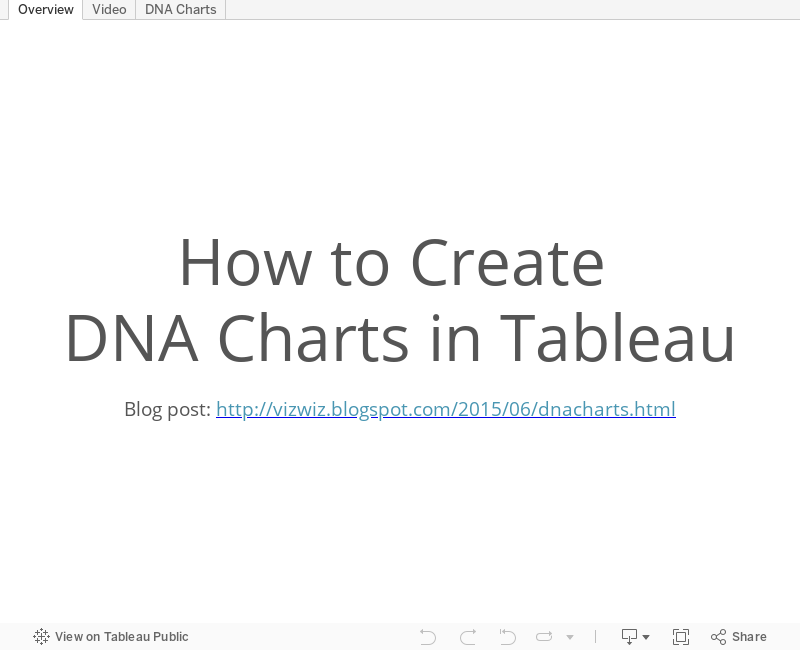
Tableau Tip: How to Create DNA Charts
barbell
,
Chris Love
,
connected
,
Data School
,
difference
,
DNA
,
dot plot
,
Information Lab
,
Laszlo Zsom
,
learning
,
lines
,
magnitude
,
tableau
,
teaching
,
tip
,
tricks
,
variance
7 comments

The Data School launched this week and on the consultants' second day, we brought them into an all day training class with the rest of the Information Lab team. One of the courses we taught was advanced visualisations. The reason we run these internal training classes is because we have a core belief in continuous learning.
As part of this exercise, we were building a dot plot and Laszlo Zsom asked how to connect two dots on the same row. I hadn't ever done it before, so I used a Gantt chart to connect them. Then Chris Love suggested using lines.
In this week's tip (two days late as it is), I demonstrate both of these methods. Click on the image below to enjoy the video.
April 22, 2015
Multiple PDFs to Tableau Extract to Tableau Viz in Seconds via Alteryx
Alteryx
,
bar chart
,
Chris Love
,
Information Lab
,
parameter
,
Stephen Few
,
tableau
,
word cloud
2 comments

- You put a bunch of PDFs into a folder (as many as you’d like)
- Run the Alteryx module
- Alteryx spits out a Tableau extract and workbook that count how many times each word appears in the PDFs
Keep an eye on The Information Lab Blog for more details. Chris is going to write a post soon on how he built this. It’s genius!
For my testing, I decide to run the module against the PDFs of the course materials that Stephen Few gives you at his Visual Business Intelligence Workshop. These PDFs average 25MB (i.e., that’s a lot of words). Chris provided a simple word cloud output as part of the package he wrote. I took that and added a bar chart and a parameter. Anyone that uses Alteryx is going to love what Chris created, pun intended.
Subscribe to:
Posts
(
Atom
)


