Showing posts with label DNA. Show all posts
August 10, 2015
Makeover Monday: 12 Ways to Visualize the Gender Gap of Federal Workers
DNA
,
donut chart
,
dot plot
,
employment
,
gender
,
Jon Schwabish
,
Makeover Monday
,
nelson davis
,
pie chart
,
slope graph
,
wages
No comments

Good friend Nelson Davis provided another great makeover example for this week. It started with this tweet from Jon Schwabish:
What would you call these charts? Not pie charts...maybe "spilt pie charts"? | From http://t.co/jZZKbLnAl0 pic.twitter.com/cyqwtp8UYz
— Jon Schwabish (@jschwabish) August 5, 2015
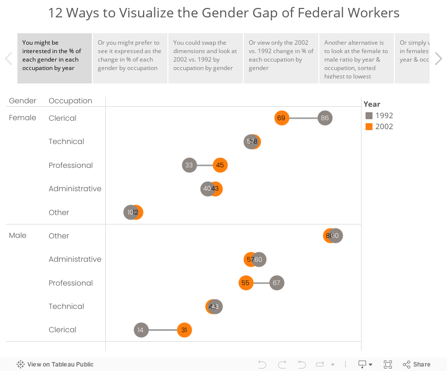
As I was thinking about this makeover, I couldn't settle on a single best way to visualize this data. I did know, though, that these moons/pies/donuts/dots needed to communicate more effectively. I've come up with 12 alternatives, each of which works way better than the original. The reason there are 12 is because there are multiple ways to display the dimensions based on the story you want to emphasize. And yes, I could have come up with another 12.
Special thanks for Carl Allchin for his feedback and help with the text on the tabs in the story points.
June 25, 2015
Tableau Tip: How to Create DNA Charts
barbell
,
Chris Love
,
connected
,
Data School
,
difference
,
DNA
,
dot plot
,
Information Lab
,
Laszlo Zsom
,
learning
,
lines
,
magnitude
,
tableau
,
teaching
,
tip
,
tricks
,
variance
7 comments

The Data School launched this week and on the consultants' second day, we brought them into an all day training class with the rest of the Information Lab team. One of the courses we taught was advanced visualisations. The reason we run these internal training classes is because we have a core belief in continuous learning.
As part of this exercise, we were building a dot plot and Laszlo Zsom asked how to connect two dots on the same row. I hadn't ever done it before, so I used a Gantt chart to connect them. Then Chris Love suggested using lines.
In this week's tip (two days late as it is), I demonstrate both of these methods. Click on the image below to enjoy the video.
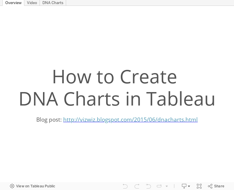
As part of this exercise, we were building a dot plot and Laszlo Zsom asked how to connect two dots on the same row. I hadn't ever done it before, so I used a Gantt chart to connect them. Then Chris Love suggested using lines.
In this week's tip (two days late as it is), I demonstrate both of these methods. Click on the image below to enjoy the video.
January 22, 2015
Core Values and Culture: The Tableau Community DNA
I read this post from Ethos3 about their company core values and culture. As I was reading through them, I thought this matched nearly exactly with the values and culture of the Tableau Community. I've made some minor tweaks to their values to be more in line with the Tableau Community.
- Focus On Yourself First: If you develop yourself, then everything will change around you.
- Pursue Growth And Learning: Always continue to learn and grow. Read as many books and create as many visualizations as possible.
- Do More: Never settle for mediocrity.
- Develop A Magnificent Obsession for Everything and Everyone: Be passionate about everything and everyone you touch.
- Do The Ordinary Extraordinarily Well: Create WOW experiences by doing ordinary things in ways no one will ever expect.
- Be Humble: Understand that there’s always someone who can do what you do better, faster and cheaper.
- Live Uniquely: Be yourself. Find your authentic voice. Share your voice.
- Commit: As Yoda would say, "Do or do not. There is no try." No wishing or trying allowed. Period. Commit to every task.
- Embrace and Drive Change: Look for opportunities to change and improve yourself, your company, and the Community.
- Empower Others: The Pledge of Allegiance starts with “I” and ends with “We.” You can’t do everything by yourself.
What do you think? I know these values are pretty much what got me where I am today. How about you?
Subscribe to:
Posts
(
Atom
)






