August 10, 2015
Makeover Monday: 12 Ways to Visualize the Gender Gap of Federal Workers
DNA
,
donut chart
,
dot plot
,
employment
,
gender
,
Jon Schwabish
,
Makeover Monday
,
nelson davis
,
pie chart
,
slope graph
,
wages
No comments

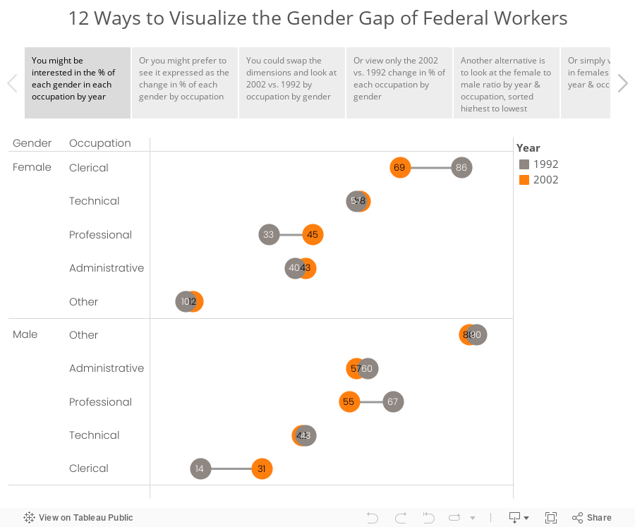
Good friend Nelson Davis provided another great makeover example for this week. It started with this tweet from Jon Schwabish:
What would you call these charts? Not pie charts...maybe "spilt pie charts"? | From http://t.co/jZZKbLnAl0 pic.twitter.com/cyqwtp8UYz
— Jon Schwabish (@jschwabish) August 5, 2015
As I was thinking about this makeover, I couldn't settle on a single best way to visualize this data. I did know, though, that these moons/pies/donuts/dots needed to communicate more effectively. I've come up with 12 alternatives, each of which works way better than the original. The reason there are 12 is because there are multiple ways to display the dimensions based on the story you want to emphasize. And yes, I could have come up with another 12.
Special thanks for Carl Allchin for his feedback and help with the text on the tabs in the story points.
Subscribe to:
Post Comments
(
Atom
)


No comments
Post a Comment