August 17, 2015
Makeover Monday: How has the GNI of Low-Income Countries Changed in the Last 20 Years?

The Guardian published an article a recently with the big title "World Bank data shows number of 'low-income' countries halved since 1994”. Naturally, you would expect the article to be about this change. However, it was not. Instead you get this viz:
Look at the title of the viz. Look again. It has NOTHING to do with the title of the article. It’s main focus is on the current Gross National Income. Yes, there is some more information in the article, but isnt the point of including a visualisation to enhance the data and make it more understandable?
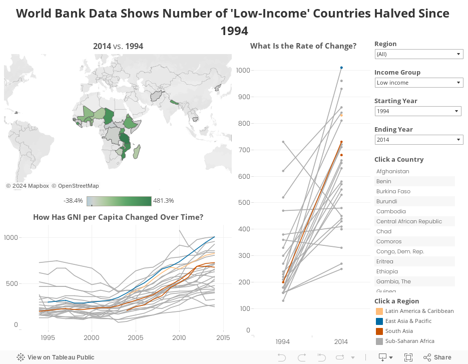
I found the same data set on the World Bank and decide to create this Tableau viz as an alternative. My intent with this viz was to:
How did I do? Did I accomplish these goals? Did I provide you with an avenue for additional insight?
Look at the title of the viz. Look again. It has NOTHING to do with the title of the article. It’s main focus is on the current Gross National Income. Yes, there is some more information in the article, but isnt the point of including a visualisation to enhance the data and make it more understandable?
I found the same data set on the World Bank and decide to create this Tableau viz as an alternative. My intent with this viz was to:
- Make the data more understandable
- Tell the story in the title of the article
- Allow to additional investigation
How did I do? Did I accomplish these goals? Did I provide you with an avenue for additional insight?
Subscribe to:
Post Comments
(
Atom
)


No comments
Post a Comment