August 31, 2015
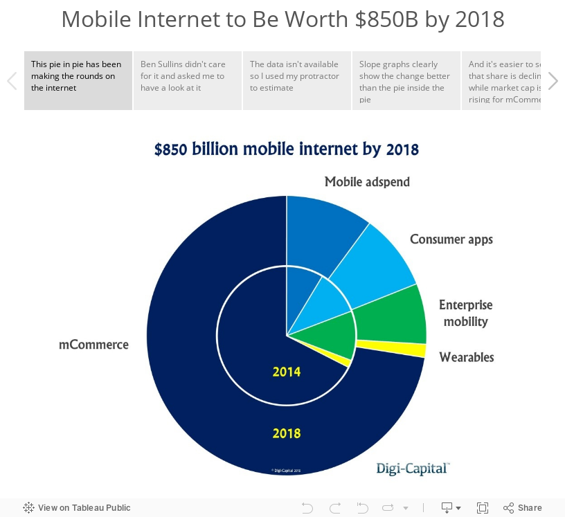
Makeover Monday: Mobile Internet to Be Worth $850B by 2018
bar chart
,
change
,
commerce
,
internet
,
Makeover Monday
,
pie chart
,
revenue
,
slope graph
No comments

It may be a bank holiday here in the U.K., but that doesn't stop me from getting out a #MakeoverMonday post. This week, I'm using story point to walk you through the makeover.
August 29, 2015
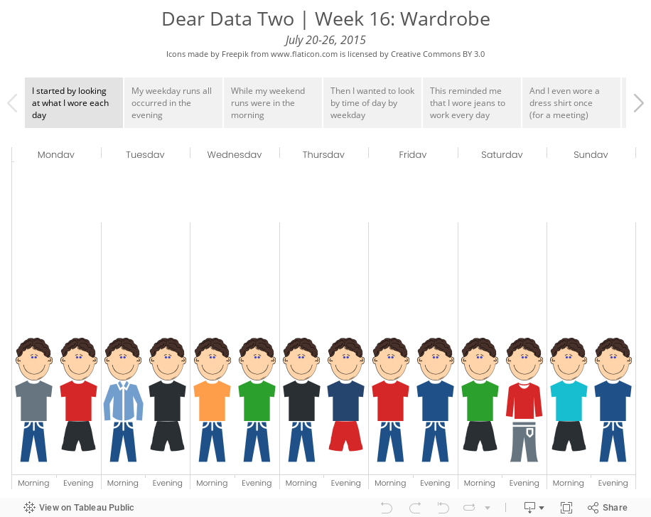
Dear Data Two | Week 16: Wardrobe

For week 16, I tracked the clothing I wore, used shapes in Tableau to build images of myself, then drew a postcard to match.
August 27, 2015
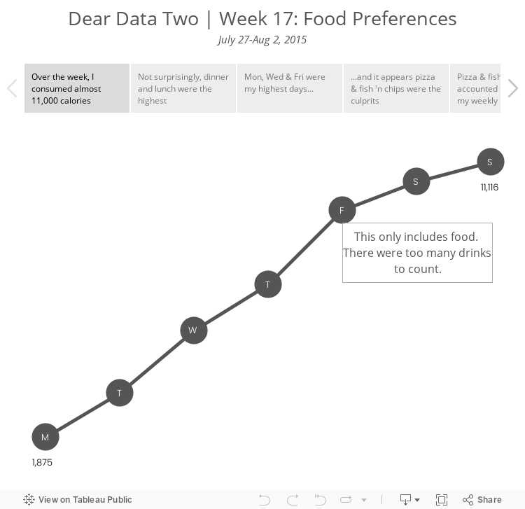
Dear Data Two | Week 17: Food Preferences

I'm heading back to week 17 to catch up on one of the postcards I hadn't yet created. Week 17 was about food preferences. I tracked the food I ate while on holiday in Scotland and counted the calories I consumed. The data is pretty basic, so I decide to try to draw some shapes, which is something I'm not particularly good at and something that I've been wanting to improve through this project.
August 26, 2015
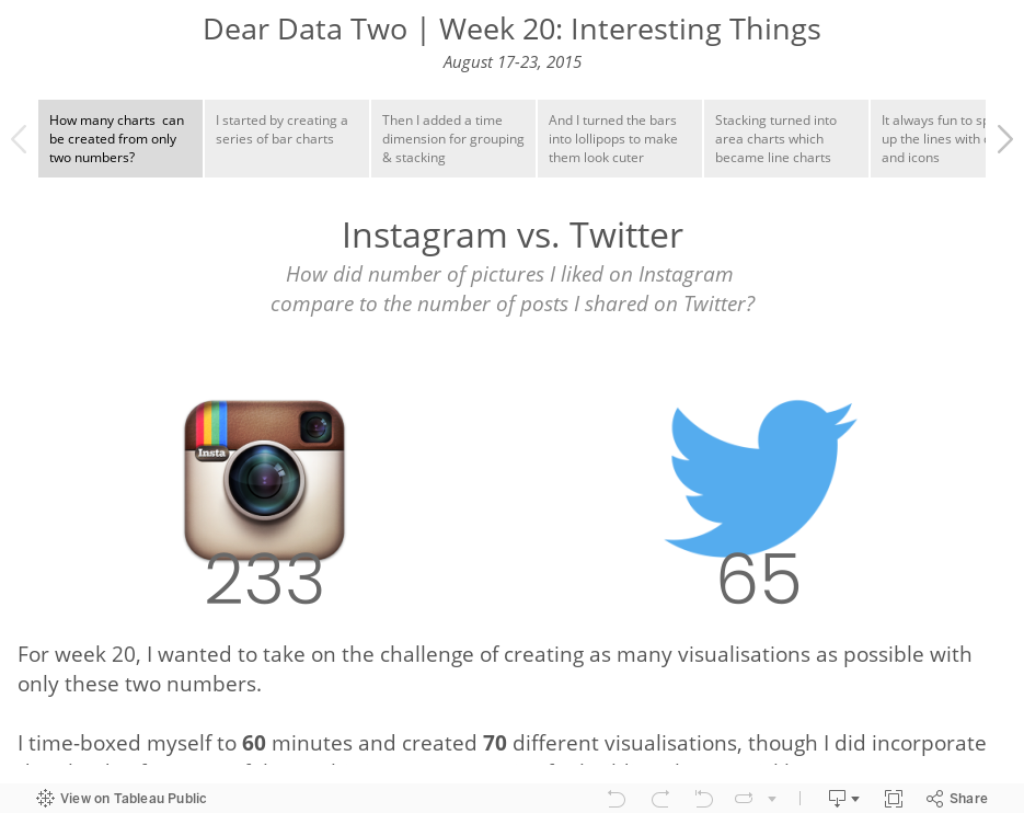
Dear Data Two | Week 20: Interesting Things

The topic for week 20 of Dear-Data-Two was "interesting things". I started the week by recording every little thing that I found interesting, but that quickly became overwhelming to keep up with. Instead, I decided to compare Instagram likes to Twitter shares. My thinking is that if I like something on Instagram or share a piece of content on Twitter, then it was interesting to me.
This resulted in the ultimate small data, which I tasked the Data School with visualising as well. The premise of the activity is to give yourself 60 minutes to create as many different visualisations in Tableau as possible. I came up with 70, and I walk you through them in the story below.
This resulted in the ultimate small data, which I tasked the Data School with visualising as well. The premise of the activity is to give yourself 60 minutes to create as many different visualisations in Tableau as possible. I came up with 70, and I walk you through them in the story below.
August 25, 2015
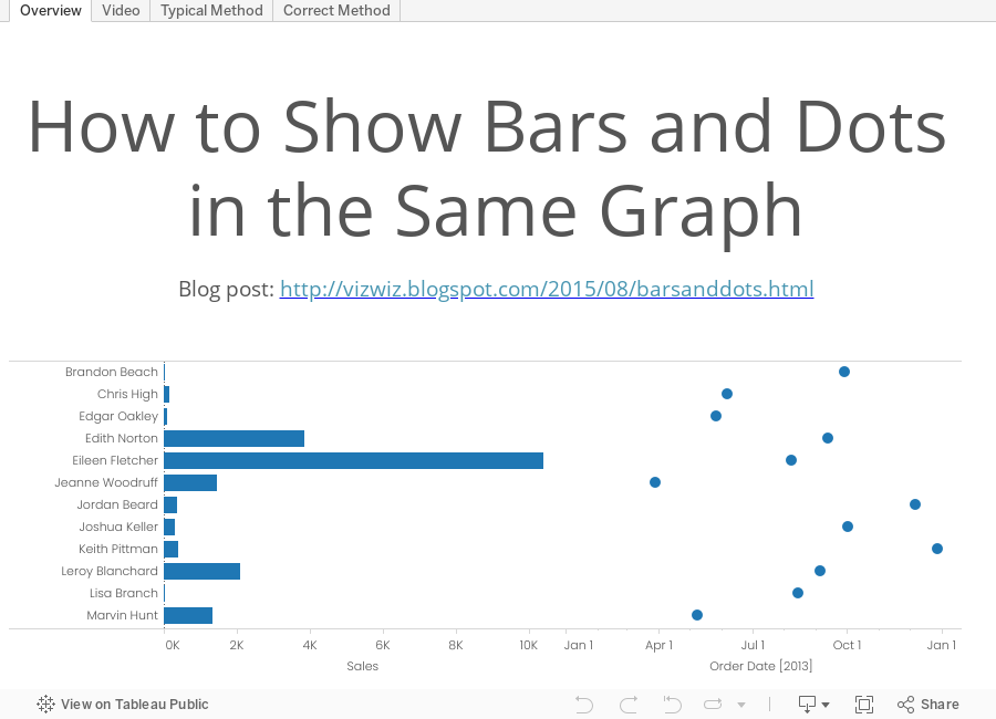
Tableau Tip Tuesday: How to Show Bars and Dots in the Same Graph

This week's tip came about based on a Server admin view that Ravi Mistry of the Data School created. In Ravi's view, he created two charts, a bar chart and a dot plot, and placed them side-by-side in a dashboard. After his demo, I showed him how he could combine them into a single view, which is what I'm showing in this week's tip.
August 24, 2015
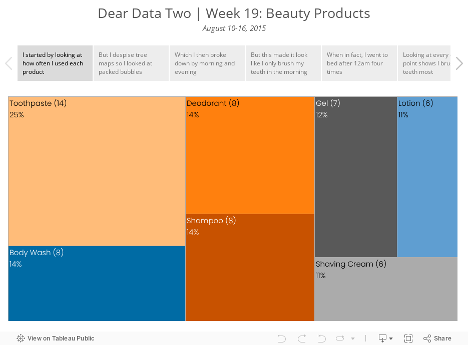
Dear Data Two | Week 19: Beauty Products

This week wasn’t the most interesting ever. I suppose for the Dear Data ladies it’s probably a bit different. For me, I tracked the “beauty” products I used throughout the week. From there, I explored the data in Tableau, which helped me uncover an interesting insight. I have detailed the insight in the story below.
Enjoy!
Enjoy!
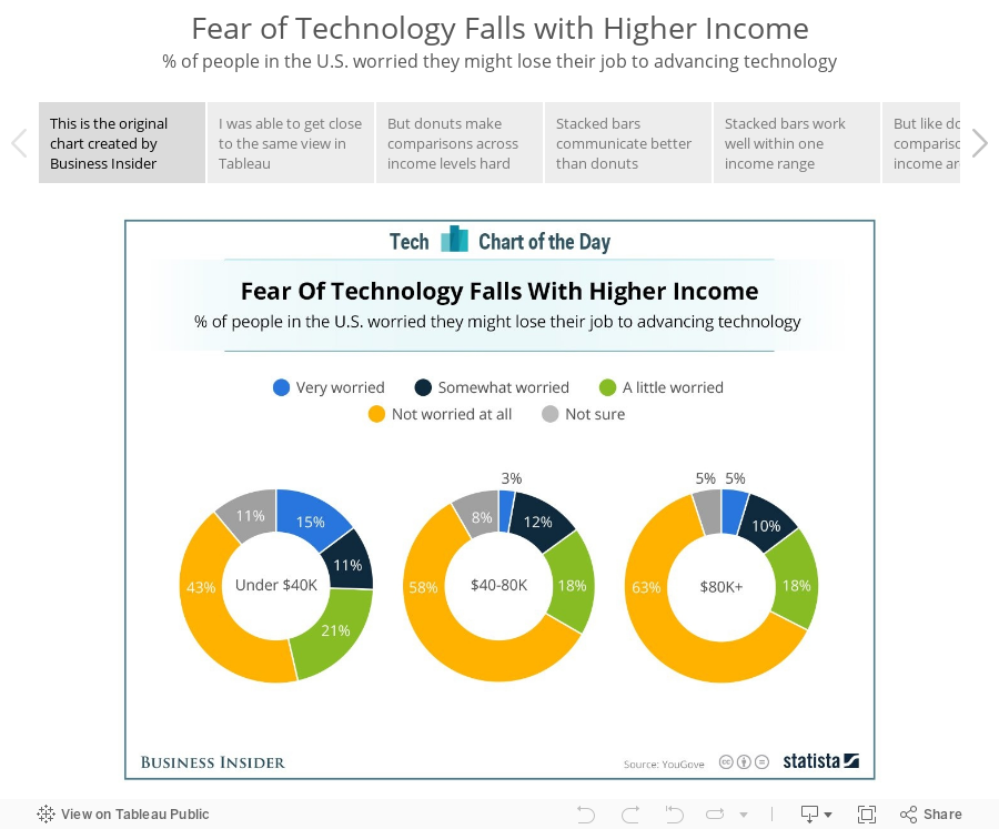
Makeover Monday: Fear of Technology Falls with Higher Income
Business Insider
,
change
,
donut chart
,
line chart
,
Makeover Monday
,
stacked bar chart
,
story points
,
trend
No comments

This week's Makeover Monday is a review of a series of donut charts from Business Insider. I'm using Tableau's story points feature to iterate through the makeover process.
August 19, 2015
How Has Poverty in Metro Neighborhoods Changed from 1970 to 2010?
change
,
DNA chart
,
FlowingData
,
makeover
,
map
,
poverty
,
tableau
,
United States
Going through my RSS feed today, I saw a post on Flowing Data with this viz show the change in poverty in metro areas in the U.S.

I navigated to the site that shows the full report and at the bottom was a link to the original source, which was this story done in Tableau.

What struck me about this was that the titles of each story point are quite good, yet the visualisation is just a table, which makes it hard to find any insight. I decided to download the workbook and create this interactive version using the same story points. I think this tells the story of the changing poverty in America’s metro areas much more clearly, plus I allow for additional exploration and insight via the sort parameter.
Thoughts? Which one works better? What would you do differently?
I navigated to the site that shows the full report and at the bottom was a link to the original source, which was this story done in Tableau.
What struck me about this was that the titles of each story point are quite good, yet the visualisation is just a table, which makes it hard to find any insight. I decided to download the workbook and create this interactive version using the same story points. I think this tells the story of the changing poverty in America’s metro areas much more clearly, plus I allow for additional exploration and insight via the sort parameter.
Thoughts? Which one works better? What would you do differently?
August 18, 2015
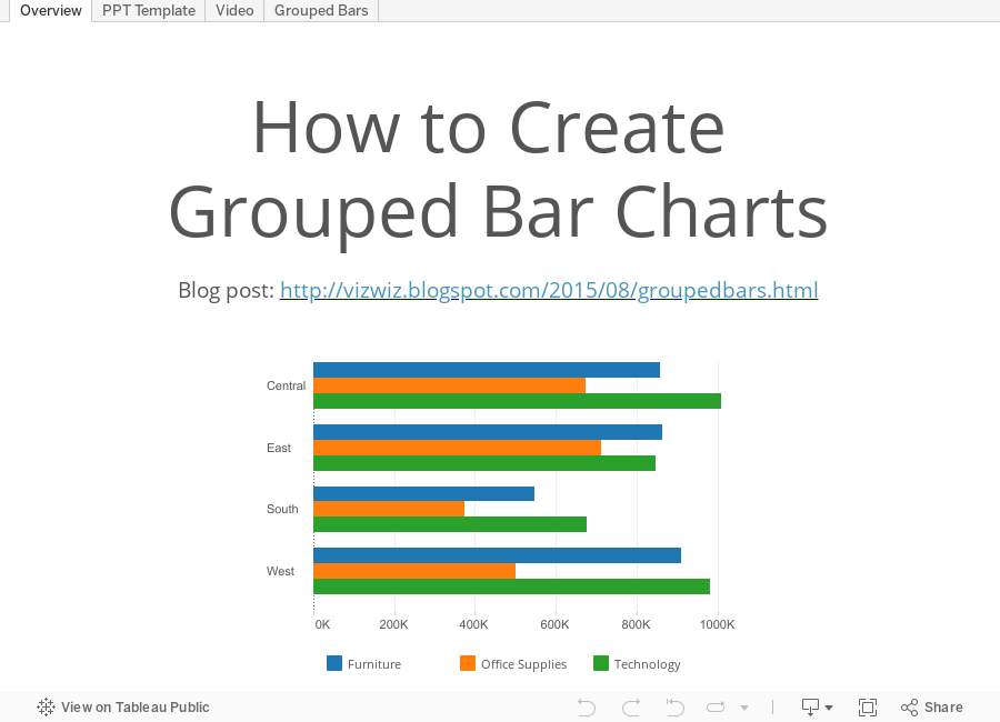
Tableau Tip Tuesday: How to Create Grouped Bar Charts
bar chart
,
grouped
,
PowerPoint
,
tableau
,
template
,
tip
,
Tuesday
,
video
5 comments

This week's tip started with the PowerPoint template sent by Tableau to #Data15 speakers. It includes a PowerPoint grouped bar chart template that isn't all the straight forward to build in Tableau.
August 17, 2015
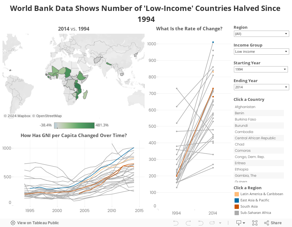
Makeover Monday: How has the GNI of Low-Income Countries Changed in the Last 20 Years?

The Guardian published an article a recently with the big title "World Bank data shows number of 'low-income' countries halved since 1994”. Naturally, you would expect the article to be about this change. However, it was not. Instead you get this viz:
Look at the title of the viz. Look again. It has NOTHING to do with the title of the article. It’s main focus is on the current Gross National Income. Yes, there is some more information in the article, but isnt the point of including a visualisation to enhance the data and make it more understandable?
I found the same data set on the World Bank and decide to create this Tableau viz as an alternative. My intent with this viz was to:
How did I do? Did I accomplish these goals? Did I provide you with an avenue for additional insight?
Look at the title of the viz. Look again. It has NOTHING to do with the title of the article. It’s main focus is on the current Gross National Income. Yes, there is some more information in the article, but isnt the point of including a visualisation to enhance the data and make it more understandable?
I found the same data set on the World Bank and decide to create this Tableau viz as an alternative. My intent with this viz was to:
- Make the data more understandable
- Tell the story in the title of the article
- Allow to additional investigation
How did I do? Did I accomplish these goals? Did I provide you with an avenue for additional insight?
August 16, 2015
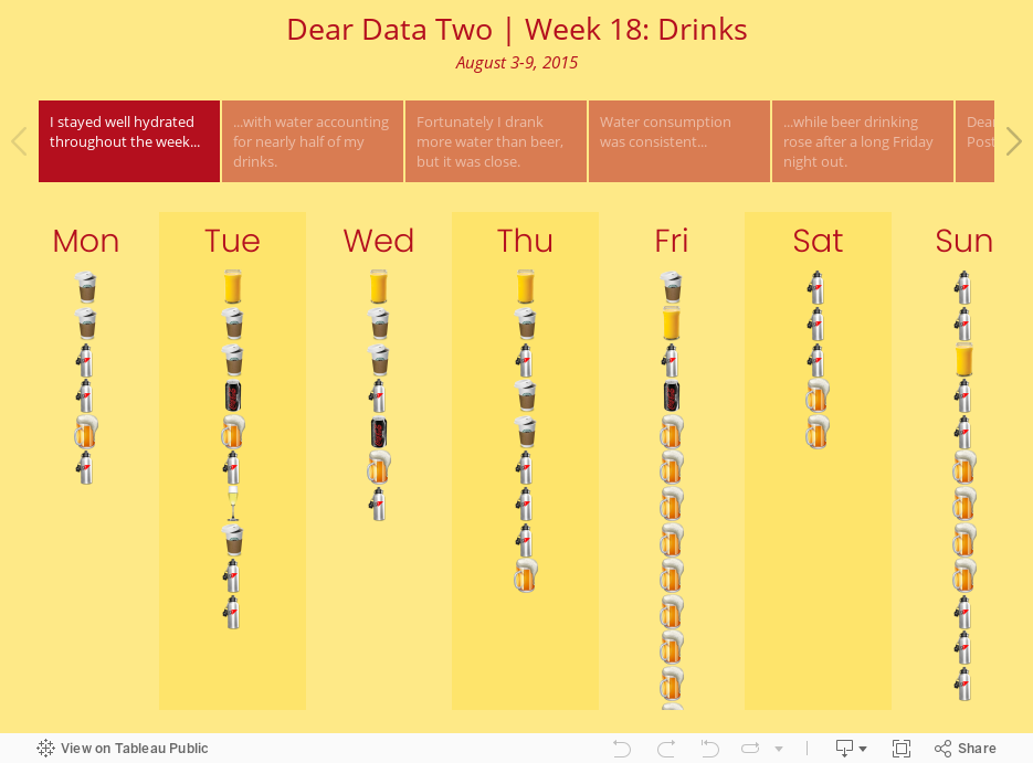
A 13 Year Old Takes on Tableau and Dear Data Two
This is a guest post from my 13 year old son Oscar, who, while we were on holiday in Scotland, saw me working on a postcard for Dear Data Two and asked if he could participate in the next week, which of course I thought was totally awesome! For week 18, the topic was drinks.
Every once and a while, my dad would show me his projects in Tableau. I found it very interesting with how it all worked. Recently, I’ve seen him working on this Dear Data Two project and found it cool with the brilliant idea to record and put certain data into a graph and present it in a tiny postcard.
On the way back home from Scotland, I asked my dad if I could do one of the projects with him. He told me that it was drinks for the week so I thought up of how I was going to record it. Over the next week, I record what day, time, and drink for the graph. The process was long but, it paid off. The data showed my most common drink and my least common drink.
The next day, I made three different graph drafts in my notebook to use as a base for the real deal. The first one was a pie chart, but my dad told me to either not use it, make it nicer, or make another.

I made another graph using bars to show the amount of drinks had on each day and another graph to show the amount had of each drink over the week.

Lastly, I made a graph to represent the amount of drinks over the course of the week in a line graph. I didn’t have enough room to put the graph on a single page, so, I split it up on two pages.


Later, my dad helped me make a Tableau account and downloaded it to my computer. I watch the tutorial video and followed along. It made sense after you get to know how everything works. The fun part, that I find, about Tableau is that there is a ton of combinations that you can make with only a few options given to you so that you can discover what happens.
I made the nice and presentable version of the graphs from my notebook in Tableau. Then I put them in a story and presented it to my dad.
As you see, it shows my drinks for the week, put in the four biggest groups. I enjoyed creating the graph and story and I thank my dad for letting me have this experience.
I finished the project by creating the postcard to send to Mr. Shaffer.


I hope this post is inspiration to anyone that ever struggles with Tableau. Keep it simple and you'll do just fine.
Every once and a while, my dad would show me his projects in Tableau. I found it very interesting with how it all worked. Recently, I’ve seen him working on this Dear Data Two project and found it cool with the brilliant idea to record and put certain data into a graph and present it in a tiny postcard.
On the way back home from Scotland, I asked my dad if I could do one of the projects with him. He told me that it was drinks for the week so I thought up of how I was going to record it. Over the next week, I record what day, time, and drink for the graph. The process was long but, it paid off. The data showed my most common drink and my least common drink.
The next day, I made three different graph drafts in my notebook to use as a base for the real deal. The first one was a pie chart, but my dad told me to either not use it, make it nicer, or make another.
I made another graph using bars to show the amount of drinks had on each day and another graph to show the amount had of each drink over the week.
Lastly, I made a graph to represent the amount of drinks over the course of the week in a line graph. I didn’t have enough room to put the graph on a single page, so, I split it up on two pages.
Later, my dad helped me make a Tableau account and downloaded it to my computer. I watch the tutorial video and followed along. It made sense after you get to know how everything works. The fun part, that I find, about Tableau is that there is a ton of combinations that you can make with only a few options given to you so that you can discover what happens.
I made the nice and presentable version of the graphs from my notebook in Tableau. Then I put them in a story and presented it to my dad.
As you see, it shows my drinks for the week, put in the four biggest groups. I enjoyed creating the graph and story and I thank my dad for letting me have this experience.
I finished the project by creating the postcard to send to Mr. Shaffer.
August 14, 2015
Does Cheeky Chappie Need to Plug or Flush? An Exasol & Tableau Demo Gone a Bit Astray
bar chart
,
dashboard
,
Exasol
,
line chart
,
map
,
medicine
,
Paul Chapman
,
prescriptions
,
tableau
,
trend
No comments

My good friend Paul Chapman stopped by the Data School this morning with his boss to talk about my experience with Exasol and to go through a short demo. We decided to use the 500m+ row dataset that we have at The Information Lab of prescriptions in the UK.
I started building a few things to show off Exasol's amazing performance and when I put the medication on the filters shelf, Paul's boss laughed when he saw "anal plugs" in the list. Naturally, me be the completely immature 42 year old that I am, I had to turn it into a story about Paul, who probably won't call me a friend for much longer. We checked Paul's town and saw many places where he could buy this product, if so he chose.
From there, I decided to spice it up a little bit, adding another medication and created the viz below. Hopefully he's at least happy that I used easyJet's official colors.
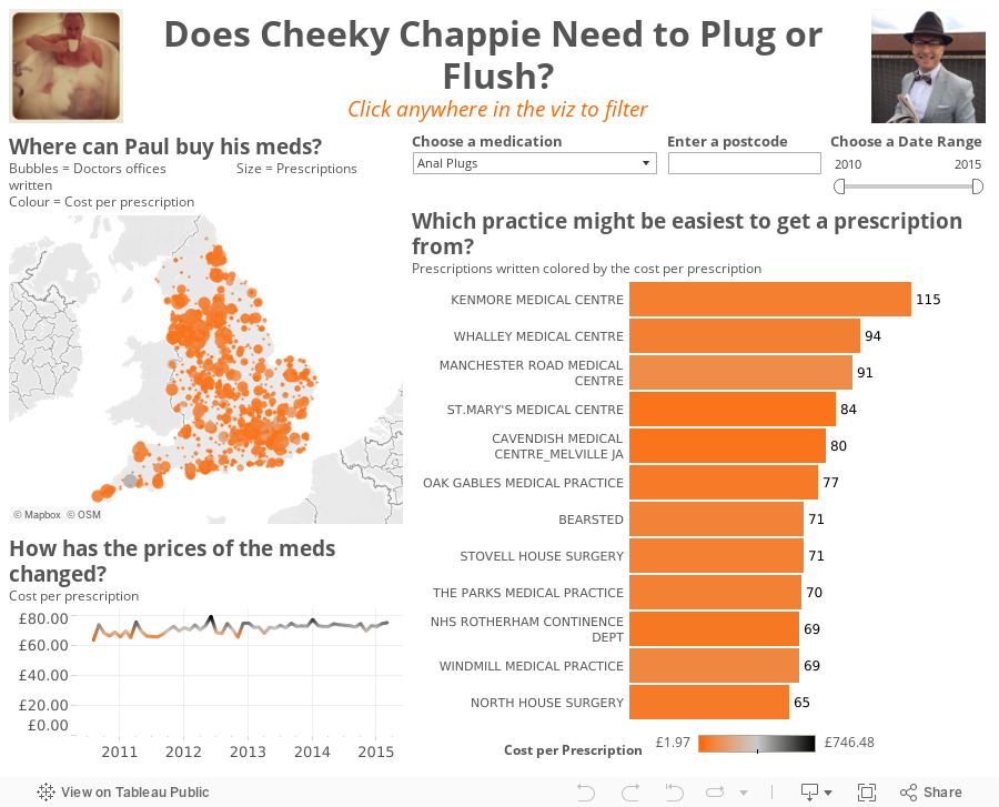
August 12, 2015
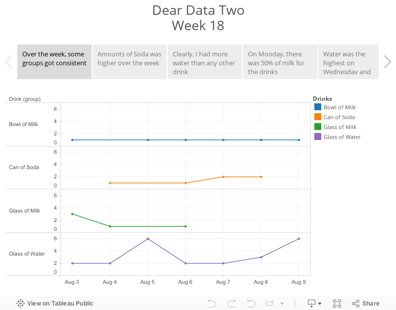
Dear Data Two | Week 18: Drinks
beer
,
circles
,
Dear Data Two
,
drinks
,
shapes
,
table calculation
,
water
No comments

I’m actually on time with this week’s postcard. This meant skipping a few weeks, but I’ll catch up on those. Week 18 was particularly fun for me for several reasons:
The data collection was really simple this week. I logged all of my drinks in a Google Sheet: date/time, drink type, and the amount. I’m still having issues with the Web Data Connector for Sheets, so I ended up needing to download the data to Excel and connecting it to Tableau.
I had to rip up two postcards because I messed up. I was trying to use coins for the circles, but it’s quite a pain to fill them in. I really need to buy a stencil kit, but the stationery stores here in London don’t carry them. Instead, my wife suggested using her circular paper cutters from her scrapbooking supplies. I cut holes in the birthday card my sister sent me (sorry sis) and used those for the patterns. This really sped up the process.
My wife also suggested using light pencil lines to sketch a grid on the postcard. This was immensely helpful as well because I had to make sure all of the circles would fit on the postcard and stay neatly aligned. I then used her white eraser to remove the lines at the end.
Lastly, I want to improve my handwriting by way of this project. I’ve always really liked the handwriting of architects. A quick Google (or is it Alphabet) search, turned up this YouTube video that gave me some good ideas and I feel like I’ve made giant strides already.
With all of this in mind, here is the week 18 visualisation. Note: my Friday night was NOT a typical Friday night. I’m fairly certain Jeffrey will be ashamed of me.
- My 13-yr old son did the project along with Jeffrey and me. He’s working on a blog post for his creation.
- It was fun seeing what I drank (and what I shouldn’t have).
- I learned more about custom shapes and table calculations (the learning never, ever stops).
- I really like how the postcard turned out; it’s probably my favorite so far.
The data collection was really simple this week. I logged all of my drinks in a Google Sheet: date/time, drink type, and the amount. I’m still having issues with the Web Data Connector for Sheets, so I ended up needing to download the data to Excel and connecting it to Tableau.
I had to rip up two postcards because I messed up. I was trying to use coins for the circles, but it’s quite a pain to fill them in. I really need to buy a stencil kit, but the stationery stores here in London don’t carry them. Instead, my wife suggested using her circular paper cutters from her scrapbooking supplies. I cut holes in the birthday card my sister sent me (sorry sis) and used those for the patterns. This really sped up the process.
My wife also suggested using light pencil lines to sketch a grid on the postcard. This was immensely helpful as well because I had to make sure all of the circles would fit on the postcard and stay neatly aligned. I then used her white eraser to remove the lines at the end.
Lastly, I want to improve my handwriting by way of this project. I’ve always really liked the handwriting of architects. A quick Google (or is it Alphabet) search, turned up this YouTube video that gave me some good ideas and I feel like I’ve made giant strides already.
With all of this in mind, here is the week 18 visualisation. Note: my Friday night was NOT a typical Friday night. I’m fairly certain Jeffrey will be ashamed of me.
August 11, 2015
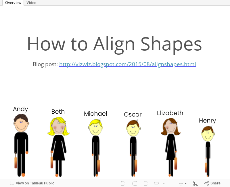
Tableau Tip Tuesday: How to Align Shapes

Last week, for Dear Data Two Week 12, I included a trick for aligning custom shapes. This week's tip is a demo of how that trick works and how you can do it yourself.
August 10, 2015
Makeover Monday: 12 Ways to Visualize the Gender Gap of Federal Workers
DNA
,
donut chart
,
dot plot
,
employment
,
gender
,
Jon Schwabish
,
Makeover Monday
,
nelson davis
,
pie chart
,
slope graph
,
wages
No comments

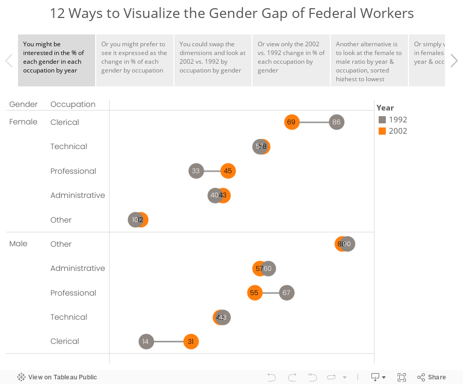
Good friend Nelson Davis provided another great makeover example for this week. It started with this tweet from Jon Schwabish:
What would you call these charts? Not pie charts...maybe "spilt pie charts"? | From http://t.co/jZZKbLnAl0 pic.twitter.com/cyqwtp8UYz
— Jon Schwabish (@jschwabish) August 5, 2015
As I was thinking about this makeover, I couldn't settle on a single best way to visualize this data. I did know, though, that these moons/pies/donuts/dots needed to communicate more effectively. I've come up with 12 alternatives, each of which works way better than the original. The reason there are 12 is because there are multiple ways to display the dimensions based on the story you want to emphasize. And yes, I could have come up with another 12.
Special thanks for Carl Allchin for his feedback and help with the text on the tabs in the story points.
August 7, 2015
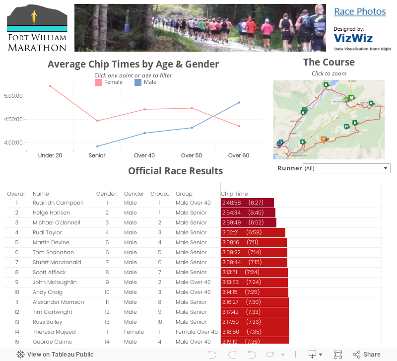
Fort William Marathon: Race Recap & Visualised Results
dashboard
,
fort william
,
interactive
,
marathon
,
running
,
time
4 comments
July 26th was a massive day for me. I'd been training since the start of April for the Fort William Marathon and this was the magical day that I would run my first marathon. It was an incredible experience on a very difficult course.
Naturally, to celebrate the marathon I had to take the results and visualise them with Tableau. All of the metrics are based on chip time, so the overall results may vary from the results on the marathon website (theirs are based on gun time).
For a first marathon, many people told me I was crazy for choosing this course, but I wouldn't trade it for anything. It was incredibly well organized, small, and the setting was second to none. Seriously, how often do you get to run in the Scottish Highlands?
 |
| I met Hairy Coo on my shakeout run Saturday. Quite the nice guy! |
 |
| Really happy with my result, especially with how much I stopped |
 |
| Finishers medal that I'll cherish forever |
 |
| Nothing beats your kids cheering you on and waiting for you at the finish |
For a first marathon, many people told me I was crazy for choosing this course, but I wouldn't trade it for anything. It was incredibly well organized, small, and the setting was second to none. Seriously, how often do you get to run in the Scottish Highlands?
Dear Data Two | Week 12: The Kriebel Family
alignment
,
Dear Data Two
,
demographics
,
family
,
infographic
,
people
,
shapes
1 comment

Week 12: People was clearly the simplest data collection I've done so far, yet the Tableau visualization and postcard took me the most time. The idea I started with was pretty simple:
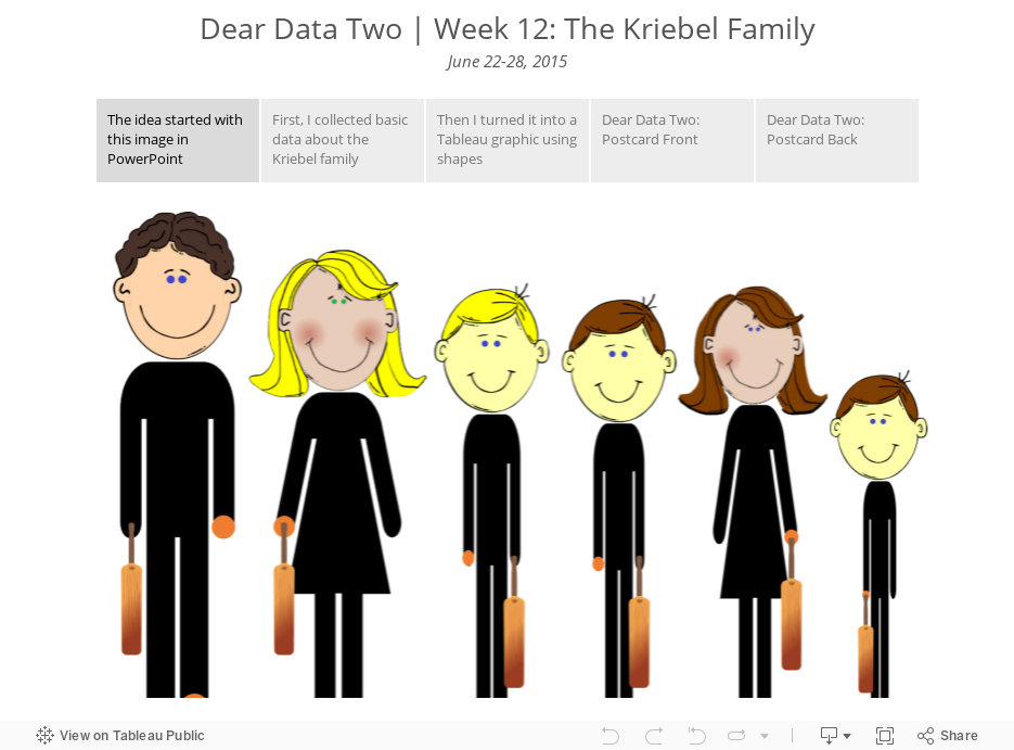
- Collection basic data about the characteristics of my family
- Use shapes in Tableau to create an infographic
- Translate the graphic to the postcard
Seems simple, right? I thought so too. The biggest problem was getting the shapes to align by their feet in Tableau. When you use shapes in Tableau, they are drawn outward from the center of the point. So what was happening was that we would all be aligned by the center of our bodies, not our feet.
Fortunately, I work with a lot of really sharp people. First, Damiana Spadafora, one of the students at the Data School, saw what I was working on and had apparently worked on a similar problem for her project last week. She pointed me to this post from Bora Beran, which is frankly quite amazing. I still couldn't get it quite right though, until Chris Love noticed Bora's trick. I'm not going to spoil the secret for you now. I'll detail it in a Tableau Tip Tuesday next week; it's pretty nifty!
Meanwhile, enjoy the story below...
August 4, 2015
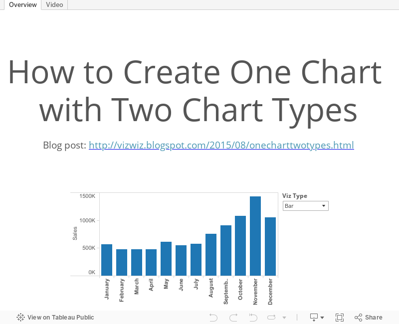
Tableau Tip Tuesday: Create One Chart with Two Chart Types
bar chart
,
dual axis
,
line chart
,
mark type
,
tableau
,
tip
,
Tuesday
No comments

I've previously written about how to create two chart types on a single chart, so this week I am presenting you with a recorded version of that same post.
August 3, 2015
Makeover Monday: Is the Average College Football Bowl Game Attendance Really on the Decline?
attendance
,
bar chart
,
change
,
college
,
football
,
line chart
,
Makeover Monday
,
year over year
No comments

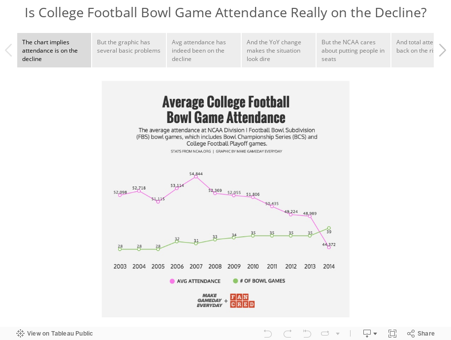
Tableau Zen Master Nelson Davis sent me an email telling me that this viz of college football attendance at bowl games is crying out for a makeover. I thought I would try something slightly different this week and use story points to help illustrate the problems and show the makeover.
August 2, 2015
Dear Data Two | Week 11: Emotions

Emotion: a strong feeling deriving from one's circumstances, mood, or relationships with others.
Week 11 could not have come at a more perfect time for me. I had so much going on in my life:
Throw in marathon training and needless to say, my emotions were all over the board. Basically, I was operating on fumes all week.
My data collection was pretty simple. Since I was already using IFTTT to log Swarm check-ins to Google Sheets, I simply added a column for my emotional state at the time of the check-in. I intentionally did not look back through the data until I was done because I didn't want to bias myself.
The summary is simple: I basically had the emotional state of an 6-month old. I found this to be a really fun analysis, one that I've never done before, and it gave me a very different insight into my week than I expected. Data for the win!
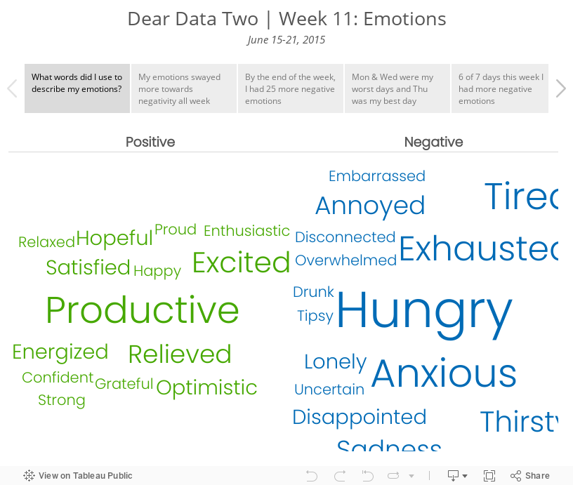
Week 11 could not have come at a more perfect time for me. I had so much going on in my life:
- Putting my family on a plane to Atlanta (before they headed to London a few weeks later)
- Saying my final goodbyes at Facebook
- Packing the rest of our stuff for storage
- Selling our car
- Saying goodbye to my sister
- Heading back to London
- Finishing prep for The Data School.
Throw in marathon training and needless to say, my emotions were all over the board. Basically, I was operating on fumes all week.
My data collection was pretty simple. Since I was already using IFTTT to log Swarm check-ins to Google Sheets, I simply added a column for my emotional state at the time of the check-in. I intentionally did not look back through the data until I was done because I didn't want to bias myself.
The summary is simple: I basically had the emotional state of an 6-month old. I found this to be a really fun analysis, one that I've never done before, and it gave me a very different insight into my week than I expected. Data for the win!
Subscribe to:
Posts
(
Atom
)


