Showing posts with label demographics. Show all posts
July 6, 2021
#MakeoverMonday Week 27 - If Only _____ Voted
biden
,
bump chart
,
Democrat
,
demographics
,
election
,
heatmap
,
Makeover Monday
,
republican
,
stacked bar chart
,
Trump
,
United States
,
USA
,
vote
,
voting
,
WatchMeViz
No comments

Resources:
1. Data Set - https://data.world/makeovermonday/2021w27
2. Original Viz - https://bit.ly/3qQGsAo
3. How to Create a Trellis Chart - https://www.vizwiz.com/2021/02/trellis-chart.html
4. The Data Visualisation Catalogue - https://datavizcatalogue.com/
The original was really good and I didn't particularly want to create a map. Instead, I wanted to visualize all of the demographics at the same time to see if any patterns emerged. I find them a bit hard to see in what I created, but when I know what I'm looking for (e.g., women vs. men) then the contrasts really stand out.
I create the heatmap the way I did for two reasons:
- To see across each metric in order to identify consistent blue or red patterns for an entire demographic (e.g., early voting or urban).
- To see if individual States always voted for Biden or Trump irrespective of the demographic (e.g., CA, MA, MD for Biden or KS, KY, LA for Trump).
There are parts of Watch Me Viz you can skip, like early on when I build some maps and try to join the data together (unsuccessfully) or when I change the data to Excel format.
Thanks for tuning in! Interact with the viz by clicking on the image below or here.
February 15, 2016
Makeover Monday: How Does Video Game Playing Vary by Demographic?
adults
,
bar chart
,
comparison
,
demographics
,
Makeover Monday
,
parents
,
radial chart
,
teens
,
video games
5 comments

This week’s Makeover Monday has a mix of good and bad parts. It comes to use from Forbes.

Let’s review this from top to bottom.
- The video game font they chose for the title is cute, yet the title itself doesn’t reflect what contained in the entire visualisation.
- I don’t understand why they chose to use a grey-to-white background. What value does that add? Remember, everything you include in a viz should have a purpose. If not, remove it.
- I really like the adults vs. teens section. In particular, I like how the bars start on opposite ends and come towards each other.
- Then we get to the parents vs. non-parents section. Why didn’t they continue the theme from the adults vs. teens section? Instead they chose some weird radial chart type thing that makes comparisons very difficult both between parents and non-parents and across platforms within a single category. Basically, this section is a disaster.
- The images of people playing videos games on a giant screen is cute, but it doesn’t enhance the viz in my opinion.
Click here to download the Tableau workbook.

August 7, 2015
Dear Data Two | Week 12: The Kriebel Family
alignment
,
Dear Data Two
,
demographics
,
family
,
infographic
,
people
,
shapes
1 comment

Week 12: People was clearly the simplest data collection I've done so far, yet the Tableau visualization and postcard took me the most time. The idea I started with was pretty simple:
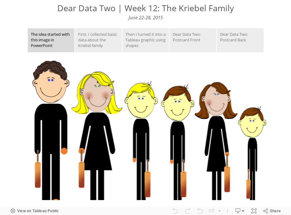
- Collection basic data about the characteristics of my family
- Use shapes in Tableau to create an infographic
- Translate the graphic to the postcard
Seems simple, right? I thought so too. The biggest problem was getting the shapes to align by their feet in Tableau. When you use shapes in Tableau, they are drawn outward from the center of the point. So what was happening was that we would all be aligned by the center of our bodies, not our feet.
Fortunately, I work with a lot of really sharp people. First, Damiana Spadafora, one of the students at the Data School, saw what I was working on and had apparently worked on a similar problem for her project last week. She pointed me to this post from Bora Beran, which is frankly quite amazing. I still couldn't get it quite right though, until Chris Love noticed Bora's trick. I'm not going to spoil the secret for you now. I'll detail it in a Tableau Tip Tuesday next week; it's pretty nifty!
Meanwhile, enjoy the story below...
June 2, 2014
Makeover Monday: The Face Pie - Taking an Analogy Too Far
chart junk
,
demographics
,
face pie
,
line
,
line chart
,
makeover
,
makeovermonday
,
pew research
,
pie chart
,
proportions
4 comments
Edward Tufte likes to say "the only worse design than a pie chart is several of them." Today's makeover takes this even one step farther. Someone at Pew Research decided that since the topic of their chart was "The Changing Face of America" that they should uses faces instead of pies.

Humans are poor at judging angles in a pie. I can't even imagine how bad we are at judging angles in obscure shapes. Also, the purpose of this graphic is to show change. It’s very difficult to understand trends in a series of face pies. I would present the data as a line chart like this:

Now it’s much, much easier to see the changing demographics of the United States. Keep it simple people!
Subscribe to:
Posts
(
Atom
)






