August 7, 2015
Dear Data Two | Week 12: The Kriebel Family
alignment
,
Dear Data Two
,
demographics
,
family
,
infographic
,
people
,
shapes
1 comment

Week 12: People was clearly the simplest data collection I've done so far, yet the Tableau visualization and postcard took me the most time. The idea I started with was pretty simple:
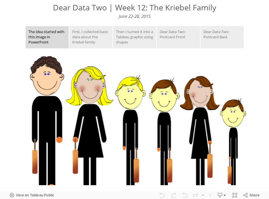
- Collection basic data about the characteristics of my family
- Use shapes in Tableau to create an infographic
- Translate the graphic to the postcard
Seems simple, right? I thought so too. The biggest problem was getting the shapes to align by their feet in Tableau. When you use shapes in Tableau, they are drawn outward from the center of the point. So what was happening was that we would all be aligned by the center of our bodies, not our feet.
Fortunately, I work with a lot of really sharp people. First, Damiana Spadafora, one of the students at the Data School, saw what I was working on and had apparently worked on a similar problem for her project last week. She pointed me to this post from Bora Beran, which is frankly quite amazing. I still couldn't get it quite right though, until Chris Love noticed Bora's trick. I'm not going to spoil the secret for you now. I'll detail it in a Tableau Tip Tuesday next week; it's pretty nifty!
Meanwhile, enjoy the story below...
Subscribe to:
Post Comments
(
Atom
)


This is quite interesting Andy. Looking forward to seeing the details. I can see this being used in showcasing any personalization projects.
ReplyDelete