December 17, 2020
How to Create a Dot Matrix Plot

Dot matrix charts are useful for visualizing the distribution and frequency of discrete data. They help you understand the scale and proportion. The purchase is to understand how many, not how much.
In this example, I'm using two colors to distinguish new vs. used cars. However, if you have only one variable or category, then stick to one color.
Resources:
- Workbook - https://bit.ly/DotMatrixPlot
- Data set - https://data.world/vizwiz/car-sales-mock-data

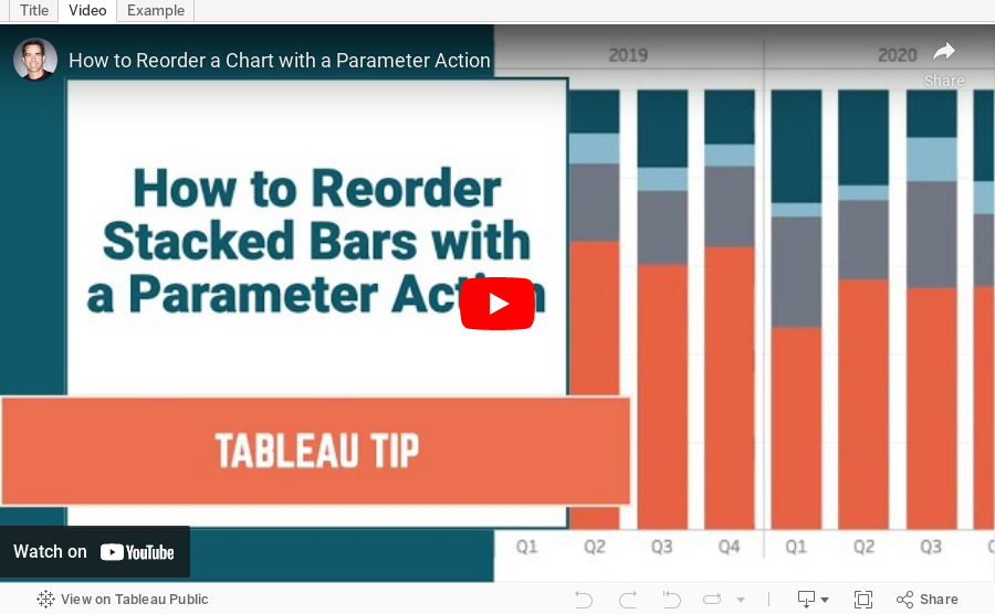
December 8, 2020
#TableauTipTuesday: How to Sort a Chart with a Parameter Action

- Build the chart
- Create a parameter
- Create a calculated field to sort the bars, then sort the Region field.
- Create de-highlight calculated field and place it on the Detail shelf
- Create a Parameter Action
- Create a Highlight Action
- Turn on Animations
- How to Reorder a Chart with a Set Action - https://www.vizwiz.com/2020/11/reorder-stacked-bars.html
- Data Set - https://data.world/vizwiz/superstore-20203
December 1, 2020
How to Create an Evenly Distributed Butterfly Chart

A Butterfly Chart is (typically) a bar chart where two sets of data series are displayed side by side. The purpose is to allow you to compare the two data series across a dimension.
Here is an example of a butterfly chart I created for Makeover Monday.

Notice how I have zero at the center and the scales are the same on either side of zero. This helps show how the chart "leans" to one side or the other.
The comparisons would be more difficult to see if the left and right hand sides of the butterfly did not have the same axis scale. In this video, I show you how two examples for creating a butterfly chart.