June 20, 2024
How to Simultaneously Highlight & Deselect with a Parameter Action in Tableau

May 15, 2024
#MakeoverMonday 2024 Week 20 - Exporting Freedom, One Bullet at a Time

I struggled mightily with this week's #MakeoverMonday. My goals was to replicate the original visualization by Bloomberg.
I knew I need to create path to connect the US at the center to each country.
I wanted to make the US the center of the of the map.
Sounds simple, right? I made it way harder than it needed to be.- I overthought the data prep.
- I forgot how to create the paths.
- I couldn't get the math right to offset the longitude.
The coloring and labeling was straightforward for me.
Adding the US as a circle in the middle was pretty simple.
To overcome the problems I facedI looked at a previous visualization I created using paths.
- I opened the workbook and the data to see the configuration.
- I replicated that set up by adding a second set of records to the data set.
- Viewers on the livestream helped me figure out the math to offset the longitude.
The simplest way to explain the location of each country is to think of the lat/lon for the US as 0,0. Then you compare that to the lat/lon for every other country to create the offset.
I got there in the end. What do you think? Was the juice worth the squeeze?
Click the image below to access the viz.
May 3, 2024
How to Make Your Cycle Plots Actionable in Tableau

Cycle plots are a fantastic way to identify seasonality in a data set. And you can make them even more useful by adding indicators for whether they are above or below the average.
Here's how you can do that in Tableau in only 2 minutes.
Like this? You'll love Next-Level Tableau. Learn more at nextleveltableau.com.
July 25, 2023
The Big Thaw: Exploring the Disappearing Antarctic Sea Ice

- Visualizations from chapter 12 of the Makeover Monday book that showed how to add context to visualizations
- Several of the vizzes from 2018 week 15, each with their own unique take on the data
- The original viz by The Guardian
September 12, 2022
#MakeoverMonday 2022 Week 37 - Berkshire Hathaway Holdings

During Watch Me Viz, I covered set actions, parameter actions, highlighting, boolean calculations, table calculation, dashboard layout, and I failed at a starburst chart (I couldn't get the years to sort properly; I'll post it when I figure it out).
Enjoy! Check out the viz below the video.
August 29, 2022
#MakeoverMonday 2022 Week 35 - The World's Biggest Military Spenders

Makeover Monday is back! Every Monday I'll be running a #WatchMeViz and every Wednesday, Eva will be running #VizReview. Subscribe to my YouTube channel for reminders of the latest events.
https://youtube.com/andykriebel
This week was a makeover of a visualization by Visual Capitalist about the top 10 military spenders. During Watch Me Viz, I iterated through 15 different charts before settling on a bump chart. If you want to learn about sets, parameters, table calculations, containers and more, watch the video below.
Below the video you can see my viz, or click here. Enjoy! If you need clarifications on anything, please comment on the video here.
June 28, 2022
How to Use the Highlighter to Set a Default Color Palette
April 5, 2022
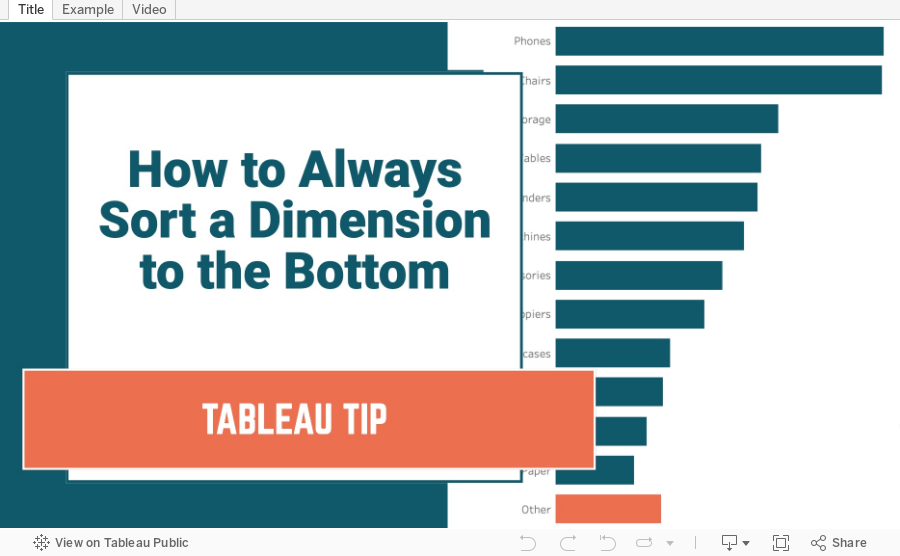
How to Always Sort a Dimension to the Bottom of a Chart
August 31, 2021
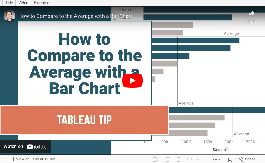
How to Compare to the Average with a Bar Chart

Context is important in data visualization. For every chart you create, consider asking yourself "compared to what?"
In this tip, I show you how to add context to a simple bar chart by showing whether a value is above or below the average.
April 12, 2021
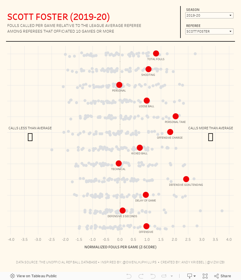
#MakeoverMonday 2021 Week 15 - Fouls Called by NBA Referees
The original viz for this week was so good that I struggled to come up with something different. In the end, I wanted to learn by recreating the original. Check out #WatchMeViz and interact with the viz below.

April 5, 2021
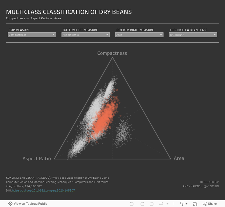
#MakeoverMonday 2021 Week 14 - Multiclass Classification of Dry Beans

March 1, 2021
#MakeoverMonday Week 9 - Seats Held by Women in National Parliaments in the EU


- Clear title
- Line chart is a good choice for a time series
- There are too many colors.
- What's the focus?
- The legend takes up a lot of space.
- The chart ratio is too flat.
- Overall, it's confusing and harder than necessary to find patterns.

February 23, 2021
Four Methods for Creating a Seismogram


February 9, 2021
How to Assign Highlight Colors to Palette


December 8, 2020
#TableauTipTuesday: How to Sort a Chart with a Parameter Action

- Build the chart
- Create a parameter
- Create a calculated field to sort the bars, then sort the Region field.
- Create de-highlight calculated field and place it on the Detail shelf
- Create a Parameter Action
- Create a Highlight Action
- Turn on Animations
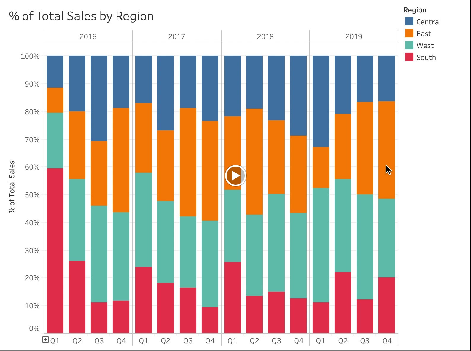
- How to Reorder a Chart with a Set Action - https://www.vizwiz.com/2020/11/reorder-stacked-bars.html
- Data Set - https://data.world/vizwiz/superstore-20203
November 12, 2020
How I Use Layout Containers (Part 2) - HR Analytics KPI Dashboard


September 9, 2020
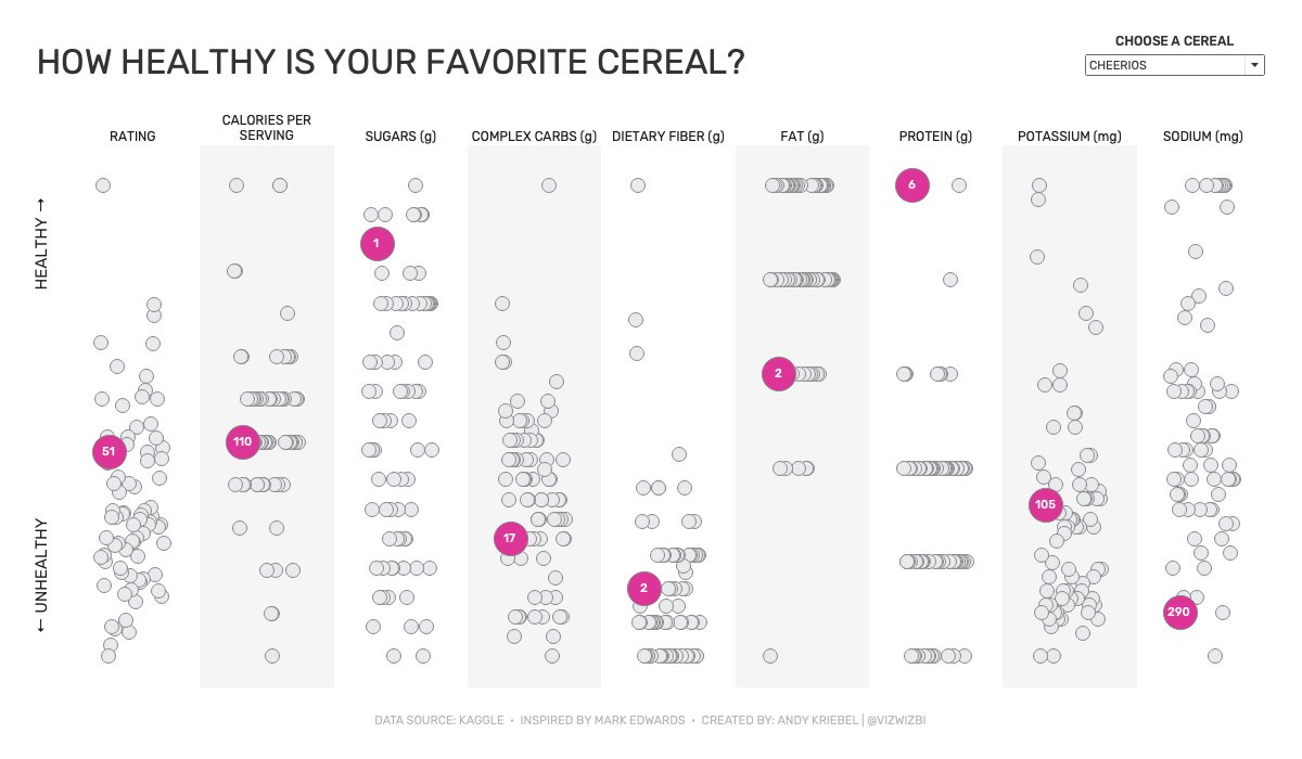
Watch Me Viz - #MakeoverMonday 2020 Week 36 - How Healthy Is Your Favorite Cereal?
June 8, 2020
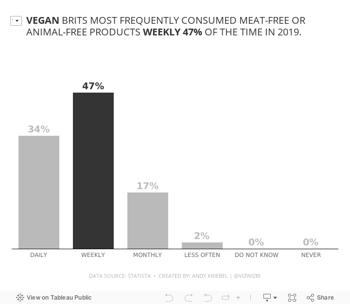
#MakeoverMonday Week 23 - Frequency of Meat-Free Consumption by Brits in 2019

June 2, 2020
#TableauTipTuesday: How to Compare to a Selected Value with a Set Action


February 25, 2020
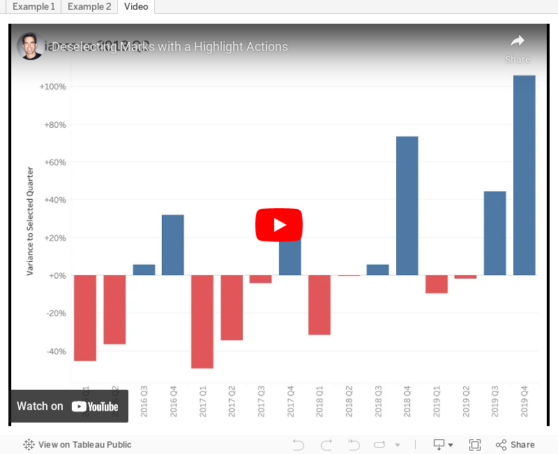
#TableauTipTuesday - Deselect Marks with a Highlight Action
- Using a set action to click on a region and sort a stacked bar chart based on that region, then use a highlight action to deselect the region selected.
- Using a set action to compare quarterly sales to the sales of a selected quarter. Then use a highlight action to deselect the quarter selected.