VizWiz

Launch, grow, and unlock your career in data
Showing posts with label tableau tip. Show all posts

May 25, 2026

The Big Beautiful Bar Chart: Build It in Tableau with Map Layers

No comments
In this video, I show you how to build what I call the Big Beautiful Bar Chart in Tableau. It combines colored bars, a budget reference line, donut charts, and clean labels all in one view using Map Layers. It looks stunning and it tells a complete story.

Here's what you'll learn:

- How Map Layers work and why they unlock chart types Tableau can't build any other way
- How to set up your data with a five-point scaffold to draw filled rectangles as bars
- How to use LOD expressions instead of table calculations (and why it matters for Map Layers)
- How to add a dotted budget line, sales labels, region labels, and a percentage label as separate layers
- How to control mark interactivity, opacity, and alignment across multiple layers

By the end, you'll have a chart that looks like it took hours but follows a repeatable process you can apply to any dataset.

If you can build this, you're already operating at a high level. Next Level Tableau is where analysts like you go to push further, work alongside the best in the datafam, and get direct access to live training with me every week.


April 22, 2026

How to Make Your Worksheet Actions Work on a Dashboard

No comments
In this video, you'll learn:

- Why worksheet actions break on dashboards
- The exact menu path to find and fix it (Dashboard → Actions → Edit)
- How to switch the source from the worksheet to the dashboard
- How to verify your target set is still correctly configured before closing

Like this? You'll love Next-Level Tableau. Learn more here.

April 17, 2026

Build a Marginal Histogram with Map Layers in One Sheet

No comments
Most Tableau analysts have never heard of a marginal histogram — and even fewer know how to build one. In this video, I'll show you how to create this advanced visualization from scratch on a single sheet using Tableau's map layers feature.

This technique uses the "Flat Earth" concept to treat your entire canvas as a coordinate system, letting you draw fully custom polygon shapes — no extensions, no workarounds. We'll build a heatmap with bar charts on two axes simultaneously, all driven by calculated fields and LOD expressions.

We're using Trump's Truth Social posting data as the dataset, but the technique works with any time-based data you want to analyze by day and hour.

What you'll learn:
- How Tableau's map layers work and why they unlock charts that don't exist natively
- The Flat Earth coordinate system — how to turn any data into drawable polygons
- Building rectangle polygons using 5-point path calculations
- Creating marginal bar charts (vertical + horizontal) on the same sheet
- LOD expressions to normalize bar lengths across dimensions
- Cleaning up the view: hiding headers, labels, and axes for a polished final result

Download the workbook, data and all of the calculations - https://nlt.kit.com/histogram

-----

Want to go from good to elite in Tableau?
Join Next Level Tableau — 3 live classes per week, office hours, and a community of analysts who take their craft seriously. Use code AUSTIN for $50 off your first month.


February 23, 2021

Four Methods for Creating a Seismogram

No comments
A Seismogram is an alternative to a circle timeline. They are a great way of showing change over time, and are particularly effective when there are big variations in the dataset.

In this video, I show you how to build several version of a Seismogram:

1. Discrete Dates with horizontal lines
2. Continuous Dates with horizontal lines
3. Continuous Dates with vertical lines
4. Gantt chart Seismogram

December 1, 2020

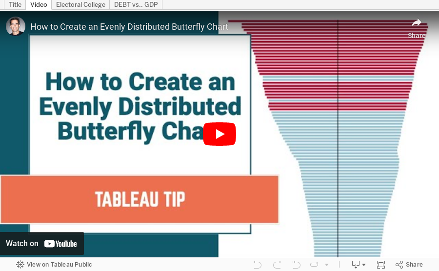
How to Create an Evenly Distributed Butterfly Chart

No comments

A Butterfly Chart is (typically) a bar chart where two sets of data series are displayed side by side. The purpose is to allow you to compare the two data series across a dimension. 

Here is an example of a butterfly chart I created for Makeover Monday.


Notice how I have zero at the center and the scales are the same on either side of zero. This helps show how the chart "leans" to one side or the other.

The comparisons would be more difficult to see if the left and right hand sides of the butterfly did not have the same axis scale. In this video, I show you how two examples for creating a butterfly chart.
November 24, 2020

How to Create a Combination Bar Chart & Candlestick Chart

No comments

In a recent Makeover Monday #WatchMeViz, I showed how to create a bar chart to compare two measures and then add a candlestick chart as well to show the difference between the two measures. It's actually quite simple; it requires some knowledge of:

  1. How Measure Names and Measure Values work together
  2. How to create a combined axis chart
  3. How to create a dual axis chart
  4. How to create a Gantt chart

In this video, I show you how to do just that. Enjoy!