December 20, 2021
How to Filter by Rank Across Multiple Worksheets
In this tip, I show you how to use a parameter to filter the rank across multiple worksheets or an entire dashboard.
December 8, 2021
#WOW2021 Week 45: Customer Purchasing Habits (RFM Analysis)

December 7, 2021
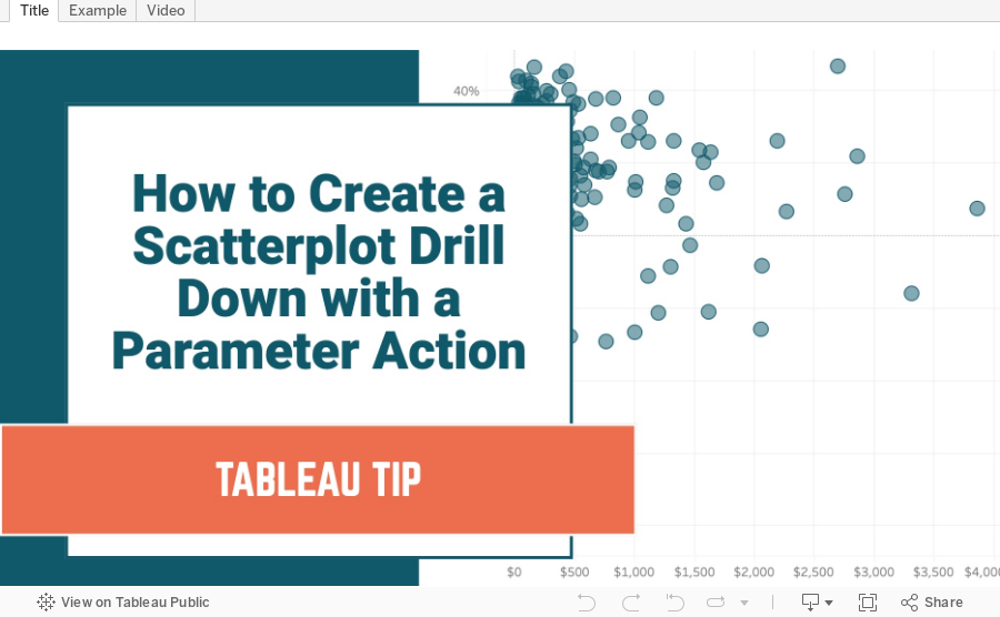
How to Create a Scatterplot Drill Down with a Parameter Action
In this example, I show you how to create an interactive scatterplot that allows the user to select a mark in a scatterplot to drill down to the underlying data. This tutorial shows you how to drill down from Sub-Category to Product. This process will work for any two dimensions.
October 14, 2021
How to Embed a Google Slides Presentation in a Tableau Dashboard
Let's say you are giving a presentation that includes both slides and Tableau dashboards/charts. You'd rather not switch back and forth between applications. You'd prefer to have it all in Tableau.
It's super simple with Google Slides. In this tip, I show you how to embed a Google Slides presentation in a Tableau dashboard.
NOTE: The Google Slides presentation will not render on Tableau Public, but it will work if you download it and open it on your computer. Download the workbook here.
September 29, 2021
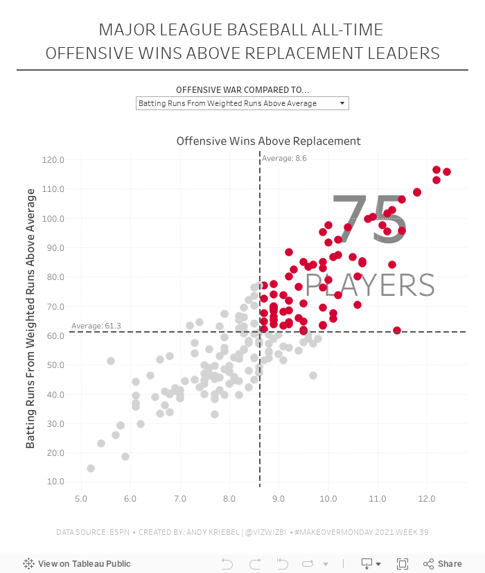
#MakeoverMonday 2021 Week 39 - MLB All-Time Offensive Wins Above Replacement

September 21, 2021
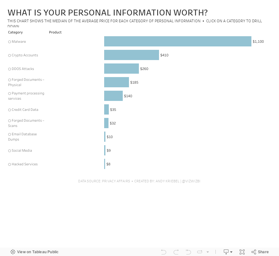
#MakeoverMonday 2021 Week 38 - What is your personal information worth?

Short and sweet this week. The data set is about the price of personal information on the dark web. There are three fields: Category, Product, and Price. To me, this looks like Superstore, so that's how I approached it. How can I visualize two fields that have a hierarchy?
In the video, I show you how to create a drill down with both a set action and a parameter action. Here's the video and below is the visualization.
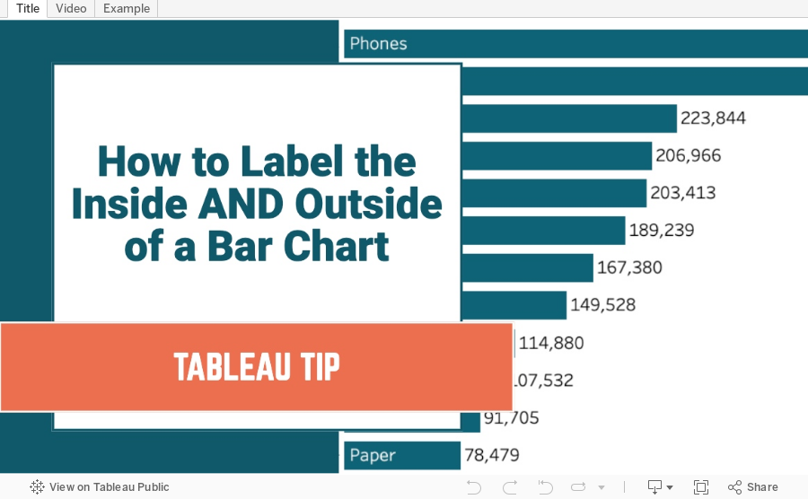
How to Label the Inside and Outside of a Bar Chart
September 14, 2021
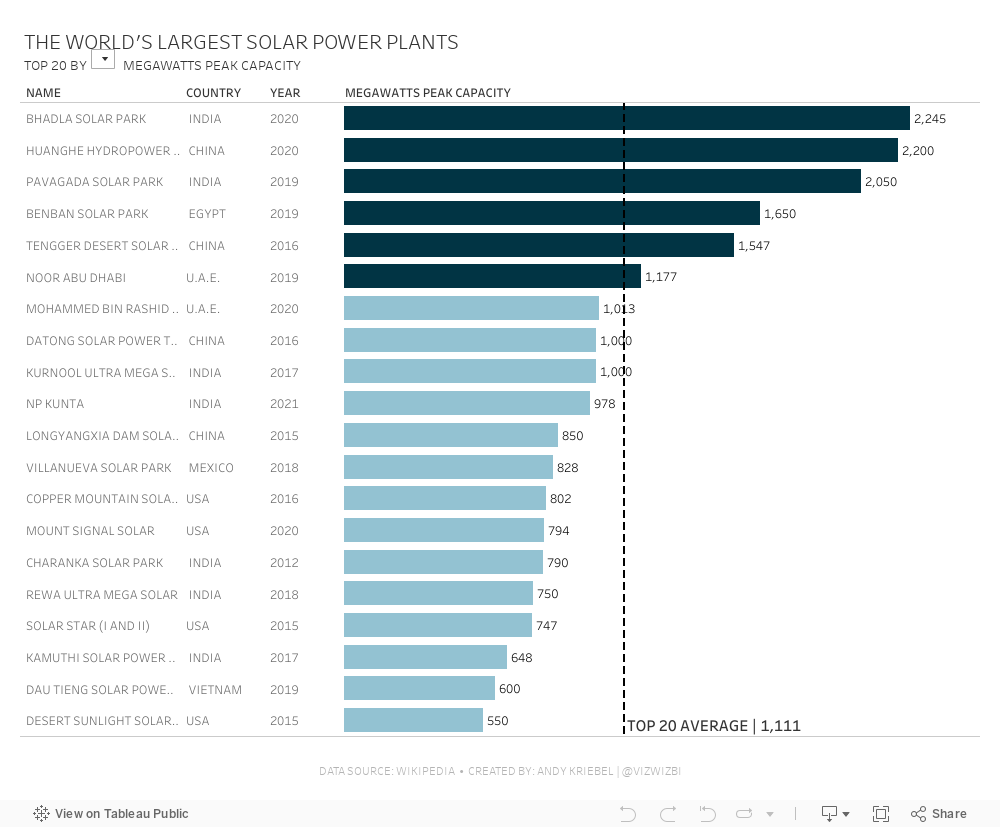
#MakeoverMonday 2021 Week 37 - The World's Largest Solar Power Plants

September 7, 2021
How to Create a Bar Chart Without an Axis
Did you know you can create a bar chart without using the rows or columns shelf? Check out this super simple tip to see how it's done.

September 6, 2021
#MakeoverMonday 2021 Week 36 - How Has American Support For Abortion Changed Since 1975?

Despite the massive setback to women's right in Texas, less Americans are anti-abortion than in 1975. Now maybe if the barbaric dinosaurs in Congress in Texas came into the 21st century, they'd finally realize women are our equals and we shouldn't control them. It's all very, very disgusting. They should be ashamed, but of course they're not. In fact, they are quite proud of what they "achieved".

August 31, 2021
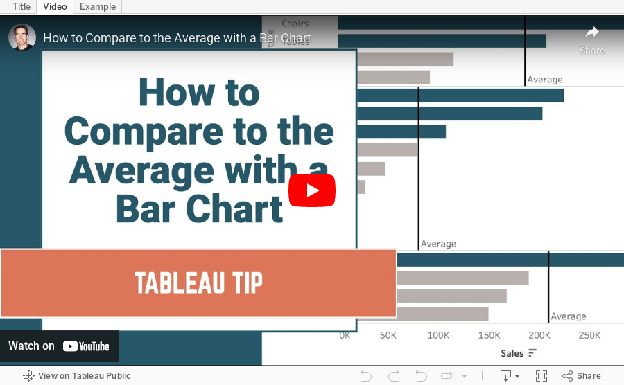
How to Compare to the Average with a Bar Chart

Context is important in data visualization. For every chart you create, consider asking yourself "compared to what?"
In this tip, I show you how to add context to a simple bar chart by showing whether a value is above or below the average.
August 30, 2021
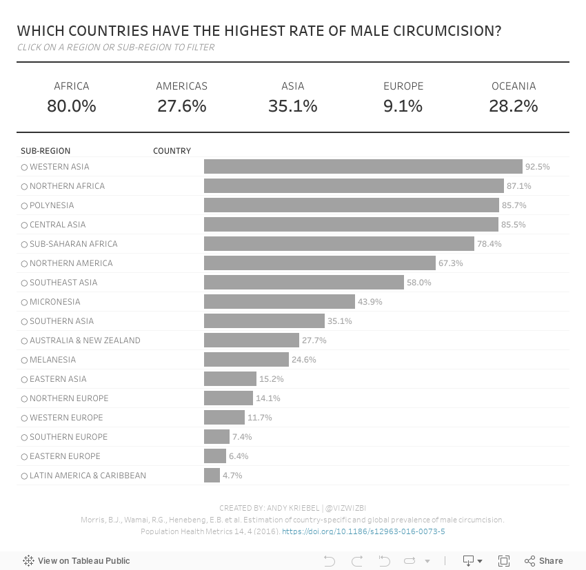
#MakeoverMonday 2021 Week 35 - Male Circumcision Around the World

In this week's Watch Me Viz, I started by showing the original visualization, demonstrated how to make a non-geographical field geographical, and then I spent lots of time working through set action drill down.
I showed how to do drill down to two and three levels of dimensions in a hierarchy. Lastly, while building the dashboard, I also showed how to move fields you select in an action to the top of the view with a sorting calculation.
Enjoy!
August 24, 2021
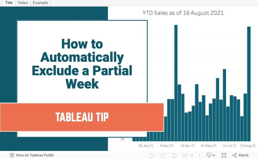
How to Automatically Exclude a Partial Week
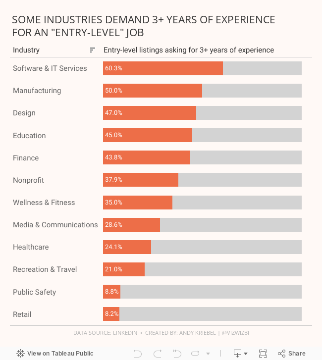
#MakeoverMonday 2021 Week 34 - Entry-Level Jobs on LinkedIn Requiring 3+ Years Of Experience

August 19, 2021
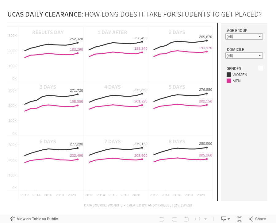
#MakeoverMonday 2021 Week 33 - UCAS Daily Placements

August 9, 2021
#MakeoverMonday 2021 Week 32 - Mortality Rates in England and Wales

I couldn't find too much to do with this week's data set, so I ended up with some simple BANs and line charts that take the original and reorganize them a bit to make them more clear.
Resources:
- Data set - https://data.world/makeovermonday/2021w32
- Chart Guide - https://chart.guide/
- Final Viz - https://bit.ly/mm2021w32
August 4, 2021
#MakeoverMonday Week 31 - Bicycle Collisions in London

- Final Viz - https://bit.ly/mm2021w31
- London Shapefiles - https://data.london.gov.uk/dataset/statistical-gis-boundary-files-london
- Data set - https://data.world/makeovermonday/2021w31
- Original Visualization - https://bikedata.cyclestreets.net/collisions/
- Watch Me Viz - https://youtu.be/ZpuX4TLqBxQ
July 26, 2021
#MakeoverMonday 2021 Week 30 - America's Racial Breakdown by State

Makeover Monday week 30 looked at this viz from Visual Capitalist showing the percentage of each race in each State in America.
In the video below, you'll see my recreate the tiled treemap before creating a tiled bar chart. Thanks for watching!
Click here to view the interactive version on Tableau Public.

July 21, 2021
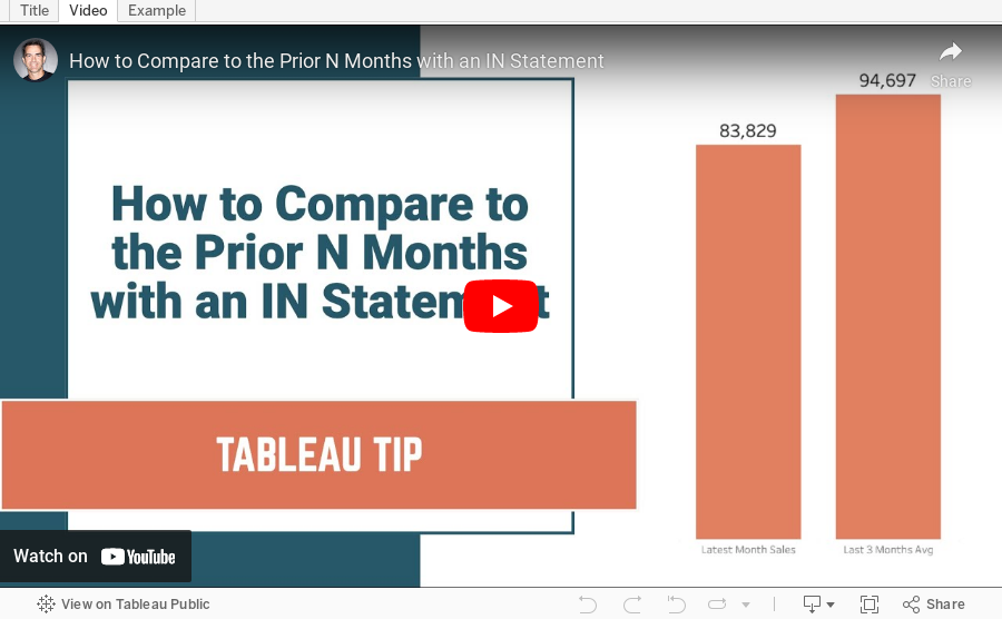
How to Compare to the Prior N Months Using the IN Function
July 19, 2021
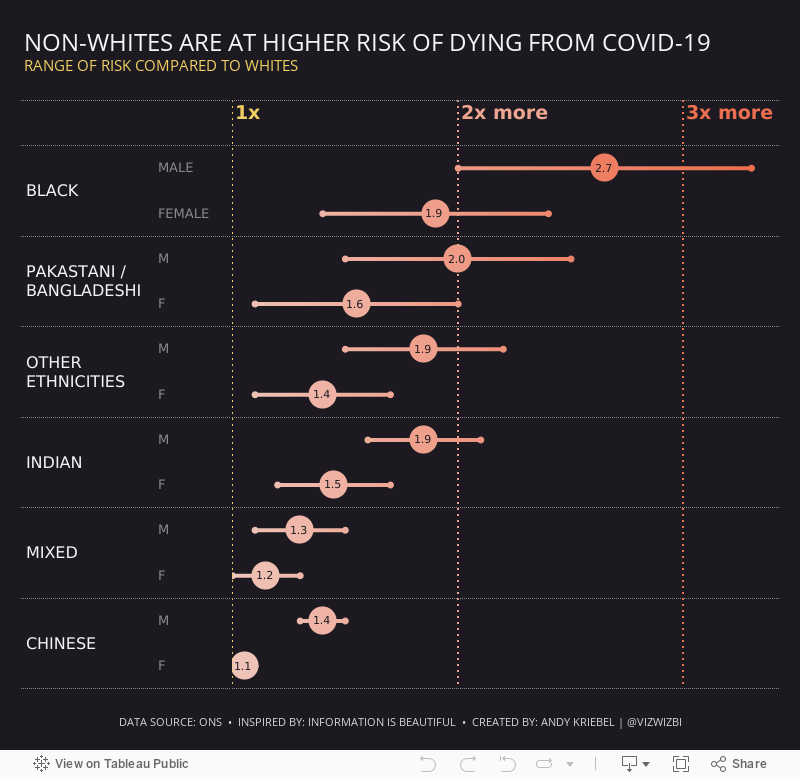
#MakeoverMonday 2021 Week 29 - Non-Whites Are At Higher Risk of Dying From COVID-19

Another COVID-19 data set this week and a great visualization that shows how much more likely ethnic minorities in the UK are to die from COVID.
In the video, I worked through rebuilding the original viz since I liked it so much. Interact with the viz below the video.
July 12, 2021
#MakeoverMonday 2021 Week 28 - COVID Vaccination Rates by Ethnicity and Age in England


