Showing posts with label color picker. Show all posts
July 31, 2023
#MakeoverMonday 2023 Week 30 - Drinking Fountains in Milan
color
,
color picker
,
dashboard
,
drill down
,
drill up
,
dynamic zone visibility
,
fountains
,
hexbin
,
how to
,
interactivity
,
Italy
,
Makeover Monday
,
map
,
milan
,
parameter
,
parameter action
,
shapes
,
spatial join
,
tableau
No comments

In this video, I analyzed the locations of drinking fountains in Milan.
You'll learn about:
You'll learn about:
- Joining spatial data sources
- Parameters
- Hexbin maps
- Custom shapes
- Using mapbox maps
- Dashboard layout containers
- Dynamic Zone Visibility
- Parameter Actions
- Custom colors
- Drill down / drill up actions
Enjoy the video and check out the viz below.
December 6, 2022
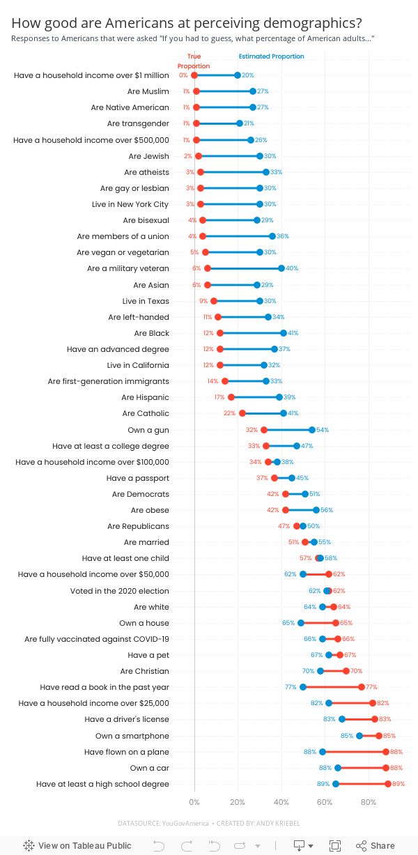
#MakeoverMonday Week 49 - How good are Americans at perceiving demographics?
America
,
barbell chart
,
color picker
,
dashboard
,
dot plot
,
formatting
,
gridlines
,
how to
,
labels
,
line chart
,
Makeover Monday
,
measure names
,
measure values
,
reference line
,
survey
,
tableau
,
tooltip
,
YouGov
No comments

Easy to replicate:
- Barbell chart with dots on the ends and a line connecting them
- Coloring the lines by the larger value
- Choosing the colors
- Formatting the view (except the labels)
Challenges/things that should be easier:
- Labeling the dots/ends of the lines; this took several iterations on the calculations
- Creating the color legend as headers; I had to use reference lines, turn on totals, move the totals to the top, then work on the formatting to get them close. They still aren't perfect.
- Creating the horizontal reference lines; this required me to create a dummy axis
While there are only 3 challenges, I estimate those three challenges took 75-80% of my time. I can only imagine how much more productive I could be if formatting didn't take so long.
In the end, I'm satisfied with how close I got to recreating the original chart. I like the additional context I added by coloring the lines connecting the dots.
If you missed #WatchMeViz, check it out below. Below the video is my final visualization.
July 19, 2021
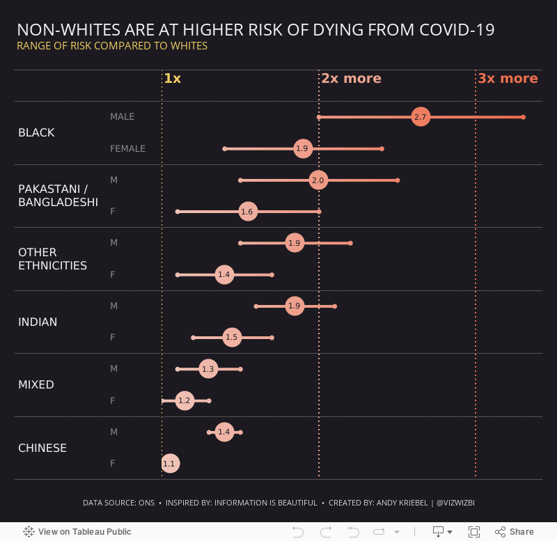
#MakeoverMonday 2021 Week 29 - Non-Whites Are At Higher Risk of Dying From COVID-19
chart
,
circle
,
color
,
color picker
,
connected
,
covid
,
custom sequential
,
formatting
,
graphs
,
Information is Beautiful
,
line
,
Makeover Monday
,
measure names
,
measure values
,
shape
,
tableau
No comments

Another COVID-19 data set this week and a great visualization that shows how much more likely ethnic minorities in the UK are to die from COVID.
In the video, I worked through rebuilding the original viz since I liked it so much. Interact with the viz below the video.
Subscribe to:
Posts
(
Atom
)






