October 31, 2017
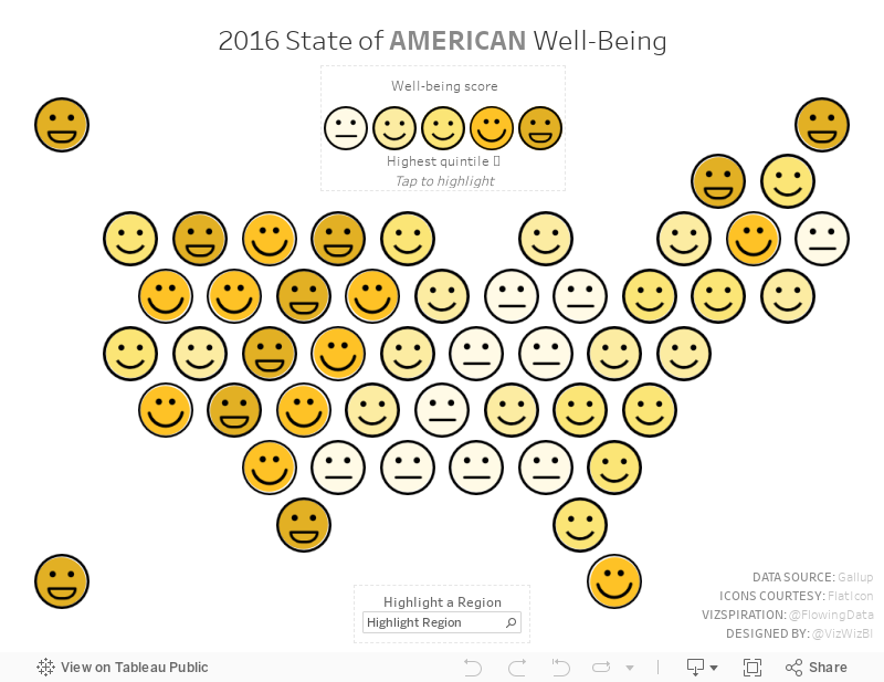
Mapping American Happiness
America
,
emoticons
,
FlowingData
,
happiness
,
map
,
smile
,
United States
6 comments

Being inspired by this viz, I wanted to see if I could recreate it in Tableau. In particular, I wanted to make it interactive by allowing the user to:
- Hover over the legend to highlight the States in each quintile
- Highlight an entire region (as an alternative to Nathan's dotted lines dividing the regions)
- View detail in the tooltip
- See a custom mobile version
With this, here's my vizspiration about American happiness.
October 30, 2017
Makeover Monday: Does having a lot of public holidays lead to a happier country?

What works well?
- People understand and like maps so this will capture their attention
- Using a consistent color scale for all countries
- Ensuring countries with no data are white (kind of like blanking them out)
- Simple tooltips
What could be improved?
- Red has a negative connotation, is this the best use for red? I'd say not.
- It can be difficult to compare countries.
- Using a filled map can make smaller countries impossible to find. Take Europe as an example; it's nearly impossible to see European countries without zooming in.
- Using the search and entering a continent zooms you in way too far. This is completely broken.
- There's no title. If you saw this independently of the article, you would have no idea what it's about.
My goals
- Make comparing countries easier
- Consider supplementing the viz with additional data
- Use story points for a step-by-step makeover
- Answer a simple question: does more public holidays mean a happier country?

October 25, 2017
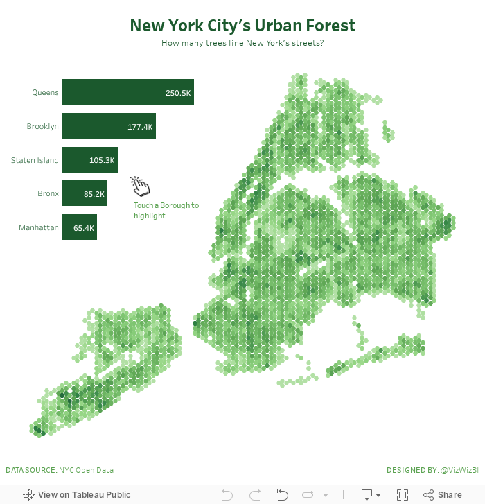
Overcoming Burnout, Hexbin Maps and New York City's Urban Forest
hex map
,
hexbin
,
Matt Chambers
,
nature
,
new york city
,
trees
3 comments
How do I overcome burnout?
For me, the best way to overcome burnout isn't to stop; that would mean not doing what I love to do. What works for me is to switch to something in my backlog, to work on a project I've been putting off, to learn something new or maybe to practice a technique. This helps re-energize me.
I can't recommend this strategy to everyone; burnout is tough. Sometimes the right decision IS to stop everything, to decompress, to get away from it all. I've done that before and it works as well. More often than not, though, I get sad when I'm not using Tableau. It's a product that has fundamentally changed my life. I'm an addict.
New York City's Urban Forest
Last night while I was preparing for Workout Wednesday, I had an idea to practice hexbin maps. Why that popped into my head I have no idea, but I went with it. I looked for a dataset that would work well as hexbins. I searched my emails and found this visualisation about trees in New York City. Fortunately NYC makes the location of every tree available here.
Why does this dataset work well with hexbin maps? According to Mapbox:
Binning is a great alternative technique for visualizing density when working with large data sets.
So, burnout temporarily overcome and I got to practice a technique I hadn't used in a while. That's a win win for me! Enjoy!
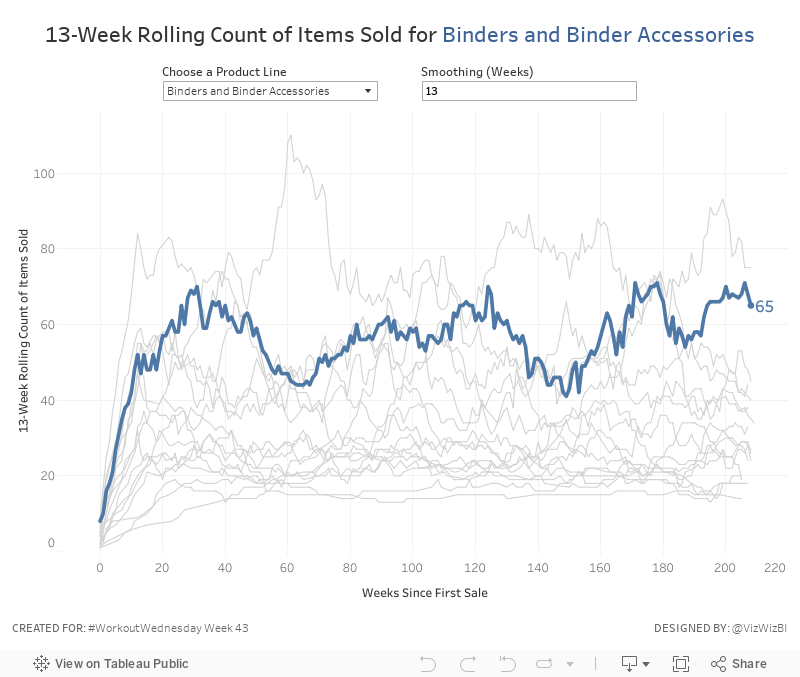
Workout Wednesday: The Seasonality of Superstore
This week's challenge builds upon Ben's work. First, you'll need this version of Superstore (which is different to Ben's but the same one I normally use for WW).Anyone ever noticed a seasonal trend in the number of products sold in the binder category before? #SampleSuperstoreInsights @tableau pic.twitter.com/zmTJeli7Yv— Ben Moss (@benjnmoss) October 15, 2017
Here are your requirements:
- Create a line chart of the rolling N week cumulative products sold since the first week each product sub-category was sold. In this case, a product sold is the count of the product names.
- Allow the user to pick a sub-category to highlight. Make it blue and all others grey.
- The sub-category highlighted should also be slightly thicker than all other sub-categories.
- Allow the user to define the number of weeks over which to compute the smoothing. The user should only be able to enter values between 8 and 52.
- The title and the y-axis should update dynamically based on the number of weeks entered for the smoothing.
- Match the tooltip in the chart
That's it! Nothing overly complicated this week. Good practice for calculations though! Enjoy!
October 24, 2017
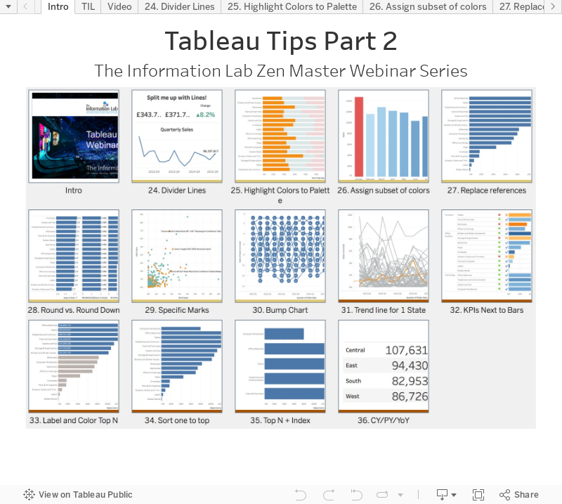
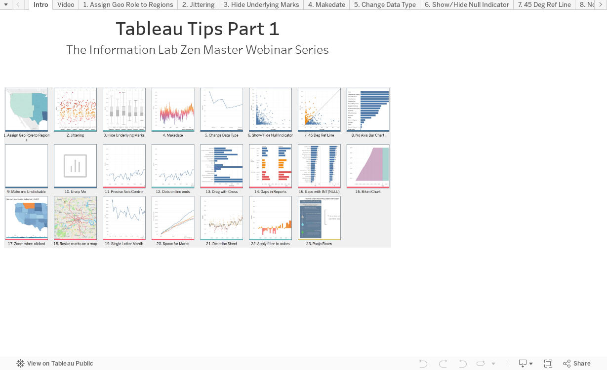
Tableau Tip Tuesday - The Information Lab Zen Master Webinar Series - Part 2
You can register for my final tips webinars here: 31 Oct @ 2pm BST.
Below is a workbook with all of the tips I shared today and the recording...enjoy!
October 23, 2017
Makeover Monday: How does my personality type compare to the U.S. population?

What works well?
- It's easy to look up your own personality type.
- Showing the distribution of each type along with the range
- The title of the article is "How frequent is my type?" and that question can be answered.
- Showing the distribution across the four major personality dichotomies as a total
What could be improved?
- The most frequent types are the two left columns and two bottom rows. I don't get that. Surely there's a way to better organize this.
My goals
- Show how my results compare to the general population
- Make something more visual
- Get it done quickly (I'm suffering from MM burnout)
With that, here's my Makeover Monday week 43.
October 20, 2017
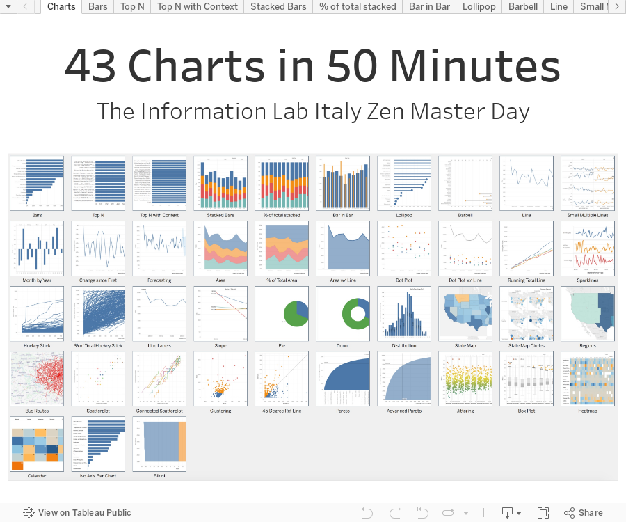
43 Charts in 50 Minutes | The Information Lab Italy Zen Master Day
charts
,
Italy
,
tableau
,
tips
,
zen master
7 comments
This afternoon, I wanted to do a slightly different take on what was supposed to be a tips session. Instead of tips, I decided to build as many charts as I could in 50 minutes. I got up to 43! I feel pretty good about that!
In the tweet below, you can watch Eva talk about Exasol and give a great demo. My tips start around the 40 minute mark.
Live From #Milan for @infolabIT @VizWizBI in #Tableau #Tip and #Tricks and #Makeovermonday with @TriMyData #vizmilan https://t.co/hjbrZukqLy— The Information Lab (@infolabIT) October 20, 2017
Want the tips I shared? Well, here you go! Enjoy!
October 19, 2017
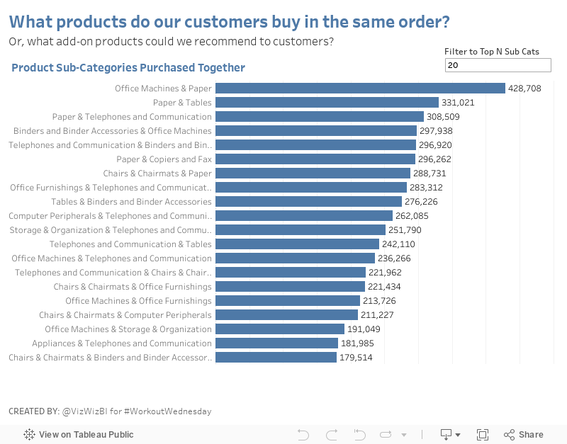
Workout Wednesday: Market Basket Analysis
cross selling
,
market basket analysis
,
self-join
,
table calc
,
table calc filter
,
Workout Wednesday
8 comments
Emma indicated that you would need to use a PC and I'm on a Mac. This, however, didn't pose a challenge.
STEP 1: Join the data to itself
The idea here to join the two Orders tables by Order ID. This self-join allows us to see the cross selling of each line item in each Order ID with all other line items with the same Order ID.
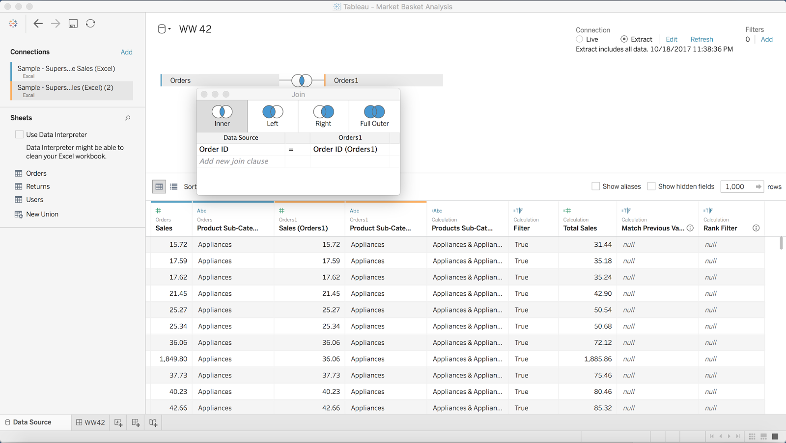
STEP 2: Filter out sub-categories that are the the same in both data sources
The goal of this filter is to remove any product sub-category that joins to a product sub-category with the same name. To do this, I created a simple boolean calculation, then added it to the Filters shelf and selected False.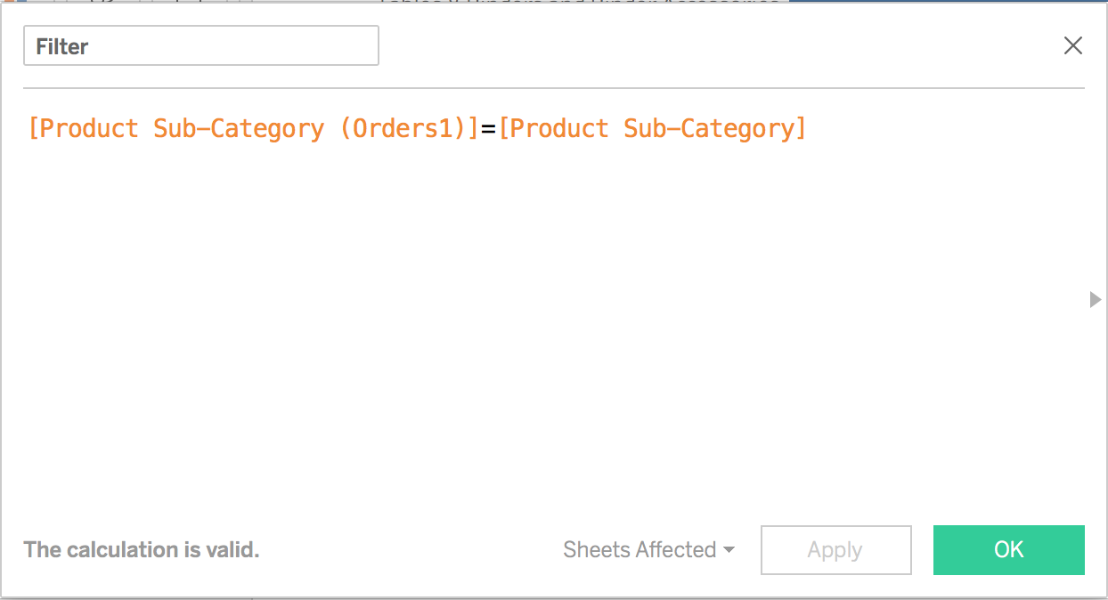
STEP 3: Create a Total Sales calculation
This is pretty straight forward. Simply take the two sales measures and add them together.

STEP 4: Combine the sub-categories to get a list of the products that sold together
You could do this with a combined field, I merely prefer to write the calculation.

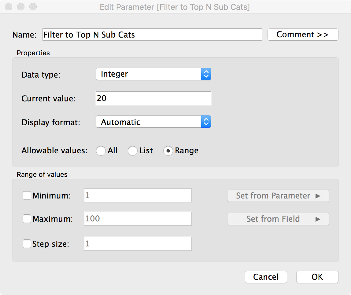
STEP 5: Create the Top N parameter and show the parameter control
STEP 6: Build a bar chart of the sub-categories purchased together sorted by Total Sales

Notice that I now have every combination of product sub-categories purchased together duplicated. I'll need a couple table calcs to fix this.
STEP 7: Check if the current row matches the previous row
With this calculation, I'm checking for duplicates. If I get "True" back as a result, then that means it's a duplicate. Notice here that I'm rounding the sales. I had to do this because Tableau wasn't matching the sales for some reason.
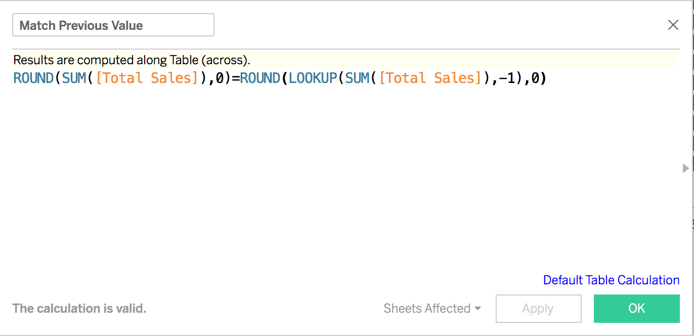
By excluding the "True" results with a table calc filter, I now have removed the duplicates.
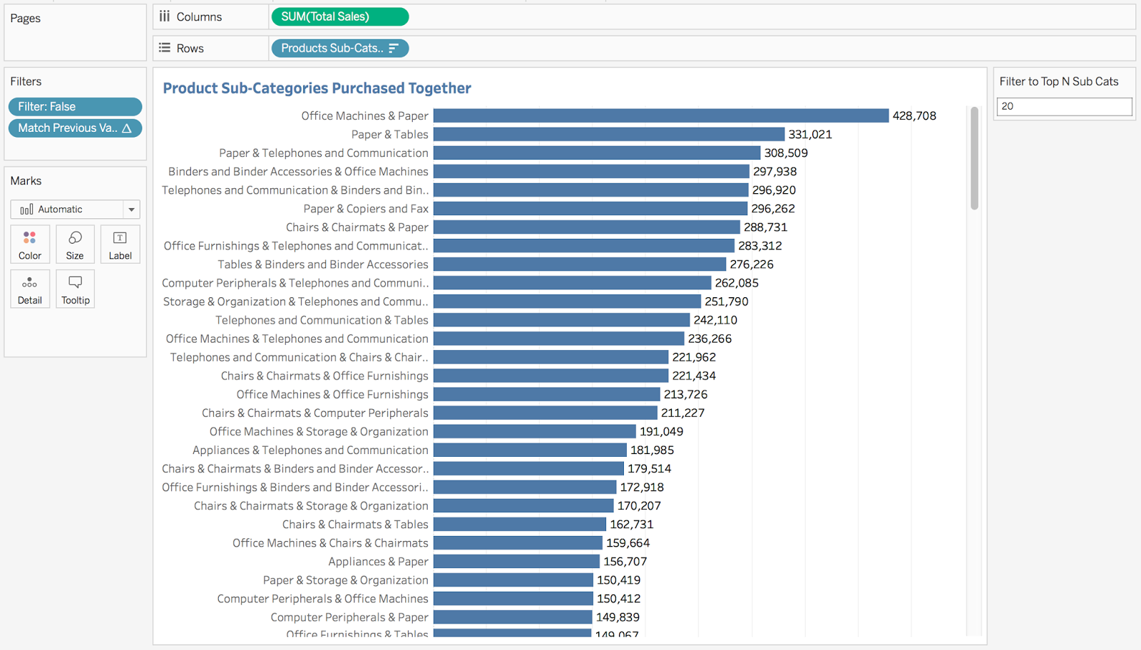
STEP 8: Filter to the top N sub-categories
Again, I need a table calc filter. I need to rank the total sales, but since I have twice as many records (the previous table calc filter essentially just "hides" the other rows), I need to take twice as many rows as I indicate in the parameter.
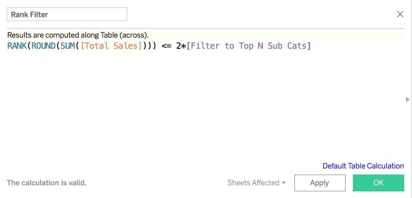
Drag this calc to the Filters shelf and choose True and I have the results I want.
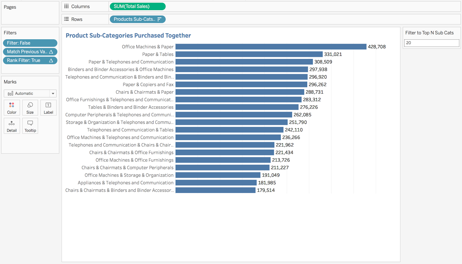
STEP 9: Build the final dashboard
October 17, 2017
Tableau Tip Tuesday - The Information Lab Zen Master Webinar Series - Part 1
You can register for my next two tips webinars here:
This morning I went through the first 23 tips. I recon I have another two hours of content, so look for webinars over the next two weeks at 2pm UK time. Register here.
Below is a workbook with all of the tips I shared today and the recording...enjoy!
October 16, 2017
Makeover Monday: Ranking Drivers in Formula-E
First, let's look at the table of results.

What works well?
- When looking at results in events, it never hurts to have the results in finishing order.
- Including the pictures of the players helps make it more personal.
- Showing the gap to first place helps provide context on how much the winner won by.
What could be improved?
- There no sense of how the driver has done over time. Are they getting better or worse? You can't tell.
- There's very little detail about what the stats mean. Definitions would be helpful for an audience to which this sport is foreign.
What were my goals?
- Compare drivers in the most recent season
- Only include drivers that completed every race
- Provide season summary stats
- See if any drivers are dominating the circuit
With those goals in mind, here's my Makeover Monday week 42. Click on the image for the interactive version.
October 11, 2017
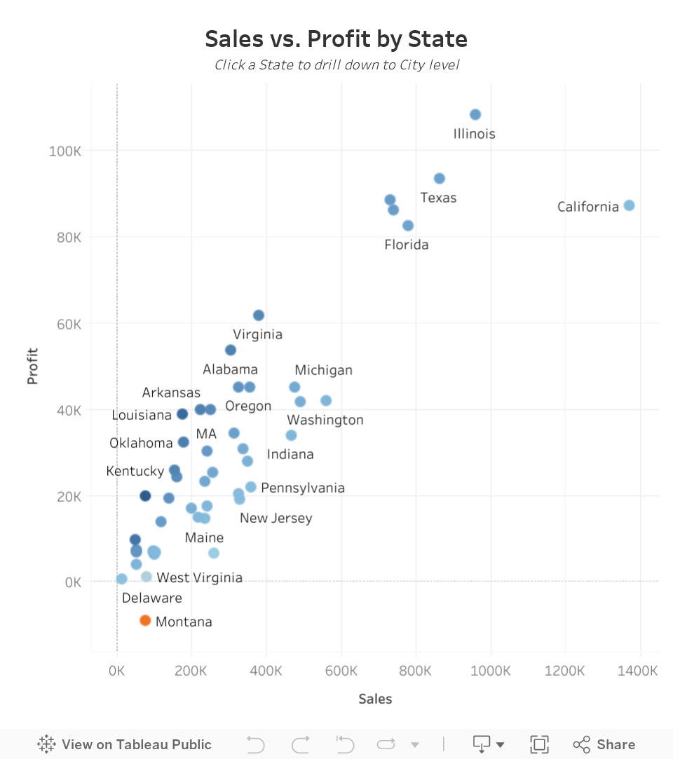
Workout Wednesday: State to City Drill Down
As a hint, in Chris' version, all cities were in the initial view, but for each State, all of the cities in that State would display the same value until you click on the State. The drawback of this method is that displaying mark labels (i.e., State names) only looks decent when a State only has sales in a single city. I want to show the labels for all States that have enough space to display it. In other words, the initial view should show only one dot per State, then when you drill down, you will see one dot per City in the selected State.
Before you start, I would highly encourage you to interact with the viz below to see how the drill down works.
Using this data source, here are the requirements:
- Create a scatterplot of sales vs. profit.
- In the initial view, you should see only one dot for each State. If you do this part right, you will have 48 marks in the view.
- Label the dots for the States in the initial view where the labels fit (using Tableau's automatic labelling).
- If you click on one of the States, then the view should automagically drill down to the cities for the selected State.
- If you choose more than one State, then the drill down should be disabled.
- Once you are in the City view, you should see one dot for each city. For example, if you click on Washington, then the City view should have 40 marks (one for each City).
- At the City level, the user should be able to click on the white space in the chart to go back to the State level.
- At the City level, no cities should be highlighted.
- You must match the tooltips. They show the State, Sales and Profit when each dot is a State. The tooltip shows the City, Sales and Profit when each dot is a City.
- The title and subtitle should change depending on if the view is State level or City level.
- Each dot should be colored by profit ratio for the State or City.
- The view should be 600x650.
Be sure to tweet an image of your work and a Tableau Public link and tag @EmmaWhyte and @VizWizBI. Good luck! I guarantee you'll learn a lot this week.
October 9, 2017
Makeover Monday: Adult Obesity in the United States
health
,
line chart
,
Makeover Monday
,
map
,
obesity
,
United States
2 comments
What works well?
- Simple title that tells me what the viz is showing
- Pulling the smaller States out separately to ensure they don't get lost due to their size
- Creating an inlay for Alaska and Hawaii
- Including a definite for obese
- Great filter action on the regions
- Everyone understands maps!
- Nice highlight action to show the State on the line chart and vice versa
- Great tooltips on the line chart
- Keeping all lines on the line chart and highlighting the selected State
- Keeping the scale on the line chart at the appropriate intervals
- Using colors that people typically will identify with good and bad
What could be improved?
- You lose the sense of change in the map.
- The height and width of the line chart seem odd. It's too tall for my liking. This accentuates the vertical change.
- There's no real story to the data. A more impactful title that has a definitive statement would help keep me there longer.
My Goals
- Create something engaging. I'm going to see if something like Michael Mixon's tilemap birth rates chart works well with this data set.
- If that doesn't work, make something that shows comparisons well.
- Make sure States are easily comparable.
- Give States even weight in the viz.
- Keep the highlighting by obesity rate and filtering by region from the original.
- Make nice tooltips like the original.
- Look for stories in the different demographics.
- Learn something new!
- Have fun at Makeover Monday Live!
With those goals in mind, here are a series of vizzes I made for Makeover Monday week 41 for each of the demographics. Click on any of them for the interactive version.
October 5, 2017
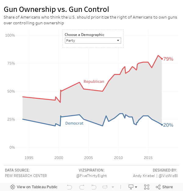
Gun Ownership vs. Gun Control - Which do Americans prefer?
The data used was readily available on Pew Research Center, so I used Google Sheets to import the data. Since FiveThirtyEight focused their viz on those people preferring gun rights over gun ownership, I only used that metric.
However, on the Pew Research Center website there are many other ways that the data is sliced demographically. I started by trying to create a single dashboard that contains each of the demographics displayed simultaneously and it was a mess! In the end, I went with a parameter to allow the user to choose the demographic they are interested in.
What did I find interesting?
- Overall, there's been a steady increase in the percentage of people preferring gun rights over gun control. Sounds like the NRA's propaganda is working.
- As stated by FiveThirtyEight, the gap between political parties is growing larger and larger. In the most recent poll (7 Apr 2017), only 20% of self-identified Democrats favored gun rights over gun control, whereas 79% of Republicans favored gun rights. It's this growing partisanship that is really damaging America.
- The younger generation is less likely to favor gun right over gun control. Is the proliferation and accessibility to information from the younger generation signaling a shift towards more liberal views?
- The most educated Americans favor gun control over gun rights. Are the undereducated preyed on by the NRA machine?
- The gap between whites and blacks is as stark as the gap between Republicans and Democrats. 30% more whites than blacks prefer protecting gun rights.
- Regionally, the South and Midwest prefer gun rights compared to the West and Northeast. This pretty much aligns with any election map you look at.
- People that live in cities are 26% less likely to favor gun rights over gun control compared to those lives in rural communities. Again, this falls pretty much in line with political affiliation.
UPDATE: Thanks to Rody Zakovich for this great tip for shading between two lines. Much better than my area chart trick!
Subscribe to:
Posts
(
Atom
)


