January 22, 2025
L-Shaped Bars: The Chart You Didn't Know You Needed

May 1, 2024
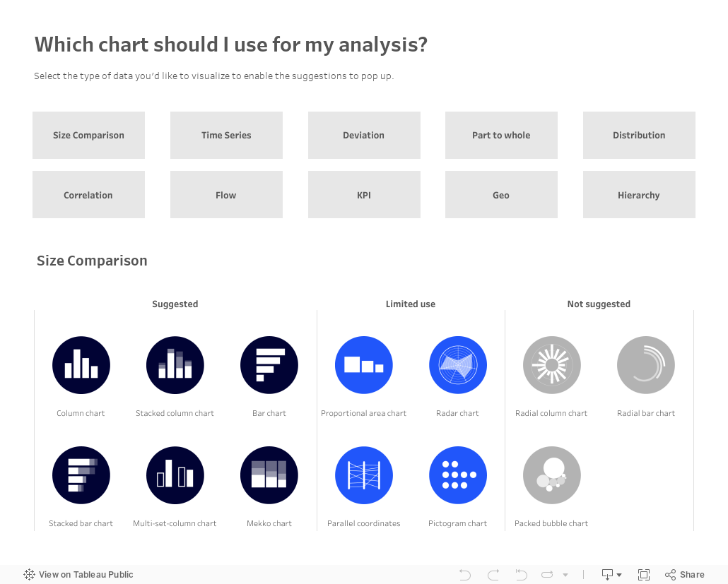
Which chart should you use for your analysis?

Over on Tableau Public, Judit Bekker create this fantastic directory of charts to help you pick the one that's most appropriate for your analysis.
Check it out below.
April 25, 2024
The ULTIMATE Guide to Custom Visualizations in Tableau
Here's the ultimate guide to custom visualizations in Tableau. Each chart contains a link to a tutorial so you can build it too.
I rarely use these charts on a day-to-day basis, but they are a fantastic way to build your technical skills.
Have you used any of these in a business context? Click on the image to view on Tableau Public.

April 24, 2024
20 Dashboard Design Best Practices
March 27, 2024
8 Reasons Power BI isn't "FREE"
October 24, 2023
Master Containers: Build an Interactive Tableau Dashboard From Scratch

September 12, 2023
#MakeoverMonday Week 37 - First time home buyers in the UK are being shut out of the market

June 12, 2023
#MakeoverMonday 2023 Week 24 - Cereal and the Green Revolution: Yields vs. Land Use

At the global level, how has crop production changed over the last fifty years?
In this Watch Me Viz live stream, I analyzed how the yield and land use of producing cereal has changed over the last 50 years.
I really liked the original visualization, so I rebuilt it in Tableau. I learned how to use dynamic zone visibility, layout containers, and more. Check it out.
Resources:
1. Data - https://data.world/makeovermonday/2023w24
2. Final Dashboard - https://tabsoft.co/3P3Sdl3
===============
Watch Me Viz is a weekly live stream where I help people become better at #Tableau, #PowerBI and data analysis. I show how I take an existing visualization, critique it, analyze the data, and build several visualizations all the while looking for a "better" visualization than the original.
If you are considering participating in Makeover Monday, you can get started by downloading data sets from the Makeover Monday website. I promise you'll become better at data analysis and data visualization by practicing every week.
Data sets - https://www.makeovermonday.co.uk/data/
===============
LEARN FROM ME
Join my newsletter. Sign up at andykriebel.com.
ARE YOU INTERVIEWING FOR A NEW JOB?
Contact me for more information about how I can help you prepare for that big interview.
===============
CONNECT WITH ME
More Watch Me Viz - https://bit.ly/WatchMeViz2023
June 6, 2023
Mastering TABLEAU Dashboards from Scratch

This comprehensive video will help you create business dashboards that are more actionable and meaningful and that your users will find easy to use at first glance. You’ll be on your way to being a dashboarding expert!
You’ll learn:
- Building basic charts
- Formatting fundamentals
- Using layout containers
- Dashboard formatting
- Essential tips for padding
- Filter controls
We'll create an interactive sales dashboard for Adidas in Tableau that's going to dynamically update based on the filters on the side of the dashboard which will allow us to select specific years, regions, products, and more.
⏬ DOWNLOAD my preferences file, the data, and starter and solution workbooks for £2 (this covers the costs of making this and future videos):
https://andykriebel.gumroad.com/l/adidassalesdashboard
Sign up for my newsletter to get advance, exclusive viewing of all of my videos, tips for using Tableau, plus exclusive discounts on products that I create.
https://andykriebel.com/
May 11, 2022
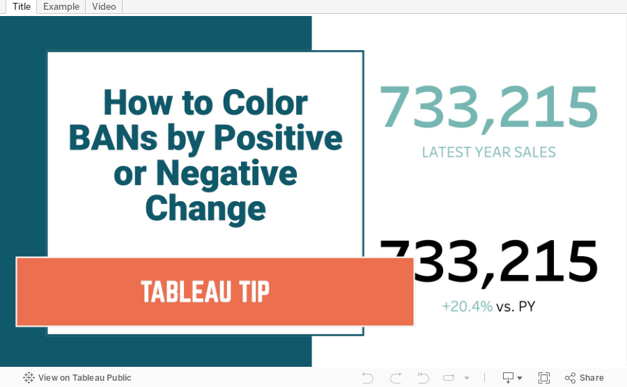
How to Color BANs by Positive or Negative Change
April 21, 2022
#B2VB - 2022/W4 - Design Some KPIs
Resources:
KPI Samples from Tableau Public:

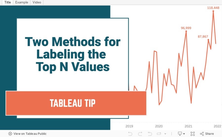
March 22, 2022
Two Methods for Labeling the Top N Values in a Chart
In this tip I show you how to use the INDEX and RANK functions to label the top N values in a chart. I also explain the difference in how they work, and how the RANK function is simpler to configure.
March 11, 2022
How to Include Multiple Dimensions on the Color Shelf
- You can have more than two dimensions on the color shelf. Simply repeat the steps for adding a second color.
- This only works for dimensions, as I show in the video.
- You do not have to use Sets for this to work; I used that in my example for simplicity.
February 15, 2022
How to Create a Barbell Chart
February 8, 2022
How to Create an Enclosed Dot Plot
February 2, 2022
How to Create a Jitter Plot
In this tip I show you how to create a jitter plot. A jitter plot is very similar to a dot strip plot other than it reduces the overlapping of the data points. The data is plotted like a dot plot and then we use either the RANDOM() or INDEX() functions to spread out the dots.
January 25, 2022
How to Calculate the Distance Between Two Points
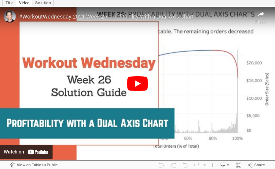
July 7, 2021
#WOW2021 Week 26 - Profitability With a Dual Axis Chart

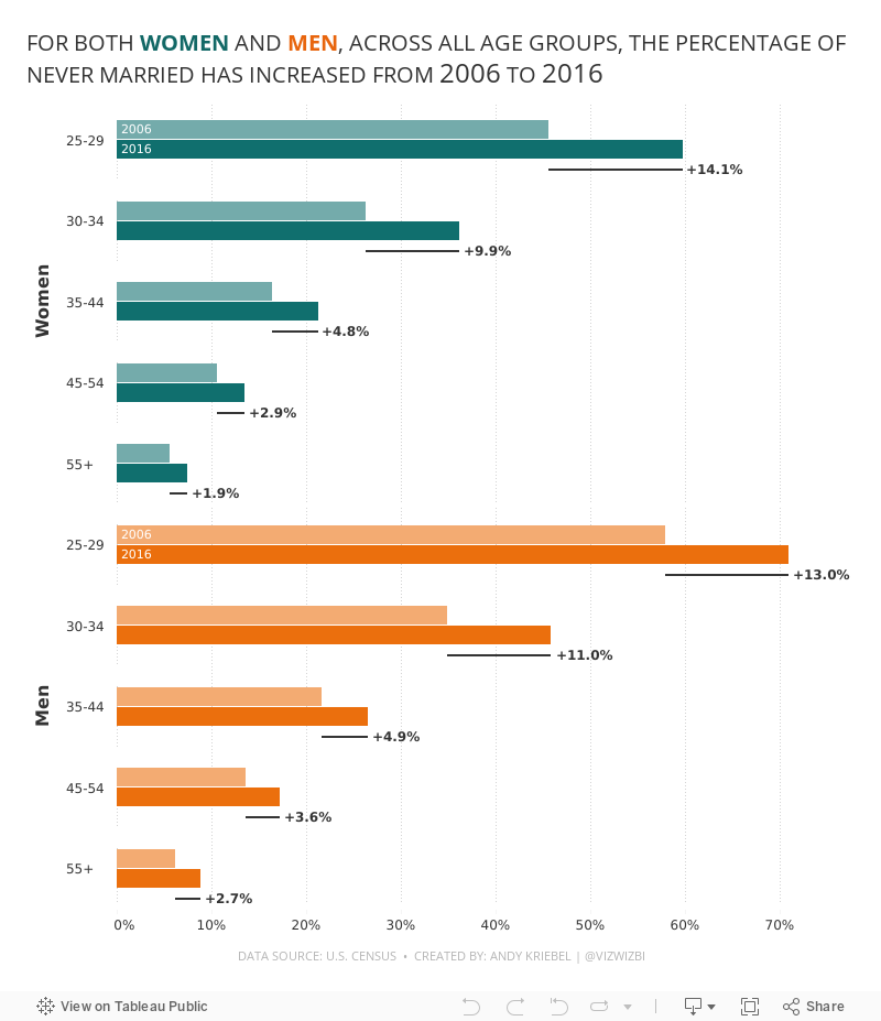
June 7, 2021
#MakeoverMonday 2021 Week 23: The Percentage of Never Married is on the Rise

- Final Viz (and below)
- Preferences file (all of my custom color palettes)
- How to Create a Combination Bar Chart & Candlestick Chart
May 17, 2021
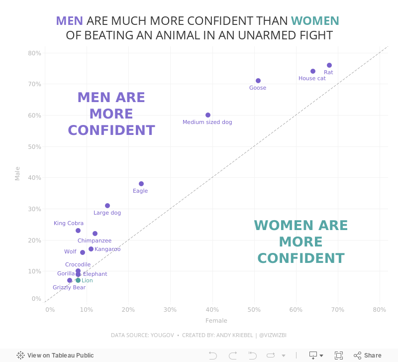
#MakeoverMonday Week 20 - Humans vs Animals

WatchMeViz
Visualization