Showing posts with label pages. Show all posts
September 12, 2023
#MakeoverMonday Week 37 - First time home buyers in the UK are being shut out of the market
animation
,
area chart
,
barbell
,
charts
,
house prices
,
how to
,
labels
,
line chart
,
pages
,
stacked area chart
,
storytelling
,
tableau
,
UK
,
united kingdom
No comments

This is what nearly happened to me during Watch Me Viz. I was convinced I had created the perfect chart. That is, until comments started coming in to the contrary. I had gotten so fixated on this one chart that I thought all other ideas were inferior.
I snapped out of it eventually and turned my attention to another chart that told the story much better.
The lesson learned: be careful of, and attuned to, sunken cost.
With that, here's Watch Me Viz for you to follow along and learn lots about Tableau.
March 22, 2021
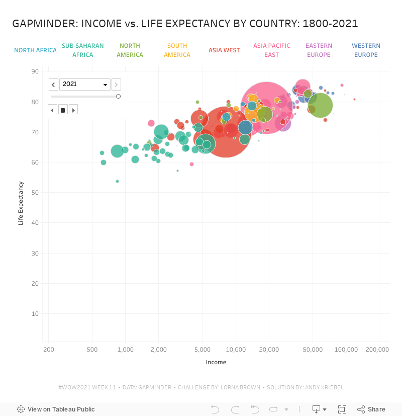
#WorkoutWednesday 2021 Week 11 - Gapminder: Income vs. Life Expectancy
animation
,
country
,
gapminder
,
hans rosling
,
highlight action
,
income
,
life expectancy
,
pages
,
population
,
region
,
scatter plot
,
scatterplot
,
Workout Wednesday
No comments

I did not use the new relationships model; I stuck with the traditional method of unions and a join as that's the most straightforward way to ensure you get the data in the correct shape.
First, you want to union together the three CSV files: life expectancy, population, and income. When you do that, you'll get this strange looking view that is super wide and doesn't have headers that mean anything.

What you should see, though, is that the headers are in the first row. To fix that, click on the drop down triangle next to the unioned data sources and choose Field names are in first row.

The years are nicely in the headers now. The next step is to select all of the columns with the years and pivot the data. Be sure to ONLY select the years.

Next, add the data source with the list of countries and drag it into the data prep area to create a join. You want to join "country" to "name". And now everything should look good. That's it for the data prep.

Now that the data is pivoted, in order to build the view, you need to create a calculated field for each measure: life expectancy, population, and income

All three calculations are the same. All you need to do is swap out the name of the csv. Lastly, build the view.

Note that the x-axis is a logarithmic scale and both axes have the option to start at 0 turned off. That's it! I hope you found this helpful.
May 23, 2017
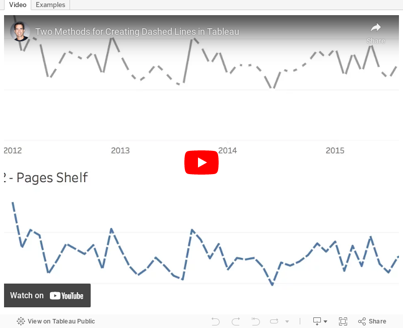
Tableau Tip Tuesday: Two Methods for Creating Dashed Lines
September 6, 2015
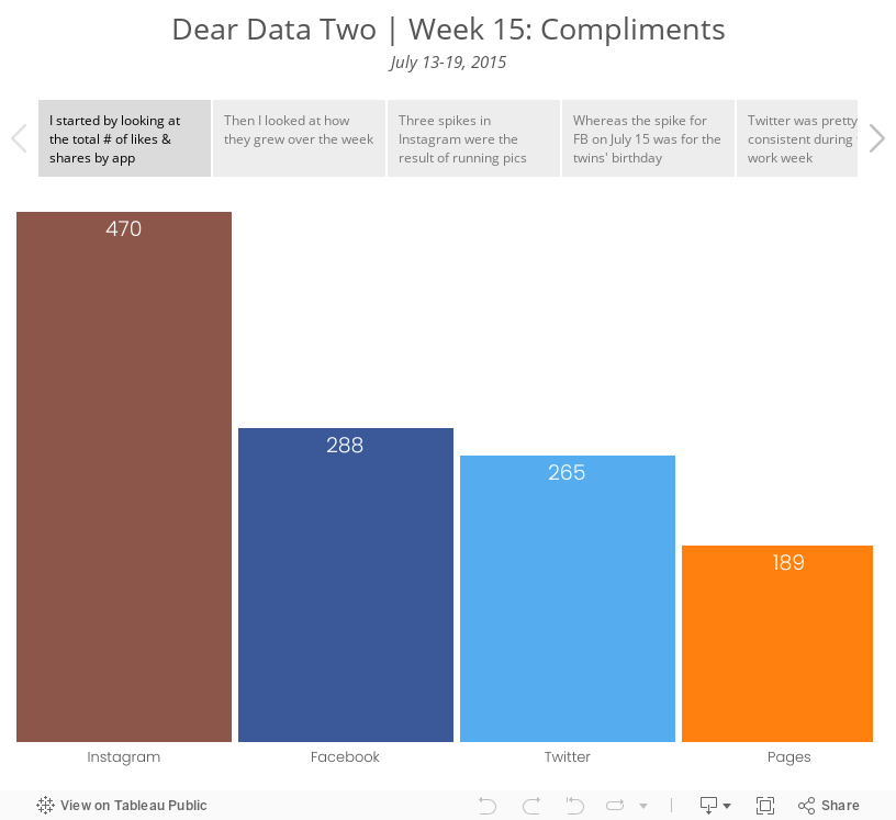
Dear Data Two | Week 15: Compliments
bar chart
,
compliments
,
cumulative
,
Dear Data Two
,
facebook
,
instagram
,
likes
,
lollipop
,
pages
,
social media
,
twitter
No comments

Just realized this is my 500th post on this blog. Feels like quite a milestone for some reason. Anyway, for Dear Data Two | Week 15: Compliments, like Jeffrey, I looked at my content that people liked across social media platforms (assuming that I can take those like, favorites, reshares as compliments).
Subscribe to:
Posts
(
Atom
)






