Showing posts with label Eva Murray. Show all posts
May 23, 2017
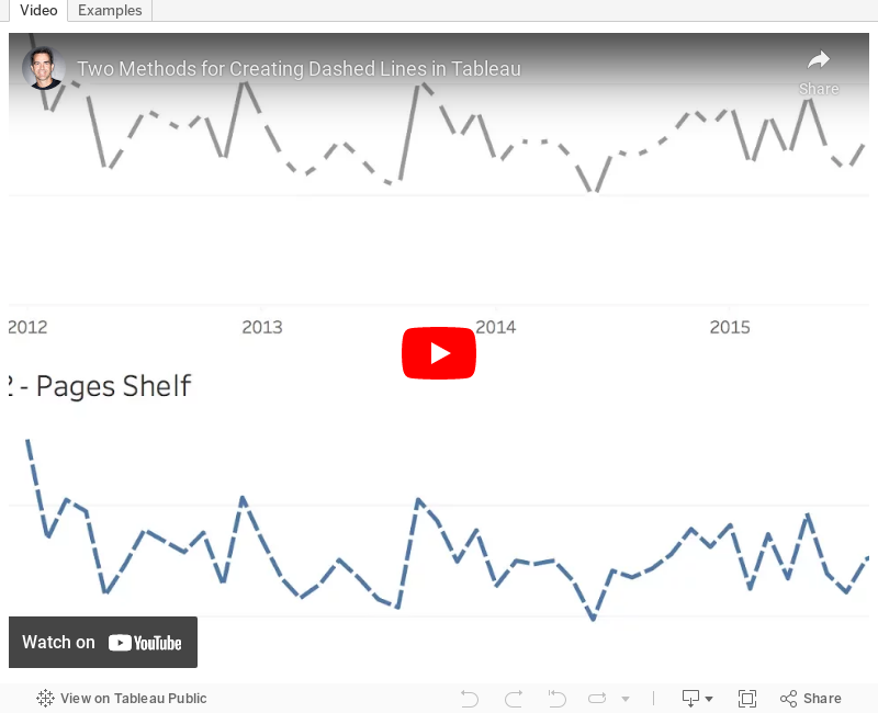
Tableau Tip Tuesday: Two Methods for Creating Dashed Lines
April 21, 2017
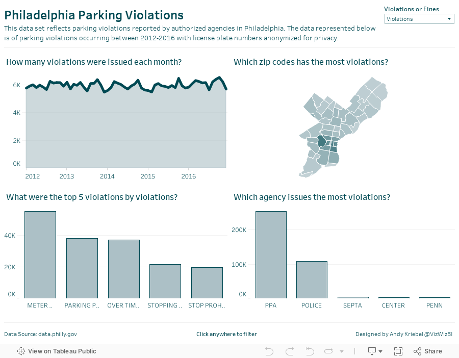
Five Years of Parking Violations in Philadelphia
#VizHawks
,
Amarendranath
,
Corey Jones
,
dashboard
,
Eagles
,
Eva Murray
,
interactivity
,
open data
,
parameter
,
parking
,
philadelphia
,
St. Joseph's University
,
violations
3 comments
Tuesday evening, Eva and I were invited by Amarendranath to participate in an event at St. Joseph's University in Philadelphia (my hometown) where we got to introduce them to Makeover Monday, watch Corey Jones give a great Tableau demo in which he introduced them to their challenge.
The data comes from the City of Philadelphia and was provided in a packaged workbook. This was sent to Eva and I as well, but the extract was painfully slow for me. I promised everyone I would create my own viz and the performance had to be addressed. I knew Exasol would give me the performance I was needing, so I created a workflow in Alteryx to take the CSV and upload it to Exasol. The great thing about throwing the data into Exasol is that I don't have to do any performance tuning. Exasol figures all of that out for you.
Now I was cooking with gas! I explored time series, types of violations, where violations occur, etc. to get a feel for the data. Next I went to back to the city's website and had a peek at their dashboard and thought it wasn't too bad. The major issue I see with it is filtering performance. I decided to build the same view in Tableau with a few changes:

How can you visualize 7.4 million parking violations in Philadelphia?
The data comes from the City of Philadelphia and was provided in a packaged workbook. This was sent to Eva and I as well, but the extract was painfully slow for me. I promised everyone I would create my own viz and the performance had to be addressed. I knew Exasol would give me the performance I was needing, so I created a workflow in Alteryx to take the CSV and upload it to Exasol. The great thing about throwing the data into Exasol is that I don't have to do any performance tuning. Exasol figures all of that out for you.
Now I was cooking with gas! I explored time series, types of violations, where violations occur, etc. to get a feel for the data. Next I went to back to the city's website and had a peek at their dashboard and thought it wasn't too bad. The major issue I see with it is filtering performance. I decided to build the same view in Tableau with a few changes:
- Create an aggregated extract that only includes the fields I need and aggregates to the monthly level. This significantly reduces the data for publishing to Tableau Public and makes the user experience better.
- Since the Eagles are my favorite NFL team, I changed the color scheme to use their official colors.
- I made the chart titles more informative by putting them in question form.
- I added an option for the user to switch between the number of violations and the amount of the fines.
All of this took about 30 minutes (primarily because the dashboard design was already done for me). Thanks Corey and Amarendranath for the opportunity to meet the team and participate! Let's do it again soon.
January 26, 2017
Makeover Monday: Regional Tourism Spending in New Zealand (Take 3)
dot plot
,
Eva Murray
,
Harry Enten
,
Makeover Monday
,
median
,
New Zealand
,
percentiles
,
tourism
Inspired by the visualisation by Harry Enten that I highlighted today on my sister site DataVizDoneRight, I decide to look at the New Zealand tourism data again and see if I could build a similar view. After all, no data visualisation is ever “complete”. I really like how this turned out (and thank you to Eva Murray for feedback).
I incorporated a legend on the upper right to make the bars easier to interpret. Basically the grey bar shows the 25th to 75th percentile of all of the regions and the red dot indicates the median of all regions. I’ve removed the total region from the view.
Subscribe to:
Comments
(
Atom
)


