June 10, 2018
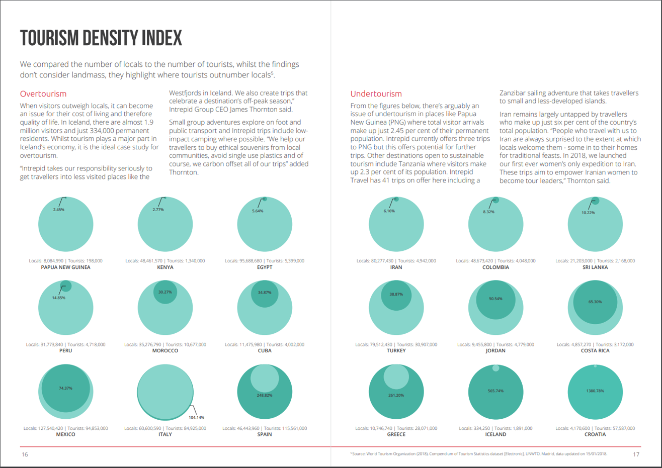
Makeover Monday: Tourism Density Index

What works well?
- Really good explanations for how they define overtourism and undertourism and examples for each
- Providing the exact figures for each country
- Colors are easy enough to distinguish
- Sorting the countries from lowest to highest
- Splitting the view between the highest 9 and the lowest 9
What could be improved?
- Circles are inherently difficult for comparisons. Are they measure by area or diameter? Either way, the circle in a circle in overkill.
- Why does the size of the light green circle change once the dark green circle is a larger value? That makes no sense at all.
- If the exact numbers were not included, it would be impossible to compare countries.
- Why show the top 9? That seems like an unusual way to select the countries.
My Goals
- Focus on either the raw values or the percentages. I'll figure this out once I explore the data.
- Make it easier to compare countries.
July 2, 2017
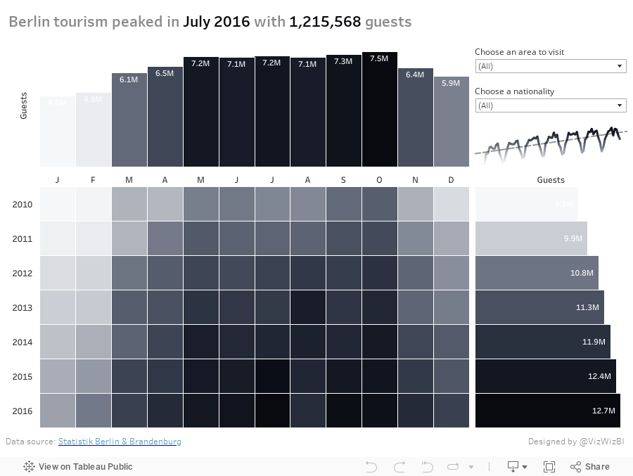
Makeover Monday: When did Tourism Peak in Berlin?
First, let's look at the viz to review:
What works well?
- Using a continuous, single color palette
- Legend is clearly labeled; even though it's in German, I can still understand it.
- Nice interactivity
- Including options to pick the metric
What could be improved?
- The callout for Berlin is confusing since there's no indication that's what was done.
- There's no sense of change over time.
- Need a more informative title.
- The color palette is pretty dull.
What were my goals?
- Think about what would be important to me as a tourist. Things like time of year to visit, places to visit, who visits, all impact my decisions on when to go places.
- Give an overall historical perspective through the use of a marginal histogram. I was definitely influenced by those created by Sarah Bartlett and Rodrigo Calloni last week.
- In only had about 30 minutes to work on it, so I spent about 5 minutes building the viz and another 25 formatting.
- Go with a black and white theme; actually I used the Facebook grey to black palette.
- Since some of the values go below 1 million, display those in thousands (e.g., 123K).
- Include the max values in the title as BANs.
January 26, 2017
Makeover Monday: Regional Tourism Spending in New Zealand (Take 3)
Inspired by the visualisation by Harry Enten that I highlighted today on my sister site DataVizDoneRight, I decide to look at the New Zealand tourism data again and see if I could build a similar view. After all, no data visualisation is ever “complete”. I really like how this turned out (and thank you to Eva Murray for feedback).
I incorporated a legend on the upper right to make the bars easier to interpret. Basically the grey bar shows the 25th to 75th percentile of all of the regions and the red dot indicates the median of all regions. I’ve removed the total region from the view.
January 24, 2017
Makeover Monday: The Regional Disparity of Tourism Spending in New Zealand
This week’s Makeover Monday data was too much fun to not continue to play with. I’ve kind of had a crush on barcode charts/strip plots since Makeover Monday week 44 last year when I created a barcode chart of Scotland deprivation.
Given how this week’s data needed to be viewed at the month, region, visitor type level in order to represent the index properly, I thought I’d give a barcode chart a try. Why do I think it works well in this case?
- By color-coding the overall index red, I can clearly see how it compares to all other regions.
- A barcode chart is great for showing distributions.
- The reference line at zero let’s me see how many regions are above and below the 2008 average.
- Having a row for each month allows me to see which months were more above the average than others, particularly within a year.
- This helps me see the big picture (spending has increased over time) while still giving me all of the details of all regions.
What do you think? Does it communicate well for you? Click on the image for the interactive version.
January 23, 2017
Makeover Monday: Domestic & International Tourism Spend in New Zealand
Already four weeks into another fun year of Makeover Monday. As it’s an even numbered week, it’s Eva’s week to pick the topic. I’m really enjoying her helping out with picking topics because it allows me to participate like everyone else. I don’t see anything ahead of time and have to read the article, interpret the data and build a viz all at once. When I pick the topics myself, I tend to think weeks ahead about what I want to create.
This week, Eva chose two charts that are basically the same. There’s one for international tourism spend and one for domestic. Here’s the international spend chart:

What works well?
- Title and subtitle make it easy to know what I’m viewing
- Source is clearly documented
- Colors are distinct enough that it’s clear we’re supposed to look at them individually
- Legend is out of the way
- Axes are clearly labeled
- Minimal gridlines that aren’t distracting
- Removing the vertical axis line
- Nice crisp font (Founders Grotesk)
What could be improved?
- Packed bars make it harder than necessary to follow a year across its months
- 100 is the baseline (see the subtitle), so why isn’t the chart the difference from the baseline?
- Overall too cluttered
- Are there more years that could be used for comparison?
- What was spending like before 2008? How do 2013-15 compare?
- Are we trying to understand the change within each month or the change across the years?
I must admit that I got sucked in by all of the detail Eva provided in the data set. I started by creating a view of the change in spending by year compared to the 2008 average. After all, this is the baseline, so we should be comparing to that. Anything above 100 is an increase compared to 2008; anything below 100 is a decline versus 2008. I wonder how many people are going to catch that subtlety in the data. I understood it after reading the notes that accompanied the chart.
This is what I came up with first. It show the change versus 2008 for each region. Click on the image for the interactive version.
But was I really doing a makeover of the original? No, I wasn’t. The original was look at the country total, so back to the drawing board I went. I really liked the look of the lines I had created so it wasn’t like I was completely starting over. What I wanted to show was:
- How did the overall spending change compared to 2008 for each visitor type?
- What was the change by year within each season? This would help me understand any seasons where tourism spending has decreased.
Overall, a really fun data set to play with and a lesson learned to not get sucked into the data too quickly. I need to think more holistically, think about the story I want to tell, search for idea, do some sketching, and move away from Tableau when I start. Basically, practice what I preach.
June 4, 2016
What’s it like to travel if you’re a Kriebel?
Paris! It evokes images of beauty, tranquility, reverence, history. For our kids, this was a must-take holiday, so this past week we traveled to Paris for half term (and Henry’s birthday). When we take a holiday, it’s generally not relaxing. Often we need a holiday from our holiday. Paris was no exception.
Despite the terrible rains, we toured museum after museum. And I tracked it all on Foursquare, with each check-in getting logged to Google Sheets automatically via an IFTTT recipe. This allowed me the chance to test out the new Google Sheets connector in Tableau 10 as well as the improved Mapbox integration.
Tableau Public isn’t running the beta yet, so for now, this image will have to do. It was quite the trip! 26 places visited in a just five days (though this does include food places). One day our kids will appreciate this adventure they’re on.

September 3, 2015
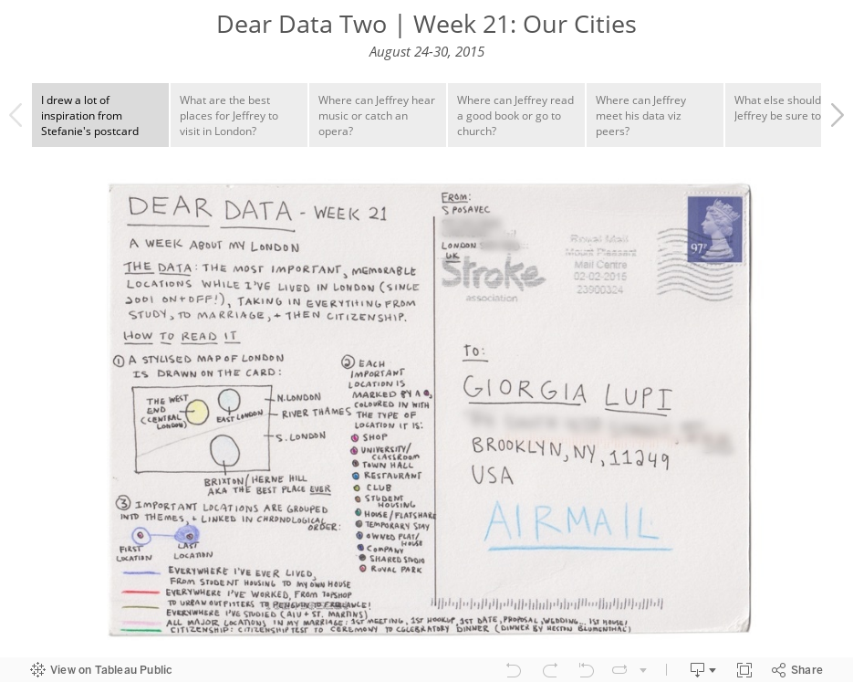
Dear Data Two | Week 21: Our Cities