October 31, 2016
Makeover Monday: Which areas of Scotland suffer the least deprivation?
barcode
,
deprivation
,
dot plot
,
Makeover Monday
,
Scotland
,
SIMD
No comments


What works well?
- Nice headers to help you know what is good and what is bad
- Alphabetical sort makes it easy to find a specific local authority
- Shading of the lowest 15% provides nice context
- Bar code representation makes spotting concentrations really easy
What could be improved?
- Unless you read the accompanying website, you can't really make sense of the chart on its own as there is now scale and no explanation of how to read it.
- There's no way to rank the local authorities from best to worst (or vice versa).
- Interactivity would help with know which datazones are which
- None of the other ranking metrics are included; this only covers the overall rank
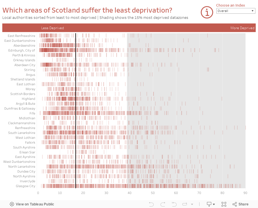
I really like the bar code chart, so I set out to recreate it with a better color scheme. I also include a more meaningful title, explanations via the information icon, and an option to choose different metrics. In addition, I used the score instead of the rank. For me, using the score makes more sense because you're looking at how each datazone is doing instead of how they rank against each other.
Here are two example of the bar code chart I created, one for the overall score and one for education.


What I did notice, though, was that two of the scores are percentages: Employment and Income. So for those metrics, I switch the viz to a dot plot. The more dots that are on top of each other, the dark they are represented, thus showing the concentration. Here's an example of Employment scores.

Here is the full interactive version. Overall, a fun visualisation to re-create.
Subscribe to:
Post Comments
(
Atom
)


No comments
Post a Comment