May 26, 2024
How to Create a Barcode Chart in Tableau
September 5, 2023
60 Unique Ways to Visualize Time in Tableau

March 1, 2017
Workout Wednesday: World Series Game 7 - Pitch-By-Pitch

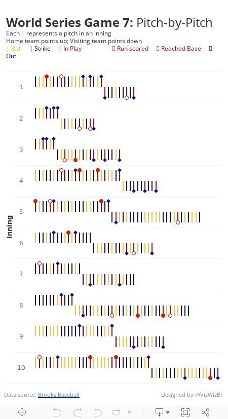
I love this graphic! So much information packed in a compact space. But I couldn't find the data anywhere. What I decided to do instead was look at game 7 of the 2016 World Series. It's talked about as one of the greatest games of all time, so I thought I'd create something similar, but on a pitch-by-pitch basis.
I was able to find the data on Brooks Baseball. I then imported it into Google Sheets for each pitcher and then unioned them all in Tableau. I'd recommend you just use the TDE I've created this week as I've removed all of the extra columns you won't need. You can download it here.
Here are the requirements:
- Each inning should be an individual row
- Within each inning, show every pitch from left to right
- The home team (Cleveland Indians) pitched first, so their bars should point up. Followed by the visiting team (Chicago Cubs), which should point down.
- Each pitch is color coded based on the outcome - Ball, Strike, or In Play
- The final outcome of each batter should be displayed as a shape and color coded. See the subtitle in my viz. Note that the open circle is filled in the middle with white so that the bar can't be seen through it.
- Match my tooltips
- Include the data source at the bottom
- Match my title and subtitle
- Viz must be a single worksheet
- Viz should be 450x800
- Optional: Match my font, Rubik in this case.
January 24, 2017
Makeover Monday: The Regional Disparity of Tourism Spending in New Zealand
This week’s Makeover Monday data was too much fun to not continue to play with. I’ve kind of had a crush on barcode charts/strip plots since Makeover Monday week 44 last year when I created a barcode chart of Scotland deprivation.
Given how this week’s data needed to be viewed at the month, region, visitor type level in order to represent the index properly, I thought I’d give a barcode chart a try. Why do I think it works well in this case?
- By color-coding the overall index red, I can clearly see how it compares to all other regions.
- A barcode chart is great for showing distributions.
- The reference line at zero let’s me see how many regions are above and below the 2008 average.
- Having a row for each month allows me to see which months were more above the average than others, particularly within a year.
- This helps me see the big picture (spending has increased over time) while still giving me all of the details of all regions.
What do you think? Does it communicate well for you? Click on the image for the interactive version.
December 6, 2016
Tableau Tip Tuesday: How to Create Barcode Charts

In this week’s Tableau Tip Tuesday, I show you how to create barcode charts. I’ve used these charts several times recently:
I also have another video with five use cases for strip plots. I use the term strip plot interchangeably with barcode chart. The difference in this video is that I show you two methods for creating them and the visual differences between the two methods.
December 3, 2016
Celebrating 114 Years of the Bermuda Cup Match
Friday at the Data School, we had Rhiannon Fox in to run a workshop about her design process and how the Data School can apply that to their work. If Rhiannon’s name is familiar, it’s because we used her great Bermuda population growth infographic for week 30 of Makeover Monday.
We like to expose the team to multiple viewpoints throughout their training. Not every process resonates with every person, so providing them broad opinions helps them find their own way and their own process. Personally, I really enjoyed the workshop with Rhiannon as it opened my eyes to a whole new way of researching ideas and getting inspiration.
As a bit of context, the first day of every Data School cohort starts with me teaching them about data viz best practices, making choices, and critiquing visualisations. We use a lot of A2 paper and crayons! Then, about a month into their training, we have Caroline Beavon come in run a workshop. Caroline’s workshop is based more on infographics and storytelling as she comes from a journalism background. Her workshop builds upon mine. Rhiannon’s then builds upon Caroline’s, however, her approach is more from a graphic designer’s perspective.
I‘ve learned a ton from both of them, but don’t want to give away all of their secret sauce. Contact either or both of them if you’d like to hire them to run a workshop for you. Both of the workshops are absolutely amazing!
In Rhiannon’s workshop, I ended up missing out on a lot of the sketching parts due to meetings and the team presented some really amazing drawings they did for their project. The hardest part was NOT using Tableau to explore the data. In fact, the data exploration is done through the drawings themselves. Since I was not able to catch up, I cheated and used Tableau. Here’s what I built in about an hour or so. Click on the image for the interactive version.

October 31, 2016
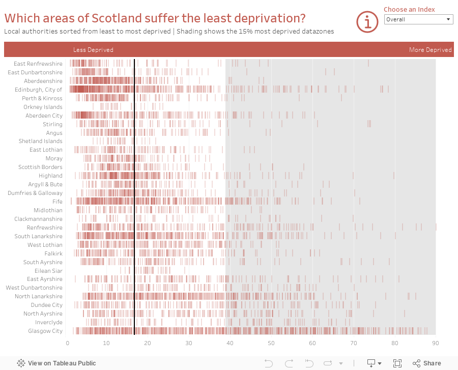
Makeover Monday: Which areas of Scotland suffer the least deprivation?


What works well?
- Nice headers to help you know what is good and what is bad
- Alphabetical sort makes it easy to find a specific local authority
- Shading of the lowest 15% provides nice context
- Bar code representation makes spotting concentrations really easy
- Unless you read the accompanying website, you can't really make sense of the chart on its own as there is now scale and no explanation of how to read it.
- There's no way to rank the local authorities from best to worst (or vice versa).
- Interactivity would help with know which datazones are which
- None of the other ranking metrics are included; this only covers the overall rank


May 24, 2016
Tableau Tip Tuesday: Five Use Cases for Strip Plots

In last week’s Makeover Monday about global warming I included a strip plot at the bottom of my final visualisation. You may hear these also called barcode charts or frequency charts, but whatever their “official” name, they are very useful for:
- Seeing a lot of data at a glance
- Understanding concentration of the data
- Seasonal trends
In this week’s video tip, I walk you through five use cases for strip plots varying from global warming to the frequency of fires to distribution of sales to deprivation in Scotland.
January 16, 2016
Dear Data Two | Week 40: Meeting New People

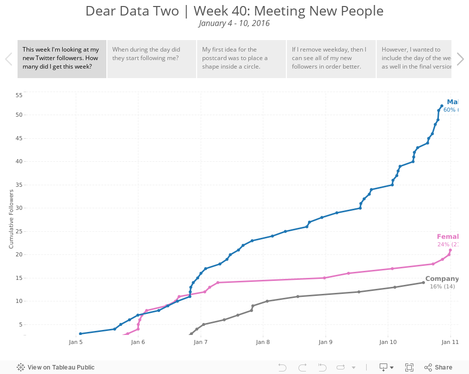
I reached out to Jeff and told him what was happening and I came up with the idea of looking at my new Twitter followers this week. I believe Jeff is going to do the same. I then set up an IFTTT channel to log new followers to a spreadsheet so that I could start my Tableau analysis.
 |
| Not surprisingly, most of my new followers (60%) were males, as Twitter tends to have more males. |
Next, I looked at when they started following me. The IFTTT channel logs in my local time, which i then broke down by AM/PM.
 |
| 64% of my new followers were after 12pm GMT |
I didn't have very much metadata to work with otherwise this week, so from this points, I focused on different ways I could visualise my postcard in Tableau.
Click through the story points below to see my brief analysis and my different postcard options. The last tab has the actual postcard for Jeff.