Showing posts with label World Series. Show all posts
March 1, 2017
Workout Wednesday: World Series Game 7 - Pitch-By-Pitch
barcode
,
baseball
,
Brooks Baseball
,
Chicago Cubs
,
Cleveland Indians
,
diverging bar chart
,
MLB
,
shapes
,
Workout Wednesday
,
World Series
16 comments

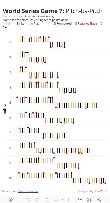
I love this graphic! So much information packed in a compact space. But I couldn't find the data anywhere. What I decided to do instead was look at game 7 of the 2016 World Series. It's talked about as one of the greatest games of all time, so I thought I'd create something similar, but on a pitch-by-pitch basis.
I was able to find the data on Brooks Baseball. I then imported it into Google Sheets for each pitcher and then unioned them all in Tableau. I'd recommend you just use the TDE I've created this week as I've removed all of the extra columns you won't need. You can download it here.
Here are the requirements:
- Each inning should be an individual row
- Within each inning, show every pitch from left to right
- The home team (Cleveland Indians) pitched first, so their bars should point up. Followed by the visiting team (Chicago Cubs), which should point down.
- Each pitch is color coded based on the outcome - Ball, Strike, or In Play
- The final outcome of each batter should be displayed as a shape and color coded. See the subtitle in my viz. Note that the open circle is filled in the middle with white so that the bar can't be seen through it.
- Match my tooltips
- Include the data source at the bottom
- Match my title and subtitle
- Viz must be a single worksheet
- Viz should be 450x800
- Optional: Match my font, Rubik in this case.
That's it! This shouldn't be as challenging as some of the past challenges I've posted. For me, this was more about trying to replicate a viz I liked. If you don't understand the fields or get stuck, ask for help. Good luck!
November 30, 2016
How Many Times Have Teams Been to the World Series?

Yesterday I wrote about how much I liked a World Series viz created by Business Insider. One of my favourite ways to learn Tableau, and one I highly recommend to everyone, is to reproduce work that inspires me.
What was most fun about creating this viz is that it’s built completely with ASCII squares. Yes, I use a measure for the axis, but the measure is merely a placeholder. I learned a lot creating this viz this way; basically you can easily create a unit chart without having to densify the data by using a simple calculation that trims the ASCII squares instead. I also included bar charts in tooltips.
Download the workbook to see how I did it. In the meantime, here’s my take on the frequency of teams appearing in the World Series.
Subscribe to:
Posts
(
Atom
)






