June 30, 2021
Sample KPI Dashboard
color
,
comparison
,
containers
,
context
,
dashboard
,
design
,
KPI
,
kpi dashboard
,
layout
,
level of detail
,
LOD
,
sample
,
tableau
,
tableau dashboard
,
template
,
trend
No comments
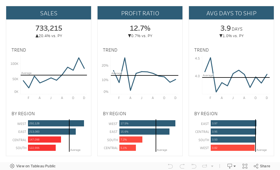
This week at The Data School, I was teaching DS24 about dashboard best practices and how to effectively use containers. We picked a visualization from the wild (this one by Ryan Sleeper) as an example for us to rebuild and to learn about effective use of containers.If you'd like to learn more, here are two videos I produced about mastering containers:
- Mastering Containers (Part 1)
- Mastering Containers (Part 2)
To see how we build the example below, feel free to download it and pick it apart. However, if you really want to learn how to build something like this, try to rebuild it based on the image alone. The videos above will definitely help.
Thank you Ryan for the inspiration!

June 28, 2021
#MakeoverMonday Week 26 - How Popular Is Your Birthday?
birthday
,
color
,
heat map
,
histogram
,
how to
,
Makeover Monday
,
marginal histogram
,
Matt Stiles
,
preferences
,
WatchMeViz
No comments
The original visualization this week was superb. I don't think what I created was better, but I did come up with a slightly different take and I showed how to build a marginal histogram. I also failed trying to create a starburst chart (I'm going to give it another go).
Resources:

June 23, 2021
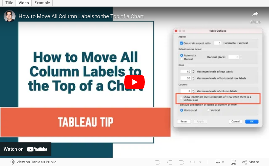
How to Move All Column Labels to the Top of a Chart
advanced settings
,
analysis
,
formatting
,
header
,
help
,
mark labels
,
move to top
,
table layout
,
tableau
,
tip
,
trick
,
tutorial
No comments
A very common frustration I hear is that Tableau can't move headers from the bottom of a chart to the top if there's more than one dimension.
In this tip, I'm going to show you how simple it is to move all discrete column labels to the top of a chart. Please keep in mind that this is a workbook level setting. Therefore, all charts in the workbook will show all discrete headers at the top.
Power BI - #WorkoutWednesday 2020 Week 53 - Executive Sales Dashboard
area chart
,
background color
,
BAN
,
dashboard
,
filter
,
KPI
,
layout
,
PBI
,
Power BI
,
shape
,
text box
,
Workout Wednesday
No comments

Overall, I found this particular WW pretty simple with PBI. Give it a shot!
June 22, 2021
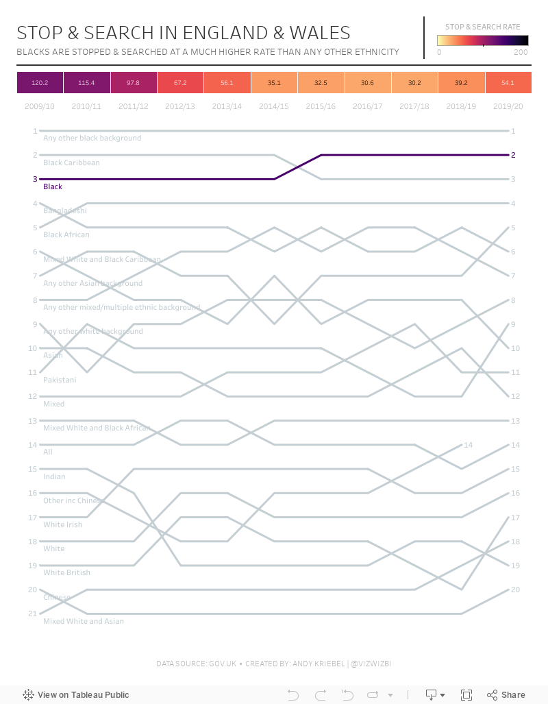
#MakeoverMonday 2021 Week 25 - Stop & Search in England & Wales
bias
,
bump chart
,
color
,
crime
,
england
,
ethnicity
,
heat map
,
label
,
Makeover Monday
,
race
,
racism
,
rank
,
stop & search
,
wales
No comments

Tough topic this week, stop & search by race. What really stuck out to me is how much more likely anyone with black ethnicity of any type is to be stopped and searched. No one can tell me there isn't racism in the UK.
Resources:
June 14, 2021
#MakeoverMonday 2021 Week 24: Which States Have the Highest Average Student Loans?
average
,
BAN
,
big numbers
,
borders
,
color
,
containers
,
context
,
dashboard
,
debt
,
filters
,
hex map
,
Makeover Monday
,
student loan
,
United States
,
USA
,
WatchMeViz
No comments
If you watch this week's #WatchMeViz (below), you'll get a good look at how I use containers to create a dashboard. I didn't iterate very much this week, as far as the number of charts is concerned, but I did mess around way too long when trying to create a hex inside of a hex map. HINT: It turned out terrible.Resources:
- Final workbook
- U.S. Hexmap Shapefile (credit: Joshua Milligan)

June 8, 2021
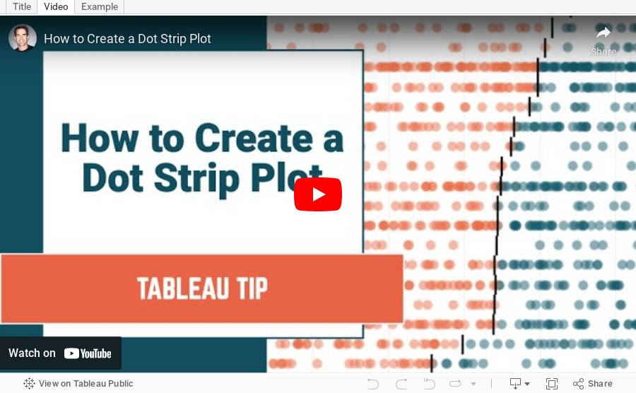
How to Create a Dot Strip Plot
chart
,
circle
,
color
,
context
,
data analysis
,
data visualization
,
dot plot
,
dot strip plot
,
filter
,
graph
,
how to
,
level of detail
,
LOD
,
strip plot
,
table calculation
,
tableau
,
tip
,
tutorial
No comments

Dot strip plots are a space-efficient method of laying out ranks across multiple categories. They are useful for showing the distribution of small data sets. For larger data sets, a histogram would be a more effective visualization.
In a dot strip plot, the dots placed in order on a strip and typically include a reference line for either the median or the average. My default is to use median reference lines as these are better for reducing the impact of outliers.
In this example, I show you how to:
- Create a dot strip plot showing the median sale by model and date for each car make
- Include a reference band from to lower to upper quartile to make it easier to see the outliers in the data
- Color the marks that are above or below the median
Download the sample data used in the tutorial here.
June 7, 2021
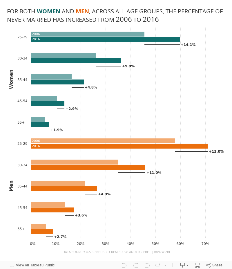
#MakeoverMonday 2021 Week 23: The Percentage of Never Married is on the Rise
age
,
bar chart
,
bar in bar
,
butterfly chart
,
candlestick chart
,
charts
,
dumbbell
,
gender
,
graphs
,
Makeover Monday
,
marriage
,
population pyramid
,
slope graph
,
time
,
tip
,
tutorial
,
WatchMeViz
,
year
No comments

Resources:
- Final Viz (and below)
- Preferences file (all of my custom color palettes)
- How to Create a Combination Bar Chart & Candlestick Chart
June 1, 2021
How to Calculate the Most Frequent Value of a Measure
BAN
,
calculation
,
compute by
,
compute using
,
discount
,
first
,
frequency
,
histogram
,
level of detail
,
LOD
,
nested
,
order
,
table calc
,
table calc filter
,
table calculation
,
Tableau Tip Tuesday
No comments

First, I show you how to return this as a histogram as well as a single number.
By the end of this tip you will be able to calculate the most frequent quantity ordered. This same process could be used, for example, to compute the most frequent discount.

Subscribe to:
Posts
(
Atom
)


