July 31, 2025
How to Create Hexbin Scatterplots in Tableau

Want to get better at Tableau?
February 20, 2025
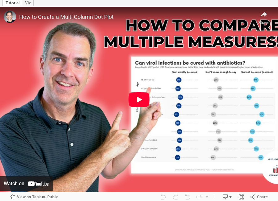
How to Create a Multi Column Dot Plot

February 12, 2025
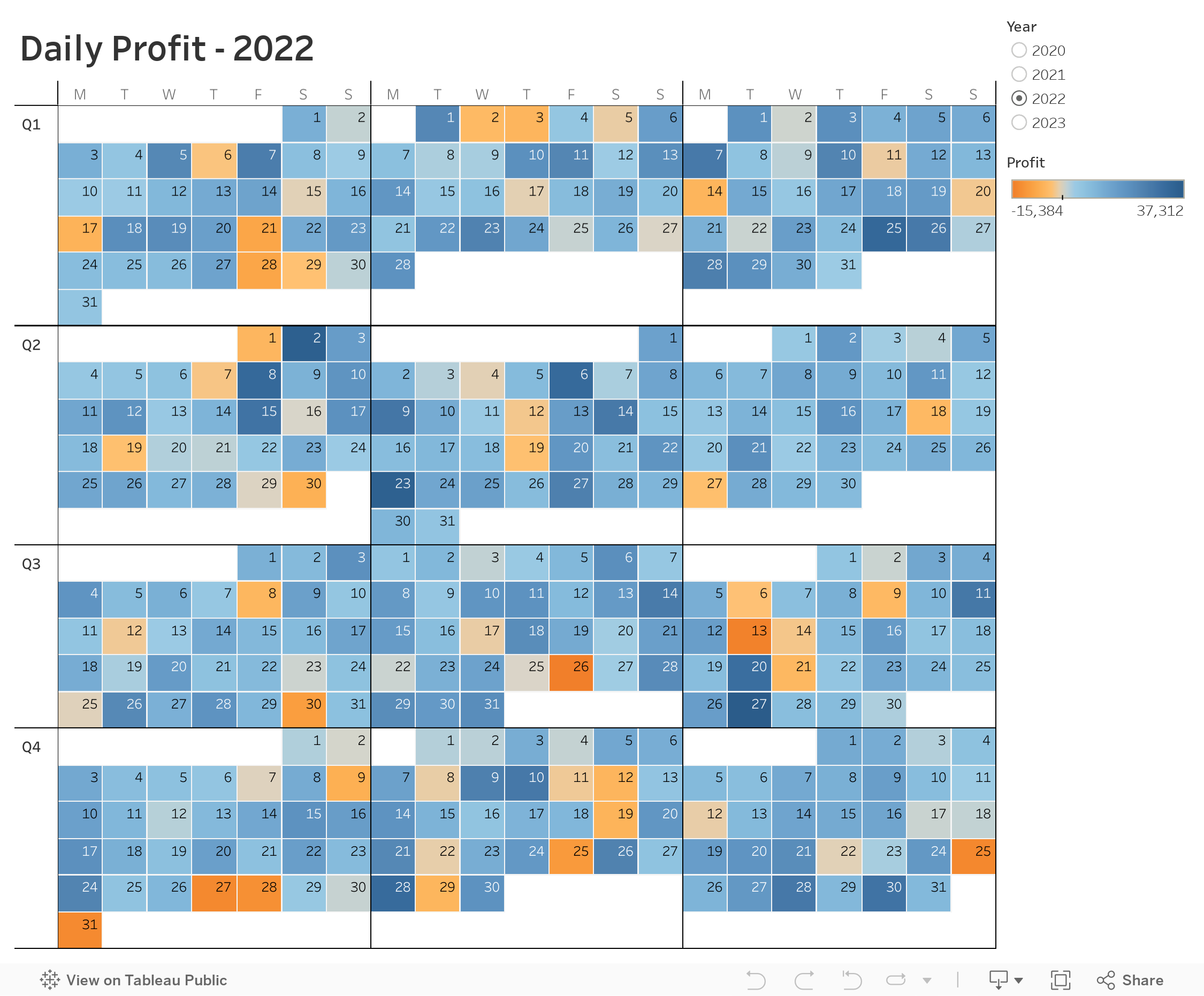
Advanced Calendar Heat Maps in Tableau (No More Workarounds!)

February 4, 2025
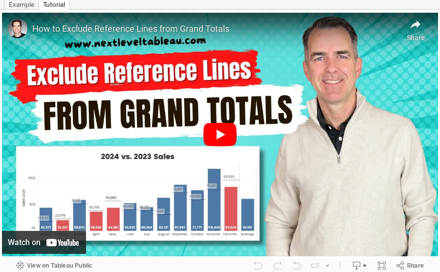
How to Exclude Reference Lines from Grand Totals in Tableau

Ever added a reference line to your Tableau visualization, only to see it appear in the grand total row, even when it doesn’t make sense?
If your grand total uses a different aggregation than your main data (e.g., SUM vs. AVG), the reference line can be misleading.
Unfortunately, Tableau doesn’t offer a simple way to exclude it—but there’s a trick to removing it while keeping your totals visible.
In the video below, I’ll walk you through the step-by-step solution to remove reference lines from grand totals.
Want to become an advanced Tableau user?
Unlock your full potential with Next-Level Tableau, the ultimate training program for Tableau users. Gain access to expert-led tutorials, live sessions, and a supportive community designed to help you master advanced skills, create stunning dashboards, and achieve your career goals.
Learn more and take your Tableau skills to the next level today at nextleveltableau.com.
Unsure? Sign up for my free course at starter.nextleveltableau.com.
January 22, 2025
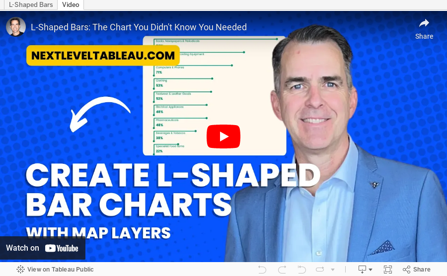
L-Shaped Bars: The Chart You Didn't Know You Needed

September 26, 2024
Stop Chart Disasters NOW With This Crucial Method

August 30, 2024
How to Create a Win/Loss Sparkline

Check out the workbook here.
June 25, 2024
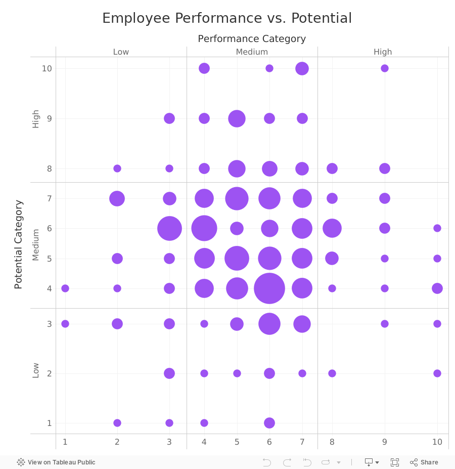
How to Create a 9-Box Matrix in Tableau

In this video, I show you how to build a 9-box matrix.
These are commonly used in talent management and HR to map a company's workforce along two dimensions, potential and performance.
Each of these two dimensions is split up into three categories, low, medium, and high, depending on the score.
For each employee performance is then plotted horizontally and potential is plotted vertically. From there, we summarize the number of employees that fall within each box.
June 20, 2024
How to Simultaneously Highlight & Deselect with a Parameter Action in Tableau

February 26, 2024
How I Create a Beeswarm Chart in Tableau

Beeswarm charts a one method of showing distributions in a data set. I show you how to create one in this #MakeoverMonday livestream.
Download the workbook | Download the data

January 8, 2024
Step-by-Step Guide to Building a Beautiful Bump Chart in Tableau
We all create charts we know *could* be better.
Here's how to make your next bump chart look like magic 🤯
Tableau is incredible for creating bump charts...
But 99% use shortcuts which don't look great.
Here's my secret:
It all comes down to the small details.
Each step has to be done right to get the view you want.
Most people don't follow these steps.
And even more don't know how to make it look great...
I'm going to show you how.
In this tip, I give you specific step-by-step instructions to get your bump chart to look just right.
👀 Do you want a copy of my viz? 👀
You got it!
Send a DM on LinkedIn saying CHART MAGIC! and I'll send you a PDF of the instructions AND the workbook for you to use for FREE.
October 17, 2023
Enhancing Tableau Drill-Downs: Use LODs in Hierarchies

Have you ever felt your drill-downs could be more insightful? Dive into this tutorial to see the magic of LOD expressions within hierarchies.
This will help us unlock deeper insights and makes data exploration even more insightful.
Whether you're well-versed in Tableau or just looking to level up your skills, there's something here for everyone.
Get the workbook - Link
October 3, 2023
Master Dynamic Zone Visibility in Tableau: Yearly to Monthly Calendar Drill Down

Welcome to this comprehensive tutorial on creating a Yearly to Monthly Calendar Drill Down using Dynamic Zone Visibility in Tableau.
📌 What You Will Learn
In this video, you'll discover how to use Tableau's Dynamic Zone Visibility feature to effortlessly switch between yearly and monthly calendar views. If you've been looking to add more flexibility and dynamism to your Tableau dashboards, this tutorial is designed for you.🔑 Key Takeaways
- Understand the concept of Dynamic Zone Visibility- Set up a yearly calendar view in Tableau
- Implement drill-down functionalities to transition to a monthly calendar view
- Practical tips and tricks for optimizing your Tableau dashboards
🔗 Additional Resources
- Data- Workbook
September 26, 2023
Dynamic Drill-Down from Monthly to Daily Data Using Set Actions

Unlock the power of Tableau's Set Actions to enhance your data visualizations!
In this in-depth tutorial, I'll walk you through a step-by-step guide on how to create an interactive chart that allows users to drill down from monthly to daily data by simply clicking on a month.
Ideal for analysts, business intelligence professionals, and anyone who wants to level up their Tableau skills.
What You'll Learn:
- How to set up Set Actions in Tableau
- Create interactive charts for effective data exploration
- Best practices for visualizing monthly and daily data
Who This is For:
- Data Analysts
- Business Intelligence Professionals
- Tableau Beginners and Enthusiasts
Prerequisites:
- Basic understanding of Tableau Desktop
Resources:
- Download the sample workbook: https://public.tableau.com/app/profile/andy.kriebel/viz/MonthtoDayDrillDown/Sheet1
- Data: https://data.world/vizwiz/sample-soda-sales
- Tableau official documentation on Set Actions: https://help.tableau.com/current/pro/desktop/en-us/actions_sets.htm
August 8, 2023
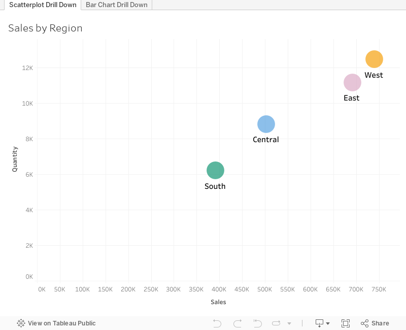
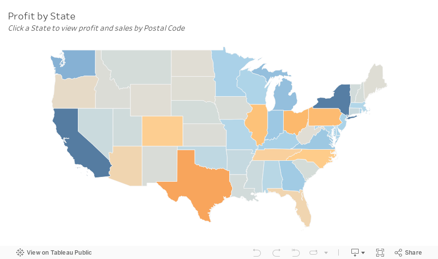
How to Master the 3-Level Drill Down in Tableau (with Dynamic Zone Visibility)

Welcome to my guide on mastering the 3-Level Drill Down in Tableau!
In this tutorial, I show you step-by-step how to make the most of using dynamic zone visibility to create this functionality. We'll go through both scatter plot drill downs from Region → State → Postal code and then replicate that as a bar chart.
You can easily make this a map drill down by changing the chart type. That's it!
🔍 What you'll learn in this video:
1. The basics of drill down functionality in Tableau
2. Hands-on demonstrations, tips, and best practices
3. How to interact with the data
💡 Why is this important?
Drill down capabilities allow analysts to explore data from a broad overview down to granular details. By mastering the 3-level drill down, you can uncover hidden patterns, insights, and trends that might be overlooked in higher-level analyses.
📌 Prerequisites:
A basic understanding of Tableau's interface and primary functions will be helpful, but beginners will be able to follow along as well!
If you are following along, be sure to pause the video along the way as you repeat the steps.
June 26, 2023
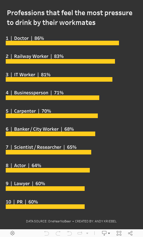
#MakeoverMonday 2023 Week 26: The UK's Drinking Culture

June 20, 2023
Tableau Tutorial for Beginners | Create Your First Dashboard

Learn how to use Tableau and created impressive dashboards.
Tableau is easy to use, but it can seem quite complex and confusing at first. The best way for you to learn Tableau is to download the files from the description of this video and follow along with me.
By the end of the video, you will have a much better understanding of Tableau and be confident that you can build dashboards on your own.
I'll take you step-by-step and show you how to create, publish and share your first interactive Tableau dashboard.
I'll cover:
- Tableau's welcome screen
- Connecting to data
- Making visuals
- Creating a dashboard
- Adding interactivity
- Publishing to Tableau Server
- Sharing with others
By the end of the video, you'll have created your first interactive Tableau dashboard which you can publish to the web or to your company's Tableau Server. I'll also show you how you can share your Tableau dashboard with others.
⏬ DOWNLOAD the data, and starter and solution workbooks here.
I would appreciate your support with a small donation to continue to make videos for you.
Sign up for my newsletter to get advance, exclusive viewing of all of my videos, tips for using Tableau, and exclusive discounts on products I create.
June 14, 2023
SIMPLE Map Drill Down in Tableau with Dynamic Zone Visibility

Creating a drill-down map in Tableau used to be more challenging than it needed to be.
But now, with the dynamic zone visibility, we can create a map drill down in just a couple of simple steps.
By signing up for my newsletter you get:
- Early access to tutorials
- New products
- Discounts
- Access to my new community Discord server
- Notification about any upcoming events and opportunities to learn
and more.
Sign up at andykriebel.com.
🆓 DOWNLOAD the data, plus a starter and completed workbooks:
https://andykriebel.gumroad.com/l/map-drill-down
🥁 See the viz in action:
June 6, 2023
Mastering TABLEAU Dashboards from Scratch

This comprehensive video will help you create business dashboards that are more actionable and meaningful and that your users will find easy to use at first glance. You’ll be on your way to being a dashboarding expert!
You’ll learn:
- Building basic charts
- Formatting fundamentals
- Using layout containers
- Dashboard formatting
- Essential tips for padding
- Filter controls
We'll create an interactive sales dashboard for Adidas in Tableau that's going to dynamically update based on the filters on the side of the dashboard which will allow us to select specific years, regions, products, and more.
⏬ DOWNLOAD my preferences file, the data, and starter and solution workbooks for £2 (this covers the costs of making this and future videos):
https://andykriebel.gumroad.com/l/adidassalesdashboard
Sign up for my newsletter to get advance, exclusive viewing of all of my videos, tips for using Tableau, plus exclusive discounts on products that I create.
https://andykriebel.com/
April 11, 2023
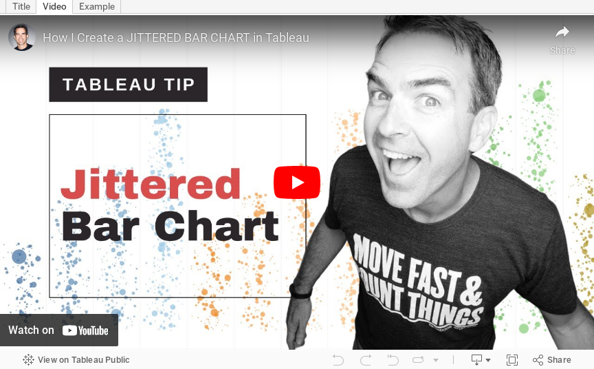
How to Create a Jittered Bar Chart in Tableau

Are you tired of the same old boring bar charts? Add some flair to your data visualization with a jittered bar chart! See more of your data without losing scope of the overall.
To create one, simply add a random amount of noise to the x-axis and y-axis of your bar chart. This will add more granularity to your data, prevent overlapping and give your chart a unique look. Try it out and impress your colleagues with your data viz skills!
Here’s a video to help you create your own.