September 12, 2023
#MakeoverMonday Week 37 - First time home buyers in the UK are being shut out of the market

June 26, 2023
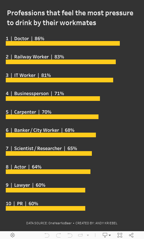
#MakeoverMonday 2023 Week 26: The UK's Drinking Culture

June 24, 2022
My Sabbatical with Maggie

August 19, 2021
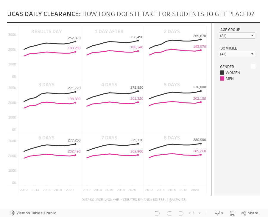
#MakeoverMonday 2021 Week 33 - UCAS Daily Placements

March 29, 2021
#MakeoverMonday Week 13 - UK Trade With the EU Since the Brexit Referendum
I must admit I got a bit stuck with this week's dataset. It was very straightforward and I didn't like how anything turned out. With some ideas from the live audience on YouTube, I started comparing exports, imports and the trade balance. I then thought about a trick I had taught the Data School about using a timeline to filter.
Great, that's it! Wrong! The layout I had in my head was all wrong. I had to move some things around and then getting everything to line up took ages! Why or why isn't formatting easier???
Then, after creating the BANs, someone suggested that it would be good to show a zoomed in version of the line chart for the dates selected. I added those as sparklines with each BAN and it turned out so much better.
Check out and download the viz here.

June 8, 2020
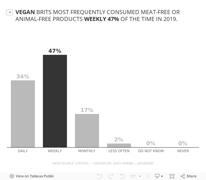
#MakeoverMonday Week 23 - Frequency of Meat-Free Consumption by Brits in 2019

December 22, 2019
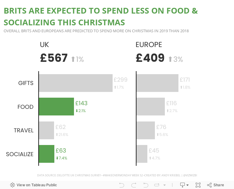
#MakeoverMonday: How much are Brits & Europeans expected to spend on Christmas?

This week, Eva picked Christmas-themed data...a simple survey from Deloitte about expected Christmas spending and the UK and Europe.

What works well?
- It a simple table that is easy to understand without doing much thinking.
- My eyes were immediately drawn to the two red declining arrows, which makes it seem to be the focus on the visualization.
- The table is neatly organized from highest to lowest spending categories.
- Everything is clearly labeled.
- The highlight box on the right provides a nice summary.
What could be improved?
- Remove the shading from 2018
- Removed the shading from the background of the Total cell
- Align the text labels either left of right, but not center
- Remove the borders between the rows, but keep them to separate the headers and totals from the rest of the table
- Change the font color of the categories to black; green could give the impression that they are increasing
- Align the arrows on the second table with the rows they correspond to
- Why is spending less red? I would think spending less is good

October 7, 2019
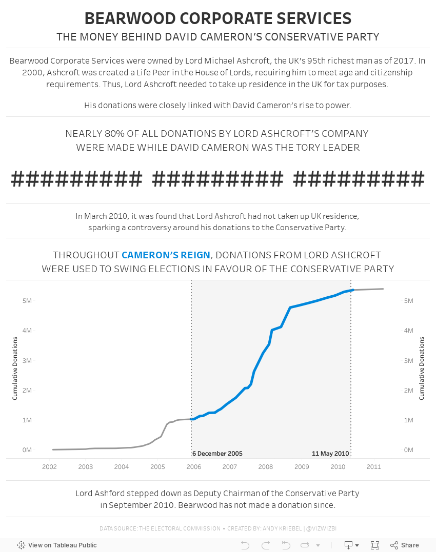
#MakeoverMonday: Bearwood Corporate Services - The Money Behind David Cameron's Conservative Party

 |
| SOURCE: THE ELECTORAL COMMISSION |
WHAT WORKS WELL?
- Placing the filters on the upper right let me know immediately that I can interact with the data to find my own story.
- The bar chart is sorted in descending order.
- The summary numbers provide some context, but not much.
- The bar chart would be easier to read if it was horizontal.
- Why are all of the bars colored? There are way too many colors and they have no meaning.
- The packed bubbles would be much better as a bar chart or BANs.
August 5, 2019
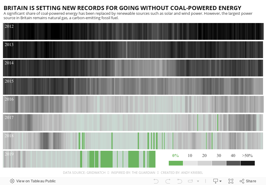
#MakeoverMonday: Britain's Reduced Dependency on Coal


WHAT WORKS WELL?
- Great color scheme
- Easy to understand layout
- Good color legend
- Informative title and subtitle
- Not much; it's quite fantastic.
- Maybe make it more interactive so you can see the specific values when you hover
May 1, 2019
The UK's Most Popular Baby Names

Sophie's Challenge
While Tableau is an amazing tool, when you use it all the time you can fall into data-viz-auto-pilot mode. You build the same kinds of charts; you construct similar kinds of dashboards; you fall back on the same formatting styles. While familiarity with tool, and a workflow, is a good thing, it also narrows your view of what’s possible.For today’s Dashboard Week challenge, I want you to step outside your data viz comfort zones and try building a viz using Flourish. Flourish is a free tool that lets your build interactive, responsive, and embeddable vizzes and data stories, all within the browser using your own data. Flourish is focused at the communication side of data viz (more than the data exploration side), and I’d like DS13 to really think about communication in today’s challenge.
Why Flourish? I really like their wide (and ever expanding) range of templates and interactivity (transitions, stories and ‘Talkies’ to name a few); also they are based in London – so why not viz-local?
Using any part (years, geographic locations, genders) of the England and Wales baby names data sets, I want DS13 to find and communicate one specific story from this data set.
Here are the rules for today, and what I’d like to see as output:
- They must work independently.
- Everything must be finished by 5pm.
- They must use Tableau and Alteryx for the data prep and exploration.
- The final viz must be made in Flourish.
My Approach
First, I had to get some data. I decided to download the data from the ONS for 1996-2016 because it was in a relatively decent format.Next, I opened the "Plotting Competitors" example because I loved the animation. The great thing about Flourish is you can immediate use the template. All you need to do is upload your own data, assign the columns, and you're done!
April 1, 2019
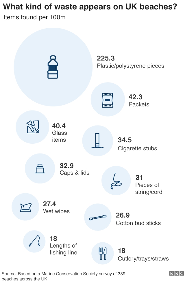
#MakeoverMonday: How much plastic waste has been found on UK beaches?

Don't believe me? Watch Drowning in Plastic on the BBC. If this documentary doesn't change you mind about the amount of plastic you waste and the impact its having, then you need to have a deeper look into your soul.
This week, Eva chose a data set about the waste found on UK beaches.
 |
| SOURCE: BBC |
WHAT WORKS WELL?
- Including the raw numbers, and how big they are, provides great impact.
- They sort going down the page.
- The title is clear, concise, and tells you what you are about to see.
WHAT COULD BE IMPROVED?
- The infographic makes it appear as though this is ALL of the waste found on the beaches. However, it's only the top 10. You can see that if you read the original article Eva linked to.
- The icons are cute, but are the necessary?
- A simpler visualization, like a bar chart, would make the impact of the plastic more apparent.
WHAT I DID
- Infogram is great for building simple infographics very quickly.
- The customization options help you create a good looking visual.
- The interactions on the charts are super responsive.
- You can change the theme or chart type with one or two mouse clicks.
- There's no "publishing" required. It's already live to everyone once you create your graphic.
- The chart types are limited, but I suspect 90% or more of what you need is available.
- If you want a chart to display the graphic a slightly different way, you may need to edit the data and either crosstab or transpose the data.
February 25, 2019
Makeover Monday: The Economic Value of the Bicycle Industry in the UK

Here's the original chart:

What works well?
- Using a line chart for representing data over time
- Minimal use of color
- Y-axis is properly labeled
- Including the sources
What could be improved?
- The x-axis label is completely wrong.
- The title needs to be more specific. As a standalone chart, we have no idea if this is about a country, a store, whatever.
- Don't include all of the axis ticks between each of the quarters.
- Remove the diamonds as markers for each point.
- Change the units of measure on the y-axis to thousands.
My goals
- Create something that's easy to understand.
- Stick with the minimal use of color.
- See if the change between periods is important. If so, what is changing and why?
- Is there seasonality? If so, how is that seasonality changing?
- Consider other metrics, like value added per bike. How does that change through time? What do the changes mean?
January 21, 2019
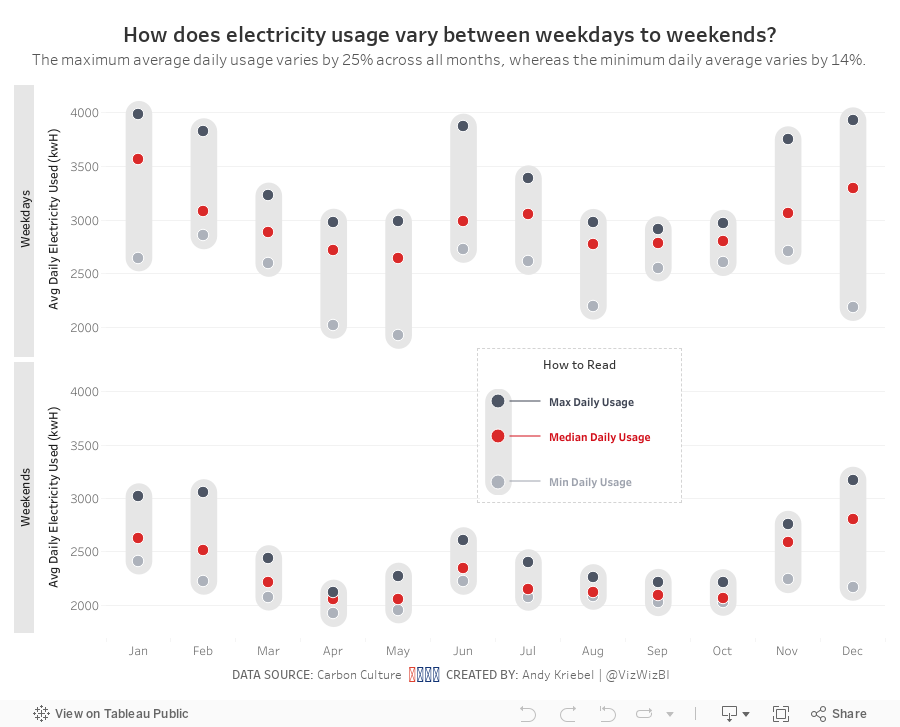
Makeover Monday: Electricity Use at 10 Downing Street

Here's the viz Eva chose:

What works well?
- Really nice BANs that also have context included. I give people feedback quite often that BANs can be great, but they're meaningless without context.
- Nice filter options with the buttons at the bottom
- The chart shows the peaks and troughs well.
- Using different colors for peak usage
- Data updates as you click on the BANs
What could be improved?
- Include a legend so you know what the colors signify
- A better x-axis is needed
- Remove the buttons that don't have any data, District Heat and Gas in this case
My Plan
- Hold off on working on my viz until we have our weekly Makeover Monday time at the Data School. I've written this section and the two above Sunday night.
- Explore the data with line charts to get a sense for the patterns in the data.
- Keep something similar to the BANs; consider different or additional context.
- Should the timeline show all of the data? Play about with different filter options.
- Consider a heatmap that shows usage by hour of the day compared to day of the week or perhaps month.
- Will reporting energy use, money, and carbon impact in the same dashboard be too crowded?
- Explore relationships between the metrics with scatterplots. Is a connected scatterplot an option?
- Would a mobile version be better so that people can look at it on the go?
- Is there any additional data?
What I Uncovered
- The data set only included 2017, so I downloaded back to 2008 as well. But data only existed back to 2013, so I had to deleted 2008-2012. Tableau Prep doesn't allow you to skip the first three rows, which is required for 2013-2016, so I used Alteryx instead and then unioned those years with 2017.
- Only data for electricity usage is consistent across the years; I was expecting to see money and carbon impact as well. I wonder why don't they include those as well. Anyway, this eliminates a scatter plot.
- Data was missing for December 2015, so I excluded that month from the data set.
- There were lots of zeros, so I removed those as well.
June 4, 2018
Makeover Monday: The UK Gender Pay Gap Across Salary Bands

Let's start with this viz from the official report:

What works well?
- The symbols make it clear this about females and males.
- The BAN in the middle tells us what the bonus pay gap is.
What could be improved?
- Both icons are filled to the same level, making it look like there is no bonus pay gap. These should be filled to the actual values for each gender.
- The icons don't add much value.
- The title could tell us a whole lot more.
- There's no source listed nor no timeframe.
- The gridlines aren't evenly spaced between 0% and 50%.

- Remove columns that aren't needed
- Splitting the data up into two streams, one for the female columns and one for the male columns.
- Pivot the data so that the pay bands are listed down instead of across
- Add a column for the gender
- Union the data back together
- Export to an extract
Click on the image for the interactive version.

This simple view makes it incredibly evident that the proportion of females declines as the pay band increases. Males would be the inverse. It's particularly stark in the largest organizations. In the City of London, there are only three employers in that range (British Telecom, Royal Mail, and Sainsbury's Supermarket).
The heat map helped give me an overview of the data and felt ready to create something more detailed. This time I wanted to look at all companies together by gender by pay band compared to the overall median for each gender. I also wanted to provide the user with the option to choose a specific company. When they do, that company gets highlighted.
Click on the image for the interactive version.
What first struck me in this view is the clear, overwhelming patterns down and to the right for women. This gave me a great impression for how big the gender pay gap problem is.
The gender pay gap is not a myth. These are facts, facts that show women are underrepresented at higher salary levels. Don't let this discussion get lost. Check out your own company. How are they performing? Ask them to share the data within your organization. Transparency is a key to fixing this discrepancy.
March 25, 2018
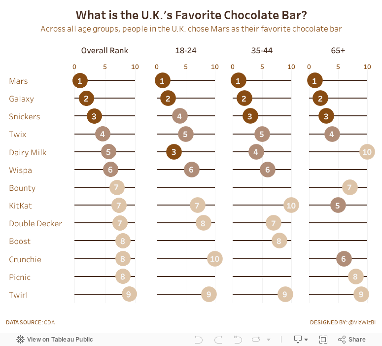
Makeover Monday: What is the UK's Favorite Chocolate Bar?
The chart we're making over this week is from CDA.

What works well?
- The bump chart is a very nice visual display for ranked data.
- Including the rank as a number at each point.
- The lines are easy to follow.
- Labeling both the left and right side so that you don't have to trace the line back to the start when you get to the end.
- Using a different mark type when the chocolate is not ranked.
- Simple title and subtitle.
What could be improved?
- This is a LOT of colors and some of them are very close to each other.
- Why are there age bands missing?
My Objectives
- Split each of the age groups out rather than connecting them and then include a total, which is the average across the age groups. I'm making the assumption here that the same number of people were surveyed in each age group.
- Display the data as a dot plot along a scale from 0-10 for each chocolate bar for each age group
- Use a brown theme to go with the connotative color of chocolate
- Color the values using a brown scale
January 7, 2018
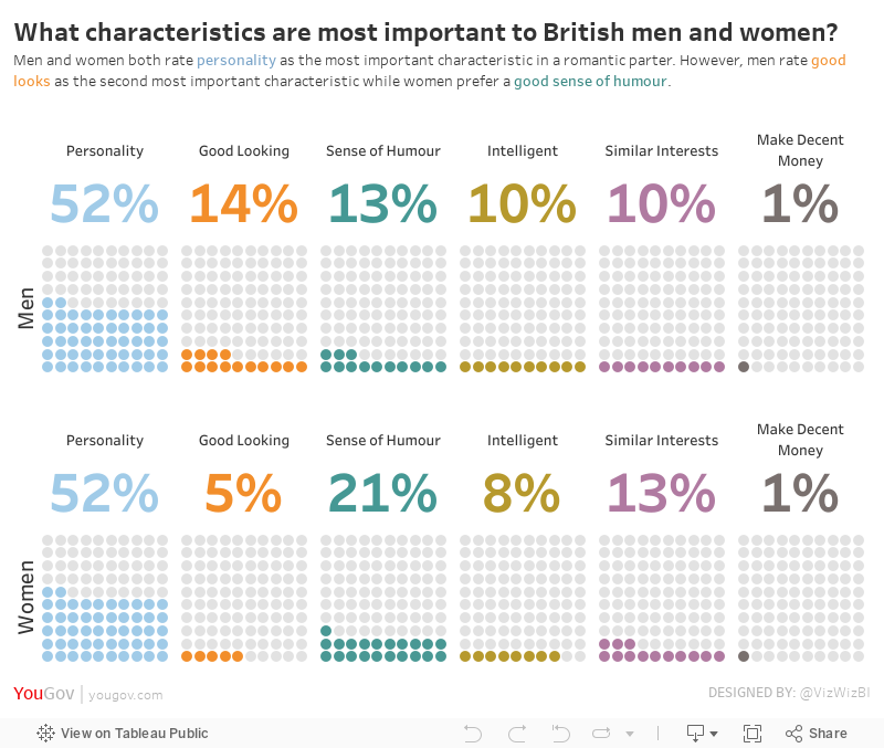
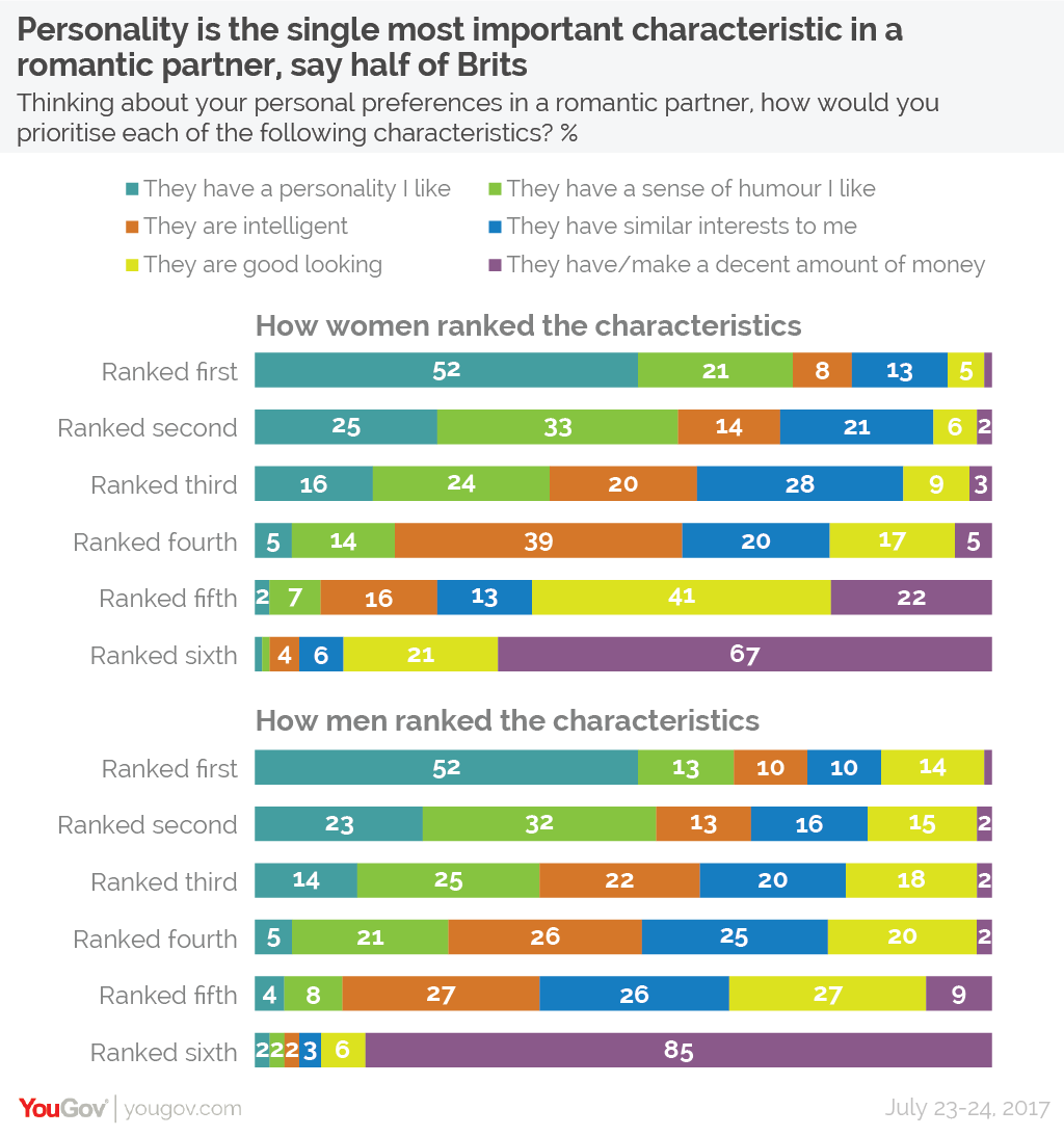
Makeover Monday: What characteristics are most important to British men and women?
For week 2, we looked at this viz from YouGov.
What works well?
- The title and subtitle that make it clear what the viz is about.
- Splitting the view up between men and women keeps it from getting too busy.
- You can easily look up any value.
- The colors are easy to distinguish from each other.
- The colors are in the same order for each row.
- Including the survey dates in the footer.
What could be improved?
- Making comparisons between men and women takes longer than necessary.
- Repeating the word "ranked" on each row is unnecessary.
- While you can easily look values up, your eyes have to go back and forth to the legend.
- The legends could be reworded to be shorter. For example, change "They have a personality I like" to "Personality".
What I did

Oh maybe this is something to work with, but wait, I could swear I've seen this somewhere before. Turns out Andy Cotgreave created this for Makeover Monday week 4 back in 2016. How ironic!
So I set out to do something similar. Basically I wanted to take the original stacked bars, keep them separated by gender, and then create BANs and the units chart for each personality characteristic as Andy has done.
With that, here's is my viz.