Showing posts with label british. Show all posts
December 22, 2019
#MakeoverMonday: How much are Brits & Europeans expected to spend on Christmas?
british
,
Christmas
,
Deloitte
,
europe
,
Makeover Monday
,
survey
,
UK
,
united kingdom
No comments

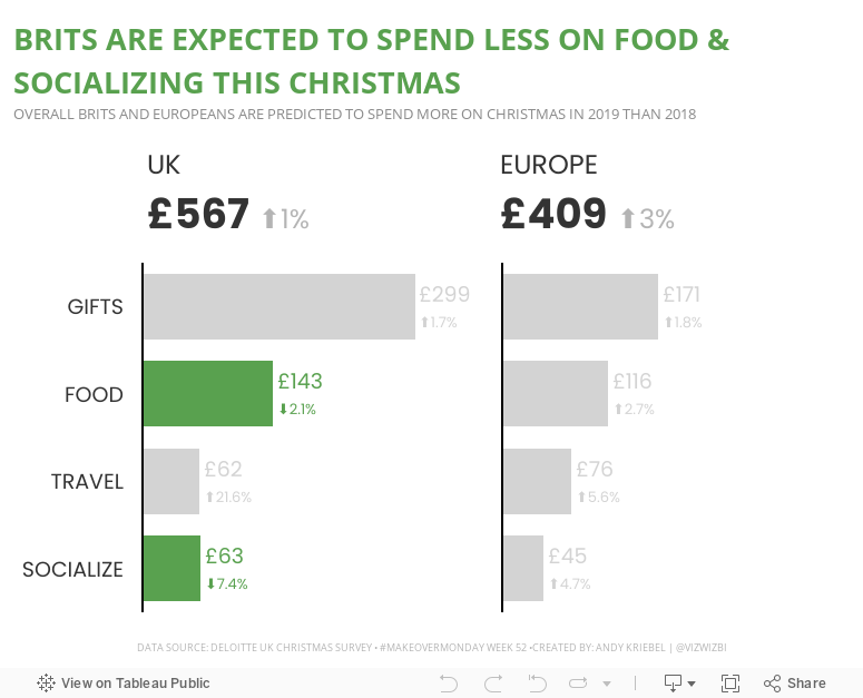
This week, Eva picked Christmas-themed data...a simple survey from Deloitte about expected Christmas spending and the UK and Europe.

What works well?
- It a simple table that is easy to understand without doing much thinking.
- My eyes were immediately drawn to the two red declining arrows, which makes it seem to be the focus on the visualization.
- The table is neatly organized from highest to lowest spending categories.
- Everything is clearly labeled.
- The highlight box on the right provides a nice summary.
What could be improved?
- Remove the shading from 2018
- Removed the shading from the background of the Total cell
- Align the text labels either left of right, but not center
- Remove the borders between the rows, but keep them to separate the headers and totals from the rest of the table
- Change the font color of the categories to black; green could give the impression that they are increasing
- Align the arrows on the second table with the rows they correspond to
- Why is spending less red? I would think spending less is good
Taking all of this into account, here's my Makeover Monday week 52. Enjoy!

January 8, 2018
Makeover Monday: Which characteristic preferences are most different with British men and women?
What I really like is how Datawrapper automatically colors the difference between the two dots. Really slick!
January 7, 2018
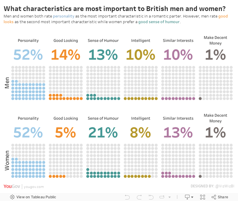
Makeover Monday: What characteristics are most important to British men and women?
british
,
characteristics
,
love
,
Makeover Monday
,
men
,
personality
,
UK
,
united kingdom
,
women
15 comments
For week 2, we looked at this viz from YouGov.
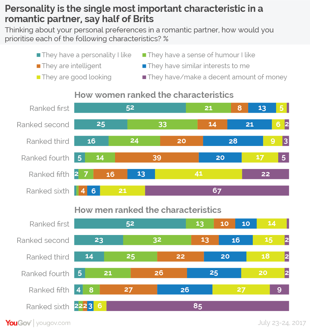
What works well?
- The title and subtitle that make it clear what the viz is about.
- Splitting the view up between men and women keeps it from getting too busy.
- You can easily look up any value.
- The colors are easy to distinguish from each other.
- The colors are in the same order for each row.
- Including the survey dates in the footer.
What could be improved?
- Making comparisons between men and women takes longer than necessary.
- Repeating the word "ranked" on each row is unnecessary.
- While you can easily look values up, your eyes have to go back and forth to the legend.
- The legends could be reworded to be shorter. For example, change "They have a personality I like" to "Personality".
What I did
I struggled with this data set. I must have spent 2-3 hours trying to find something insightful, trying different chart types, etc. Nothing was working for me. When I get stuck like this, I like to turn to Google images. I searched for "looks vs. personality charts" to hopefully find some inspiration.
I clicked on one image and then some of the related images. This image in particular stuck out to me:

Oh maybe this is something to work with, but wait, I could swear I've seen this somewhere before. Turns out Andy Cotgreave created this for Makeover Monday week 4 back in 2016. How ironic!
So I set out to do something similar. Basically I wanted to take the original stacked bars, keep them separated by gender, and then create BANs and the units chart for each personality characteristic as Andy has done.
With that, here's is my viz.
Subscribe to:
Posts
(
Atom
)


