October 27, 2022
Which chart type should you use?
I get asked quite often how I know which chart to choose and when. There are lot of times now when I don't really think about it, but that because of my experience. When I started, I had no idea which chart would work best for my data.
To make it easier for you to choose the right chart type, here's a list of resources I use when I need to know which chart to use and when.
Financial Times Visual Vocabulary
Use this guide to help you decide which data relationship is most important in your story, then look at the different types of chart within the category to form some initial ideas about what might work best.
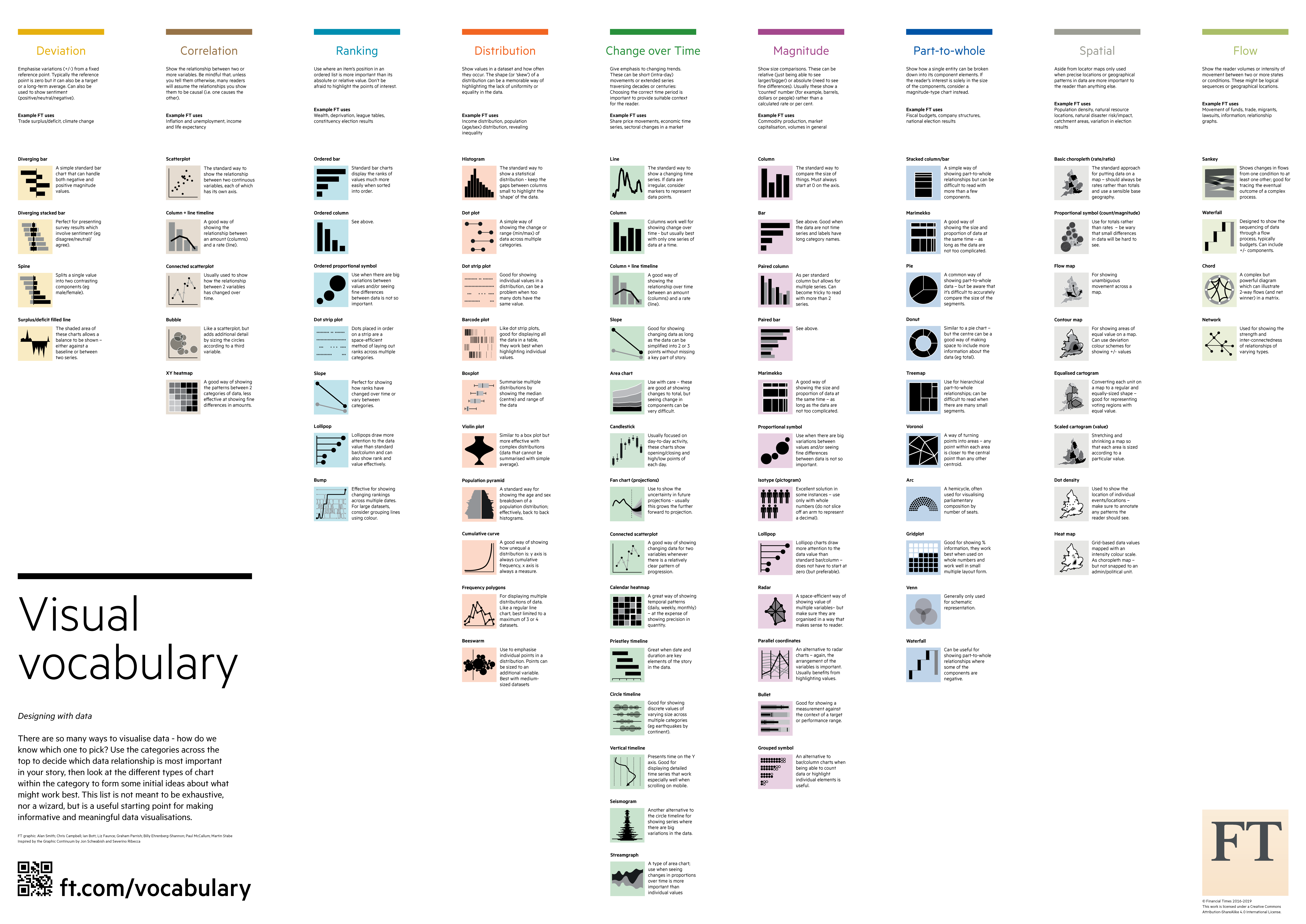
Chart.Guide Chart Chooser
Link | The charts are split into different categories, based on their primary use. You can then pick a chart type within each group. I particularly like the icons that tell the primary use for the chart: analysing, communicating, monitoring, and confusing.
The Data Visualisation Catalogue
Link | This is similar to chart.guide. You can see all of the chart types alphabetically or organize them by function or as a list.
The Tableau Chart Catalog
Link | Collated by Kevin Flerlage, this workbook provides a list of chart types and links to them.
The Data Viz Project
Link | This is by far the most extensive set of charts. Each chart includes a detailed description of the chart type and its functions. There are also options for viewing the charts by chart family, data input, function and shape.

The Visualization Universe
Link | I really should be using this resource more often. It's curated by some of the best data visualization experts in the world. You can sort by most popular, alphabetical, and which chart types are trending.
Subscribe to:
Post Comments
(
Atom
)


No comments
Post a Comment