December 30, 2018
Makeover Monday: Team by Team NHL Attendance
attendance
,
hockey
,
KPI
,
Makeover Monday
,
NHL
,
trend
No comments

For week 1, we're making over this chart from NHL to Seattle. Granted the chart is from 2013, but it's still worth a makeover. If you want to see what John Barr has done since then, you can find a more recent visualization of NHL attendance from him here.
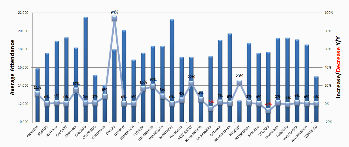
What works well?
- The teams are ordered alphabetically, which makes it easy to find a specific team.
- Axes are clearly labeled
What could be improved?
- You should NEVER EVER truncate the axis of a bar chart.
- You should not use a line chart for non-ordinal data (e.g., team names).
- There's no title.
- 3D bar charts are meh
- Labeling each square makes the viz feel cluttered.
- Ordering the bars from highest to lowest would make it easier to see where a team ranks.
What I did
- I grouped the team into their respective conferences and divisions.
- I create a couple of KPIs and repeated them for each team.
- I started by lining up the teams horizontally, which kept me under an hour. Then I sent a screenshot to Eva and she said it would make more sense to have them vertically and geographically west to east. THAT TOOK FOREVER! Three sheets for each team, each within a "team container", which is inside a "Division" container, which is inside a horizontal container to give each division container the same space. What a pain!
It's done. So with that, here's my first Makeover Monday for 2019. Click the image for the interactive version.
December 23, 2018
Makeover Monday: Spending on Christmas Gifts in America
census
,
Christmas
,
Deloitte
,
Makeover Monday
,
population
,
retail
,
shopping
,
spending
,
world bank
No comments

I believe Charlie Hutcheson is the only community member to complete all 156 weeks, though Simona Loffredo has only a couple of weeks to catch up on before the end of the year to join Charlie (and me) in the 100% club. As of this writing, Charlie has 307 vizzes on his Tableau Public profile, while Simona has 197. That's an incredible achievement and a testament to their dedication to improve week by week.
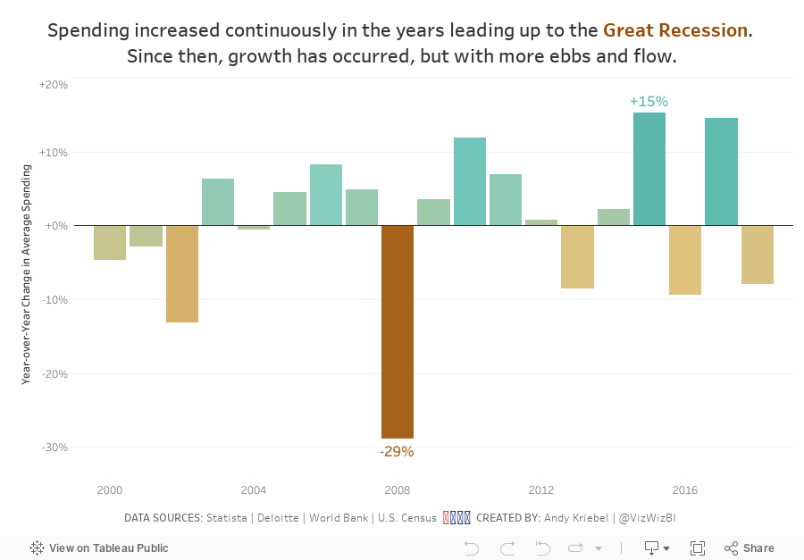
It's nearly Christmas Day, so Eva picked a Christmas-themed data set. Let's have a look at the viz:
 |
| Original viz by Statista |
What works well?
- It's a line chart based on time, so it's easy to understand what it's telling us.
- Using one color
- I kind of like the banding for every other year.
- Good axis title for the measure
What could be improved?
- Remove all of the numbers except the first and last years.
- Add a title
- Add the data source; surely Statista didn't come up with the data themselves.
- Remove the paywall so we can see information about the source and the publisher.
- Remove the paywall for downloading the data. All you really need to do is type the numbers into Excel anyway.
- Is there any insight?
What I did
- Create something simple
- Supplement with additional data to see if it can add any context.
- Deloitte's 2018 Holiday Survey of Consumers for information about the number of gifts purchased
- US Census for Monthly Retail Trade spending - I used the Total (excl. Motor Vehicle and Gas) and divided it by the number of months.
- Population data from the World Bank (1999-2017) and the US Census (2018)
- Looked at year-over-year change
- Compare the statistics to look for relationships
I found absolutely no relationships between the average spending data and the other metrics. You might see that as a waste of time, but for me, that's part of the analytical process. Just because you don't find something, that doesn't mean the analysis is wasted. It means you have confirmed there is no relationship.
With that, here's my final Makeover Monday for 2018, focusing on the year-over-year change to highlight the Great Recession.
December 18, 2018
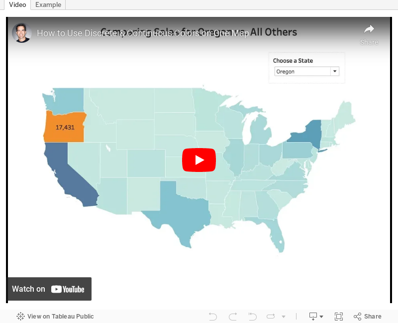
Tableau Tip Tuesday: Using Discrete & Continuous Colors on One Map
color
,
continuous
,
discrete
,
dual axis
,
layer
,
layering
,
map
,
Tableau Tip Tuesday
No comments

A couple weeks ago,
This is quite simple if you know how to layer maps and take advantage of multiple marks cards. I show you how to do just that in this week's tip.
Enjoy!
December 17, 2018
Makeover Monday: London Bus Safety Performance
bus
,
KPI
,
Makeover Monday
,
performance
,
safety
,
TfL
,
transport for london
No comments

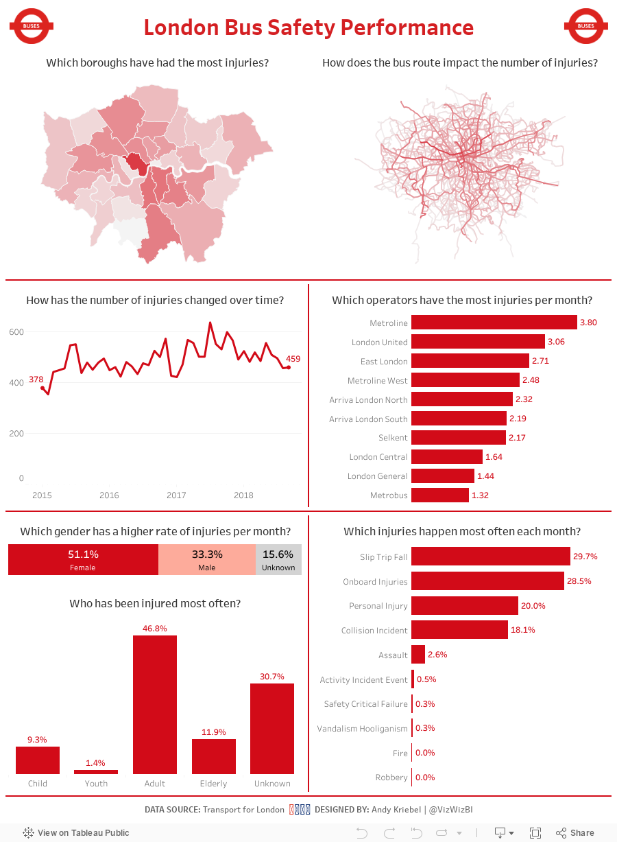
So, to get back at them, I gathered all of the bus injury data from Transport for London and gave it to all of you, the Makeover Monday Community, to help make their scorecards better. What does the scorecard look like now?

What works well?
- The line charts are easy to understand.
- All charts have good titles.
- The donut chart is clear and simple.
- The colors work well together (except the pie).
What could be improved?
- The pie chart could be made into a bar chart.
- The charts could use more context.
- The data is horribly delayed (it's December 17th as I write this and the data only goes through June).
What I did
- Give the user an opportunity to explore the data; every chart has action filters
- Use TfL colors
- Provide context on some of the charts, like injuries per month
With that, here's my Makeover Monday week 51.
December 9, 2018
Makeover Monday: How much land is needed to produce our food?
animal products
,
animals
,
food
,
highlight
,
Makeover Monday
,
reference line
,
vegan
,
vegetarian
,
waterfall
No comments

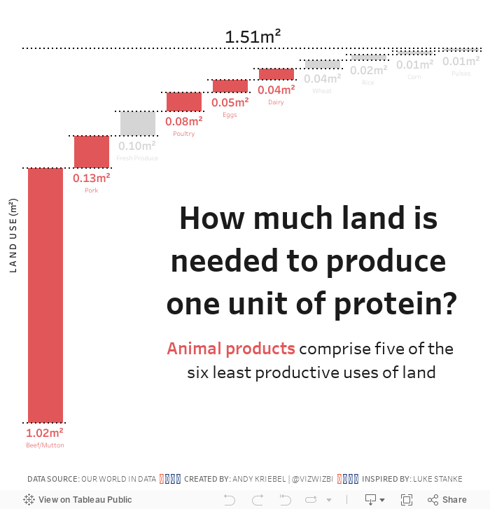
- A 9oz/251g steak contains 62g of protein.
- Multiply that by 1.02m² (the amount of land needed to produce 1g of steak)
- It takes 63.25m² of land to produce ONE STEAK. That's 678ft² for my American friends.
SERIOUSLY! WTF!
That's like a one bedroom apartment for every 10oz steak. That's ridiculous and a major reason why I went vegetarian 18 months ago.
Let's have a look at this week's chart:

What works well?
- Using a descending bar chart for ranking from largest to smallest
- Labeling the ends of the lines for more precision
- Simple title
What could be improved?
- It took me several times to read the subtitle to make sense of it. Something simpler would be helpful.
- Remove the gridlines
- Remove the axis
What I did
- Recreated the waterfall chart that I had to create for Workout Wednesday week 49
- Used color to highlight the food types that come from animals; I used red to represent bad (my opinion)
- Change the title into the form of a question
- Included a BAN to summarize the findings
With that, here's my Makeover Monday week 50.
December 3, 2018
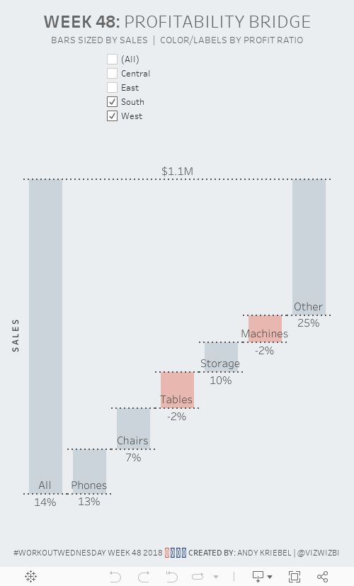
Workout Wednesday | Week 48: Profitability Bridge
I'm a bit behind again on Workout Wednesday, you know, this whole life thing. Today I had a few minutes to look at week 48. As it was a waterfall chart with a couple of other tricks thrown in, I thought it would be pretty straightforward, and it was...thank goodness.The basic requirements:
- Create a waterfall chart showing the top 5 sub-categories by sales. Include an other category for all other categories.
- Show a bar on the far-left of the waterfall that shows all sub-categories. Label it all.
- Add dashed lines that “connect” each bar.
- Add a dashed line that connects the All bar with the Other bar.
- Make sure each line looks as a single continuous dashed line.
- Label each sub-category above the bottom line of each bar.
- Label each bar with the profit ratio below the bottom line of each bar.
- Add a filter by region. Make sure the filter is centered on the dashboard above the chart.
- Color the bar gray if it above zero or pink if it is below zero.

December 2, 2018
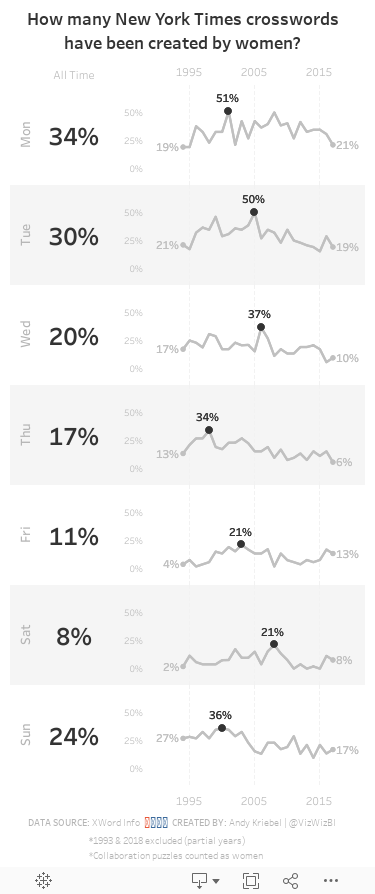
Makeover Monday: How many New York Times crosswords have been created by women?
big numbers
,
crossword
,
female
,
gender
,
indicator
,
new york times
,
sparkline
,
women
No comments

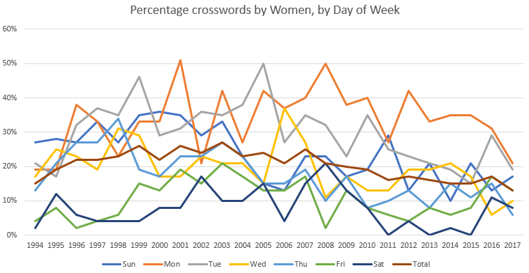
What works well?
- The title explains what the chart is displaying.
- The x-axis and y-axis are easy to understand.
- Excluding 1993 and 2018 since they are partial years.
- The chart has the proper height-to-width ratio.
What could be improved?
- The title could be a bit more informative. Something like "Over the last 24 years, there have been only three weekdays where women has constructed at least 50% of the crosswords."
- There are too many colors, making the chart distracting and the lines hard to follow.
What I did
- Separated the days into separate charts so the trends for each weekday would be easier to follow
- Created sparklines and highlighted the high point for each weekday
- Labeled the values for 1994 and 2017 for context
- Included a BAN for the overall percentage for each weekday
- Created a mobile layout
- Shaded every other row to distinguish the weekdays and help guide the eye across the chart
Subscribe to:
Posts
(
Atom
)


