Showing posts with label retail. Show all posts
December 23, 2018
Makeover Monday: Spending on Christmas Gifts in America
census
,
Christmas
,
Deloitte
,
Makeover Monday
,
population
,
retail
,
shopping
,
spending
,
world bank
No comments

I believe Charlie Hutcheson is the only community member to complete all 156 weeks, though Simona Loffredo has only a couple of weeks to catch up on before the end of the year to join Charlie (and me) in the 100% club. As of this writing, Charlie has 307 vizzes on his Tableau Public profile, while Simona has 197. That's an incredible achievement and a testament to their dedication to improve week by week.
It's nearly Christmas Day, so Eva picked a Christmas-themed data set. Let's have a look at the viz:
 |
| Original viz by Statista |
What works well?
- It's a line chart based on time, so it's easy to understand what it's telling us.
- Using one color
- I kind of like the banding for every other year.
- Good axis title for the measure
What could be improved?
- Remove all of the numbers except the first and last years.
- Add a title
- Add the data source; surely Statista didn't come up with the data themselves.
- Remove the paywall so we can see information about the source and the publisher.
- Remove the paywall for downloading the data. All you really need to do is type the numbers into Excel anyway.
- Is there any insight?
What I did
- Create something simple
- Supplement with additional data to see if it can add any context.
- Deloitte's 2018 Holiday Survey of Consumers for information about the number of gifts purchased
- US Census for Monthly Retail Trade spending - I used the Total (excl. Motor Vehicle and Gas) and divided it by the number of months.
- Population data from the World Bank (1999-2017) and the US Census (2018)
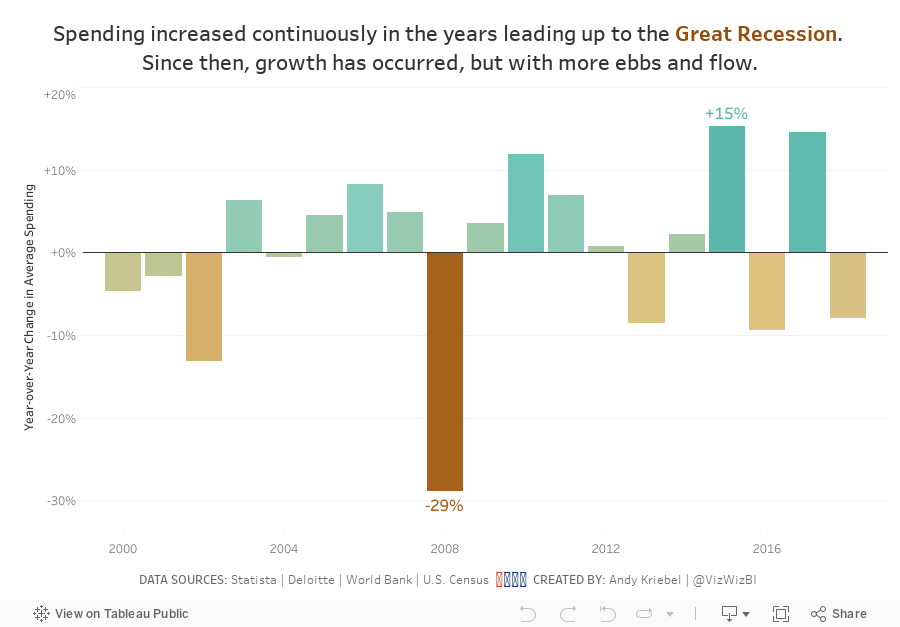
- Looked at year-over-year change
- Compare the statistics to look for relationships
I found absolutely no relationships between the average spending data and the other metrics. You might see that as a waste of time, but for me, that's part of the analytical process. Just because you don't find something, that doesn't mean the analysis is wasted. It means you have confirmed there is no relationship.
With that, here's my final Makeover Monday for 2018, focusing on the year-over-year change to highlight the Great Recession.
February 4, 2011
Mr. Nielsen, a simple bar chart is so much better!
bar chart
,
chartjunk
,
column chart
,
Nielsen
,
pie chart
,
retail
,
sales
,
shoppers
3 comments
Another fantastic article from Nielsen, tainted by a pie chart. Want to Increase Store Traffic, Loyalty and Growth? Re-Think the Center Store

The purpose of Nielsen’s pie charts is to compare the % of total trips to the % of total sales. But there’s no way to do it effectively or quickly if your eyes are having to constantly scan back and forth in an attempt to compare their sizes.
Any of the bar/column charts below is a considerable improvement over the pie charts. My favorite of the options below is the bar-in-bar chart. You can quickly see that fill-in/errand trips are the most frequent, but food trips dominate sales. Which is your favorite?

Subscribe to:
Posts
(
Atom
)






