March 22, 2021
#MakeoverMonday Week 12 - How much do Americans spend on cereals?
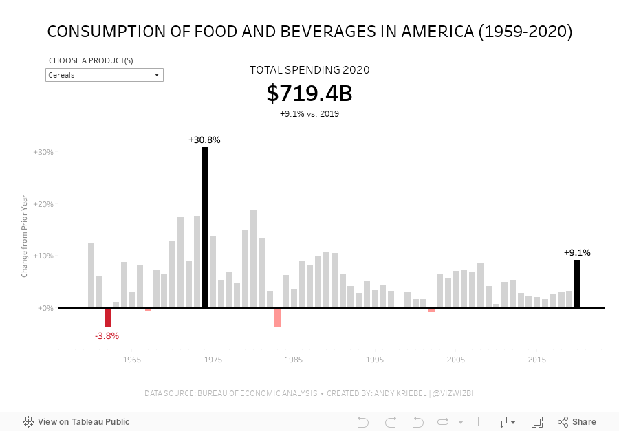
Viz 1 - Year over Year Change in Consumption of Food and Beverages in America

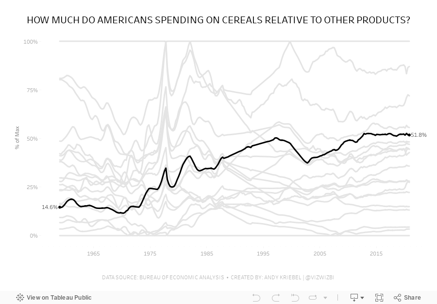
Viz 2 - Parallel Coordinates - How much do Americans spend on cereals relative to other products?

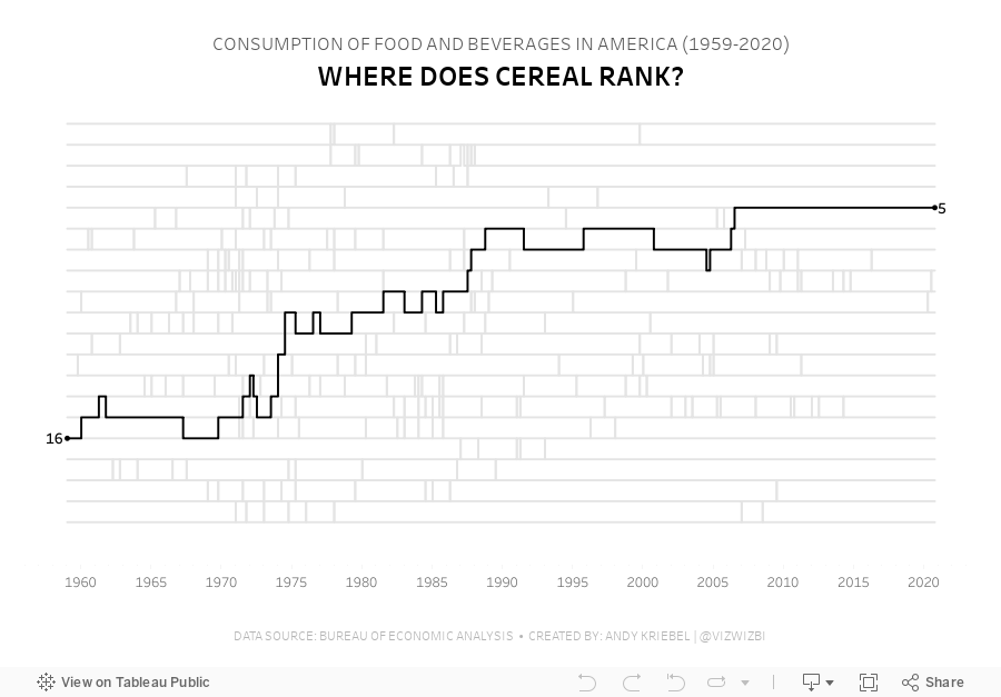
Viz 3 - Bump Chart - #MakeoverMonday 2021 Week 12 - How Does Cereal Rank in American Food Spending?

March 25, 2019
#MakeoverMonday: Consumer Spending by Generation

What works well?
- The generations are sorted from youngest to oldest.
- The title is clear.
- The gridlines help guide the eye across the viz.
- It's easy to compare the general/misc category and the restaurants across generations.
- A stacked bar chart is easy to understand.
What could be improved?
- The story in the data, from the article, is about how millennials are spending more on restaurants. It would be good to make that a more obvious focus of the viz.
- There are too many colors.
- While the title is clear, if you don't read the article, you could miss the purpose for the chart.
What I did
December 23, 2018
Makeover Monday: Spending on Christmas Gifts in America

I believe Charlie Hutcheson is the only community member to complete all 156 weeks, though Simona Loffredo has only a couple of weeks to catch up on before the end of the year to join Charlie (and me) in the 100% club. As of this writing, Charlie has 307 vizzes on his Tableau Public profile, while Simona has 197. That's an incredible achievement and a testament to their dedication to improve week by week.
It's nearly Christmas Day, so Eva picked a Christmas-themed data set. Let's have a look at the viz:
 |
| Original viz by Statista |
What works well?
- It's a line chart based on time, so it's easy to understand what it's telling us.
- Using one color
- I kind of like the banding for every other year.
- Good axis title for the measure
What could be improved?
- Remove all of the numbers except the first and last years.
- Add a title
- Add the data source; surely Statista didn't come up with the data themselves.
- Remove the paywall so we can see information about the source and the publisher.
- Remove the paywall for downloading the data. All you really need to do is type the numbers into Excel anyway.
- Is there any insight?
What I did
- Create something simple
- Supplement with additional data to see if it can add any context.
- Deloitte's 2018 Holiday Survey of Consumers for information about the number of gifts purchased
- US Census for Monthly Retail Trade spending - I used the Total (excl. Motor Vehicle and Gas) and divided it by the number of months.
- Population data from the World Bank (1999-2017) and the US Census (2018)
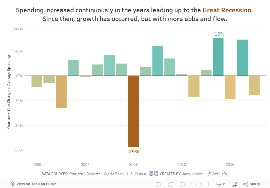
- Looked at year-over-year change
- Compare the statistics to look for relationships
September 10, 2018
Makeover Monday: Spending at Trump Properties in Washington D.C.

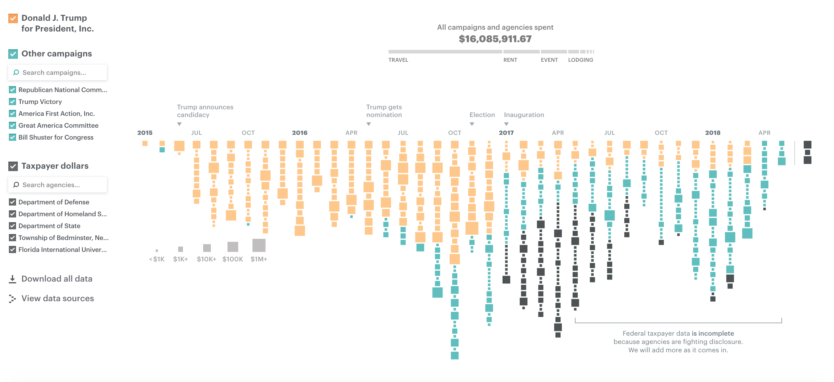
Since Watergate, presidents have actively sought to avoid conflicts between their public responsibilities and their private interests. Every president since Jimmy Carter sold his companies or moved assets into blind trusts or broadly held investments – until now. Donald Trump never did this, despite his expansive holdings. He stands to gain personally when groups pay his companies.Let's start by looking at the chart created by ProPublica:
What works well?
- Colors are easy to distinguish
- Good interactivity for additional information
- Filter options are obvious and easy to use
- Sizing the blocks gives you relative comparisons
- Good use of annotations
- Stacking the blocks makes it obvious there were more records in one month versus another
What could be improved?
- Using size for the blocks makes exact comparisons difficult
- Include a title
- Include a subtitle with additional context
- Provides the user the ability to ask "How does this affect me?"
What I did
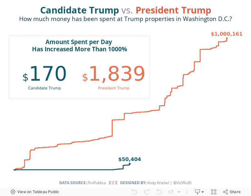
- I explored the data quite a bit, before focusing on Washington. I did this because I saw a large increase in spending after Trump was elected.
- Use simple colors like the original
- Compare spending during the Campaign vs since Trump has been President
- Use BANs to call out the import information
February 27, 2017
Makeover Monday: How do I use my AMEX?
I received my annual AMEX statement back in January. It included these two charts:


Normally I review what works and what doesn't. However, this week I'm incredibly short on time, so read Eva's review and you'd basically be reading what I would write.
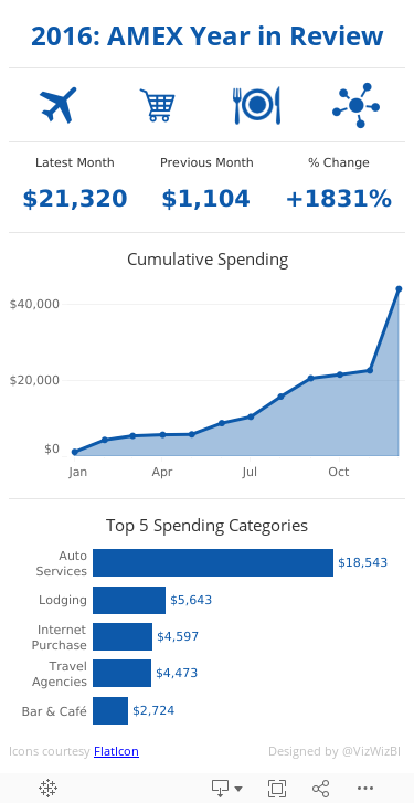
For my viz, I knew I wanted something that I could view on my phone. Nearly every viz I created now, I start with the mobile version. It tends to lead to a better user experience. I drew inspiration from this dashboard by Money Dashboard:

In addition, I wanted to use the blue that in the AMEX Delta gold card. Ok, so without any more bantering, here's my makeover for this week. Clean, simple, tells me what I need to know. Good enough for me!
February 8, 2013
Taking the Kraken to U.S. federal government spending
I was watching a video from Simon Rogers the other day about data journalism and how he got started. During his TEDx talk he showed this bubble chart that he created on government spending in the UK.

This reminded me that Tableau 8, the Kraken, now has the ability to create bubble charts. They’re not quite as sophisticated as what Simon created, they’re more like what you can build with ManyEyes, yet, like most of Tableau’s features, they’re unbelievably simple to build.
I downloaded data about US federal government spending in the 2013 budget from Wikipedia, connected to it with Tableau and within 3 clicks I had my bubble chart.
Clicks 1 & 2 – Select Agency and Total (which is total spending)

Click 3 – Click the packed bubbles option from Show Me

And here’s what you get:

This is pretty boring, so I placed Total on the color shelf and changed the color palette to red-blue diverging and reversed them.

That’s about six clicks and I have something pretty interesting. But that’s not enough for me. I wanted some interactivity. A few minutes later and this is what I created:

Is it perfect? No. Give it a whirl.
- Play around with the selectors. Notice how the sheet colors change from a measure to a dimension. Download the workbook and see if you can figure out how I did it.
- Click on a department in the table to highlight it’s bubble.
- Notice how the table sorts based on the spending type you pick. This makes finding the top few bubbles much easier.
These new bubble charts are going to be pretty useful, though I can totally see them get wildly misused.
July 9, 2010
What's wrong with "visual" spend analytics?

- The largest slice should be first and it should start at the zero position.
- The legend is in an order that makes sense, but the slices don't match that order.
- The colors are way too strong.
- The third bullet on the left tells a good message, but if you want to see the true impact of that 97%, you need to start at the zero position.


- The title of the graph is black with white font, making it difficult to read and it garners too much attention. A light gray background with a black regular font works better.
- The text in the table is blue. Why? What value does it add?
- A darker or double line to separate the rows from the total would make the total more distinct.
- Numbers (as well as their headers) that represent quantitative values should ALWAYS be aligned to the right. Aligning the data to the right allows for quicker comparisons of the values; it's much easier to find the bigger values.
Towards the end of the session, John showed how you can wrap all of the visualization together in a dashboard. While this makes perfect sense, he wasn't careful enough about the design. Let's look at two examples.

- The dashboard title is meaningless. Every dashboard title should be a statement/phrase that captures the attention of the reader and signals what they are looking at. An example might be: "Expected savings were not achieved in the most recent quarter"
- The background is of the entire dashboard is gray, making it difficult to read the black font against it. A white background is nearly always preferred.
- As before, the chart titles are black with white font. Choose a light gray background and a regular black font.
- Six pie charts. Really? Six? Why not bar charts? The purpose appears to be to show rank, in which case a bar chart is preferred.
- Each set of two pie charts can be combined into one bar chart. The results would be three bar charts.
- The color shelves and quick filters just seem off for some reason. The placement strikes me as needing cleaning up. I'd have to work on this.

- When someone views a dashboard, their eyes automatically go to the upper left corner of the chart. The first thing they see here is the company logo. This would be best placed on the upper right.
- The contact information should then be shown below the company logo, like he has it, but on the right.
- The quick filters should be on the right, whether this is a banner for a home page or not.
September 19, 2009
Katrina Contracts
That led me to finding how Katrina contracts were being awarded by government Department. It's been tough to identify just which contracts were awarded to Halliburton since most of them are to subsidiaries. I'm working to gather all of those. The data was gathered from the Federal Procurement Data System (FPDS).
This is a very simple analysis, well not really much analysis at all, but in this instance, given the amount of information I want to display, I actually think the pie chart works better. Thoughts?






