Showing posts with label piechart. Show all posts
November 12, 2010
Is it a cherry pie?
If you've been a follower of this blog for a while, you are well aware of my dislike of pie charts. I criticized a pie chart from a poll conducted by Digital Photography School in a blog post back in April. Today they published the results from another polls, but this time, I'm not too unhappy with their use of a pie chart.

In this case, their use of the pie chart is somewhat acceptable because:
In this case, their use of the pie chart is somewhat acceptable because:
- There are only three data points.
- The chart starts at the zero position.
- The largest slice is first (though it would be better if they were in descending order all the way around).
- The results can be easily discerned.
October 26, 2010
Improving on the Blogger Stats Dashboard
Recently Google added the Stats feature to Blogger blogs. It's basically a dashboard very similar to Google Analytics, just stripped down (like Tableau Public vs. Tableau Desktop). There are four tabs, three of which are well done (Overview, Posts and Traffic Sources). However, the Audience dashboard is poorly designed.
This is the Google version of my blog stats from May 2010 - October 2010:

The map is well done, as you would expect, though it's tough to see the light green on the countries with less pageviews. I like the table below the map as a reference.
My issue is with the pie charts on the right. The tables are sufficient for my needs, especially since it has the total pageviews as well as the % of total. The pie charts are shown in descending order, but you have to work to find the starting point; as I've said in the past, pie charts should always start at the 0 degree mark when used.
If I were to visualize this dashboard, I would create it like this.

I've made the following changes/improvements:
This is the Google version of my blog stats from May 2010 - October 2010:
The map is well done, as you would expect, though it's tough to see the light green on the countries with less pageviews. I like the table below the map as a reference.
My issue is with the pie charts on the right. The tables are sufficient for my needs, especially since it has the total pageviews as well as the % of total. The pie charts are shown in descending order, but you have to work to find the starting point; as I've said in the past, pie charts should always start at the 0 degree mark when used.
If I were to visualize this dashboard, I would create it like this.
I've made the following changes/improvements:
- The left half of the dashboard the same, except that I was limited to bubbles on the map since I built this with Tableau's standard features. I prefer the filled in countries, and I know there are workarounds in Tableau, but I think this map makes the variance easier to see since I used an orange-brown color pallet.
- I did not change the reference table below the map.
- On the right, I have combined the pie charts and tables into a single view. The bar charts are listed in descending order by % of total pageviews and labeled with the # of pageviews. It's much easier to make sense of the bar charts than the pie charts.
October 15, 2010
Many Eyes hurts my eyes
barchart
,
Many Eyes
,
pareto
,
piechart
,
tableau
,
tableau public
,
terrorism
6 comments
The goal of Many Eyes is to "democratize visualization and to enable a new social kind of data analysis." This is a fantastic goal, however, many of the options available to create visualizations are poorly used. Let's look at two examples.
The data used for these visualizations can be found here, but note that the source is unknown, so I have no idea if the data is reliable or not.
The trouble with critiquing a visualization is that sometimes there are so many problems you become overwhelmed. Here are just a few:
For the most part, this map is well done. Some thoughts:
 I had a few goals I wanted to accomplish. How did I do?
POST PUBLICATION NOTE: The blue-red color range has already changed to red only, even though I have yet to interact with the data.
The data used for these visualizations can be found here, but note that the source is unknown, so I have no idea if the data is reliable or not.
The trouble with critiquing a visualization is that sometimes there are so many problems you become overwhelmed. Here are just a few:
- A bar chart is a much better way to display this data than a pie. chart
- There are way too many data points in the pie chart. While pie charts should be avoided whenever possible, if you MUST use them, limit them to no more than three slices.
- The pie does not start at the 0 degree mark.
- The slices, while ordered descending, are shown counter clockwise. Why?
- The interactivity (click on the slices) provides no value (i.e., chart junk).
For the most part, this map is well done. Some thoughts:
- There needs to be bit more contrast through the colors.
- Iraq clearly stands out from the rest as it should. My focus goes immediately there.
- I like the shading of the countries in their entirety. This one feature of Tableau that I wish they would add as a standard choice. Yes, I know there are workarounds.
- I like the option to switch between the shaded countries and bubbles, but again, the color choice could be better.
I had a few goals I wanted to accomplish. How did I do?- Create a greater contrast between the colors in order to make those with the highest number of casualties stand out more.
- Convert the pie chart to a bar chart to make the comparisons easier to detect.
- Create a Pareto chart to highlight the most important set of factors.
- Make the map and bar charts interactive. If you click or lasso (i.e., select multiple) on countries, the map and bar charts automatically filter each other and the countries are highlighted on the Pareto chart.
- Add a filter (at the top right) for Continent so that you can easily zoom in.
- When I first publish the workbook to Tableau Public, the blue-red color range looks exactly as I created it. However, once I interact with the Tableau Public workbook above (e.g., lasso several countries), the color range changes to red only; the blue converts to red.
- The axis on the Pareto chart would not display the tick marks. It looks fine in Desktop.
- Since the tick marks would not display, I decided to add reference lines. Again, those display perfectly in Desktop, but you can't see them in Public.
POST PUBLICATION NOTE: The blue-red color range has already changed to red only, even though I have yet to interact with the data.
September 13, 2010
Energy Generated by a Pie
ann orowski
,
barchart
,
chartjunk
,
cobb emc
,
energy
,
georgiamagazine
,
piechart
No comments
Our power company, Cobb EMC, sends out a monthly community magazine and it always provides nice stories on how they support the community and how they utilize their energy resources.
In the September edition of Georgia Magazine, they published a pie chart of the fuel sources of energy generated (see p. 15).

When I first looked at this I thought Coal was the #1 fuel source. Why? Because Coal was on the top of the pie and it just looks like it was the largest. Fortunately there are labels that let me know otherwise. If I was forced to use a pie chart (i.e., if the purpose was to establish a parts-to-whole relationship), I would present it like this:

Some improvements include:
If I were to present this data, I would present it in a ranking relationship with a bar chart. I would want to convey to the reader the fuel sources that provide the most energy, not necessarily the contribution to the total.

To me, it's much easier and quicker with the bar chart to see how much more energy comes from nuclear and coal than from natural gas and hydroelectric sources. I'm going to write to the editor.
In the September edition of Georgia Magazine, they published a pie chart of the fuel sources of energy generated (see p. 15).
When I first looked at this I thought Coal was the #1 fuel source. Why? Because Coal was on the top of the pie and it just looks like it was the largest. Fortunately there are labels that let me know otherwise. If I was forced to use a pie chart (i.e., if the purpose was to establish a parts-to-whole relationship), I would present it like this:
Some improvements include:
- Displaying the data largest to smallest starting at the 0 degree mark.
This allows you to quickly see that a great, great majority of the fuel comes from two sources. It's much harder to see in their pie chart. - The 3D view has been removed.
- The spaces between the slices have been removed.
If I were to present this data, I would present it in a ranking relationship with a bar chart. I would want to convey to the reader the fuel sources that provide the most energy, not necessarily the contribution to the total.
To me, it's much easier and quicker with the bar chart to see how much more energy comes from nuclear and coal than from natural gas and hydroelectric sources. I'm going to write to the editor.
July 9, 2010
What's wrong with "visual" spend analytics?
AlvarezMarsal
,
barchart
,
dashboard
,
JohnSimon
,
piechart
,
spending
,
tableau
,
webinar
No comments
I've been spending time lately watching lots of videos and attending lots of webinars, with the idea of continuous improvement. Today I watched a recorded session on Tableau Software's website titled "Visual Spend Analytics."
While the content and topic were quite interesting, given I work in the consumer packaged goods industry, I was disappointed with several of the visualizations that the author presented. John used Tableau for all of his demonstration, showing primarily views that were built prior to the webinar. I could tell, given my experience with Tableau, that John made changes to the reports/visualizations that Tableau would create automatically itself. In other words, some very basic best practices were broken.
Let's look at a few examples.
The first slide that caught me off guard, again given that the session was hosted by Tableau, was this pie chart.


Towards the end of the session, John showed how you can wrap all of the visualization together in a dashboard. While this makes perfect sense, he wasn't careful enough about the design. Let's look at two examples.

While four slices isn't too awful, some of the "standard" design of the pie chart is.
- The largest slice should be first and it should start at the zero position.
- The legend is in an order that makes sense, but the slices don't match that order.
- The colors are way too strong.
- The third bullet on the left tells a good message, but if you want to see the true impact of that 97%, you need to start at the zero position.
If you insist on a pie chart, here's a better way to do it that addresses all of the rules I've outlined above, but again, a pie chart is not the most effective way to assign quantitative values to 2-D areas.
99 times out of 100, a bar chart is a better alternative to a pie chart. I would display this same set of data like this. I think this clearly demonstrates that there is high value placed on spend analysis.
A bit farther into the presentation, John was showing a table he built for a client. Let's examine it:
A few issues that I see include:
- The title of the graph is black with white font, making it difficult to read and it garners too much attention. A light gray background with a black regular font works better.
- The text in the table is blue. Why? What value does it add?
- A darker or double line to separate the rows from the total would make the total more distinct.
- Numbers (as well as their headers) that represent quantitative values should ALWAYS be aligned to the right. Aligning the data to the right allows for quicker comparisons of the values; it's much easier to find the bigger values.
Towards the end of the session, John showed how you can wrap all of the visualization together in a dashboard. While this makes perfect sense, he wasn't careful enough about the design. Let's look at two examples.
First, let's look at this one titled "Dashboard - Sub-Category":
Again it looks like John overrode the best practices that Tableau has built into it and it has taken away from the presentation of the data.
- The dashboard title is meaningless. Every dashboard title should be a statement/phrase that captures the attention of the reader and signals what they are looking at. An example might be: "Expected savings were not achieved in the most recent quarter"
- The background is of the entire dashboard is gray, making it difficult to read the black font against it. A white background is nearly always preferred.
- As before, the chart titles are black with white font. Choose a light gray background and a regular black font.
- Six pie charts. Really? Six? Why not bar charts? The purpose appears to be to show rank, in which case a bar chart is preferred.
- Each set of two pie charts can be combined into one bar chart. The results would be three bar charts.
- The color shelves and quick filters just seem off for some reason. The placement strikes me as needing cleaning up. I'd have to work on this.
The last dashboard John demonstrated was a map of their office sites.

Neat I guess, but I don't see any value in making it interactive. If this is a banner for a home page, then a guess the layout is ok, but if it's meant to give some useful information, then it needs some work:
- When someone views a dashboard, their eyes automatically go to the upper left corner of the chart. The first thing they see here is the company logo. This would be best placed on the upper right.
- The contact information should then be shown below the company logo, like he has it, but on the right.
- The quick filters should be on the right, whether this is a banner for a home page or not.
Every time I attend a webinar I learn something. While most of them are very well done, there are occasions where the presenter should have asked someone with a significant knowledge of visual data display to review the materials.
As part of the wrap up for the session, John said that the company was delivering "innovative analytics" that position them to be a "value added" vendor. Can they add value? Certainly, but they could add a lot more by following more best practices. Are the analytics "innovative?" I don't think so, but then again, I already work with this same type of information.
April 16, 2010
Do you share the images you take online?
One of my favorite photography blogs is Digital Photography School. Just today they published the results of one of their polls.
So I'm thinking, okay, this is a photography website, surely they can present the data in an effective manner, but NOOOOOO. They succumbed to the dreaded pie chart.
Question 1: Do you share you images online? Yes or No?
Their results:

The simple, more effective way:

Question 2: Expanding on question 1, but how often do you share pictures online?
Their results:

I challenge you: what ranks #1? Took you a while huh?
Not only is a pie chart purely a bad choice, but their presentation doesn't even put the data in any sort of logical order. And, the color choices are terrible.
My take:

I challenge you again: what ranks #1? Took you about 1 second, right?
I'm so, so disappointed that even one of the most popular photography blogs can't get it right. What is this world coming to?
So I'm thinking, okay, this is a photography website, surely they can present the data in an effective manner, but NOOOOOO. They succumbed to the dreaded pie chart.
Question 1: Do you share you images online? Yes or No?
Their results:
The simple, more effective way:
Question 2: Expanding on question 1, but how often do you share pictures online?
Their results:
I challenge you: what ranks #1? Took you a while huh?
Not only is a pie chart purely a bad choice, but their presentation doesn't even put the data in any sort of logical order. And, the color choices are terrible.
My take:
I challenge you again: what ranks #1? Took you about 1 second, right?
I'm so, so disappointed that even one of the most popular photography blogs can't get it right. What is this world coming to?
April 9, 2010
The Earth is a Giant Pie
Check this out:

It's frightening that someone would publish a sphere-like pie chart; this was a new approach to me and possibly the worst yet. Come on, at least put the data in order. The KISS method is so much better:
A simple bar chart based on the data table would look like:

What are the top 5 categories? Takes you a while to figure it out, doesn't it? The most effective way to display this data to communicate the message is:

Why overcomplicate things when simple is clearly the best approach?

It's frightening that someone would publish a sphere-like pie chart; this was a new approach to me and possibly the worst yet. Come on, at least put the data in order. The KISS method is so much better:
A simple bar chart based on the data table would look like:
What are the top 5 categories? Takes you a while to figure it out, doesn't it? The most effective way to display this data to communicate the message is:
Why overcomplicate things when simple is clearly the best approach?
December 12, 2009
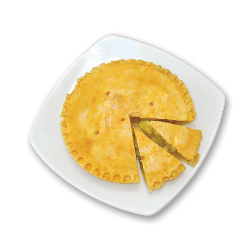
The Best Pie Chart Ever
This is so perfect!
The genius that created this said: "Needed to do a pie chart... so bought an apple pie at M&S, cut the percentages, and shot the pic. Pudding was served later with custard! ;-)"

The genius that created this said: "Needed to do a pie chart... so bought an apple pie at M&S, cut the percentages, and shot the pic. Pudding was served later with custard! ;-)"
October 28, 2009
Chocolate Cream Pie
chartjunk
,
chartsbin
,
gender
,
Guardian
,
nobelprize
,
piechart
3 comments
Oh how I love pie! They are delectable, delightful and delicious. Better yet, they're interactive; who can't use an interactive pie? Click on the image. I promise, you'll love it.

Some things I like (wink, wink):
Don't fret. There's more pie on the buffet:
Nobel Peace Prize Winners by Gender (I like how this chart sort of "swirls" in when the page loads...fancy stuff!)
Nobel Prize Winners in Physics by Gender (The 1.0695% of women who won are probably more upset about this pie chart than any apparent sexism.)
I will give ChartsBin some credit though. Their interactive maps are quite good. They're very similar to the maps on Google Analytics.
Some things I like (wink, wink):
- The colors get darker the farther out from the radius you go. I guess you could say they radiate.
- The pie doesn't start at the zero degree mark for easier ranking/comparisons.
- The level of precision...people must really care about the 1/10,000th of a percent of an award.
- What takes the cake, I mean pie, is the interactivity. You have to try it out; it's worth the giggle.
Don't fret. There's more pie on the buffet:
Nobel Peace Prize Winners by Gender (I like how this chart sort of "swirls" in when the page loads...fancy stuff!)
Nobel Prize Winners in Physics by Gender (The 1.0695% of women who won are probably more upset about this pie chart than any apparent sexism.)
I will give ChartsBin some credit though. Their interactive maps are quite good. They're very similar to the maps on Google Analytics.
September 7, 2009
Bubbles Bubbles Everywhere
aoscott
,
barchart
,
bubblechart
,
contribution
,
internet
,
media
,
newyorktimes
,
piechart
,
stats
,
stephenfew
,
tableau
,
television
4 comments
The New York Times ran an article written by A.O. Scott back in November. The purpose is not to critique the article, but rather the, gasp, bubble chart used to rank media consumption hours.

I'm a big fan of Stephen Few and have learned a lot from Stephen and his books about effective visual design. Stephen point out that "Visual perception in humans has not evolved to support the comparison of 2-D areas, except as rough approximations that are far from accurate."
As soon as I saw this ranked bubble chart, I immediately began exploring other, more effective display mediums. Here are some examples.
I wanted to start by trying to find a way to use the bubble charts. The only method I could employ was to add color to the bubble charts, but I don't gain much at all.

Of course, the simplest way to rank data is through a simple bar chart. The first example is as intuitive as it gets; it's very easy to compare the relative size of the bars. The only purpose of this graph is to emphasize the rank.

I took this a step further. When reviewing Scott's bubble chart, I had the impression that he was emphasizing the percentage of time that we spend in each of the different medium. That led me to a bar chart that shows the contribution to the total. It's the same graphic as the ranking chart above, but this time I intentionally labelled the bars to emphasize the contribution of each activity.

I'll conclude with one of the least effective displays, the dreaded pie chart, but I think one of the pie charts is actually a bit effective. The first pie chart displays every category, which makes it impossible to compare the sizes and has way too much information.

I decided to group all but the top two categories into an "other" category to simplify the pie chart and I also ensured that they were ranked by contribution as you made your way around the pie.

Which display do you like best? Which display is most effective? My vote is for the bar chart displaying the contribution to the total.

I'm a big fan of Stephen Few and have learned a lot from Stephen and his books about effective visual design. Stephen point out that "Visual perception in humans has not evolved to support the comparison of 2-D areas, except as rough approximations that are far from accurate."
As soon as I saw this ranked bubble chart, I immediately began exploring other, more effective display mediums. Here are some examples.
I wanted to start by trying to find a way to use the bubble charts. The only method I could employ was to add color to the bubble charts, but I don't gain much at all.
Of course, the simplest way to rank data is through a simple bar chart. The first example is as intuitive as it gets; it's very easy to compare the relative size of the bars. The only purpose of this graph is to emphasize the rank.
I took this a step further. When reviewing Scott's bubble chart, I had the impression that he was emphasizing the percentage of time that we spend in each of the different medium. That led me to a bar chart that shows the contribution to the total. It's the same graphic as the ranking chart above, but this time I intentionally labelled the bars to emphasize the contribution of each activity.
I'll conclude with one of the least effective displays, the dreaded pie chart, but I think one of the pie charts is actually a bit effective. The first pie chart displays every category, which makes it impossible to compare the sizes and has way too much information.
I decided to group all but the top two categories into an "other" category to simplify the pie chart and I also ensured that they were ranked by contribution as you made your way around the pie.
Which display do you like best? Which display is most effective? My vote is for the bar chart displaying the contribution to the total.
August 17, 2009
Pie Chart Abuse
I ran across this post from the Replacement Level Yankees Weblog and it provided me with a fantastic example of a pie chart gone wild (aka chart junk).

Answer this question for me by looking at the pie chart: Which player had the 5th most RBIs?
Pie charts are designed to represent parts of a whole. Does this chart present the data this way? Well, I suppose it does, but is it done effectively? Certainly not. It appears the data is sorted in alphabetical order, but that doesn't provide any insight. If insisting on a pie chart, why not sort it descending by % of total RBI? Pie charts should be used sparingly, if ever. A simple bar graph displays the data much more effectively.
Answer this question for me again by looking at the bar chart below: Which player had the 5th most RBIs? Which chart made it easier to find the answer?

Answer this question for me by looking at the pie chart: Which player had the 5th most RBIs?
Pie charts are designed to represent parts of a whole. Does this chart present the data this way? Well, I suppose it does, but is it done effectively? Certainly not. It appears the data is sorted in alphabetical order, but that doesn't provide any insight. If insisting on a pie chart, why not sort it descending by % of total RBI? Pie charts should be used sparingly, if ever. A simple bar graph displays the data much more effectively.
Answer this question for me again by looking at the bar chart below: Which player had the 5th most RBIs? Which chart made it easier to find the answer?
Subscribe to:
Posts
(
Atom
)






