August 30, 2021
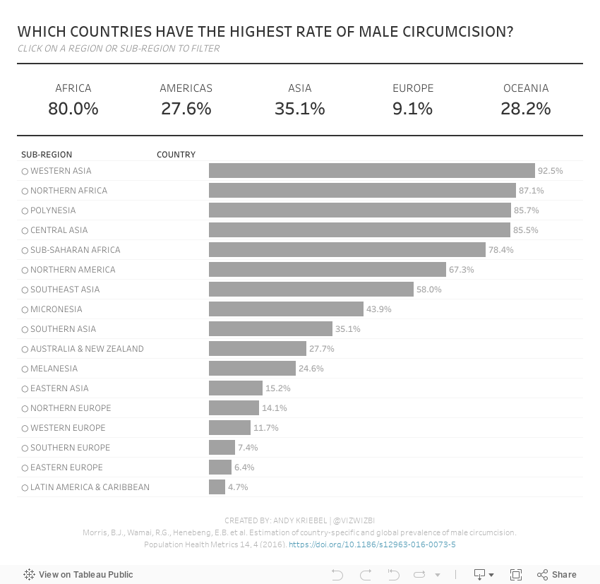
#MakeoverMonday 2021 Week 35 - Male Circumcision Around the World

In this week's Watch Me Viz, I started by showing the original visualization, demonstrated how to make a non-geographical field geographical, and then I spent lots of time working through set action drill down.
I showed how to do drill down to two and three levels of dimensions in a hierarchy. Lastly, while building the dashboard, I also showed how to move fields you select in an action to the top of the view with a sorting calculation.
Enjoy!
August 9, 2021
#MakeoverMonday 2021 Week 32 - Mortality Rates in England and Wales

I couldn't find too much to do with this week's data set, so I ended up with some simple BANs and line charts that take the original and reorganize them a bit to make them more clear.
Resources:
- Data set - https://data.world/makeovermonday/2021w32
- Chart Guide - https://chart.guide/
- Final Viz - https://bit.ly/mm2021w32
June 7, 2021
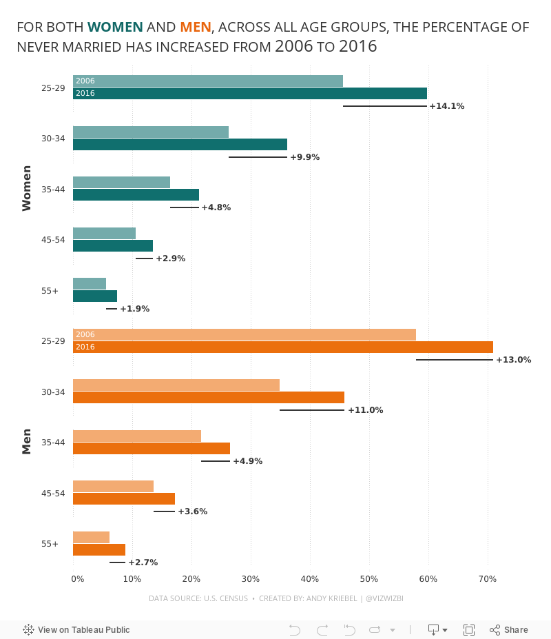
#MakeoverMonday 2021 Week 23: The Percentage of Never Married is on the Rise

- Final Viz (and below)
- Preferences file (all of my custom color palettes)
- How to Create a Combination Bar Chart & Candlestick Chart
May 17, 2021
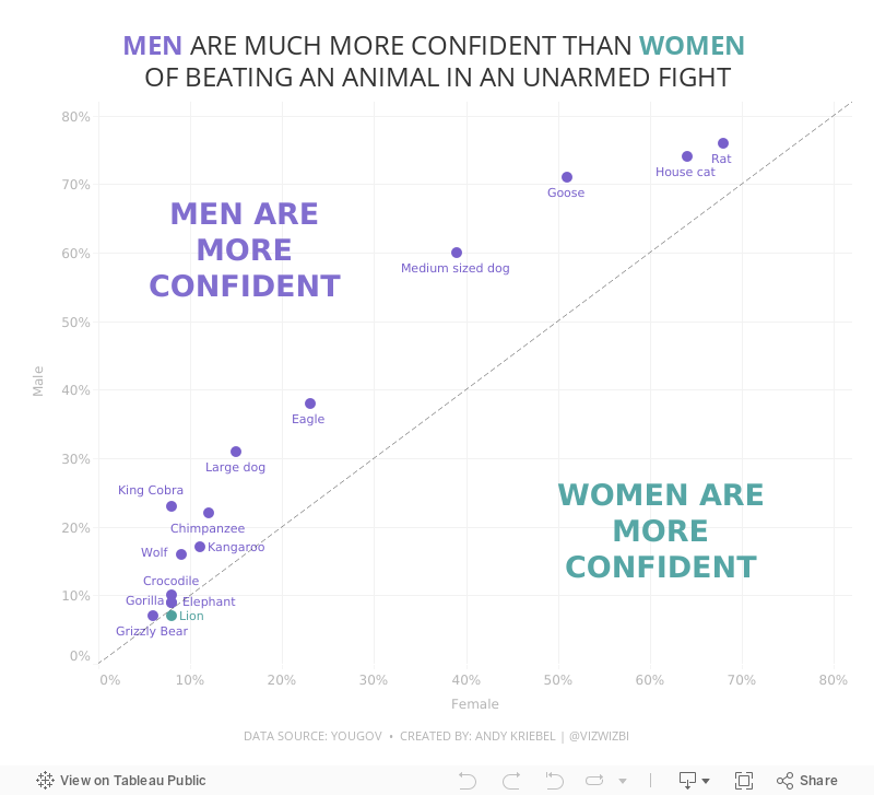
#MakeoverMonday Week 20 - Humans vs Animals

WatchMeViz
Visualization
March 8, 2021
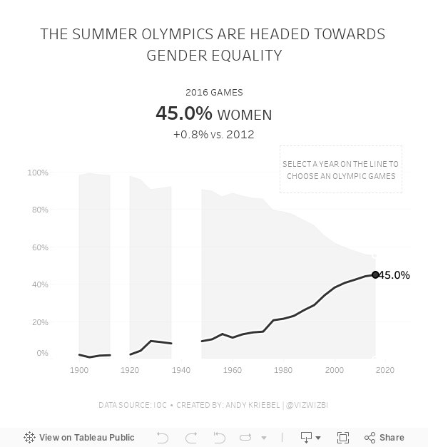
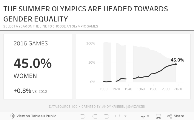
#MakeoverMonday Week 10: Female Participation in the Summer Olympics

First, thank you to Tommaso Ferri for moderating Watch Me Viz. I enjoyed working with this data set and was able to build nine vizzes in about 40 minutes, then took another 40-50 working through formatting and some pesky table calcs. I got there in the end!
After the live stream ended, I created one more version that uses containers. I think I like this one best. Below you'll find the live stream recording as well as the two final visualizations.
Thanks for watching!
February 8, 2021
#MakeoverMonday Week 6: Why Are Women Perceived to Be Unequal to Men?

Wow! What a fun #WatchMeViz that was! I iterated through 16 charts and then when the idea solidified, there was some great conversation and feedback on the chat to help me get to the end. I find survey responses quite difficult to visualize, so instead of getting frustrated, I thought about all of the ways I can compare data to see if anything would work.
Most importantly, thank you to all of your on the live chat. It makes a huge difference to me and I love getting your feedback and questions along the way. You make me better. You can find the final visualization below the video.

January 11, 2021
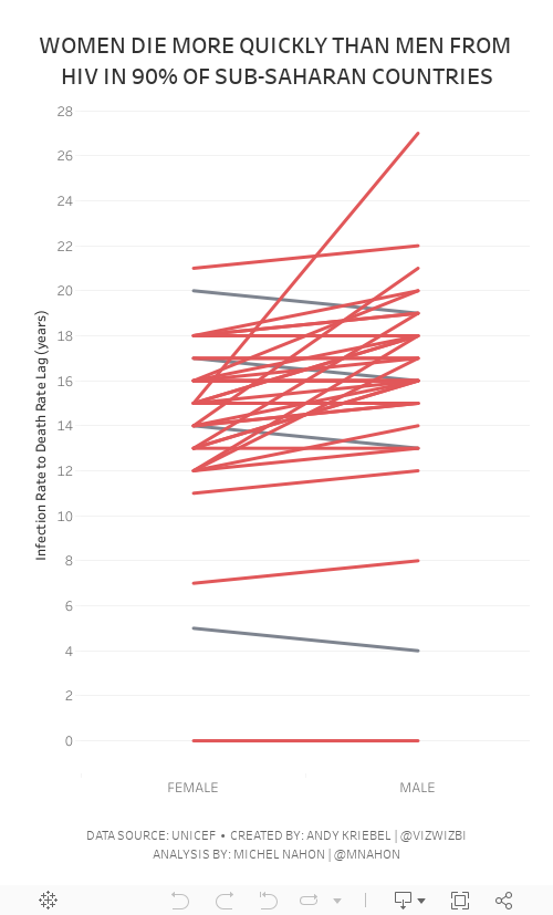
#MakeoverMonday Week 2 - Women Die More Quickly Than Men From HIV Infection

I must admit that I REALLY struggled with this data set. I could have easily just compared males vs. females by country and year, but it seems we've been doing that over and over again. I looked to explore the data and thought a connected scatterplot would look nice, but it didn't.
Fortunately Michel Mahon proposed looking at the lag between the year of HIV infection rate and death. Morbid yet interesting analysis. It took me a while to get the calcs working; I'd recommend you build your view as a table to verify the calcs when you're not sure if they're correct. In the end, thanks to Michel's suggestion, I created a slope graph that compares the lag in years for both men and women.
As the documentation suggested, women die more quickly than men.
Below are both my visualization and the Watch Me Viz session on YouTube. Thanks for tuning in!
November 2, 2020
#MakeoverMonday Week 44 - Where do women have more access to the internet and mobile phones than men?
#MakeoverMonday week 44 is another #Viz5 initiative. The topic this week is access to the internet and mobile phones by gender and country.
First, sorry about the video cutting out at the very end. My mistake.
In this video, I first review the initial visualization and talk about what works and what does. In the end, I went with a quadrant chart, which is a scatter plot with broken up into four quadrants. The viz focuses on only two of the quadrants to highlight the significant difference in the number of countries where women have more access to men for both technologies vs. the opposite.
I showed several methods for visualizing the data:
- Side-by-Side Bar
- Bar in bar
- Bar Graph vs. Reference Line
- Barbell
- Peas in a pod
- Floating bar chart
- Slope graph (terrible choice)
- Ranked slope graph (even worse choice)
- Histograms
- Box plot
- Scatter plot
Resources:
- Final workbook - LINK
- Data set - https://data.world/makeovermonday/2020w44
- Country and region information (Be careful joining this as some country names don't match. You'll want to using data blending and alias the country names to match.) - https://data.world/vizwiz/country-region-codes
- Chart Guide - https://chart.guide/
- Interactive chart chooser - https://depictdatastudio.com/charts/

March 20, 2019
#MakeoverMonday Data Studio Edition: Reykjavik Index for Leadership in G7 Countries

DATA PREP REQUIRED
- Add values for the remainder (100 - index)
- Add a sort column
- Pivot the data so that the index and the remainder were in the same column
WHAT WORKED WELL
- To create the stacked bar chart, all you need to do is select the chart type and drop the fields on the appropriate shelves.
- Customizing the split of the colors for the index and the remainder was easy.
- I was able to customize the size of the viz.
- You can choose any font that Google supports!!
- The tooltips are super responsive.
- Everything looks very crisp.
- Hiding the gridlines leaves a nice thin black line on the y-axis without me needing to fiddle around with a few different settings.
- The overall UX is quite intuitive. I see they have a data explorer now too.
WHAT I COULDN'T OVERCOME
- I couldn't find a way to show only the mark labels for the purple bars.
- I couldn't add a reference line for the G7 average so I had to leave it in the view.
- I couldn't hide the x-axis only. When you do, the y-axis gets hidden as well.
March 19, 2019
#MakeoverMonday Power BI Edition: Reykjavik Index for Leadership in G7 Countries

DATA PREP REQUIRED
- Add values for the remainder (100 - index)
- Add a sort column
- Pivot the data so that the index and the remainder were in the same column
WHAT WORKED WELL
- Creating a stacked bar chart in Power BI was quite simple.
- Customizing the split of the colors for the index and the remainder was easy.
- The viz layout is super intuitive and automatically adjust to the size of the screen while maintaining the original chart ratio.
- The fonts look super crisp.
- Simple to add a constant reference line for the G7 average.
WHAT I COULDN'T OVERCOME
- I couldn't find a way to show only the mark labels for the purple bars.
- I had to change the mark labels so that the values of the grey bars wouldn't be visible by making the text the same color as the grey bars.
- I couldn't copy/paste into a text box.
- I couldn't customize the font size for the reference line.
- I'm sure there's a way, but I couldn't figure out how to color code the bars based on whether they were above or below the G7 average. For example, I wanted to make those countries below the G7 average a lighter shade of purple.
December 2, 2018
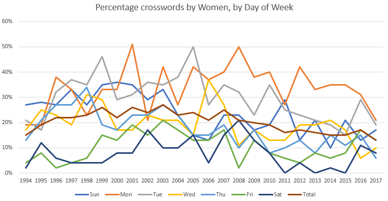
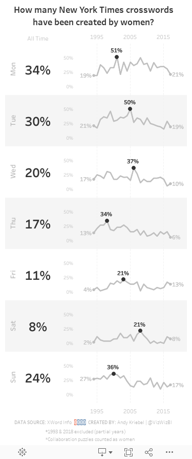
Makeover Monday: How many New York Times crosswords have been created by women?

What works well?
- The title explains what the chart is displaying.
- The x-axis and y-axis are easy to understand.
- Excluding 1993 and 2018 since they are partial years.
- The chart has the proper height-to-width ratio.
What could be improved?
- The title could be a bit more informative. Something like "Over the last 24 years, there have been only three weekdays where women has constructed at least 50% of the crosswords."
- There are too many colors, making the chart distracting and the lines hard to follow.
What I did
- Separated the days into separate charts so the trends for each weekday would be easier to follow
- Created sparklines and highlighted the high point for each weekday
- Labeled the values for 1994 and 2017 for context
- Included a BAN for the overall percentage for each weekday
- Created a mobile layout
- Shaded every other row to distinguish the weekdays and help guide the eye across the chart
November 12, 2018
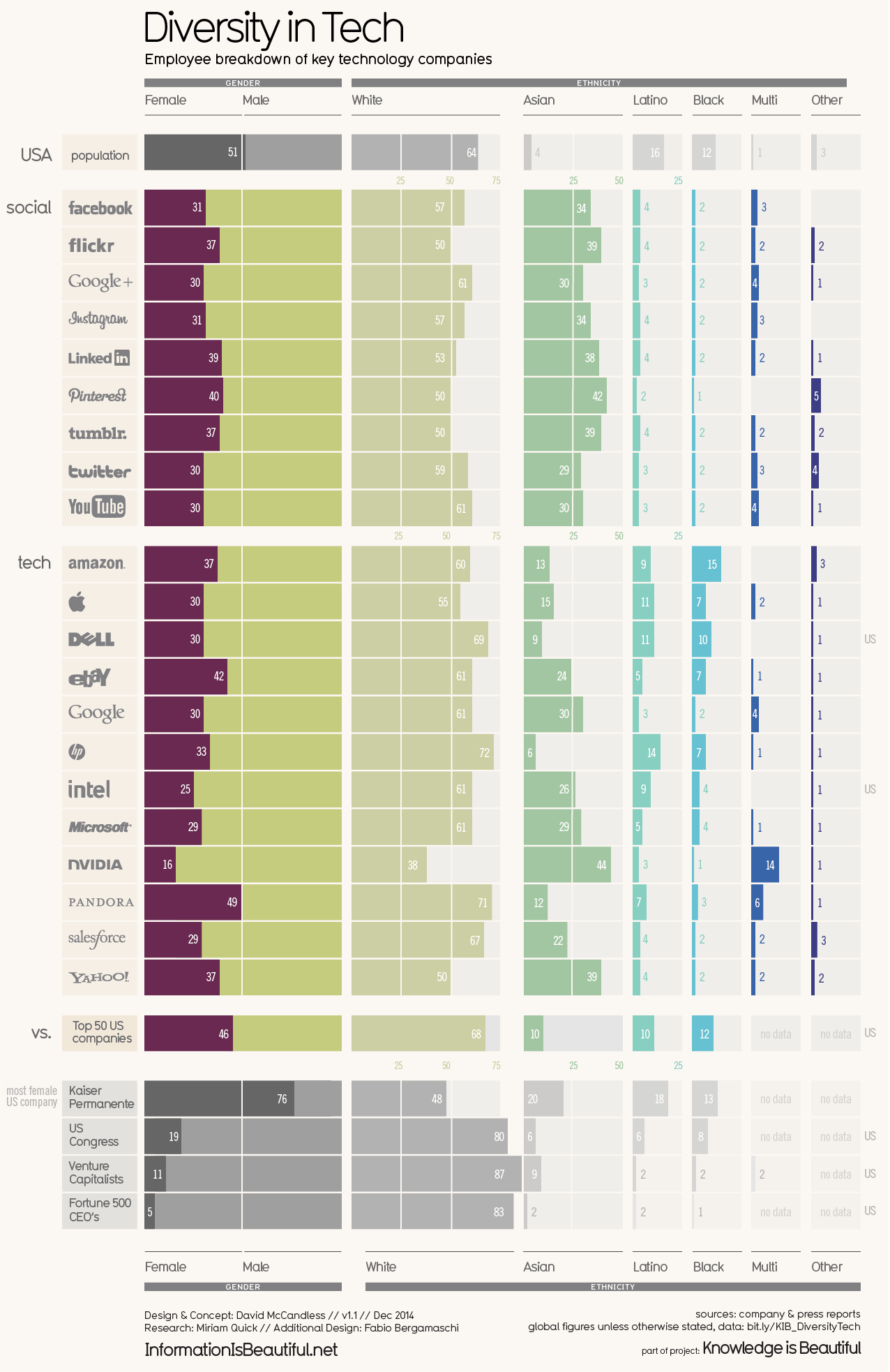
Makeover Monday: The Lack of Diversity in Tech Companies

What works well?
- Vertical groupings work well for comparisons
- Using more pronounced colors for the companies and greying out the comparators
- Nice filtering options
- Title and subtitle are simple and tell us what the viz is about
- Good labeling
- Including a white divider line at 50%
- Including sort options
What could be improved?
- Including the gender breakdown as well as the ethnicity breakdown in the same chart makes it feel too cluttered.
- As the years are set as filters, it's overly difficult to see if companies are becoming more or less diverse over time.
- Are the logos necessary?
What I did
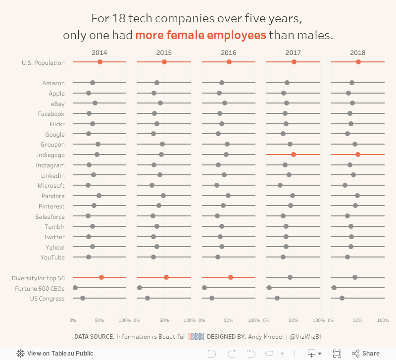
- Focused on the gender diversity
- Chose a simple dot plot to make the viz less cluttered
- Included a more impactful title
- Kept their background color, but used a different color for highlighting
November 4, 2018
Makeover Monday: America's Aging Population

The original visualization is from the US Census Bureau:

What works well?
- The title above the charts tells us the insights in the data. This is a very effective technique.
- The colors work well together.
- Labels for the ages are well-placed and colored to represent the lines
- Labeling the start and end of the lines
- Hiding the axis but still leaving the axis title
- Including the note about the 2016 data
What could be improved?
- Remove the title at the very top, the entire blue section
- Make the footer less prominent; it's competing with the viz for attention when it should be secondary
- Kill the bar chart; it looks strange have axis labels for every five years, but then only showing the data for a set of years
- Remove the dots on the lines except for the start, end and where the lines cross
- Remove the vignette shading behind the charts
What I did
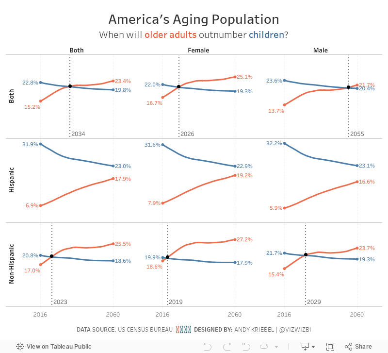
- I like the idea behind the line chart, so I used that as my starting point.
- I pivoted the data by age, then created age groups that match the original (under 18 and 65+).
- I wanted to compare ages and origins for the two age groups to see if the crossing of the populations is consistent (spoiler, it's not).
- I wanted to add focus to the year the lines cross. I did that by adding a black dot on that year and by including a reference line.
- I kept the labeling of the start and end of each line.
- While the population in total gradually shifts towards the older generation, the split between hispanic and non-hispanic does not follow the same pattern.
- Older hispanics will likely outnumber hispanic children between 2070 and 2075, whereas non-hispanic older people will outnumber non-hispanic children much sooner.
- The female population is shifting much more quickly to the older generation than males.
October 15, 2018
Makeover Monday: The Under-representation of Women in the House of Representatives


What works well?
- It's simple and easy to understand.
- Nice and clean; there's no unnecessary decoration
- Using colors that represent the parties
- Using a line chart to represent change over time
- Labeling the end point makes us aware of the current situation
What could be improved?
- The stepped lines are necessary.
- The ratio of the chart looks strange to me.
- The title could be more impactful.
- Adding a y-axis would add context.
What I did
- Focus on the % of women and men in each party
- Use the party colors, but still be able to distinguish men and women
- Use a line to break up the area chart
- Use an impactful title and subtitle
- Use a viz in tooltip to show BANs
September 24, 2018
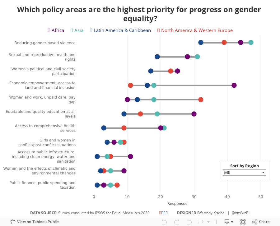
Makeover Monday: Priorities for Progress on Gender Equality


What works well?
- The colors are easy to distinguish.
- The footnotes help to explain the percentages...sort of.
- The chart layouts are easy to understand. Bar charts nearly always work well.
- Labeling the top of each bar removes the need for an axis.
- Good drill down from the overall to the per region level.
What could be improved?
- I find the chart titles quite confusing.
- Comparisons within a single region are difficult.
- I had no idea how to read these charts without reading the article. A chart should, ideally, be able to stand on its own.
What I did
- I focused on making over the bottom chart.
- I kept the original colors.
- I changed the bars to dots to help show the range of responses better.
- I didn't convert the responses to percentages as I wasn't confident it was accurate.
- I included a sorting option to allow sorting by the total responses or the responses within a region.
- Based on a twitter conversation with Dan Caroli last week, I turned on advanced logging feature which tracks each change you make in a sheet and then I turned them into this gif.

With that, here's my Makeover Monday week 39 for Equal Measures 2030.
June 4, 2018
Makeover Monday: The UK Gender Pay Gap Across Salary Bands

Let's start with this viz from the official report:

What works well?
- The symbols make it clear this about females and males.
- The BAN in the middle tells us what the bonus pay gap is.
What could be improved?
- Both icons are filled to the same level, making it look like there is no bonus pay gap. These should be filled to the actual values for each gender.
- The icons don't add much value.
- The title could tell us a whole lot more.
- There's no source listed nor no timeframe.
- The gridlines aren't evenly spaced between 0% and 50%.

- Remove columns that aren't needed
- Splitting the data up into two streams, one for the female columns and one for the male columns.
- Pivot the data so that the pay bands are listed down instead of across
- Add a column for the gender
- Union the data back together
- Export to an extract
Click on the image for the interactive version.

This simple view makes it incredibly evident that the proportion of females declines as the pay band increases. Males would be the inverse. It's particularly stark in the largest organizations. In the City of London, there are only three employers in that range (British Telecom, Royal Mail, and Sainsbury's Supermarket).
The heat map helped give me an overview of the data and felt ready to create something more detailed. This time I wanted to look at all companies together by gender by pay band compared to the overall median for each gender. I also wanted to provide the user with the option to choose a specific company. When they do, that company gets highlighted.
Click on the image for the interactive version.
What first struck me in this view is the clear, overwhelming patterns down and to the right for women. This gave me a great impression for how big the gender pay gap problem is.
The gender pay gap is not a myth. These are facts, facts that show women are underrepresented at higher salary levels. Don't let this discussion get lost. Check out your own company. How are they performing? Ask them to share the data within your organization. Transparency is a key to fixing this discrepancy.
January 18, 2018
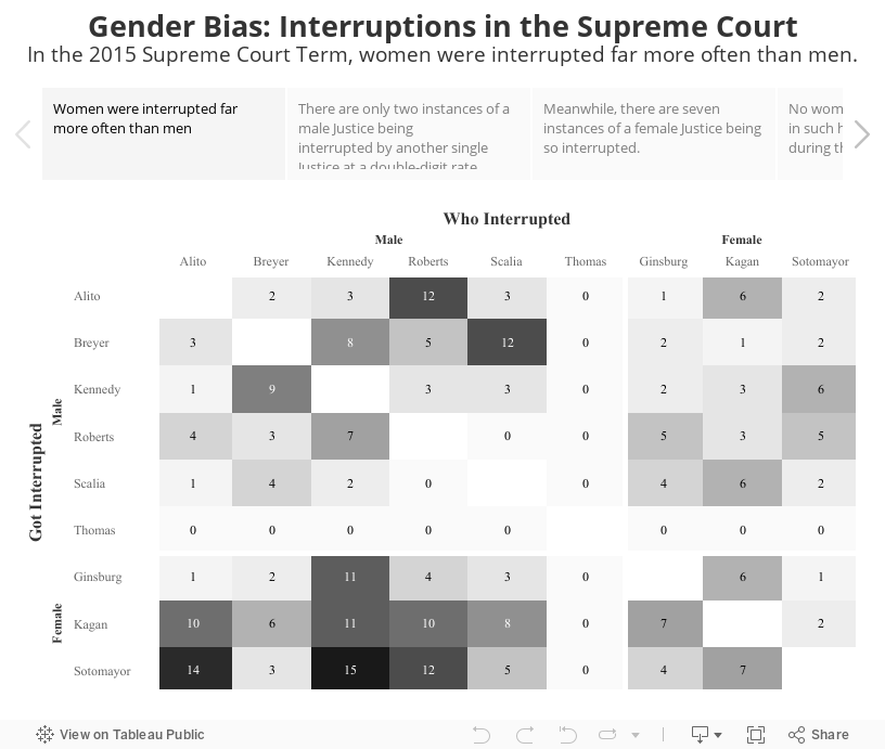
Gender Bias: Interruptions in the Supreme Court