January 11, 2021
#MakeoverMonday Week 2 - Women Die More Quickly Than Men From HIV Infection

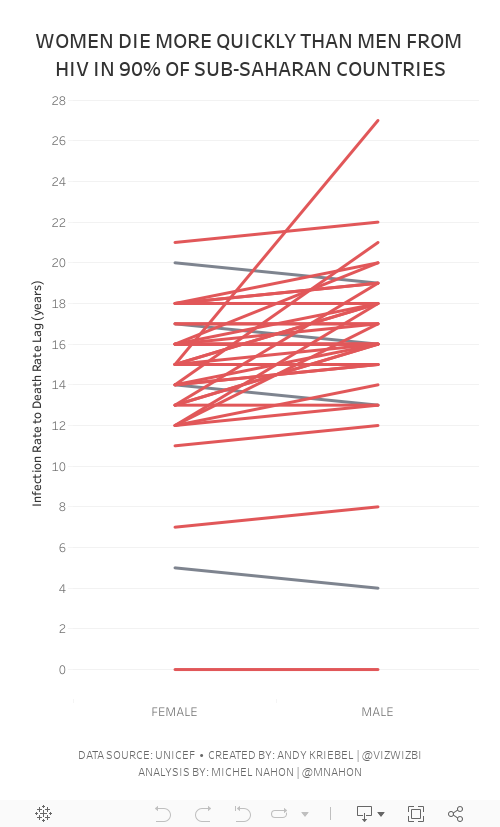
I must admit that I REALLY struggled with this data set. I could have easily just compared males vs. females by country and year, but it seems we've been doing that over and over again. I looked to explore the data and thought a connected scatterplot would look nice, but it didn't.
Fortunately Michel Mahon proposed looking at the lag between the year of HIV infection rate and death. Morbid yet interesting analysis. It took me a while to get the calcs working; I'd recommend you build your view as a table to verify the calcs when you're not sure if they're correct. In the end, thanks to Michel's suggestion, I created a slope graph that compares the lag in years for both men and women.
As the documentation suggested, women die more quickly than men.
Below are both my visualization and the Watch Me Viz session on YouTube. Thanks for tuning in!


No comments
Post a Comment