June 24, 2019
Canadian Consumer Price Index
On Saturday, I was catching up on some Workout Wednesday challenges. Week 51 2018 was a challenge from Rody Zakovich to learn about using containers to control the padding on dashboard objects. I love the way this looks so I wanted an excuse to put it into practice.I received the weekly data.world newsletter on Friday and it contained a data set about the Canadian Consumer Price Index. Given I had just completed the padding challenge, this made for a relatively quick exercise.
In addition to working on the padding, I also incorporated Parameter Actions that allow the user to choose an item to explore.
Here's the lesson: the only way to get good at something is to practice, relentlessly. Find reasons to practice; don't wait for them.
Let me know what you think about this design...thanks! Click on the image for the interactive version (it's too big to fit in a window on this blog).

June 23, 2019
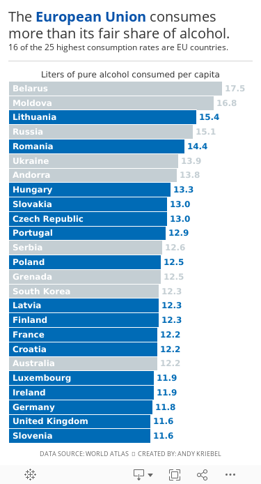
#MakeoverMonday: The European Union consumes more than its fair share of alcohol

.png) |
| Source: World Atlas |
What works well?
- Clear title
- Countries are listed in decsending order
- Simple color for the bar chart
- Labeling the axis
What could be improved?
- The axis is truncated; this is a big no-no for a bar chart.
- The labels for the countries don't need to be rotated on a diagonal.
What I did
- A bar chart is the easiest way to communicate, so I've kept that.
- I rotated the bars to make them horizontal.
- I save space by labeling the inside of the bars with the country name.
- I labeled the ends of the bars so that I wouldn't need an axis.
- I highlighted the EU countries, since I found that an interesting piece of the analysis.
- I created the viz as a mobile size, since I thought this was as good of an opportunity as any to practice mobile design.
Thoughts?
June 19, 2019
#WorkoutWednesday Week 24: Side-by-Side Bar Chart
In preparation for #WorkoutWednesday Live at TC Europe, I wanted to warm up by completing week 24. Luke challenged the community create a "simple" side-by-side bar chart.
While I can understand that this is something that could be used in a work setting, I think the juice you get from building it aren't worth the squeeze. In other words, there are too many hacks to get it to work. Still, though, it was a fun exercise.
- The calculations are quite simple.
- You don't need table calculations.
- I chose the advance option, which I first tried by using another measure to space out the bars, but that didn't work so I created three separate sheets with blank containers for spacing. This hurt my soul, but it got the job done.
- I don't agree with creating a percent change of percentages. For example, it's hard to comprehend that Home Office has a 28% great contribution to furniture than to the overall. That doesn't make sense to me. When I see the numbers, I view it as 0.7% greater contribution. Maybe I'm misunderstanding the purpose.
- I don't like having to create a dummy sheet for the footers. That's not Luke's fault though; it's a limitation of Tableau that requires the workaround.
So here's my solution. If you download the workbook, you might like the name of percent change of percent calculation. I still love you Luke!

June 18, 2019
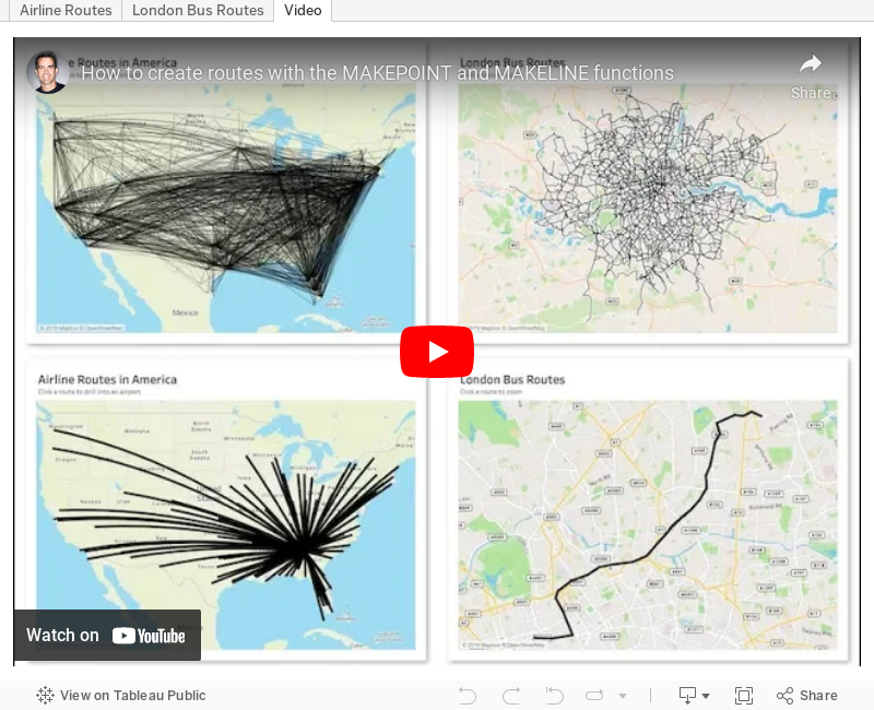
#TableauTipTuesday: How to create routes with the MAKEPOINT and MAKELINE functions
airlines
,
airport
,
bus
,
flights
,
London
,
makeline
,
makepoint
,
route
,
routes
,
Tableau Tip Tuesday
,
vector map
No comments

Leave a comment if you have any questions.
June 17, 2019
#MakeoverMonday: Finding the right Airbnb for you in Berlin
airbnb
,
Alteryx
,
BAN
,
big numbers
,
locations
,
Makeover Monday
,
map
,
polygon
,
reviews
,
spatial join
,
stats
No comments


What works well?
- Since the data is about finding a place to stay, a map is super intuitive for the user.
- The map helps show concentrations of Airbnbs.
- The summary stats on the right help add context.
- There are some good filtering options.
What could be improved?
- The red/green color palette won't work for the colorblind.
- The red/green palette makes me think of bad vs. good, but they're actually for categorical data.
- It's harder than necessary to find information about specific rentals.
What I did
I joined the spatial file to the listings and reviews data in Alteryx. I joined the data to get some summary data that I needed for my viz. I then smoothed out the edges of the neighbourhoods to make the map less jagged.
From there, I thought about the data from the user's perspective. What would I want to know about properties and how would I find that information? That served as the basis for this exploratory viz.
June 9, 2019
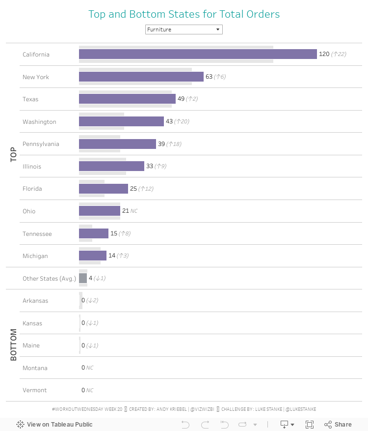
#WorkoutWednesday Week 20: Top and Bottom States for Total Orders
As I continue catching up on WW, I went to week 20, which was a live event at the SFTUG, so I knew it had to be solvable quickly and wouldn't require any crazy calcs. The goal was to create a view that:- Groups together the top 10 States, bottom 5 States and all other States based on their total orders.
- Shows all other States as an average number of orders across the States
- Display the 2018 value plus the change vs. 2017 on the end of the bar with arrow indicators for the change
- Show different colored bars for 2018 depending on the groups created in step 1 above
I thought for sure this was solvable with table calcs and it mostly is, until you get to all other States. You would need State in detail and this draws multiple bars and the calcs for 2018 and 2017 orders would need quite a bit of thinking to get them just right. I decided on LODs instead.
If you haven't solved this one yet, I highlight suggest you consider sets for the Top, Bottom and Blank groupings.
Here's my solution:

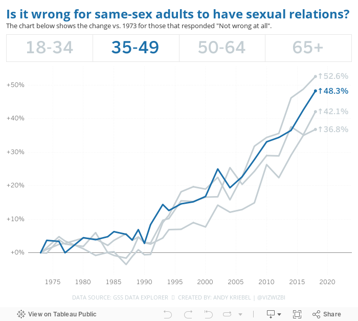
#MakeoverMonday: Is it wrong for same-sex adults to have sexual relations?


What works well?
- The title, question response, and breakdown are all organized together. They also look quite crisp; that's because they render differently because they aren't part of the Tableau rendering.
- The scale goes to 100%.
- The horizontal gridlines help guide the eye.
- Showing the year header every five years
- Using a line chart to show trends over time
- Allowing the user to highlight a line by clicking on the legend
- Overall, it's an easy chart to understand.
What could be improved?
- The share, print, export, and table buttons are in the way. Move them to the footer.
- The colors are too similar.
- Remove the dots on the lines for each year.
- Why is the title green?
- Legend text is cut off for some selections
What I did
I like the overall design of the original, so I decided to clean it up and change the main metric to answer the question differently.
- I removed all of the dots from the lines.
- I allow the user to highlight an age via a parameter action.
- I changed the metric on the change from % of population to the change vs. 1973. For me, this is a more meaningful way to show the change in opinions.
- I moved the title closer to the chart.
- I used Benton Sans as the font (Tableau fonts get boring sometimes).
This ended up being pretty much what I built last week, and I'm ok with that. If a chart works, stick with it.
June 8, 2019
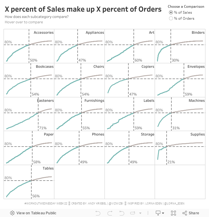
#WorkoutWednesday Week 22: X% of Sales make up Y% of Orders
challenge
,
highlight
,
lorna eden
,
parameter
,
parameter actions
,
pareto
,
reference line
,
table calc
,
table calculation
,
trellis chart
,
Workout Wednesday
No comments

Great! That part was pretty straightforward. I've done a Pareto tons of times. I've done a trellis tons of times.
Then there was the coloring of the line. That is, the line needed to be colored in each pane up to the point where two reference lines meet. I got that right way...so I thought.
Lastly, there was the little detail (i.e., not so little) of creating dynamic reference lines that update based on both the parameter selected and the point which you hover over. The fact that these are two conditions should have been my first clue.
I spent quite a while on the reference lines trying to make one reference line act upon two calculations. Well...that's not how reference lines work. Then it hit me that I actually needed four reference lines. Two of them will always hide based on the option selected in the parameter.
PROGRESS!!!!
The calcs were fiddly. I got lost in the logic a couple times because what you have to do is a bit counterintuitive, kind of like double negatives. I wrote down the four scenarios so that I could approach them one by one.
My calculation names are a mess, which drives me insane and actually made getting to the solution much harder. I'm normally very good about making sure I have clear names, but in this case I had several with almost the same name, so I kept mixing them up, hence why writing things down helped.
Once I got that figured out, I was done. A bit of tidying, then I downloaded Lorna's solution to compare mine too. We had taken a nearly identical approach (it must be that teacher she had at The Data School that set her on her way).
Thanks for the challenge Lorna! I enjoyed the struggle and always love the eureka moments. This was another viz that I could easily see used in a business context.
June 7, 2019
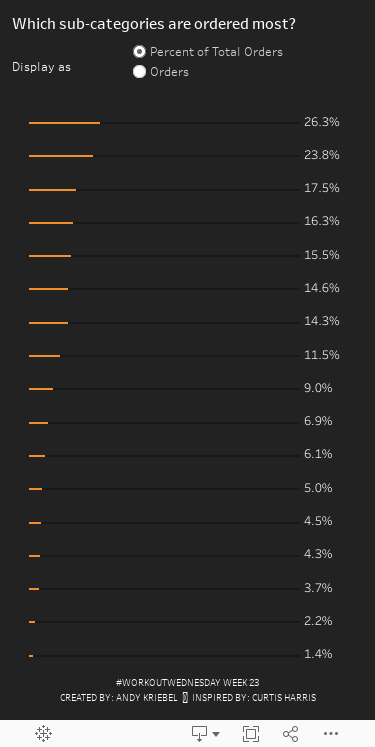
#WorkoutWednesday Week 23: Which sub-categories are ordered most?
bar chart
,
Curtis Harris
,
mobile
,
parameter
,
progress
,
subtotal
,
Workout Wednesday
No comments

REQUIREMENTS
- Create a bar chart which displays the sub-category label on top of its bar
- Label all bars to the right of the maximum value in view
- Create a parameter that changes the display from a percent of total view to a raw order count view
- Create a progress shadow for every bar
- Show progress to 100% or progress to the maximum value depending on the parameter selection
- Only use one sheet
- Match formatting and colors
- Match tooltips
The part that tripped me up the most was labeling the sub-category above the bar. I had done this before, but couldn't remember how, and I didn't to look back; I wanted to figure it out again. One other thing I wanted to do was make sure that the text didn't overlap the bar as it shows in the viz to rebuild (sorry Curtis, I know it's not 100% correct now).
To do this:
- Add Sub-Category on the rows twice.
- Hide the headers
- Turn on subtotals
- Move the column subtotals to the top
- Add a dummy measure as a secondary axis with the value 0
- Make sure the mark type is a circle on this shelf
- Add Sub-Category to the text shelf on the shelf with the circle and add an extra line below it in the text box with a space. This forces an extra line.
Tada! Fun one Curtis!
June 3, 2019
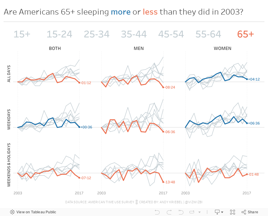
#MakeoverMonday: Are Americans sleeping more or less than they did in 2003?

Given how this book impacted me, I wanted to find a topic about sleep. I found the American Time Use Survey, the best data I could find on the topic. As it turns out Matthew Walker is hosting an event on London Thursday night that I've bought tickets for. What amazing timing!
Here's the original viz from the ATUS:

What works well?
- It's a simple side-by-side bar chart that makes comparing men to women easy within each age group.
- Clear axis title
- Labeling the bars can help with interpretation
- Ordering the ages chronologically
- The title is simple.
- I like the line that divides the title from the chart.
What could be improved?
- The axis is cut off. You should never ever truncate an axis for a bar chart as the length of the bar is what you are measuring, not a portion of the length.
- The 3-D shading of the bars is unnecessary.
- It would be good to see how sleep has changed over time. Are people sleeping more or less?
- The labels are misleading. It's obvious some bars are longer than others, yet they are both showing the same values, e.g., 15-19 years.
- What's the takeaway from the chart?
- The data includes naps and spells of sleeplessness. What proportion does this make up?
- People typically overestimate how much they sleep, so how accurate is the data in the end?
What I did
- Incorporated all of the years
- Compared genders vs. ages vs. overall
- Used parameter actions to allow the user to highlight an age group
- Look at the change since 2013 to see if groups are sleeping more or less
I did find that older Americans (65+) are sleeping less than in 2013 and men tend to sleep less than women. Overall, the data turned out to not be as interesting as I had hoped, but that's ok. It's still always fun to explore and understand data and to practice new features.
Subscribe to:
Posts
(
Atom
)


