June 3, 2019
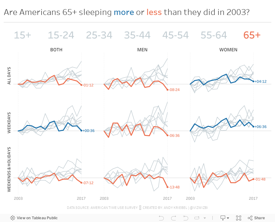
#MakeoverMonday: Are Americans sleeping more or less than they did in 2003?

Given how this book impacted me, I wanted to find a topic about sleep. I found the American Time Use Survey, the best data I could find on the topic. As it turns out Matthew Walker is hosting an event on London Thursday night that I've bought tickets for. What amazing timing!
Here's the original viz from the ATUS:

What works well?
- It's a simple side-by-side bar chart that makes comparing men to women easy within each age group.
- Clear axis title
- Labeling the bars can help with interpretation
- Ordering the ages chronologically
- The title is simple.
- I like the line that divides the title from the chart.
What could be improved?
- The axis is cut off. You should never ever truncate an axis for a bar chart as the length of the bar is what you are measuring, not a portion of the length.
- The 3-D shading of the bars is unnecessary.
- It would be good to see how sleep has changed over time. Are people sleeping more or less?
- The labels are misleading. It's obvious some bars are longer than others, yet they are both showing the same values, e.g., 15-19 years.
- What's the takeaway from the chart?
- The data includes naps and spells of sleeplessness. What proportion does this make up?
- People typically overestimate how much they sleep, so how accurate is the data in the end?
What I did
- Incorporated all of the years
- Compared genders vs. ages vs. overall
- Used parameter actions to allow the user to highlight an age group
- Look at the change since 2013 to see if groups are sleeping more or less
I did find that older Americans (65+) are sleeping less than in 2013 and men tend to sleep less than women. Overall, the data turned out to not be as interesting as I had hoped, but that's ok. It's still always fun to explore and understand data and to practice new features.
Subscribe to:
Post Comments
(
Atom
)


No comments
Post a Comment