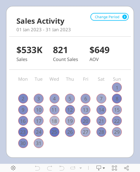
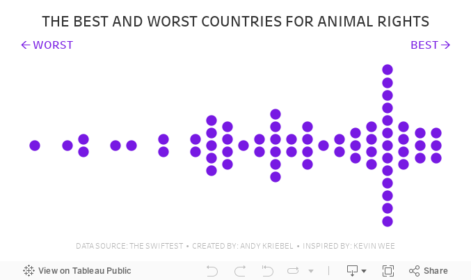
December 20, 2024
Create a Custom Calendar Widget

Thanks Nicholas for providing me with the data set and setting an example of how simple visualization can communicate data effectively.
If you're not already following Nicholas, do so. You're guaranteed to find inspirational designs for your dashboards.
No extensions required. I think you'll love the trick I did with the title so that you can't click on it.
Downloading the workbook so that you can reverse engineer it is one of the best ways to learn.
December 17, 2024

Learn how to build a stunning waffle chart in Tableau using map layers and calculations!
This advanced Tableau tutorial will show you how to simplify the creation of waffle charts while unlocking powerful design and flexibility for your data analysis projects.
You’ll Learn How To:
- Connect Tableau to Superstore and a waffle chart template with Relationships
- Use the MakePoint function to create dynamic map-based charts
- Apply map layers for advanced customization and perfect label placement
Why You Need This:
This method combines advanced Tableau charts with the flexibility of map layers, allowing you to:
1. Create precise grid-based waffle charts.
2. Perfectly center labels without complex workarounds.
Who Is This For?
- Data analysts looking to enhance their Tableau dashboards
- Advanced Tableau users exploring new chart techniques
Become a Next-Level Tableau member and become a Tableau expert

November 25, 2024
Perfect Labels For Rounded Bar Charts In Under 2 Minutes

Labeling a rounded bar has always been tricky. You might manually drag the labels, try to play around with the alignment and more, but still, you can't get the labels perfect.
No more! In this Tableau Tip, I'll show you:
1. Why standard labels don't work
2. How to build a rounded bar chart
3. How to perfectly align the labels
September 26, 2024
Stop Chart Disasters NOW With This Crucial Method

August 30, 2024
How to Create a Win/Loss Sparkline

Check out the workbook here.
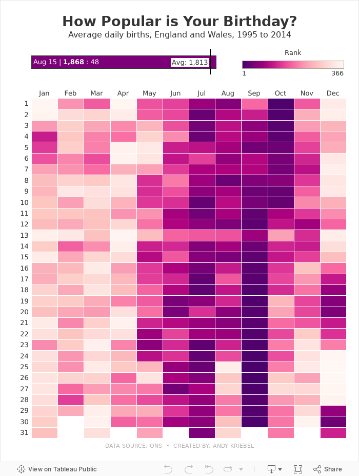
August 15, 2024
How Popular is Your Birthday?

Click on your birthday to see how popular it is.
July 8, 2024
Build an interactive Tableau dashboard in 3 minutes!

Build 80% of your dashboards with these 4 charts, a bit of interactivity, and that's it.
You probably won't need to create anything fancy, formatting will be minimal, and you won't need to wrestle with containers.
This video show you how to create it in only 3 minutes!
June 30, 2024
How to Rank & Filter the Top 5 in Tableau in Under 60 Seconds!

June 28, 2024
How to Replace a Datasource & Fields in Tableau

Need to change a datasource but don't want to rebuild the workbook? Has a field name changed?
It can be a real pain to update each sheet in a workbook one by one.
Conveniently, Tableau allows you to change the entire datasource with the "Replace Datasource" option.
Or, if you only need to change a field, Tableau has an option called "Replace References" that allows you to swap one field out for another all in one shot.
In this example, I take you through the whole process.
You could also apply this method when you simply want to swap out all existences of one field for another.
For example, you want to change all used of Order Date to Ship Date.
Easy peasy!
June 25, 2024
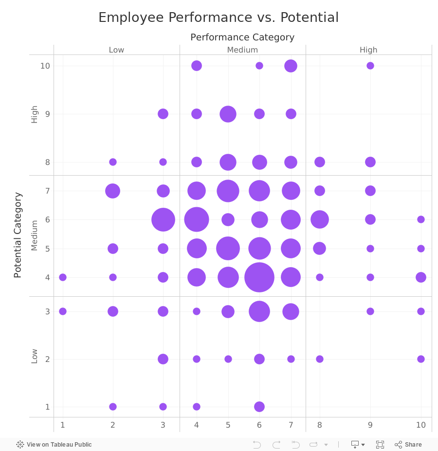
How to Create a 9-Box Matrix in Tableau

In this video, I show you how to build a 9-box matrix.
These are commonly used in talent management and HR to map a company's workforce along two dimensions, potential and performance.
Each of these two dimensions is split up into three categories, low, medium, and high, depending on the score.
For each employee performance is then plotted horizontally and potential is plotted vertically. From there, we summarize the number of employees that fall within each box.
June 20, 2024
How to Simultaneously Highlight & Deselect with a Parameter Action in Tableau

June 4, 2024
Find Red Flags in Your Data in ONLY 5 MINUTES with Control Charts

May 26, 2024
How to Create a Barcode Chart in Tableau
May 25, 2024
How to Calculate Year over Year Change in Tableau
How to Create a Dot Strip Plot in Tableau
May 15, 2024
#MakeoverMonday 2024 Week 20 - Exporting Freedom, One Bullet at a Time

I struggled mightily with this week's #MakeoverMonday. My goals was to replicate the original visualization by Bloomberg.
I knew I need to create path to connect the US at the center to each country.
I wanted to make the US the center of the of the map.
Sounds simple, right? I made it way harder than it needed to be.- I overthought the data prep.
- I forgot how to create the paths.
- I couldn't get the math right to offset the longitude.
The coloring and labeling was straightforward for me.
Adding the US as a circle in the middle was pretty simple.
To overcome the problems I facedI looked at a previous visualization I created using paths.
- I opened the workbook and the data to see the configuration.
- I replicated that set up by adding a second set of records to the data set.
- Viewers on the livestream helped me figure out the math to offset the longitude.
The simplest way to explain the location of each country is to think of the lat/lon for the US as 0,0. Then you compare that to the lat/lon for every other country to create the offset.
I got there in the end. What do you think? Was the juice worth the squeeze?
Click the image below to access the viz.
May 3, 2024
How to Make Your Cycle Plots Actionable in Tableau

Cycle plots are a fantastic way to identify seasonality in a data set. And you can make them even more useful by adding indicators for whether they are above or below the average.
Here's how you can do that in Tableau in only 2 minutes.
Like this? You'll love Next-Level Tableau. Learn more at nextleveltableau.com.
May 1, 2024
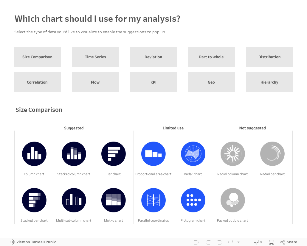
Which chart should you use for your analysis?

Over on Tableau Public, Judit Bekker create this fantastic directory of charts to help you pick the one that's most appropriate for your analysis.
Check it out below.
How to Create a Cycle Plot in Tableau
April 30, 2024
How I Create a Unit Histogram in Tableau

A unit histogram is a chart that shows the distribution of data points across a series of bins of a measure.
Unlike a traditional histogram that uses bars, a unit histogram consists of a set of marks, each representing a member of a dimension.
In this example, our final result is a unit histogram showing the distribution of states by their average sales.
If you like this, you'll love Next-Level Tableau. You get over 175 hours of live training with me, 130+ on-demand videos, workshops, office hours, workbooks, data sets, lots of new videos each year, any new courses I create, and a great Community.
Get more info and sign up today at nextleveltableau.com.
April 29, 2024
How to Create a Comet Chart in Tableau
April 26, 2024
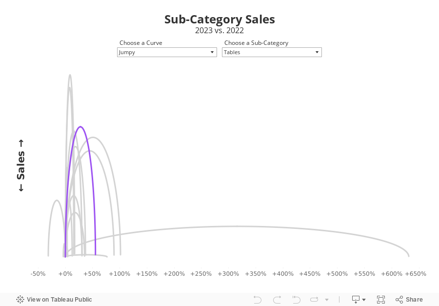
Jumpy Curvy Things in Tableau

I received a request to teach how to build a jump plot during Next-Level Tableau office hours. The idea was to recreate this visualization that I created for Makeover Monday back in 2018.
The problem, though, was that the data preparation was done in Alteryx, which I no longer have a license for. Thanks for a member of NLT that had an Alteryx license, we were able to decode what the workflow was doing.
Then, in office hours, we recreated the data prep in Tableau Prep before building the visualization in Tableau. Download the Prep flow here. Download the workbook below.
This is just one example of one thing learned as a member of NLT. Sign up today and I guarantee you'll become a Tableau expert.
April 25, 2024
The ULTIMATE Guide to Custom Visualizations in Tableau
Here's the ultimate guide to custom visualizations in Tableau. Each chart contains a link to a tutorial so you can build it too.
I rarely use these charts on a day-to-day basis, but they are a fantastic way to build your technical skills.
Have you used any of these in a business context? Click on the image to view on Tableau Public.

April 24, 2024
20 Dashboard Design Best Practices
April 23, 2024
How to Create Rounded Bar Charts in Tableau
A rounded bar chart is a type of bar chart where the ends of the bars are rounded instead of being straight. They create a more visually appealing and softer look to the chart.April 21, 2024
How to Create Custom Date Hierarchies in Tableau
April 20, 2024
The What, Why, and How of Custom Dates in Tableau
Why you should build a Tableau Public profile
April 18, 2024
How to Create a Donut Chart in Tableau
Which chart would you like to show?
Beginners and advanced designers alike get stuck deciding which chart is right for their data. Next time you're stuck, try this chart guide by Damola Ladipo.
Check it out on Tableau Public here. Click the image below for a hi-res version to print.

April 16, 2024
How to Create a Bar-in-Bar Chart in Tableau
April 13, 2024
25 Example to Help You Master Calculations in Tableau
How to Create a Proportional Stacked Bar Chart in Tableau
Proportional stacked bar charts are a good way of showing the size and proportion of data at the same time.
April 10, 2024
How to make sense of ANY data set
Demystify ANY data set by answering 5 simple questions:
- When?
- Where?
- Which?
- Who?
- Why?
----------
P.S. Newsletter subscribers get a deeper dive into each of these for FREE when they sign up. Go to andykriebel.com to get yours.
11 Ways to Compare Two Measures
I don't believe in complexity in data visualization. I stick with simple charts when you needs to compare measures to add context.
Tableau workbook here.
April 9, 2024
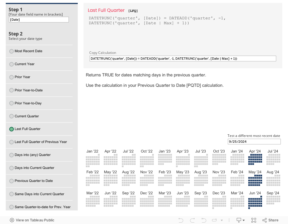
The Ultimate Tableau Date Calcs Cheat Sheet

How to Create a Floating Bar Chart in Tableau
A floating bar chart is similar to a Gantt chart, except it shows the range of two data points instead of two dates.
April 8, 2024
How to Create an Enclosed Dot Plot in Tableau
An enclosed dot plot is similar to a barbell charts except the line connecting the dots surrounds the dots.
April 7, 2024
How to Create a Barbell Chart in Tableau
A barbell chart is a dot plot that shows two or more points and also connects those points to display the range.
April 6, 2024
How to Create a Histogram in Tableau
A histogram visualizes the distribution of data over a continuous interval. Each bar represents the frequency at each bin.
18 Ways to Visualize Bar Charts in Tableau
The SECRET to never choosing the wrong chart...the Bar Chart! Here are 18 options for your next bar chart.
Tableau tutorial and workbook here.
How to Create a Heatmap in Tableau
A heat map is a good way of showing the patterns between 2 categories of data. They use color to encode the intensity of the relationships in the matrix.
April 2, 2024
60 Ways to Visualize Time Series Data in Tableau
I don't believe in creating fancy visualization to get attention. I prefer easy to understand. Here's my complete list of 60 unique ways to visualize time series data.
Learn to build them here. View the workbook here. Download it on Gumroad here (for a small fee).
April 1, 2024
#WatchMeViz: Can viral infections be cured with antibiotics?

March 27, 2024
8 Reasons Power BI isn't "FREE"
What are joins?
Fundamentals of Joins by Andy Kriebel
March 11, 2024
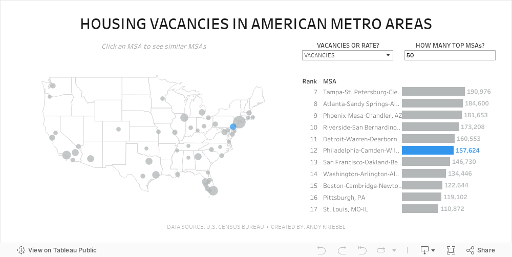
#MakeoverMonday 2024 Week 11 - Housing Vacancies in America

- Size - 1000x475
- Max 4 containers; no tiled containers allowed
- Filter out Alaska, Hawaii and Puerto Rico
- Clicking on a MSA in the map highlights the MSA in the map and bar chart and changes the MSAs that are displayed in the bar chart
- The bar chart shows the rank of the MSA for the metric selected.
- There should always be 11 bars (though I didn't test the lowest rank).
- The label on the end of the bar and in the map reflect the formatting of the measure selected (i.e., either whole numbers or a percentage to one decimaal).
- Include an option to change the measure and to change the number of MSAs on the map.
- Create a mobile view
- NO LODS!
March 8, 2024
Visualizing Time Series Data in Tableau
Last night I was invited to speak at the Chicago Tableau User Group about visualizing time series data. Other than spatial data, time series data is my favorite to visualize.
There seem to be endless methods for making time series data useful for analysis. Check out this video for 60ish ways to visualize time.
I had a 20 minute slot to present and, of course, I ran over time. I seem to do this with every session I run lately. Be it training for Next-Level Tableau, presenting at events, or running a livestream, I get into a groove and don't want to stop.
I was able to create 14 vizzes in 20+ minutes. I added an extra in this workbook to make the dashboard format nicely.
Click on the image below to download the workbook and dissect it. Get the data here to follow along.
Have fun!

March 6, 2024
What does Level of Detail mean in Tableau?

If you’re serious about learning Tableau, you must understand the level of detail of the view. Another way to think about it is the level of granularity.
This is essential for ensuring you know the aggregations that Tableau will perform as this will impact your analysis.
Here's a guide to help you:
March 5, 2024
11 Steps to Create KPIs & Sparklines in the Same Sheet in Tableau

Want to cut the number of sheets you need in your KPI dashboard in half? These 11 simple steps will get much closer.
Steal the calcs to speed up your work.
P.S. If you like tips like this, remember to follow me on LinkedIn so you're notified about everyting I post. Content curated just for you, 3 times daily.
February 26, 2024
How I Create a Beeswarm Chart in Tableau

Beeswarm charts a one method of showing distributions in a data set. I show you how to create one in this #MakeoverMonday livestream.
Download the workbook | Download the data
January 8, 2024
Step-by-Step Guide to Building a Beautiful Bump Chart in Tableau
We all create charts we know *could* be better.
Here's how to make your next bump chart look like magic 🤯
Tableau is incredible for creating bump charts...
But 99% use shortcuts which don't look great.
Here's my secret:
It all comes down to the small details.
Each step has to be done right to get the view you want.
Most people don't follow these steps.
And even more don't know how to make it look great...
I'm going to show you how.
In this tip, I give you specific step-by-step instructions to get your bump chart to look just right.
👀 Do you want a copy of my viz? 👀
You got it!
Send a DM on LinkedIn saying CHART MAGIC! and I'll send you a PDF of the instructions AND the workbook for you to use for FREE.


