March 8, 2024
Visualizing Time Series Data in Tableau
Last night I was invited to speak at the Chicago Tableau User Group about visualizing time series data. Other than spatial data, time series data is my favorite to visualize.
There seem to be endless methods for making time series data useful for analysis. Check out this video for 60ish ways to visualize time.
I had a 20 minute slot to present and, of course, I ran over time. I seem to do this with every session I run lately. Be it training for Next-Level Tableau, presenting at events, or running a livestream, I get into a groove and don't want to stop.
I was able to create 14 vizzes in 20+ minutes. I added an extra in this workbook to make the dashboard format nicely.
Click on the image below to download the workbook and dissect it. Get the data here to follow along.
Have fun!

September 23, 2017
Vizspiration: Chicago Taxi Trips from Near North Side

With his permission, I wanted to try to remake his viz with a different data set. On the last day for DS6 at The Data School, they had a two hour task of creating a viz with the Chicago Taxi data that we used for MM week 6. I figured this might be a perfect data set to give it a go.
I don't like mine nearly as much as Suraj's. It sure was fun creating it though. It took me about 45 min total. There's nothing very complicated about the viz itself, and it's probably this simplicity that I like the most.
Thanks Suraj for the inspiration!! Click on the image below for the interactive version.
February 6, 2017
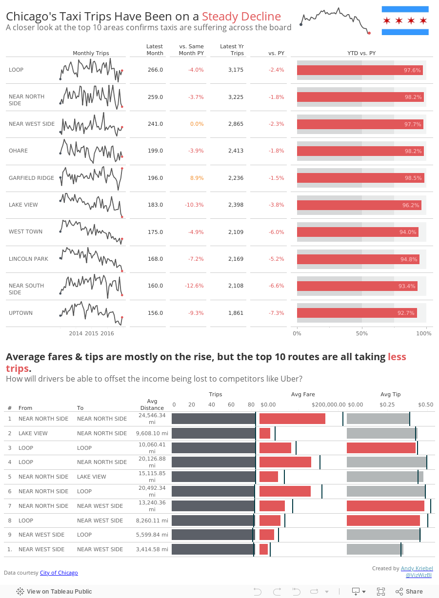
Makeover Monday: Are We Nearing the Death of Chicago Taxis?

What works well?
- Using a line chart to portray a time series rarely is a bad choice
- Nice simple labeling of the axes
- Title tells me what I'm looking at
- Red line on the grey background works well
- The y-axis is truncated, but the chart maintains a nice 3x2 ratio so that the line trends aren't too distorted.
- Scale of the y-axis is a bit odd; I like nice rounded numbers that make the math easy to do in my head
- There is SO much more data to work with; why limit to only trips?
- Could use a more impactful title
- Could use more context
Overall, another fun week. Tonight I get to introduce this to a bunch of new Tableau users at the #MakeoverMonday Live session at Tableau HQ in London. Can't wait to see what they come up with!