March 8, 2024
Visualizing Time Series Data in Tableau
Last night I was invited to speak at the Chicago Tableau User Group about visualizing time series data. Other than spatial data, time series data is my favorite to visualize.
There seem to be endless methods for making time series data useful for analysis. Check out this video for 60ish ways to visualize time.
I had a 20 minute slot to present and, of course, I ran over time. I seem to do this with every session I run lately. Be it training for Next-Level Tableau, presenting at events, or running a livestream, I get into a groove and don't want to stop.
I was able to create 14 vizzes in 20+ minutes. I added an extra in this workbook to make the dashboard format nicely.
Click on the image below to download the workbook and dissect it. Get the data here to follow along.
Have fun!

July 12, 2017
Workout Wednesday: Insights & Annotations
- Create a map
- Create a barbell chart
- Have the map interact with the barbell chart
- Include an option for users to add custom annotations
June 29, 2016
WTF Wednesday: Misconceptions About Muslim Population

This morning I was going through the backlog of Makeover Monday candidates that I have saved in Pocket and it’s quite an extensive list. So I thought I’d knock one off the list and start up #WTFWednesday for those of us that just can’t have enough Tableau in our lives.
For this makeover, I look back at this viz from The Guardian about the misconceptions about Muslims by Europeans. If you’d like to have a go at it, the data is here (XLS) and here (TDE).

What works well?
- It’s neatly organised by the amount of misconception
- Colors follow Guardian standards
- Nice title that sets the story
What doesn’t work well?
- When I first read it, I assumed the darker blue was the average guess, but that’s not the case. This should be made clearer.
- Comparing countries could be made easier
- Stacked bars with overlapping labels look very cluttered
I didn’t want to spend a lot of time on this so I decided to make a simple barbell chart sorted by the largest misconception. This was also the first time that I’ve put bar charts in tooltips, which works well for allowing the user to see the precise values.
January 11, 2016
Makeover Monday: Stephen Curry Hates Mid-Range Jump Shots

This week's Makeover Monday looks at this simple stacked bar chart from Sports Chart of the Day:

What works well:
- Nice labelling on the axes; this makes it clear what we data is displayed
- Nice annotation of the point of the chart
What could be done better:
- Needs a better title
- Needs to incorporate shooting % so that I can better understand the relationship between shots taken and shooting %
- Group together all shots over 30 feet
- Find a better way to compare the number of shots taken on each range. I find the stacked bars hard to compare within in a shot distance.
- Make the different shot ranges more clear, e.g., what defines a long 2?
- Provide a summary
- How are Curry's shot selections changing over time?
With these considerations in mind, here is my my makeover of the chart:
Note: If you'd like to participate in Makeover Monday, check this link for the details.
December 14, 2015
Makeover Monday: You Don’t Know What Tony Romo’s Got Till He’s Gone

Anyone that knows me knows that I despise the Dallas Cowboys and, in particular, their golden boy Tony Romo. As a lifelong Eagles fan, I’ve been indoctrinated into the hatred for anything associated with that ugly blue star. It drives me nuts to hear how much all of the NFL pundits love Tony Romo. He’s never won anything and chokes in the playoffs every time they make them.
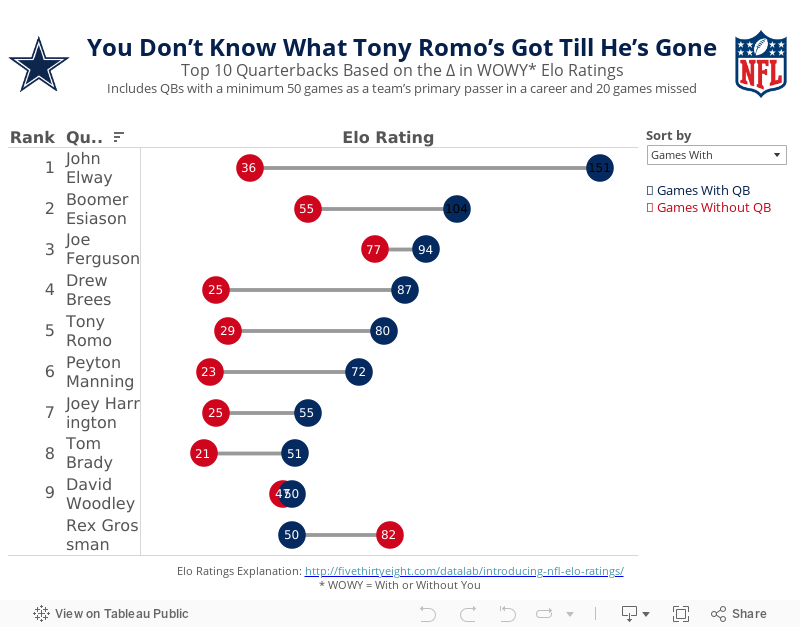
So when I saw this article by FiveThirtyEight, it caught my attention. Was I not giving Romo his due? Does that matter anyway? In the article, the author looks at a metric they call WOWY (or With or Without You). In its most basic sense, this metric measures the impact that a particular player has on their team by measuring the Elo rating when that players plays and when they do not. For this piece, they considered quarterbacks that were the primary QB for at least 50 games and missed at least 20 games. They then pared that down to the top 10 based on what they called the WOWY ∆ ELO.
The result is this table:

The table clearly shows Tony Romo as the 3rd most important player to their team based on this metric. Ok fine. But is there more to the story? Can this simple table be made more intuitive for the readers to understand?
I created the barbell chart below. This view makes it much easier to see the difference between the With and Without You metrics. I also added a metric to the view that calculates the difference between the two. I then created a drop down to allow you, the reader, to sort by the metric you find most interesting. In essence, I’ve turned this simple table into four stories:
- WOWY ∆ ELO - This metric shows Romo as the 3rd most missed player in NFL history when he’s out injured.
- Games With - Sorting the chart by the Games With Elo rating, suddenly Romo is only 5th on this list, yet he’s ahead of Peyton Manning. This view also shows just how amazing John Elway was when he played. Elway’s Elo rating is nearly 50% higher than the second best.
- Games Without - Interesting…the teams that Rex Grossman played for actually performed better without him in the lineup. Clearly he was quite terrible as an NFL quarterback. You can also see Romo down in 6th position; the Cowboys are definitely much worse without him.
- Difference - I added this metric to show the variation between the With and Without You values. Now Romo is back in the 3rd position, and look at that gap for John Elway…wow!
Give it a play for yourself. Do you see anything else interesting?
November 9, 2015
Makeover Monday: The Highest Paid Positions in the NFL

Ok, here we go. First, the chart to makeover today was by Cork Gaines of Business Insider.

I really like the idea behind this chart: understanding the salary distribution of NFL players by position. However, there are a few problems with this chart:
- The labels are vertical, making them harder than necessary to read.
- It took me a while to understand the sorting; the chart appears to be sorted by average salary.
- The salaries are only for the top 10 in each position, which means the min, avg and max are all relative to those 10 players.
- The labelling feels like it’s cluttering the chart.
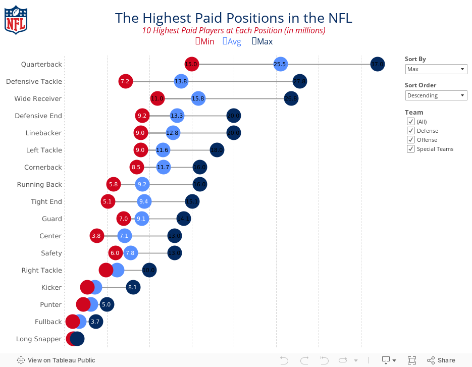
To address these concerns, I’ve created the viz below. In my version, I’ve made the following changes:
- Changed the labels to horizontal
- Added options for sorting the viz by any of the metrics and allowing the user to pick a sort order
- Added a filter for the team the position belongs to
- Changed the chart from a bar chart to a dot plot/DNA chart
- Moved the labels into the middle of the dots, where they fit, and removed the $ symbols
- Changed the colours to use the offical NFL colours
This was a pretty simple and quick makeover that I feel provides a much more meaningful and insightful visualisation.
November 3, 2015
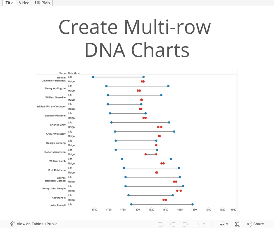
Tableau Tip Tuesday: How to Create Multi-row DNA Charts

This was pretty straightforward, but required using the pivoting capabilities in the connection window.
August 19, 2015
How Has Poverty in Metro Neighborhoods Changed from 1970 to 2010?

I navigated to the site that shows the full report and at the bottom was a link to the original source, which was this story done in Tableau.

What struck me about this was that the titles of each story point are quite good, yet the visualisation is just a table, which makes it hard to find any insight. I decided to download the workbook and create this interactive version using the same story points. I think this tells the story of the changing poverty in America’s metro areas much more clearly, plus I allow for additional exploration and insight via the sort parameter.
Thoughts? Which one works better? What would you do differently?






