February 1, 2017
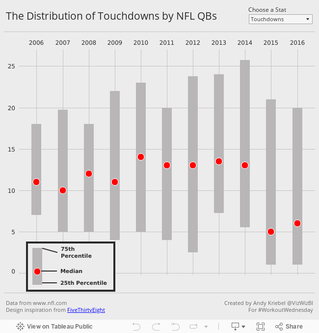
Workout Wednesday: The Distribution and Median of NFL Quarterbacks
Below is the visualisation that I created. If you're reading this on a phone, tap on the image for the interactive version. Some requirements to keep in mind that are intentionally designed to make this tougher and to make you learn:
- All of the elements must be floating on a dashboard sized 650x650.
- You cannot use the Player dimension anywhere in the view.
- Match my colors including the background
- Create the legend (HINT: It's not an image)
- Match the tooltip (Note the stats that are displayed in the tooltip. This will be a bit tricky. Essentially you need to count the number of players that are contained within each band.)
- The viz should update based on the stat selected. The user should be able to choose between: Attempts, Completions, Interceptions, Touchdowns, and Yards
- The title should update dynamically based on the stat the user selects.
- Optional: Use Montserrat font (you can download it from Google fonts)
January 25, 2017
Workout Wednesday: Cumulative Passing Yards for NFL QBs
Nice challenge from Emma this week! She’s a massive NFL fan and since the Super Bowl is upon us, she decide to challenge us to create a common baseline chart that shows the passing yards for QBs in the NFL over the course of their careers. Go to her blog for the full challenge details.
First requirement was to filter to QBs that had played at least 3 seasons and had at least 2000 total passing yards. I did this by adding a data source filter. The benefit of doing this is that my Player list will now only include those that meet the criteria and I won’t need filters elsewhere.

Next, I created a LOD calc to get the first year for each QB.

I built upon that calculation with this calculation that gives me the number of seasons played per QB. This goes onto the Columns shelf.

The cumulative passing yards is merely a running total table calc set at the Year level. This goes on the Rows shelf.

I put Player on the detail shelf to get a line per QB. I also put Year and Yds on the Detail shelf since I need those for the tooltip.
Next was a parameter to pick a QB and use that to highlight the QB chosen. I then created a simple calculation that check the Player again the parameter and put that on the color shelf.
Last was the dot on the end of each line. To do that, I created a calculation that checks if it’s the end of the line and the player selected and, if so, return the cumulative passing yards. Since this is a nested table calc, it’s important to set both table calcs to compute using Year.

Some tidying up, adding the footnotes and I was done. I decided to float all elements on the dashboard to ensure they would render exactly as I wanted them to. Another fun week of learning something new! Thanks Emma!!
December 14, 2015
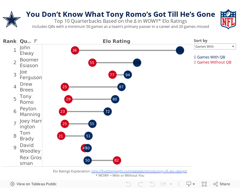
Makeover Monday: You Don’t Know What Tony Romo’s Got Till He’s Gone

Anyone that knows me knows that I despise the Dallas Cowboys and, in particular, their golden boy Tony Romo. As a lifelong Eagles fan, I’ve been indoctrinated into the hatred for anything associated with that ugly blue star. It drives me nuts to hear how much all of the NFL pundits love Tony Romo. He’s never won anything and chokes in the playoffs every time they make them.
So when I saw this article by FiveThirtyEight, it caught my attention. Was I not giving Romo his due? Does that matter anyway? In the article, the author looks at a metric they call WOWY (or With or Without You). In its most basic sense, this metric measures the impact that a particular player has on their team by measuring the Elo rating when that players plays and when they do not. For this piece, they considered quarterbacks that were the primary QB for at least 50 games and missed at least 20 games. They then pared that down to the top 10 based on what they called the WOWY ∆ ELO.
The result is this table:

The table clearly shows Tony Romo as the 3rd most important player to their team based on this metric. Ok fine. But is there more to the story? Can this simple table be made more intuitive for the readers to understand?
I created the barbell chart below. This view makes it much easier to see the difference between the With and Without You metrics. I also added a metric to the view that calculates the difference between the two. I then created a drop down to allow you, the reader, to sort by the metric you find most interesting. In essence, I’ve turned this simple table into four stories:
- WOWY ∆ ELO - This metric shows Romo as the 3rd most missed player in NFL history when he’s out injured.
- Games With - Sorting the chart by the Games With Elo rating, suddenly Romo is only 5th on this list, yet he’s ahead of Peyton Manning. This view also shows just how amazing John Elway was when he played. Elway’s Elo rating is nearly 50% higher than the second best.
- Games Without - Interesting…the teams that Rex Grossman played for actually performed better without him in the lineup. Clearly he was quite terrible as an NFL quarterback. You can also see Romo down in 6th position; the Cowboys are definitely much worse without him.
- Difference - I added this metric to show the variation between the With and Without You values. Now Romo is back in the 3rd position, and look at that gap for John Elway…wow!
Give it a play for yourself. Do you see anything else interesting?
December 25, 2012
Is Mark Sanchez as bad as Sports Chart of the Day says he is? Here’s some context.
After week 14 of the NFL season, Cork Gaines more or less blamed the poor performance of the NY Jets on Mark Sanchez, saying:
Last night, Mark Sanchez turned the ball over five times, continuing a disturbing trend over the past two seasons. He now has a league-leading 24 turnovers this season (17 int, 7 fumbles lost) and 50 over the last two seasons combined. In his first two seasons, Sanchez turned the ball over just 37 times.
Corked followed this up by publishing this chart on Business Insider’s Sports Chart of the Day.

I thought “Wow, Sanchez really is terrible!” But I’m an Eagles fan, and we know terrible football. This got me thinking about Michael Vick. He was absolutely HORRIBLE turning the ball over the first few weeks of the season before he got a concussion and hasn’t played since.
In Cork’s chart, Vick is at #11, but he’s only played a full season in the NFL once. So far in 2012, Vick has 19 turnovers in 9 games, for a turnover rate of 2.1 per game. This puts Vick at #2 on the turnover rate ranking ahead of, you guessed it, Mark Sanchez.
What this should tell you, as it did to me, is that Cork’s chart isn’t normalized. Sanchez has played more games that Vick at a slightly lower turnover rate, so of course he’s going to have more turnovers.
I decided to look into this farther and gathered data through week 15 from Pro-Football-Reference.com and built this viz. (Download the data here.) BTW, if you ever need pro football data, this is by far the easiest place on the internet to find what you’re looking for.

I started with turnovers, as Cork did, and if you sort by Turnovers on the right, you see that Sanchez is now third on the list, granted he was benched for week 15.
Change the sort to Turnovers per Game and Sanchez is now sixth. Rex Grossman is first in turnover rate. No wonder he hasn’t played this year.
It was important to me to also look at win percentage to see how turnovers might correlate to winning. Change the sort to Win % and you can clearly see that those QBs at the top (the best winning percentages) have very low turnover rates, Andrew Luck being the exception, but he has seven game winning drives this year, which is a crazy number.
You can explore the relationship between turnovers and win % a bit deeper on the 2nd tab (Win % vs. Turnovers).
I chose to use a lollipop chart for these first three views. I could have chosen a dot plot, but I wanted to emphasize both the end point and the length of the bar, but I didn’t want to clutter the chart too much with a bar chart.
I then wanted to see how who has improved or regressed from last year. We do have one game less, so take that into consideration. This view confirms that Sanchez is worse this year from a turnovers perspective: 28 in 2011 in 16 games and 29 in 2012 in 14 games. Not good Mark!
For this view, I chose to use a bar chart for 2012 with 2011 as reference line. But it’s not really a reference line. It’s a dual axis chart with 2011 as a Gantt bar. For me, this view works because it gives me a quick comparison between the last two seasons.
I finish the viz off with a dot plot comparing fumbles and interceptions, each of which you can sort by on the right. Ryan Fitzpatrick threw 39 interceptions last year…39! That’s really hard to do.
I chose a dot plot for this view because I wanted an uncluttered view of two measures on the same chart, and I was only concerned about their relationship to each other, not their length.
There’s an immensely larger number of analyses you can perform on this data set. I’d be curious to see if anyone can find any hidden relationships. Give it a shot and post a comment if you find something useful.


