August 28, 2017
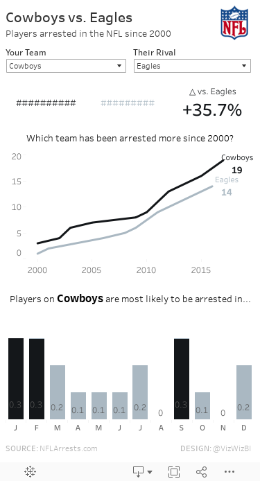
Makeover Monday: Player Arrests in the NFL since 2000

Let's have a quick look at the original viz.

What works well?
- Really nice interactivity
- Fast and slick filtering options
- Sorting the teams from worst to best
- Allowing the user to customize the view
- Showing the top 5 in three categories
- Expand button allows you to quickly see a bigger chart
- Option to click on a team and quickly drill into that team
What could be improved?
- The Hide All and Show All buttons are unnecessary.
- Too many colors
- Tooltips aren't very useful
- Comparisons are more difficult than they need to be
My Goals
- Allow for comparisons between teams
- Make the patterns more obvious
- Reduce the complexity of the view
- Choose simple chart types
- Show BANs to summarize the data
- Make a mobile-friendly view
February 1, 2017
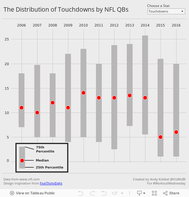
Workout Wednesday: The Distribution and Median of NFL Quarterbacks
Below is the visualisation that I created. If you're reading this on a phone, tap on the image for the interactive version. Some requirements to keep in mind that are intentionally designed to make this tougher and to make you learn:
- All of the elements must be floating on a dashboard sized 650x650.
- You cannot use the Player dimension anywhere in the view.
- Match my colors including the background
- Create the legend (HINT: It's not an image)
- Match the tooltip (Note the stats that are displayed in the tooltip. This will be a bit tricky. Essentially you need to count the number of players that are contained within each band.)
- The viz should update based on the stat selected. The user should be able to choose between: Attempts, Completions, Interceptions, Touchdowns, and Yards
- The title should update dynamically based on the stat the user selects.
- Optional: Use Montserrat font (you can download it from Google fonts)
January 25, 2017
Workout Wednesday: Cumulative Passing Yards for NFL QBs
Nice challenge from Emma this week! She’s a massive NFL fan and since the Super Bowl is upon us, she decide to challenge us to create a common baseline chart that shows the passing yards for QBs in the NFL over the course of their careers. Go to her blog for the full challenge details.
First requirement was to filter to QBs that had played at least 3 seasons and had at least 2000 total passing yards. I did this by adding a data source filter. The benefit of doing this is that my Player list will now only include those that meet the criteria and I won’t need filters elsewhere.

Next, I created a LOD calc to get the first year for each QB.

I built upon that calculation with this calculation that gives me the number of seasons played per QB. This goes onto the Columns shelf.

The cumulative passing yards is merely a running total table calc set at the Year level. This goes on the Rows shelf.

I put Player on the detail shelf to get a line per QB. I also put Year and Yds on the Detail shelf since I need those for the tooltip.
Next was a parameter to pick a QB and use that to highlight the QB chosen. I then created a simple calculation that check the Player again the parameter and put that on the color shelf.
Last was the dot on the end of each line. To do that, I created a calculation that checks if it’s the end of the line and the player selected and, if so, return the cumulative passing yards. Since this is a nested table calc, it’s important to set both table calcs to compute using Year.

Some tidying up, adding the footnotes and I was done. I decided to float all elements on the dashboard to ensure they would render exactly as I wanted them to. Another fun week of learning something new! Thanks Emma!!
December 14, 2015
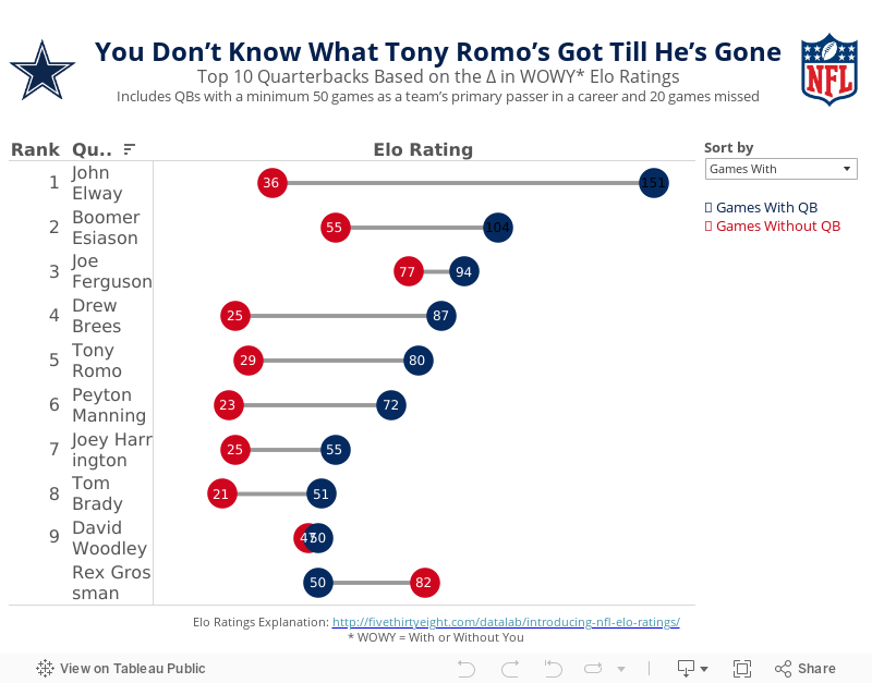
Makeover Monday: You Don’t Know What Tony Romo’s Got Till He’s Gone

Anyone that knows me knows that I despise the Dallas Cowboys and, in particular, their golden boy Tony Romo. As a lifelong Eagles fan, I’ve been indoctrinated into the hatred for anything associated with that ugly blue star. It drives me nuts to hear how much all of the NFL pundits love Tony Romo. He’s never won anything and chokes in the playoffs every time they make them.
So when I saw this article by FiveThirtyEight, it caught my attention. Was I not giving Romo his due? Does that matter anyway? In the article, the author looks at a metric they call WOWY (or With or Without You). In its most basic sense, this metric measures the impact that a particular player has on their team by measuring the Elo rating when that players plays and when they do not. For this piece, they considered quarterbacks that were the primary QB for at least 50 games and missed at least 20 games. They then pared that down to the top 10 based on what they called the WOWY ∆ ELO.
The result is this table:

The table clearly shows Tony Romo as the 3rd most important player to their team based on this metric. Ok fine. But is there more to the story? Can this simple table be made more intuitive for the readers to understand?
I created the barbell chart below. This view makes it much easier to see the difference between the With and Without You metrics. I also added a metric to the view that calculates the difference between the two. I then created a drop down to allow you, the reader, to sort by the metric you find most interesting. In essence, I’ve turned this simple table into four stories:
- WOWY ∆ ELO - This metric shows Romo as the 3rd most missed player in NFL history when he’s out injured.
- Games With - Sorting the chart by the Games With Elo rating, suddenly Romo is only 5th on this list, yet he’s ahead of Peyton Manning. This view also shows just how amazing John Elway was when he played. Elway’s Elo rating is nearly 50% higher than the second best.
- Games Without - Interesting…the teams that Rex Grossman played for actually performed better without him in the lineup. Clearly he was quite terrible as an NFL quarterback. You can also see Romo down in 6th position; the Cowboys are definitely much worse without him.
- Difference - I added this metric to show the variation between the With and Without You values. Now Romo is back in the 3rd position, and look at that gap for John Elway…wow!
Give it a play for yourself. Do you see anything else interesting?
November 19, 2015
Philadelphia Has the Worst Sports Teams in North America
How bad are Philly sports teams?
- The Eagles are more or less unwatchable. They’re inventing new ways to lose.
- The 76ers have lost 20+ games in a row. That’s really, really hard to do in the NBA.
- The Flyers couldn’t score if there was no goalie in the opposing net.
- The Phillies…well, they did their best to be one of the worst baseball teams of all-time.
I took the ugly table of numbers from the article and built the interactive dashboard you see below, confirming my worst fears.
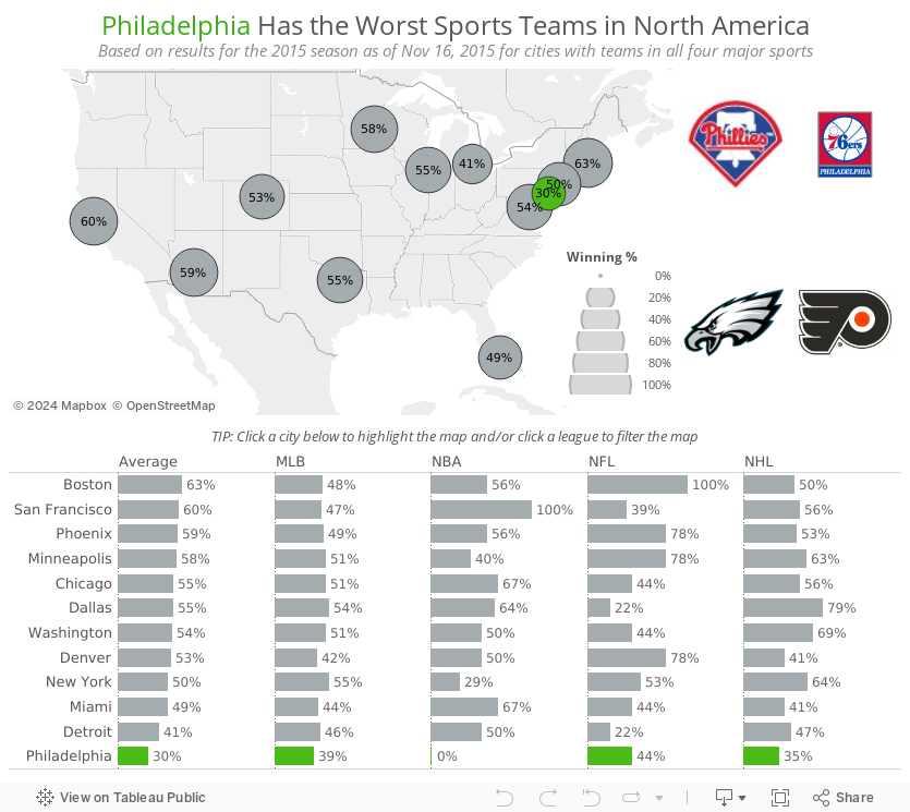
This merely confirms the misery that is being a Philadelphia sports fan.

November 9, 2015
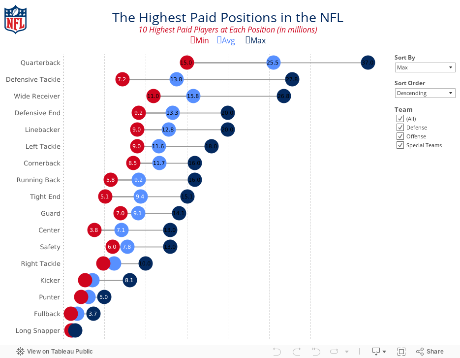
Makeover Monday: The Highest Paid Positions in the NFL

Ok, here we go. First, the chart to makeover today was by Cork Gaines of Business Insider.

I really like the idea behind this chart: understanding the salary distribution of NFL players by position. However, there are a few problems with this chart:
- The labels are vertical, making them harder than necessary to read.
- It took me a while to understand the sorting; the chart appears to be sorted by average salary.
- The salaries are only for the top 10 in each position, which means the min, avg and max are all relative to those 10 players.
- The labelling feels like it’s cluttering the chart.
To address these concerns, I’ve created the viz below. In my version, I’ve made the following changes:
- Changed the labels to horizontal
- Added options for sorting the viz by any of the metrics and allowing the user to pick a sort order
- Added a filter for the team the position belongs to
- Changed the chart from a bar chart to a dot plot/DNA chart
- Moved the labels into the middle of the dots, where they fit, and removed the $ symbols
- Changed the colours to use the offical NFL colours
This was a pretty simple and quick makeover that I feel provides a much more meaningful and insightful visualisation.
September 28, 2015
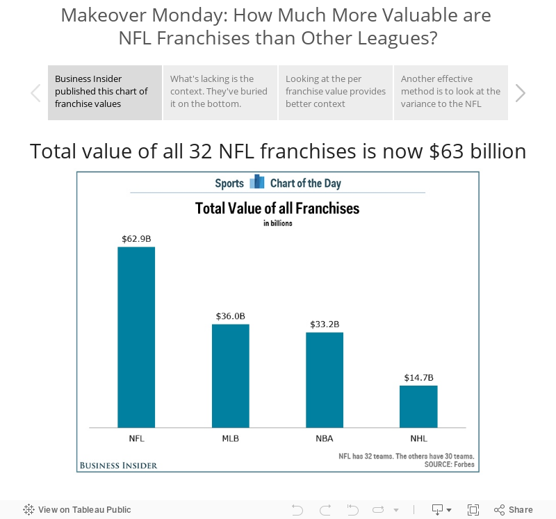
Makeover Monday: How Much More Valuable are NFL Franchises than Other Leagues?

Business Insider’s chart is lacking context, so in today’s makeover, I walk you through a few simple methods for adding context to a simple bar chart.
May 4, 2015
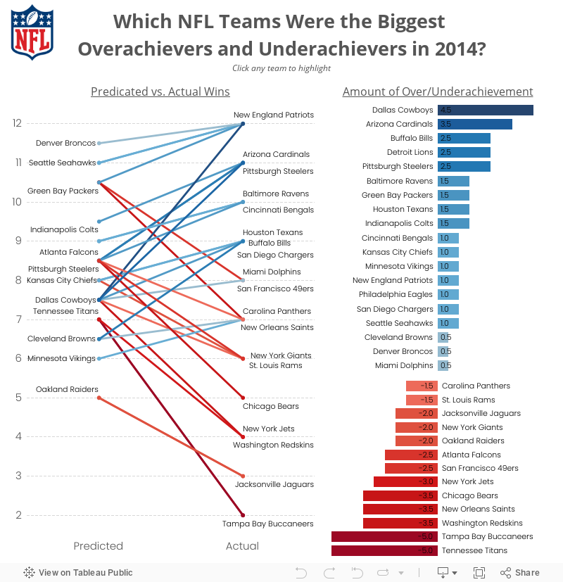
Makeover Monday: Which NFL Teams Were the Biggest Overachievers and Underachievers in 2014?


My biggest problem with this viz is that I have to turn my head sideways to read it. In addition:
- The length of the bars isn’t accurate. How can +4.5 be longer than -5.0?
- The bars are in reverse order - the biggest overachievers (Dallas) should be first.
- I have to do the math in my head to get to their predicted wins.
My first thought was to see what this viz looked like it I rotated it counter clockwise.

That definitely makes it more readable, but the story still doesn’t stand out. What the data is screaming for is to show the change and emphasize the winners and losers. To this end, along with accounting for the observations above, I created this interactive version in Tableau.
May 12, 2014
Makeover Monday: Will Johnny Manziel stop the run of terrible QBs for the Cleveland Browns?
The NFL Draft is somewhat of a national holiday here in the US. It’s the day when all fans can dream of their team using their picks to turn the fortunes of their franchise around. QBs are particularly in the spotlight. In this spirit, Chart of the Day published a chart on Friday after the first round of the NFL Draft showing the number of starting QBs for each NFL team since 1999.

Accompanying the chart was this statement:
“Since 1999, 20 different quarterbacks have started for the Browns, the most in the NFL. Meanwhile, the New England Patriots have had just three starting quarterbacks over the same span.”
This statement implies that there is a relationship between number of starting QBs and success (because they’re only talking about the outliers), yet they provide no additional context. I downloaded the winning percentages for every NFL team since 1999 from SportingCharts.com and joined it to the Chart of the Day data.
I like how they’ve sorted the bars in ascending order by number of QBs, yet I don’t like how they always have the labels rotated. A horizontal bar chart would be much easier to read.
Given that we can easily compare number of QBs and win %, I turned to Tableau and build this simple view.

Looking at the data this way, it becomes much more clear that there is no direct correlation between the number of starting QBs and win % (as implied by COTD).
- Detroit is an absolutely horrible franchise, yet they’re right in the middle of the pack with starting QBs.
- Chicago has a winning record, yet they’ve used the third most QBs.
- Cincinnati and Houston have had pretty stable QB situations, yet they don’t win even half of their games.
One particular insight that sticks out to me is the amazing amount of parity that exists in the NFL. 25 or 32 teams have between 40-60% win percentage. In any given season, you can pretty much count on around 80% of the teams winning between 9.6 and 6.4 games per season. This is exactly what the NFL wants and is a large reason that they run a socialist type model of revenue sharing.
What else do you see? You can click on a team to highlight them. Download the data here and the workbook here.
February 18, 2014
Makeover - Chart of the Day: The Seattle Seahawks are one of the NFL best defenses of all-time
Cork Gaines of Chart of the Day has once again provided me with a terrible chart to pick apart. The idea behind this chart is simple, but the execution is nothing short of terrible. Let's start with the chart Cork produced:

I like Cork's idea: How did the Seahawks defense rank against the best defenses of all-time? His primary method of measurement is how each team compared to the NFL average. Makes sense.
However, there is way too much going on in this chart to make any sense of it.
- Cork chose to show two measures. This confused me. Do all of the teams make up the top 15 in each of these categories? I doubt it. It turns out that the measure he's ranking them on is PPG allowed vs. the NFL average. So why include YPG allowed?
- Why show 15 teams? Showing the top 10 makes it easier to find where the Seahawks rank.
- The point of the article is to highlight the Seahawks, yet he fails to highlight them. You have to do too much work to find them.
- The teams are ranked in reverse order. For some reason, nearly every chart that Chart of the Day produces is sorted backwards. I suspect they’re using Excel to create their charts. The best team should be on the left, not the right. If you don't pick up on that, you might be led to believe that the 2005 Bears had the best defense, when in fact it's the 1975 Rams (who are way over on the right).
- He's barely highlighting the teams that won the Super Bowl with a tiny asterisk.
- The chart forces you to turn your head 90 degrees to the right to read the labels.
- Is the axis needed? All of the bars are labeled, so I would say no.
I'm sure there are some other things I'm missing, but I'm too irritated with this chart to continue to make myself suffer.
Since I'm in the process of testing Tableau for Mac, I decided to build my version of the chart there.

How did I address my concerns with Cork's chart?
- I decided to only show PPG allowed vs. the NFL average. I wanted to keep it simple.
- I’m only showing the top 10 teams.
- The point of the article is to highlight the Seahawks, which I've clearly done.
- The teams are ranked in the correct order, starting with the best defense on the left.
- I decided to highlight the Super Bowl winning teams by showing the Lombardi Trophy. This makes it easier to see that having a great defense does not guarantee the title.
- I've made the team names much easier to read by displaying the text horizontally.
- The bars are labeled and they all start at zero, so I've eliminated the axis.
It saddens me to see the consistently poor output from Chart of the Day. They have so much interesting sports data to work with, yet they continue to communicate their stories so, so poorly. Maybe I should send Cork a copy of Data Visualization: A Successful Design Process by Andy Kirk and/or Show Me the Numbers by Stephen Few.
February 1, 2013
Just in time for the Super Bowl. Who should you hang out with to watch the game and bond over beer and wings? Facebook data, Tableau style.
The Facebook Data Science team does some pretty awesome analysis of friend relationships! On Monday they published an article on fan relationships between NFL teams. It’s very interesting content. I was working on the last visualization in the post with their team but we didn’t get it done before they had to publish their post.
So with their permission, I’m publishing my version of NFL fan relationships. Here’s their explanation for how to read it:
Even the most die-hard fans among us have some friends who root against us. While it turns out that most friendships between NFL fans on Facebook are between fans of the same team, we wondered, what about the rest of the friendships? Which rival teams' fans are most likely to hang out on Sunday to bond over beer and wings despite their conflicting allegiances?
The following viz shows the fan-friendships for each team in the league, excluding friendships between users who like the same team. Highlight a team by choosing it from the list on the upper-right. Filter by Division.
If you have a large monitor, check out this version.

There are a couple of interesting findings. Dallas and Pittsburgh are nearly always in the top 3, while Jacksonville, Houston and Buffalo aren’t very popular. Perhaps this helps explains why certain teams are on TV more than others, or perhaps they’re more popular because they’re on TV.
Where does your favorite team rank?
December 25, 2012
Is Mark Sanchez as bad as Sports Chart of the Day says he is? Here’s some context.
After week 14 of the NFL season, Cork Gaines more or less blamed the poor performance of the NY Jets on Mark Sanchez, saying:
Last night, Mark Sanchez turned the ball over five times, continuing a disturbing trend over the past two seasons. He now has a league-leading 24 turnovers this season (17 int, 7 fumbles lost) and 50 over the last two seasons combined. In his first two seasons, Sanchez turned the ball over just 37 times.
Corked followed this up by publishing this chart on Business Insider’s Sports Chart of the Day.

I thought “Wow, Sanchez really is terrible!” But I’m an Eagles fan, and we know terrible football. This got me thinking about Michael Vick. He was absolutely HORRIBLE turning the ball over the first few weeks of the season before he got a concussion and hasn’t played since.
In Cork’s chart, Vick is at #11, but he’s only played a full season in the NFL once. So far in 2012, Vick has 19 turnovers in 9 games, for a turnover rate of 2.1 per game. This puts Vick at #2 on the turnover rate ranking ahead of, you guessed it, Mark Sanchez.
What this should tell you, as it did to me, is that Cork’s chart isn’t normalized. Sanchez has played more games that Vick at a slightly lower turnover rate, so of course he’s going to have more turnovers.
I decided to look into this farther and gathered data through week 15 from Pro-Football-Reference.com and built this viz. (Download the data here.) BTW, if you ever need pro football data, this is by far the easiest place on the internet to find what you’re looking for.

I started with turnovers, as Cork did, and if you sort by Turnovers on the right, you see that Sanchez is now third on the list, granted he was benched for week 15.
Change the sort to Turnovers per Game and Sanchez is now sixth. Rex Grossman is first in turnover rate. No wonder he hasn’t played this year.
It was important to me to also look at win percentage to see how turnovers might correlate to winning. Change the sort to Win % and you can clearly see that those QBs at the top (the best winning percentages) have very low turnover rates, Andrew Luck being the exception, but he has seven game winning drives this year, which is a crazy number.
You can explore the relationship between turnovers and win % a bit deeper on the 2nd tab (Win % vs. Turnovers).
I chose to use a lollipop chart for these first three views. I could have chosen a dot plot, but I wanted to emphasize both the end point and the length of the bar, but I didn’t want to clutter the chart too much with a bar chart.
I then wanted to see how who has improved or regressed from last year. We do have one game less, so take that into consideration. This view confirms that Sanchez is worse this year from a turnovers perspective: 28 in 2011 in 16 games and 29 in 2012 in 14 games. Not good Mark!
For this view, I chose to use a bar chart for 2012 with 2011 as reference line. But it’s not really a reference line. It’s a dual axis chart with 2011 as a Gantt bar. For me, this view works because it gives me a quick comparison between the last two seasons.
I finish the viz off with a dot plot comparing fumbles and interceptions, each of which you can sort by on the right. Ryan Fitzpatrick threw 39 interceptions last year…39! That’s really hard to do.
I chose a dot plot for this view because I wanted an uncluttered view of two measures on the same chart, and I was only concerned about their relationship to each other, not their length.
There’s an immensely larger number of analyses you can perform on this data set. I’d be curious to see if anyone can find any hidden relationships. Give it a shot and post a comment if you find something useful.
December 7, 2011
Sports Chart of the Day: When you want to emphasize rank, sort appropriately…please!
Dear Sports Chart of the Day,
I’ve been patient. I’ve added comments (which never seem to get posted/approved). And I’m frustrated. I love your blog, but you really need to make some simple changes to your charts.
You often post charts like the one below (from this blog post). You often say things like you said in this post:
Here are the top 17 teams in the NFL based on points scored and points allowed and how many wins those teams would be expected to have based on those numbers (actual record in parentheses)
As a reader, it’s very clear that you are emphasizing top-to-bottom rank. Those of us that live in the western part of the world have learned to read left to right. You want us to look at the “top 17 teams”, yet the chart reads right to left. Please, please start sorting your ranking charts in the appropriate order, descending in this case. Trust me, this will improve your message.

Respectfully,
Andy
November 18, 2011
The Best NFL Kick Returners Ever!
Using Tableau is a never-ending journey of learning and today was no exception. It began with this chart from the Chart of the Day:

Overall, this chart is well executed, except I would have sorted the players in descending order. But I wanted to take it one step farther, so I downloaded the data from pro-football-reference.com and got to work in Tableau. I wanted to be able to compare:
- Not only the combined kick returns, but also the top punt returners and kickoff returners separately. I wanted to know which players were the best in each category.
- Players that played for one team versus more than one team
- A player’s kick return ability compare to his punt return ability
Finally, I wanted to be able to filter each chart by the Top X Players for that chart. This is where parameters come in handy.
I started this post by saying I learned a few things. I learned to:
- Make the user experience easier by creating a list of instructions like Steve Wexler at DataRevelations.com always does. Hover over the NFL logo to see the instructions for this viz.
- Filter by a Top X parameter when there’s more than one item on the color shelf (like on the Total TDs chart). Check out this discussion on the Tableau forum for an explanation (thanks to Joe Mako for the link and help making it work with a scatter plot).
To answer the question in the title of the viz, Devon Hester is very dangerous…a clear outlier, he’s a player that is “numerically distant” from the rest of the players.
July 14, 2011
Chart abuse: A stacked column chart dissected
I ran across this chart today on the Chart of the Day blog. From the article:
“Below is a look at the number of running backs selected in the first round during the Super Bowl era (1967-2010) as well as the number of running backs taken among the top ten picks.”

This stacked column chart needs improvement. Why?
- The commentary for the chart is misleading. It indicates that your comparing the total running backs drafted in the first round to those in the top 10, which would lead you to believe the top 10 is percentage of the total running backs.
- How can you tell how many running backs were taken in the top 10? You have to guess at that number since there’s no vertical axis.
- What do the labels on the bars mean? Do they reference the # of Other 1st Rounders or the Top 10 picks or both?
- Stacked bars can make it challenging to compare the bars other than the lowest bar. In this case, a line chart would be a better way to compare the other 1st rounders, though that would defeat the overall purpose of the chart…to show the total number of 1st round picks by year.
March 27, 2011
I HATE the Cowgirls!
I grew up in Philadelphia and if there’s one thing you learn, it’s to HATE the Cowgirls! Jerry Jones is so egotistical, but then again, he sure knows how to run a profitable business.
View the original blog post here.

October 11, 2009
All-Criminal NFL Offensive Lineup
I love how the players have on the stripes. The title is priceless: "Talented, Dangerous and Idiotic."


