Showing posts with label percentiles. Show all posts
July 24, 2018
Tableau Tip Tuesday: How to group items into dynamic halves, tertiles, quartiles, and quintiles
adoption rate
,
bins
,
percentiles
,
rank
,
rank_percentile
,
table calculation
,
Tableau Tip Tuesday
No comments
This week's tip came about from a client request at The Data School last week. The customer was looking to understand how quickly different doctors adopted different medications. I worked with Alexander Fridriksson to solve this problem using table calculation.
In Alexander's example, he needed to break the customers down into thirds: early adopters, the next 33% of adopters and late adopters. The beauty of this solution is that it dynamically recategorizes the doctors based on the marks in the view.
As we can't share specific client examples, this video shows you how to use the RANK_PERCENTILE table calculation to "bin" states based on their adoption date. An adoption rate in this case is the first time a product was sold in a category.
Enjoy!
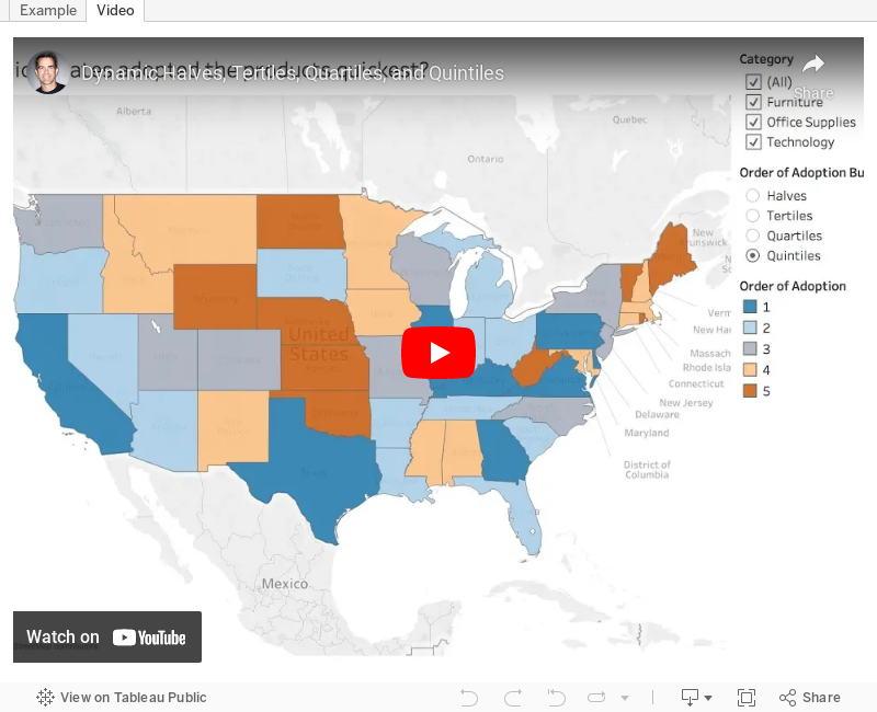

In Alexander's example, he needed to break the customers down into thirds: early adopters, the next 33% of adopters and late adopters. The beauty of this solution is that it dynamically recategorizes the doctors based on the marks in the view.
As we can't share specific client examples, this video shows you how to use the RANK_PERCENTILE table calculation to "bin" states based on their adoption date. An adoption rate in this case is the first time a product was sold in a category.
Enjoy!
September 5, 2017
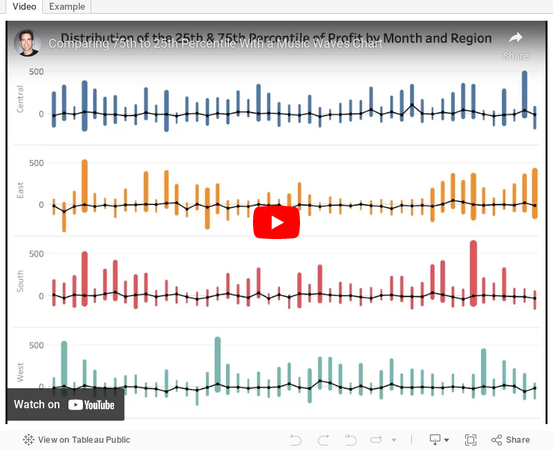
Tableau Tip Tuesday: Comparing 75th to 25th Percentile With a Music Waves Chart
- Create percentile calcs and place them on the same axis.
- The date field must be discrete.
- Use Measure Names on the Path shelf.
There are some other subtleties that you'll pick up on the video as well. Enjoy!
February 1, 2017
Workout Wednesday: The Distribution and Median of NFL Quarterbacks
distribution
,
LOD calc
,
mean
,
nfl
,
percentiles
,
quarterback
,
Workout Wednesday
1 comment
Last week on my Data Viz Done Right site, I wrote about a distribution visualisation created by Harry Enten that shows the range of dates for snowfall at select U.S. cities. It's Super Bowl week, so I decided to recreated the style of Harry's viz in Tableau with the same NFL data that Emma used last week. Your challenge this week is to re-create my viz.
Below is the visualisation that I created. If you're reading this on a phone, tap on the image for the interactive version. Some requirements to keep in mind that are intentionally designed to make this tougher and to make you learn:
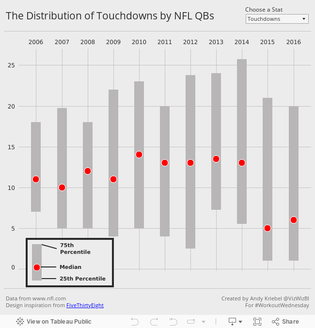

Below is the visualisation that I created. If you're reading this on a phone, tap on the image for the interactive version. Some requirements to keep in mind that are intentionally designed to make this tougher and to make you learn:
- All of the elements must be floating on a dashboard sized 650x650.
- You cannot use the Player dimension anywhere in the view.
- Match my colors including the background
- Create the legend (HINT: It's not an image)
- Match the tooltip (Note the stats that are displayed in the tooltip. This will be a bit tricky. Essentially you need to count the number of players that are contained within each band.)
- The viz should update based on the stat selected. The user should be able to choose between: Attempts, Completions, Interceptions, Touchdowns, and Yards
- The title should update dynamically based on the stat the user selects.
- Optional: Use Montserrat font (you can download it from Google fonts)
If you have any questions or get stuck, either leave a comment on this post or tweet me. Good luck!
January 26, 2017
Makeover Monday: Regional Tourism Spending in New Zealand (Take 3)
dot plot
,
Eva Murray
,
Harry Enten
,
Makeover Monday
,
median
,
New Zealand
,
percentiles
,
tourism
Inspired by the visualisation by Harry Enten that I highlighted today on my sister site DataVizDoneRight, I decide to look at the New Zealand tourism data again and see if I could build a similar view. After all, no data visualisation is ever “complete”. I really like how this turned out (and thank you to Eva Murray for feedback).
I incorporated a legend on the upper right to make the bars easier to interpret. Basically the grey bar shows the 25th to 75th percentile of all of the regions and the red dot indicates the median of all regions. I’ve removed the total region from the view.
Subscribe to:
Posts
(
Atom
)






